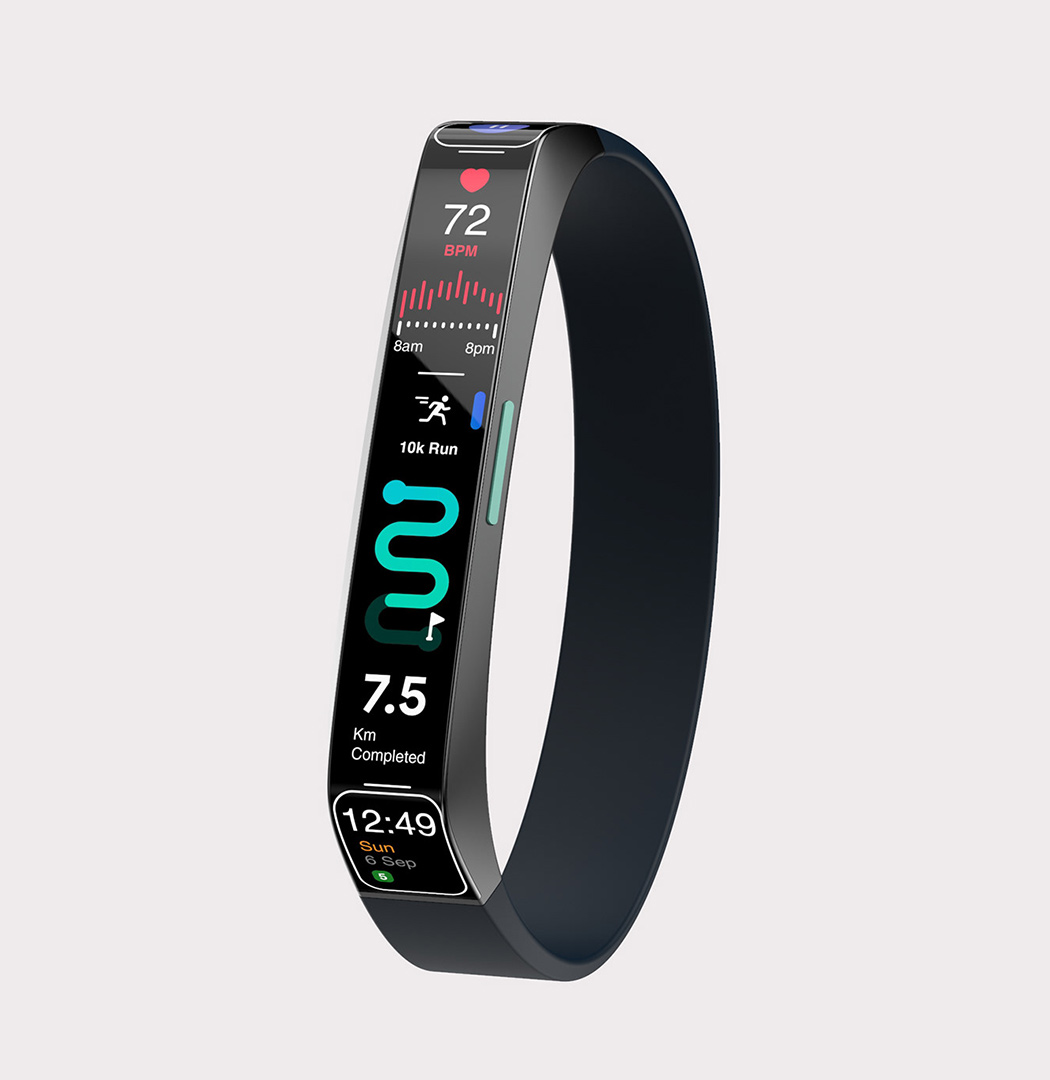
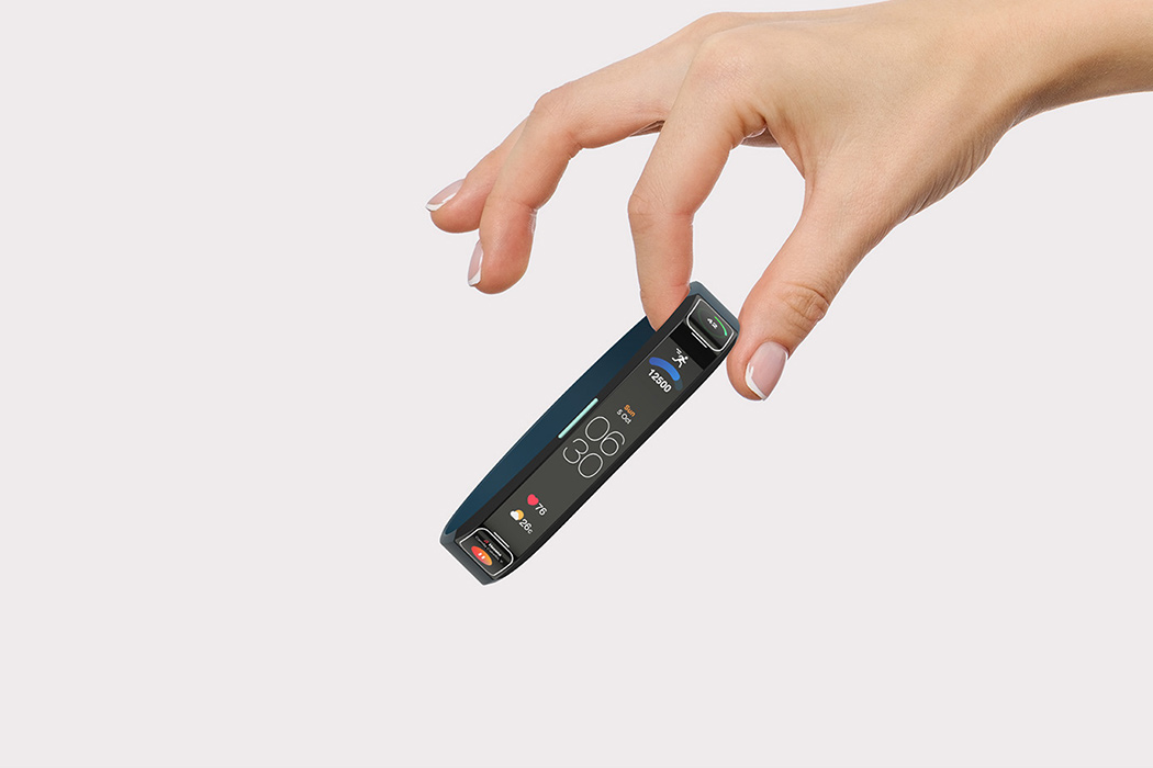
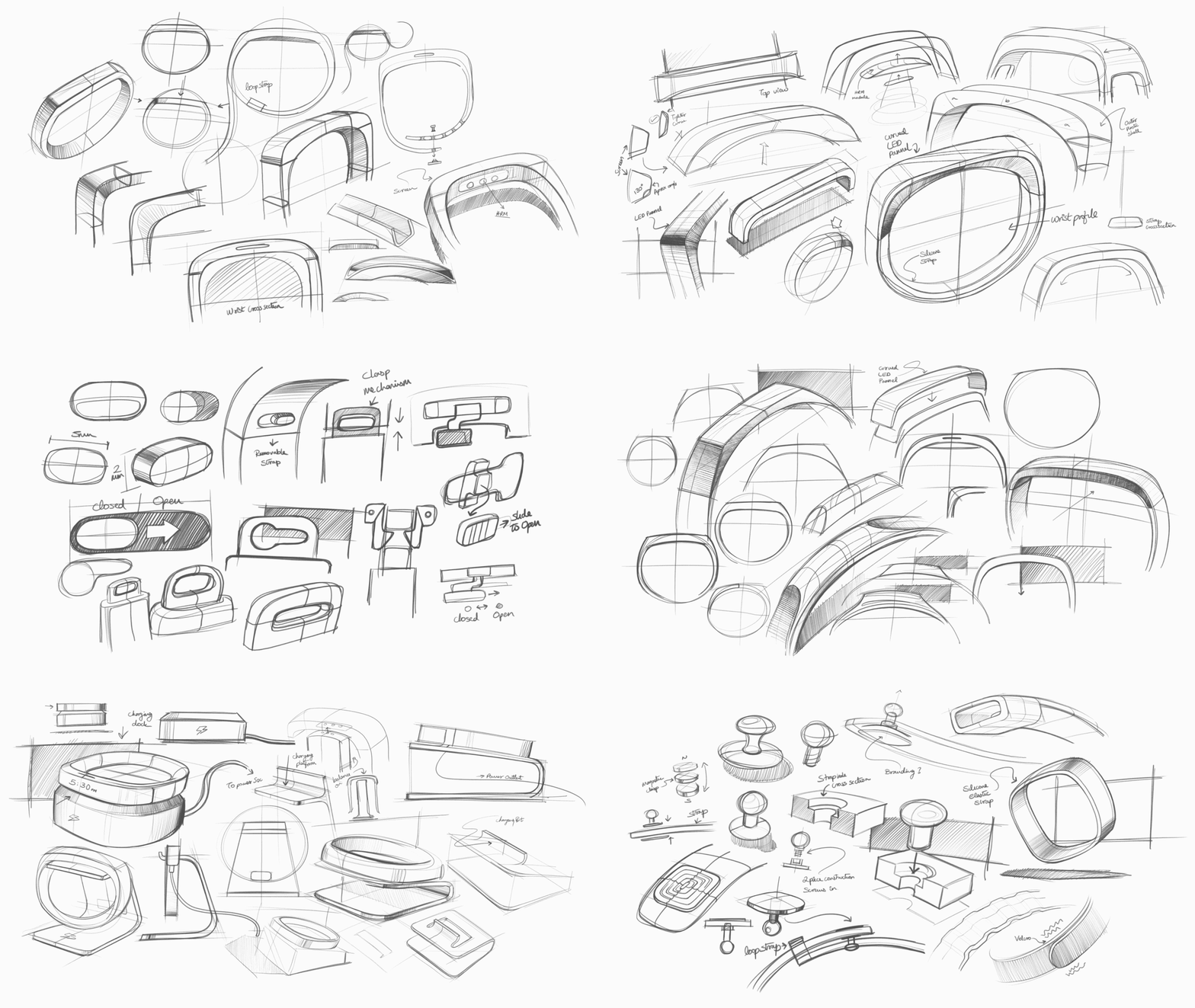
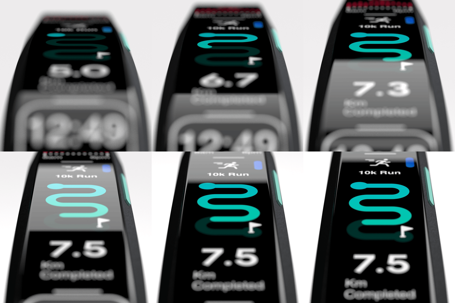
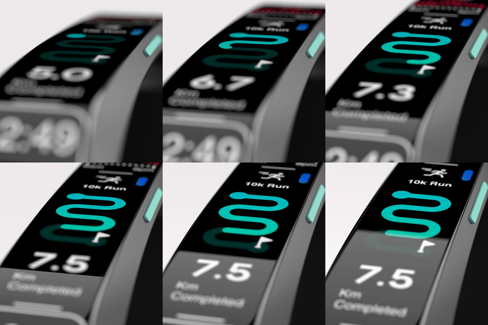
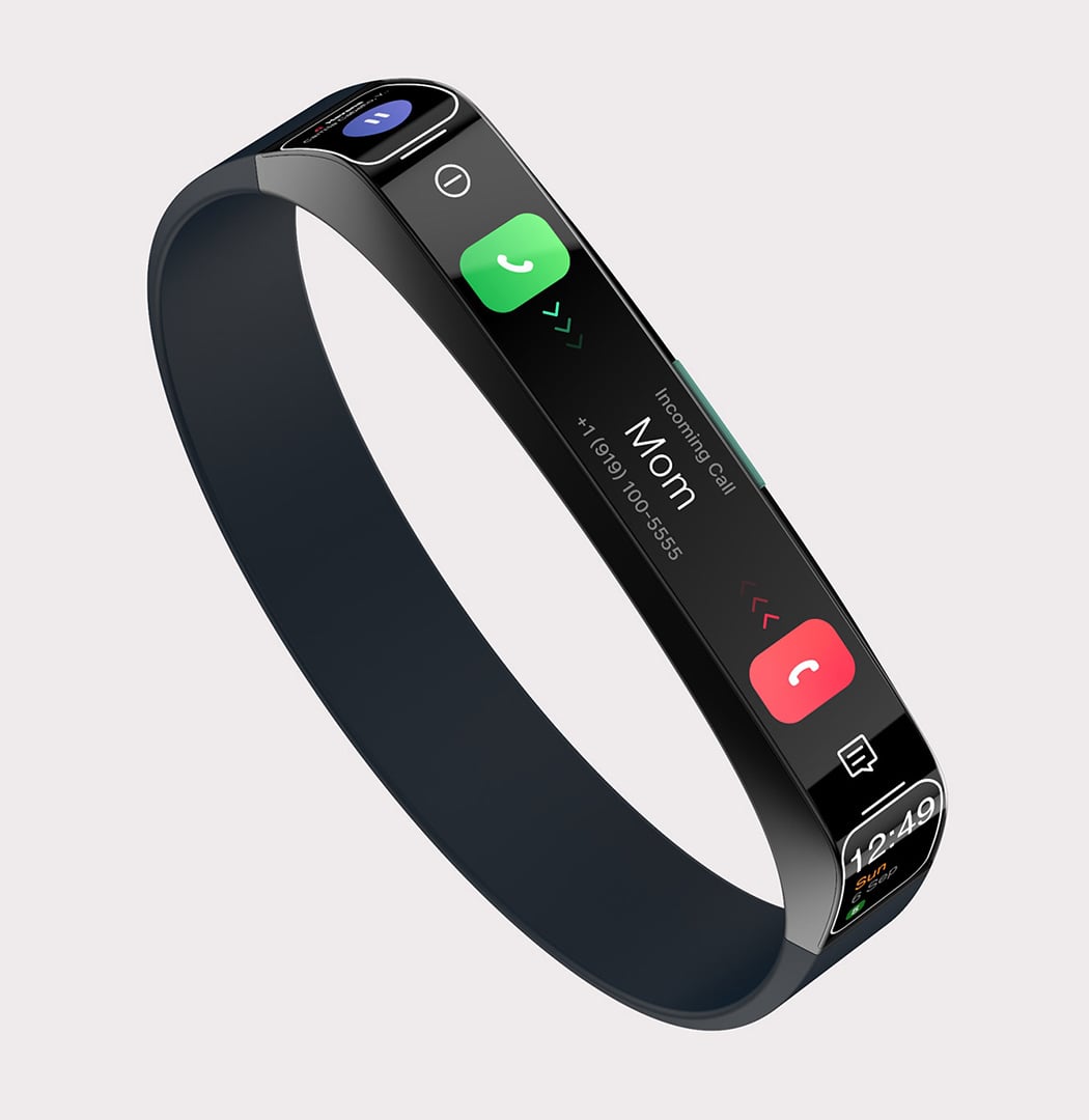
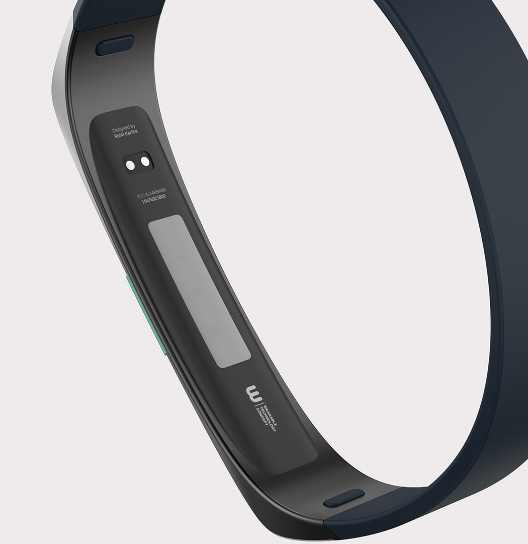
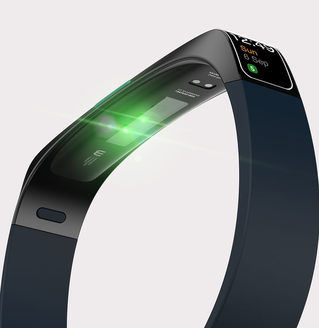
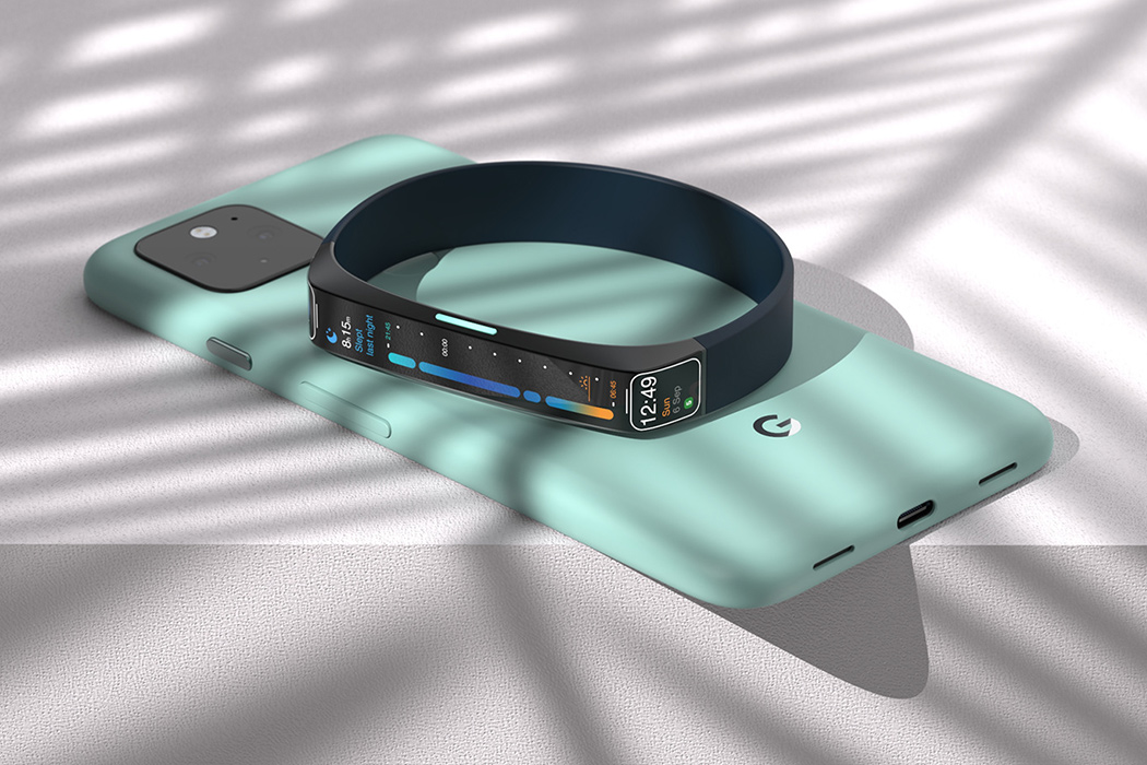
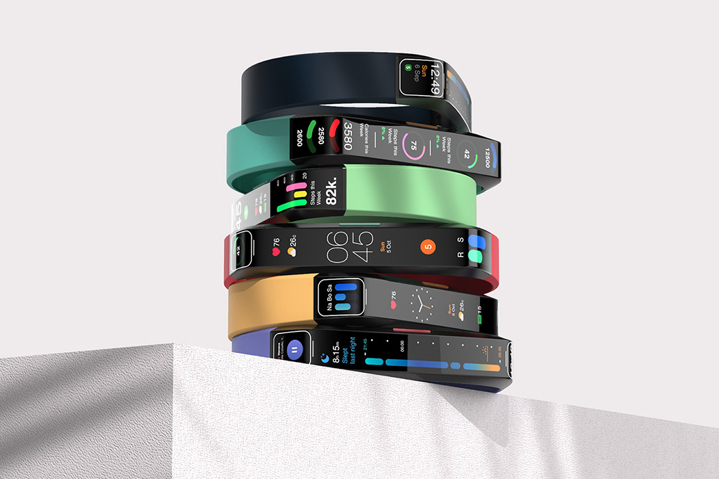
Phone screens may be getting larger, but smartwatch displays are getting slimmer. This wearable tech design concept imagines a screen that takes advantage of a limited amount of space. Many smartwatches have a square or circular face, similar to a mechanical timepiece; this also gives the user more control over the touch-screen display. For 2021, this wearable technology concept attempts to slim down and create a touch-screen fitness-watch that can fit more information in less space.
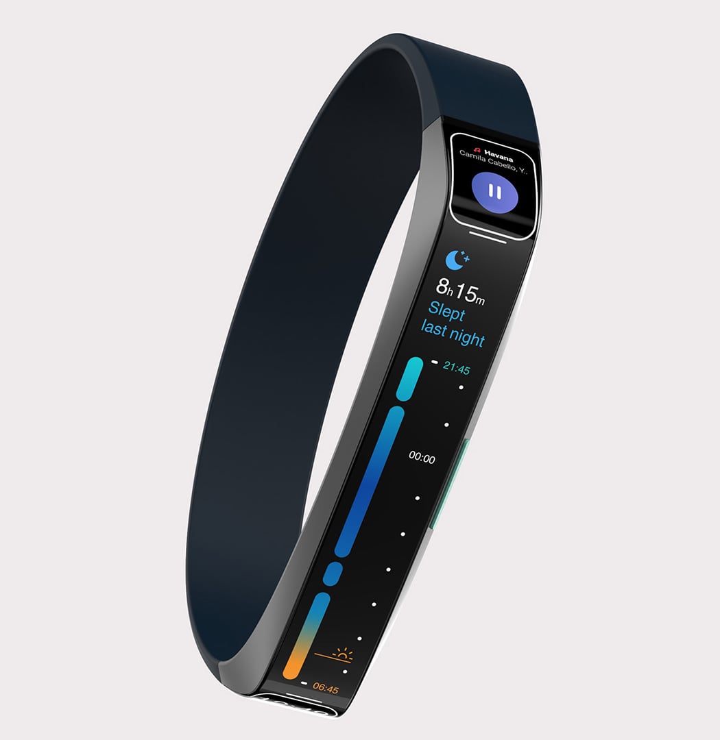
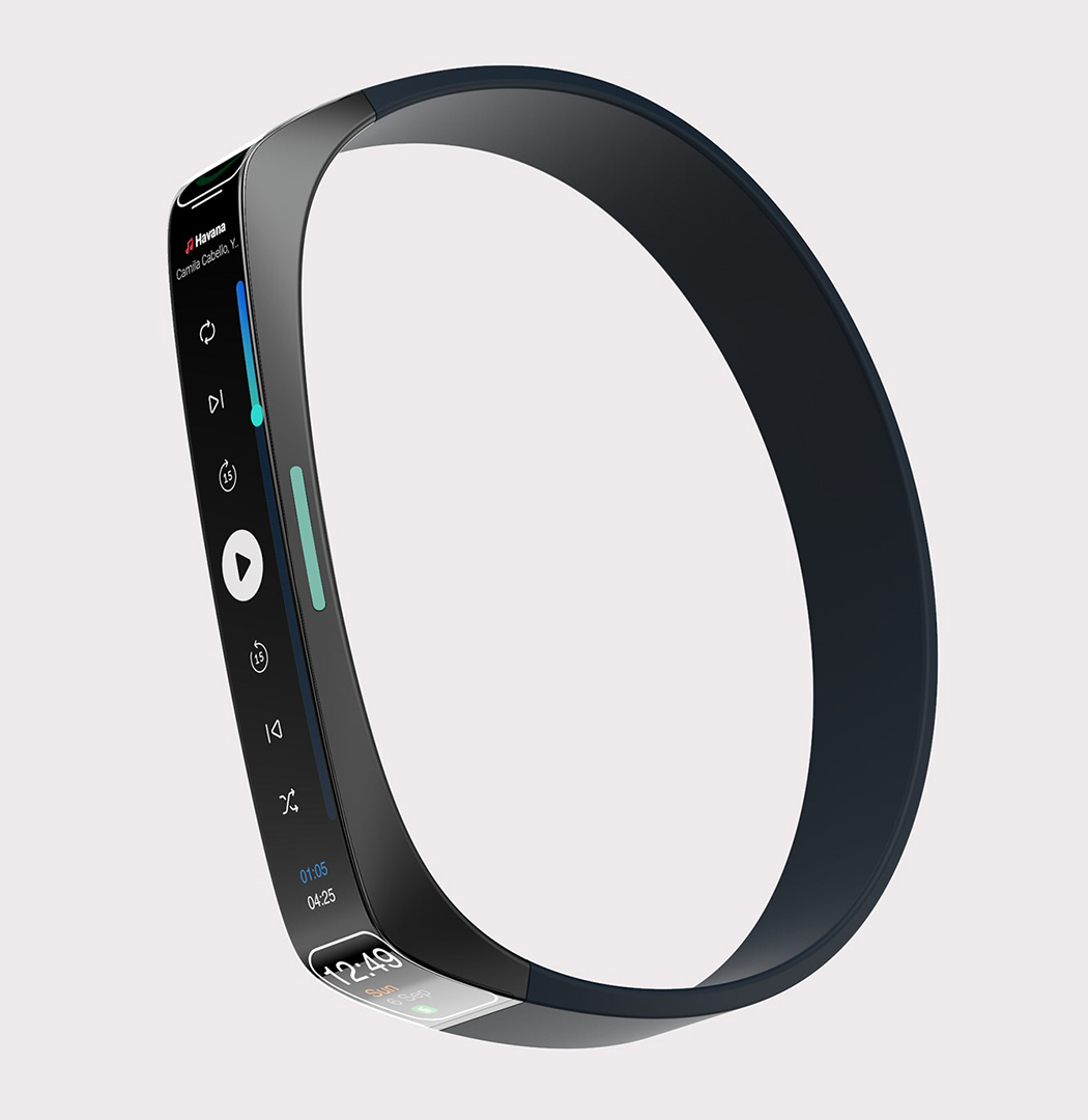
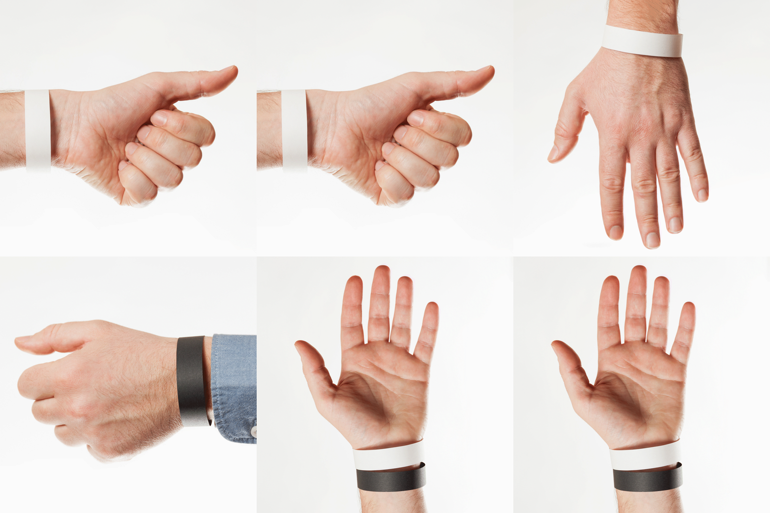
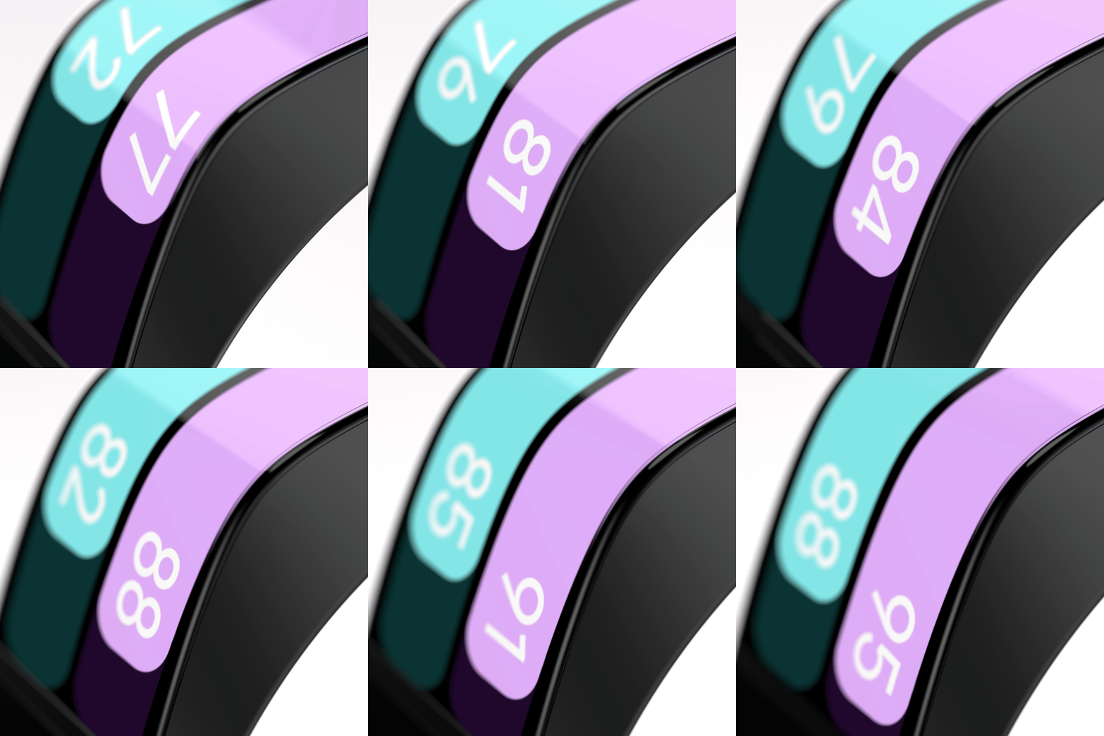
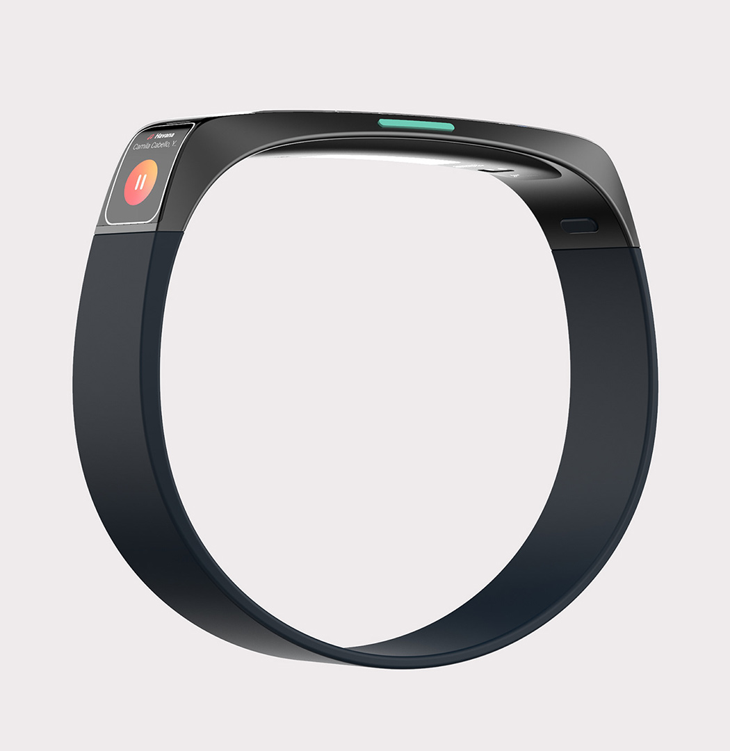
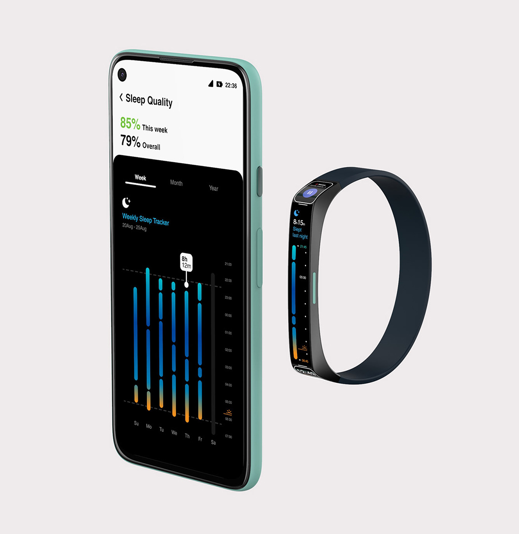
The unique aspect of the design is how the screen wraps around the wrist comfortably. Unlike similar products, which use a swipe feature to access the various widgets, this concept displays all of them on the same screen. How can they fit comfortably? Well, the display for this concept happens to be extra long, stretching past the width of your wrist. Also, instead of swiping through the different pages, the interface works by scrolling up or down. This is a newer design concept that works better for this type of device.
You don’t have to swipe back and forth between multiple pages (everything is right there in your eye’s view). Also, as someone who also works out with a FitBit, I can say that, even though mine has a slender rectangular screen, that concentration of the electronic part of the device can be a little uncomfortable. It’s not quite as flexible as the rubber wristband, and that extra weight will cause the watch to jiggle up and down my wrist. This newer design concept distributes the weight across a longer surface area, so it’s not quite as concentrated. Even though I can’t test out this concept practically, I’m optimistic about its practical applications. In addition to being more aesthetically pleasing than comparable products, this concept is also more user-friendly.
Designer: Rohit Kartha
