Robotic Open-source Scale Dress Printed by ELEGOO Neptune 4 Series: 3D Printing in Fashion

3D printing has revolutionized the design industry by making it easier to prototype ideas quickly and efficiently. This technology allows designers to experiment with new concepts without the high costs traditionally associated with prototyping. As a result, executing designs has become more affordable and accessible, opening up new avenues for creativity. Beyond design, 3D printing is now breaking into other industries, including fashion, with trailblazers like ELEGOO leading the charge.

ELEGOO is not just a pioneer in 3D printing but also in empowering women to use technology to turn their ideas into reality. One prime example is an innovative robotic and modular dress system that will showcase the potential of 3D printing in fashion, inspiring a new wave of creators. This initiative highlights how 3D printing is transforming the fashion industry, offering unprecedented opportunities for innovation and expression.

Designer: Anouk Wipprecht

Click Here to Buy Now: $209.99 $275 (23% off). Hurry, deal ends in 48-hours!

Anouk Wipprecht and the Scale Dress: Futuristic Fashion

Anouk Wipprecht, a visionary Dutch FashionTech Designer and Engineer, has partnered with ELEGOO to push the boundaries of fashion technology. She has developed a new modular system for integrating motors into fabrics, revolutionizing how garments can interact with the wearer and environment. This collaboration marks a significant leap in the fusion of fashion and technology, showcasing the endless possibilities of innovative design.

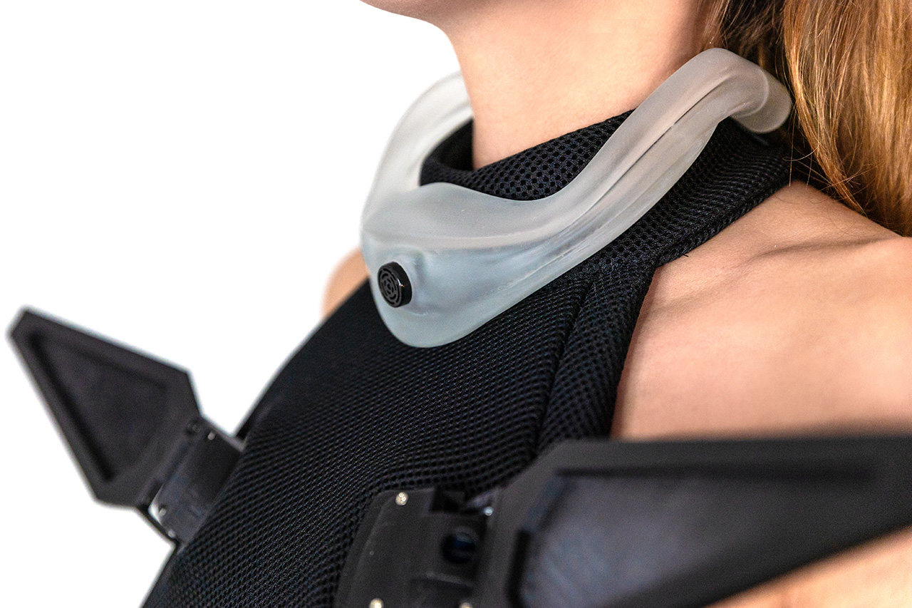
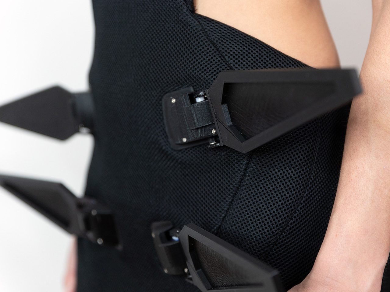
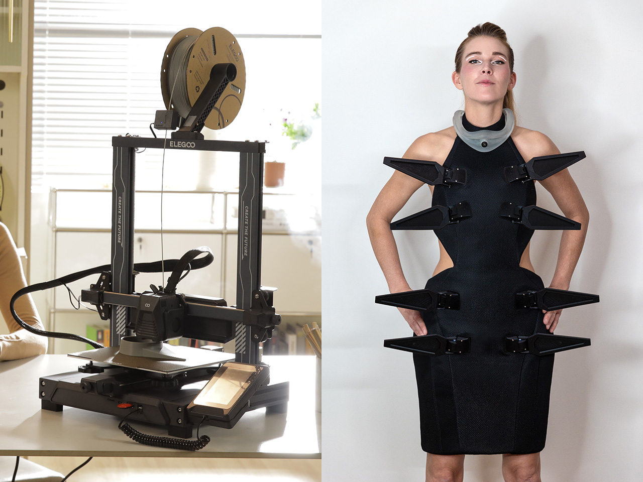
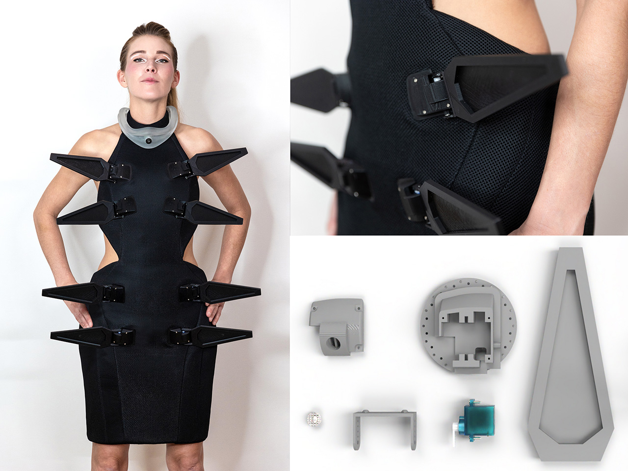
The “Scale Dress” is a groundbreaking creation from this collaboration, representing a futuristic approach to fashion. This robotic, open-source dress comprises multiple 3D-printed mechanical parts, each equipped with tiny servo motors. These motors animate the dress, creating dynamic movements around the body. Ingeniously, the mechanism is sandwiched between fabric layers, with its round shape evenly distributing weight to prevent sagging or imbalance.

The Scale Dress not only captivates with its moving elements but also serves as a modular, open-source template for aspiring designers. Anouk Wipprecht has ensured that the design is accessible to those interested in robotic fashion. The servo-arms can be interchanged to hold various elements, addressing the challenge of integrating electronics with fabric and creating lifelike movements.

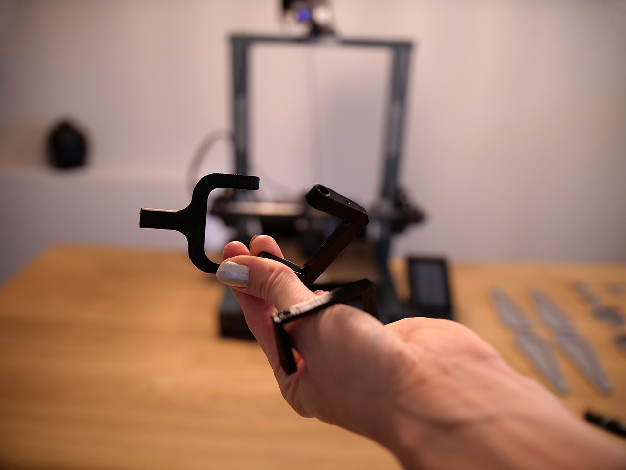
To empower others to explore this innovative realm, Anouk has open-sourced the Scale Dress design on her Instructables page. In collaboration with ELEGOO, she provides a detailed step-by-step guide on creating your own robotic dress with moving parts. The guide focuses on utilizing 9g servo arms, enabling creators to experiment and personalize their designs with ease.

This initiative not only highlights the potential of 3D printing and robotics in fashion but also encourages a new generation of designers to embrace technology. By sharing her knowledge and tools, Anouk Wipprecht is paving the way for more innovative and interactive fashion creations, inspiring others to explore the intersection of technology and design.

ELEGOO With Her: Empowering the Next Generation of Women Creators

The “ELEGOO With Her” program is a remarkable initiative aimed at equipping more women and girls with 3D printing skills. And the debut of the Scale Dress marks the official launch of the program, followed by a roundtable featuring prominent female designers at Formnext 2024 in Frankfurt, the largest 3D Printing Fair in Europe. This will kick off the initiative that aims not just to revolutionize the 3D printing industry but also fashion tech.

From November 19, 2024, to February 5, 2025, ELEGOO will recruit 30 women and girls for its empowerment program, providing them with 3D printers, software support, and mentorship. Participants will benefit from two months of online courses and workshops, culminating in a showcase of their work in April. This program is a testament to ELEGOO’s commitment to fostering diversity and innovation in the tech industry, empowering women to become leaders in 3D printing.

ELEGOO Neptune 4 Series: Unleashing Creativity in Fashion Design

The Scale Dress, designed for the FashionTech field, utilizes 3D-printed mechanical parts created with the ELEGOO Neptune 4 series 3D printers. The Neptune 4 series’ intelligent printing capabilities make it an ideal tool for blending technology and fashion. By enabling intricate designs and seamless integration of mechanical parts, this printer is a catalyst for innovation in FashionTech, pushing the boundaries of what’s possible in the industry.

This fusion of 3D printing technology and fashion is opening up new horizons for creativity and innovation. With pioneers like ELEGOO leading the way, the potential for groundbreaking designs and empowering diverse creators is limitless. As 3D printing continues to evolve, its impact on fashion and beyond will undoubtedly shape the future of design.

Click Here to Buy Now: $209.99 $275 (23% off). Hurry, deal ends in 48-hours!

The post Robotic Open-source Scale Dress Printed by ELEGOO Neptune 4 Series: 3D Printing in Fashion first appeared on Yanko Design.

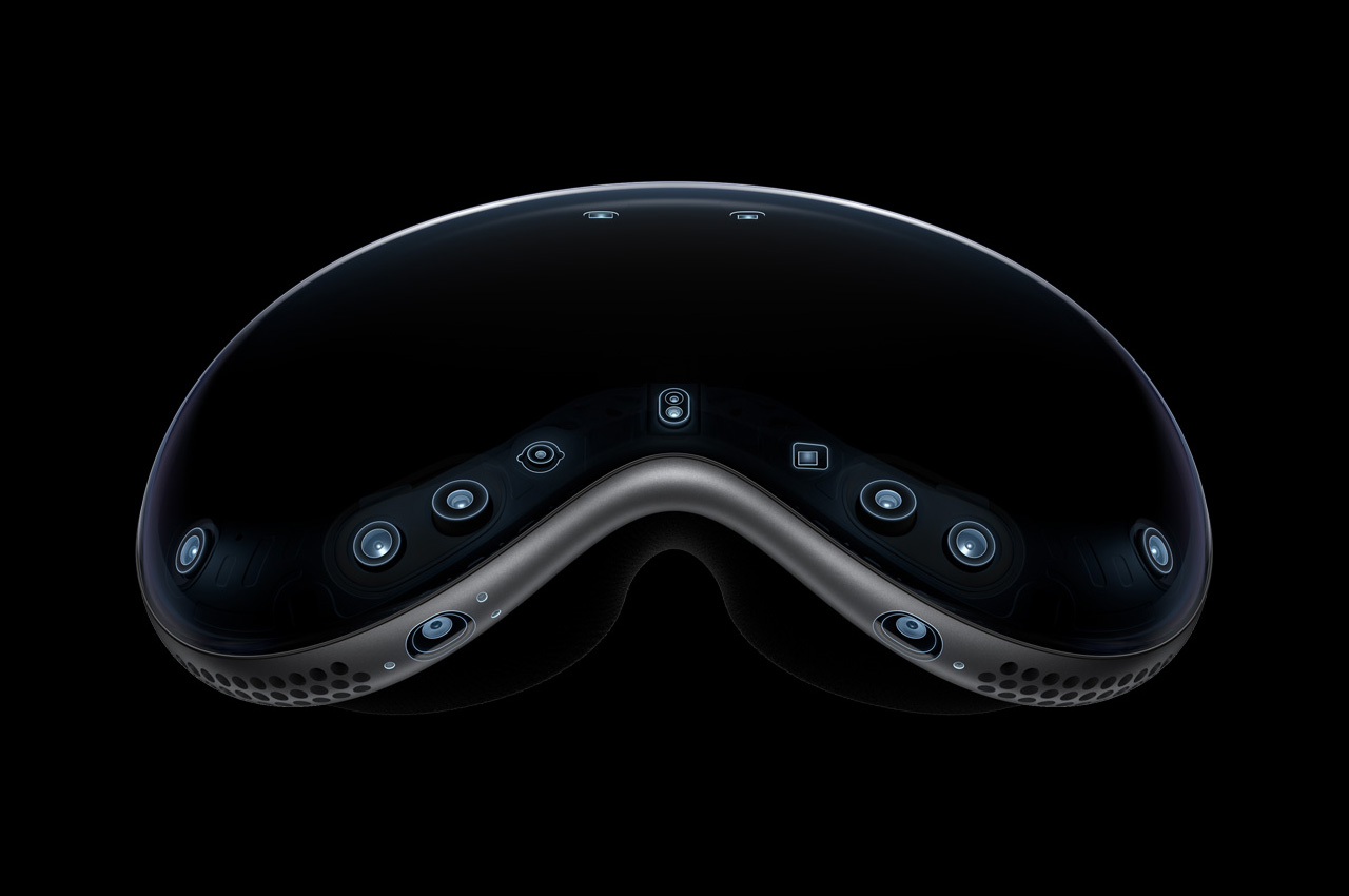
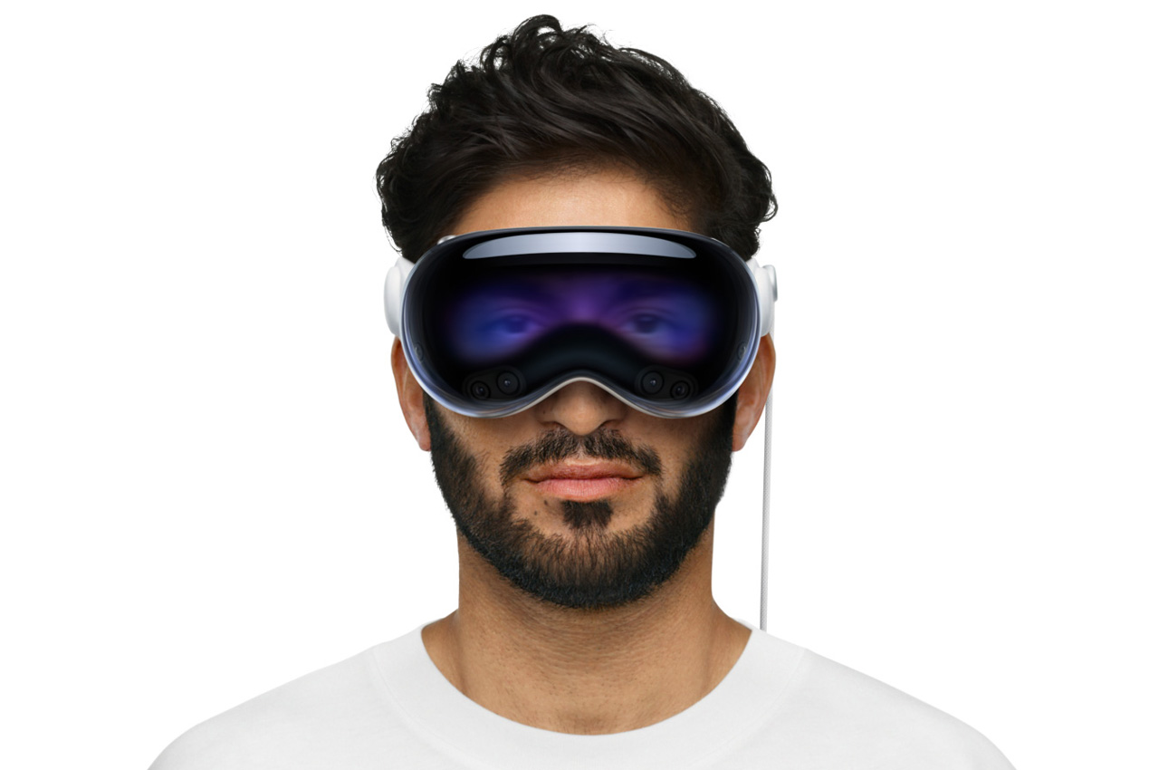
Apple is allegedly working on an Affordable, Consumer-grade Spatial Headset

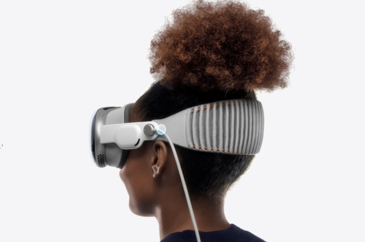
Apple showed us what a mixed reality headset could be capable of with the debut of the Vision Pro at WWDC in 2023. It had all the bells and whistles required of an AR and VR headset from Apple, but didn’t find many takers. Perhaps because of its steep price tag or maybe, no one was ready for a headset positioning them into the spatial computing just yet.

For me, per se – it was the price, bulkiness, and small market size for a standalone device in the smart glasses category. Apple soon realized it after significant losses in projected sales. This is why rumors of Apple mulling the rollout of a more affordable non-Pro mixed reality headset model started doing the rounds.

Designer: Apple

Such a device would be made possible by trimming down the features and functionalities of the Vision Pro, but the Cupertino company has thought otherwise (at least for now). New reports by way of Bloomberg’s Mark Gurman, Apple is instead planning a pair of smart glasses that would be targeted at the masses – like the Meta’s Ray Bans – and fit better in the Apple ecosystem than the Vision Pro or its stripped-down brother.

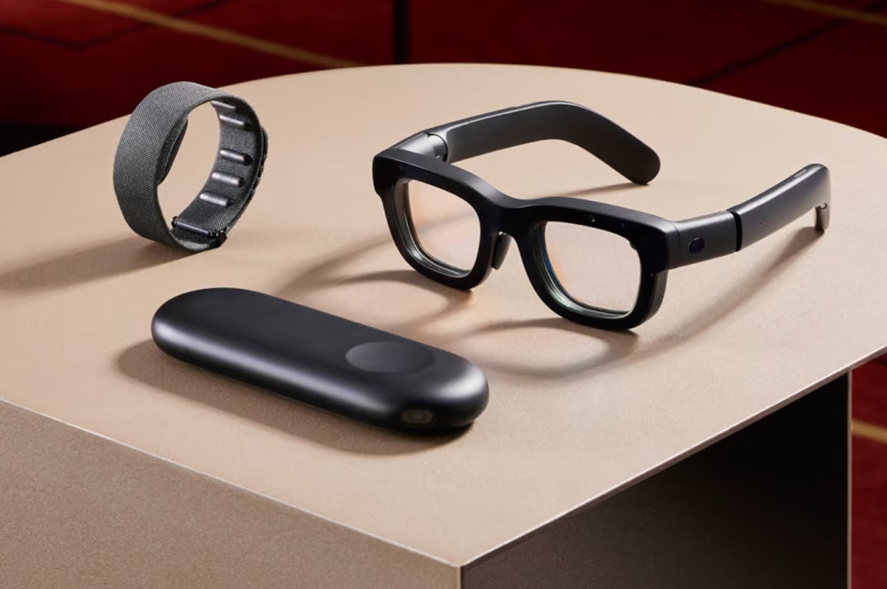
The latest information suggests that the budget-friendly Vision model could have been postponed until after 2027, while the new internal study, codenamed project “Atlas” is running within Apple to understand from the company’s employees where they stand on the topic of smart glasses. Based on the internal understanding, Apple is thinking about smart glasses that would somewhat target the consumer segment that Meta’s Orion augmented reality glasses intend to.

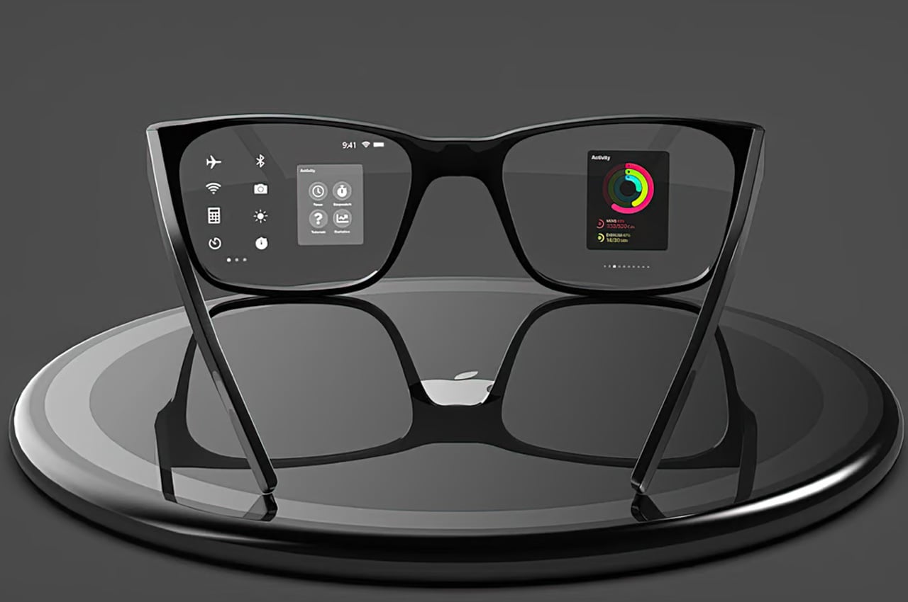
The Orion glasses for now are a prototype themselves. It wouldn’t be the best choice to compare or base the two non-existent devices on the same footing. But the basic idea is that Apple could have a pair of smart glasses that look like regular glasses and are a combination of slick design and useful features that would allow a connected iPhone to do most of the computing.

At the time of writing, it is not known whether Apple has started building such a product. Still, we learn that feasibility studies are happening within the company to deliver eyewear that addresses the issues of convenience, weight, and battery life. Irrespective of what direction Apple intends to take with the idea of smart glasses, it’ll almost take a few years to reach the market. If you’re in a hurry, get your hands on the Meta options!

The post Apple is allegedly working on an Affordable, Consumer-grade Spatial Headset first appeared on Yanko Design.

Top 5 Innovative Smart Rings To Meet Your Modern Lifestyle Needs

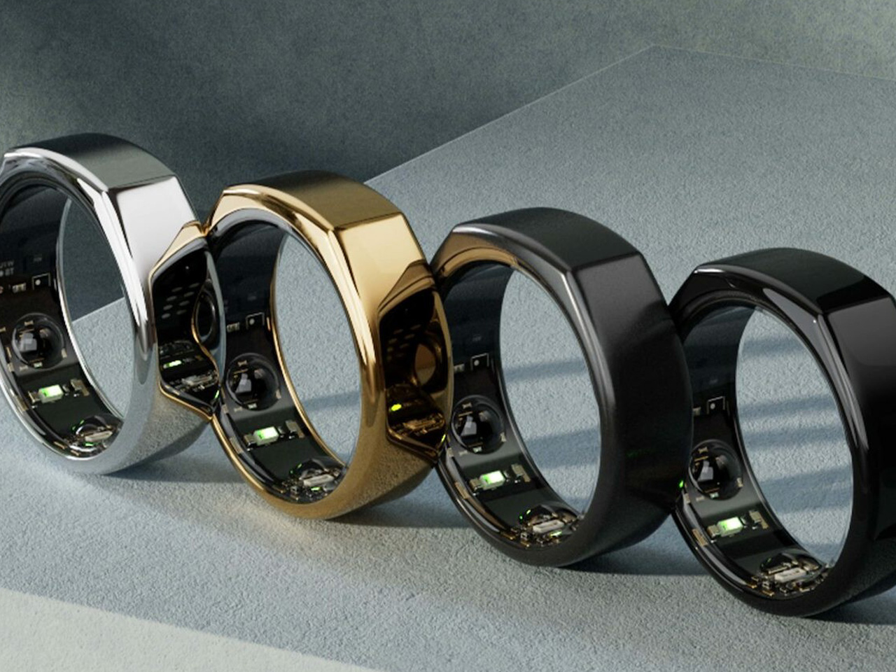
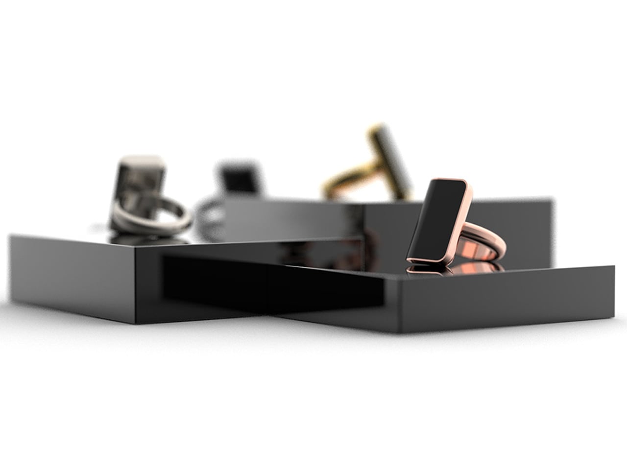
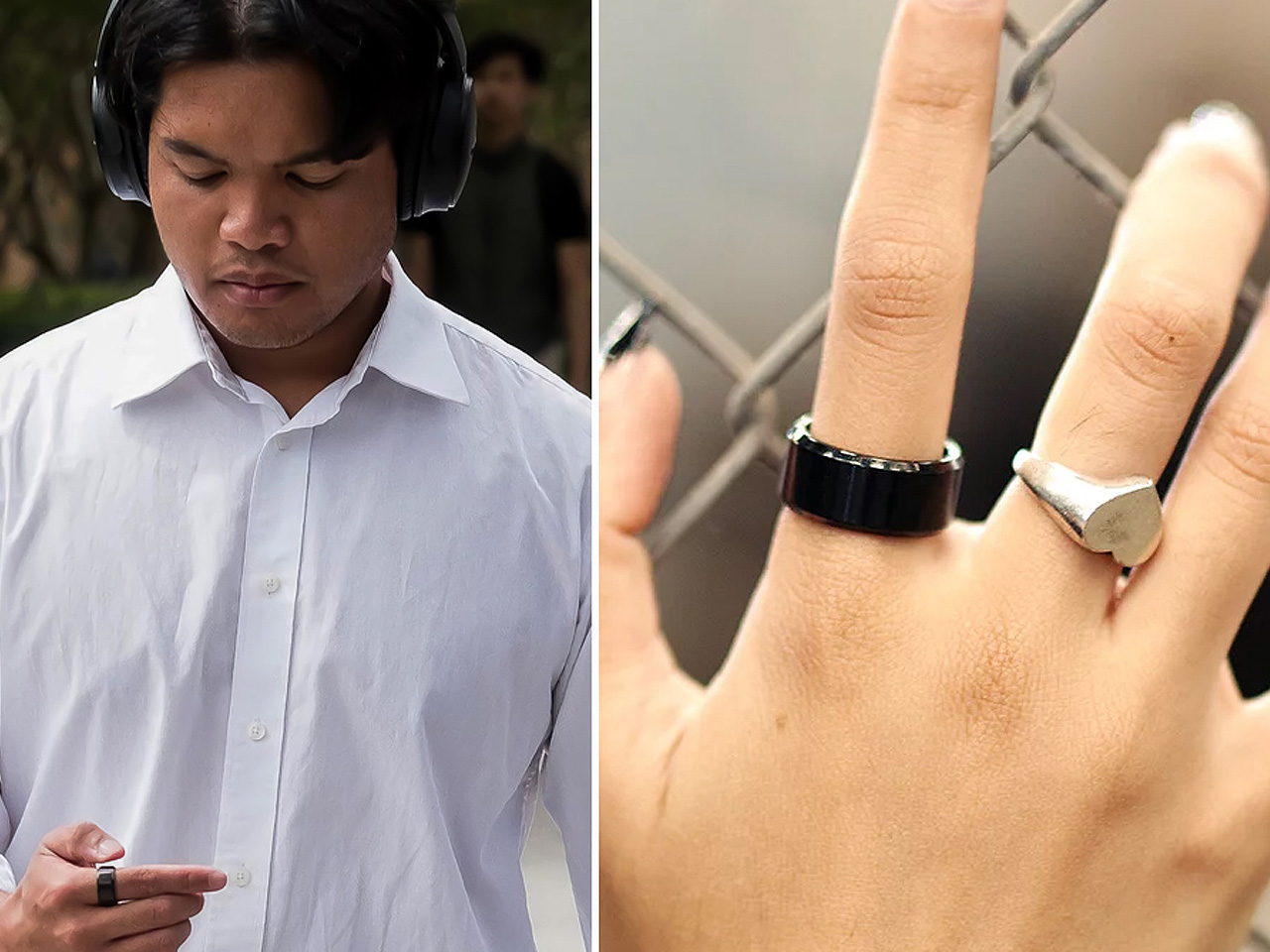
Wearable devices are getting more advanced, stylish, and sophisticated by the minute, and smart rings are no exception. These innovative and nifty wearables merge functionality, form, and fashion, serving as handy designs that elevate your daily life without hampering your taste and style. Smart Rings help with a whole bunch of activities ranging from health monitoring and fitness tracking to even interacting or controlling your music! We’ve curated the top five smart rings for you, highlighting their excellent functionalities and their ability to meet your needs. These must-have accessories are recommended for anyone who wants to upgrade their wearable tech.

1. Oura Ring Gen3

Meet the Oura Ring Gen3 – a Strava-integrated fitness ring. The smart wearable is designed to track your health accurately and precisely. It utilizes advanced sensors to measure heart rate, step count, calories burned, and blood oxygen level. Unlike typical wrist-worn trackers, it delivers precise readings since it can measure signals from your fingers, offering accurate and detailed data. It also lends a hand in tracking your body temperature, detecting stress and any illness, and educating you on how stress can impact your body.

2. Aina

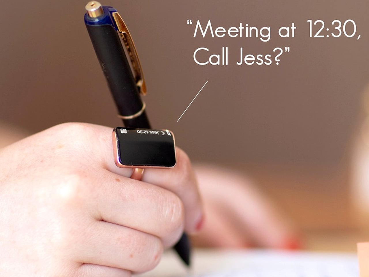
Meet Aina – a smart wearable ring that sits comfortably on your finger, and does everything your smartphone can. It can book cabs, unlock doors, make payments, track your fitness and health, and let you talk on your phone, without having to use it. You simply need to hold your finger to your ear, and the ring will project the sound directly into your ear. The smart ring feels right out of a James Bond movie! It is designed to mirror or replicate the smartphone experience, while sitting soundly on your finger.

3. Circular Wellness Ring

The Circular wellness ring provides the standard lineup of activity tracking and health monitoring, but it also gives you a little more. It is integrated with a smart alarm, which wakes you up easily and effectively at the best time, based on your sleep cycle. The ring can also analyze your bio-signals to keep an eye on your sleep quality, providing you with tips and recommendations on how to improve it. You don’t need to take off the ring at night, which ensures that tracking continues uninterrupted, and your data is consistently stored and analyzed.

4. Melo Ring

Dubbed the Melo Ring, this little ring sits on your finger and lets you interact with music using touch or swipe gestures through the sensors placed all over the ring. You can share songs with other Melo Ring users with a simple flick of a finger. You can use the ring to add songs to a playlist, read out song names, or change the playlist when you feel like it. It serves as a wearable accessory that you can wear every day, offering you easier control over your music.

5. Dhyana Smart Meditation Ring

Called the Dhyana Smart Meditation Ring, this wearable strengthens your mind and helps you improve your sleep cycle and everyday focus. It provides real-time feedback so you can meditate easily and make the most out of your experience. It utilizes heart rate variability, making it the ideal ring for beginners looking to focus better while meditating. It uses visual cues and immediate feedback to help you track and rate your calmness. It also provides access to millions of wellness tracks, or you can pick songs from Spotify, YouTube, and more.

The post Top 5 Innovative Smart Rings To Meet Your Modern Lifestyle Needs first appeared on Yanko Design.

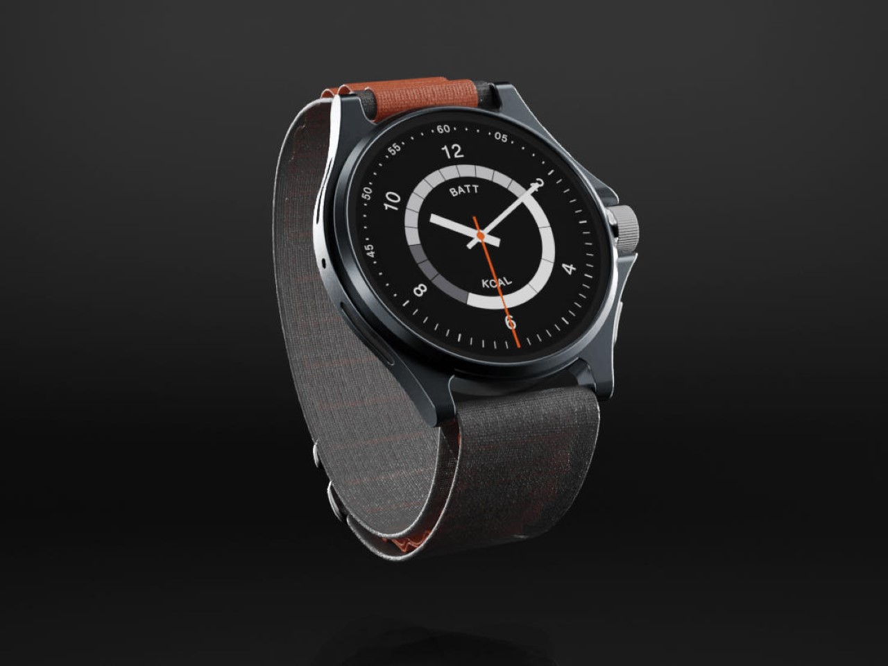
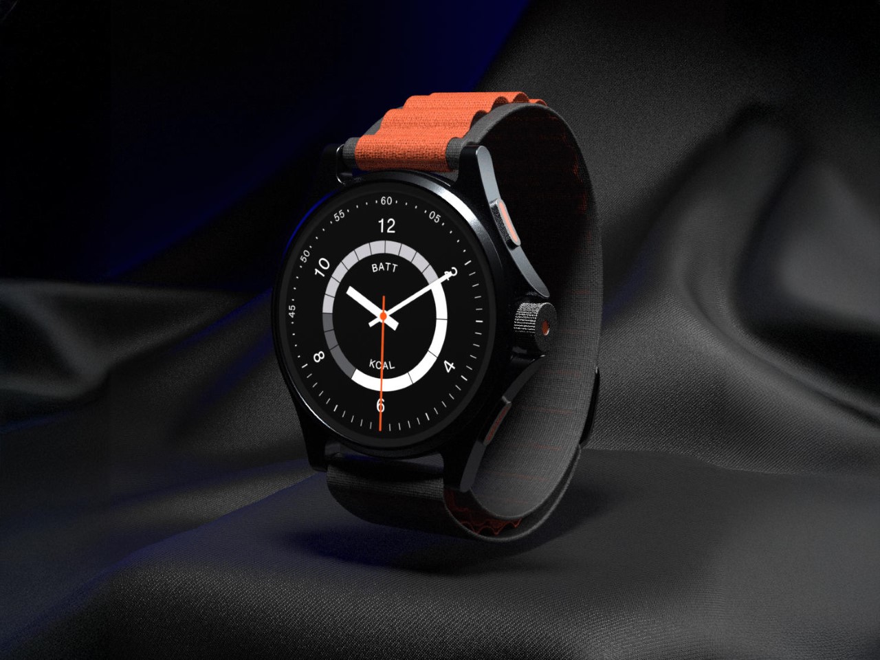
The Nothing Watch (Ultra) may not have a Glyph Interface, but it makes up with a minimal Glyph OS

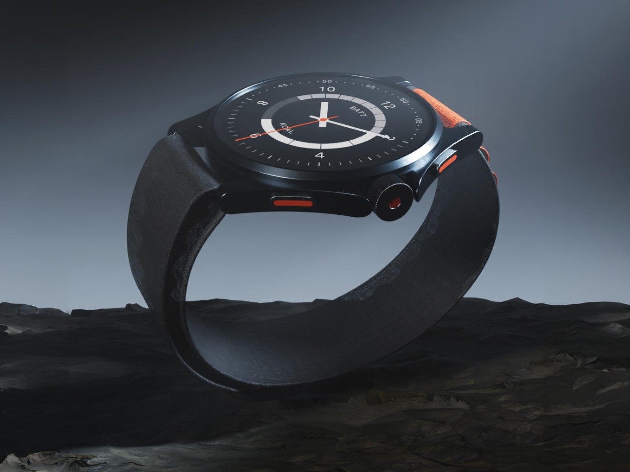
While Nothing doesn’t have a smartwatch in its portfolio, it certainly could add one – considering CMF’s Watch Pro already set the perfect foundation. Meet the Nothing Watch (Ultra) concept – a watch that brings the company’s minimalism-meets-fun approach to the world of smartwatches.

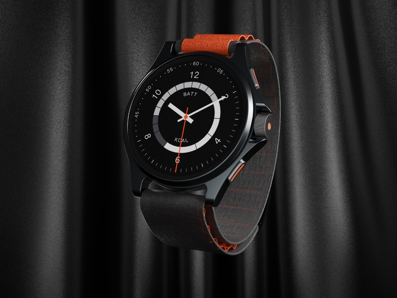
Designed by Abdelrahman Shaapan, the Watch (Ultra) takes the smartwatch to its logical next level, with a design that bridges digital experiences with a fairly analog-inspired design. The watch face is a mirror of the phone’s analog Glyph Interface, while the watch itself comes not with one button but three (including the crown of course).

Designer: Abdelrahman Shaapan

The Nothing Watch (Ultra) blurs the lines between Nothing and CMF, with a design that combines black and orange. Sure, with a watch this minimal, you really can’t do much with transparency, which is why the Watch (Ultra) ditches transparency entirely. It comes with a solid metal frame, supported by an Alpine Loop-inspired band that secures the watch around your wrist.

The Glyph goes missing too, but it manifests itself in the form of a Glyph OS – using white bars an strips to turn timekeeping into a Nothing-powered meaningful experience. The digital display has a minimal clock face, and a Glyph ring around the center that tells you both your battery level as well as the kilocalories burnt during the day. Sort of like activity rings on the Apple Watch, but interpreted differently.

The Watch (Ultra) concept leaves a lot to be desired – especially in the form of context and detail. The designer added a fair bit of detail in the form of a watch body with pushers and a crown on one side, and side-firing speakers on the other – but the OS still only shows just one screen. Maybe a little more detail in terms of a more comprehensive Glyph OS experience could really seal the deal – and although it might be too much to ask, I could DEFINITELY use one transparent variant!

The post The Nothing Watch (Ultra) may not have a Glyph Interface, but it makes up with a minimal Glyph OS first appeared on Yanko Design.

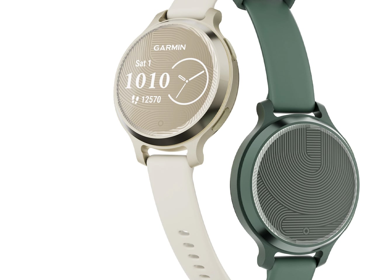
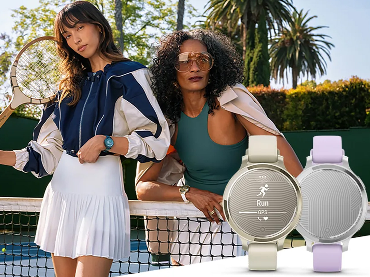
Garmin’s smallest GPS smartwatch ‘Lily 2 Active’ is designed for active women

It is not easy for new players to penetrate the otherwise competitive smartwatch arena. But Garmin is no outsider. Arguably, it is amid the top few in the industry. No wonder, the GPS-enabled consumer tech specialist is increasing its profile with the addition of a women-first watch that’s stylish, features built-in GPS, and comes with all the health and wellness features of a connected smartwatch.

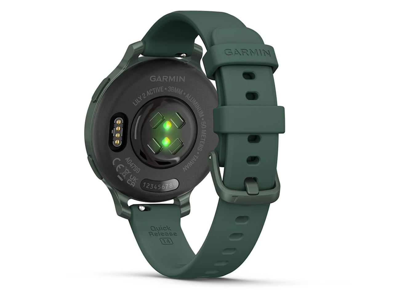
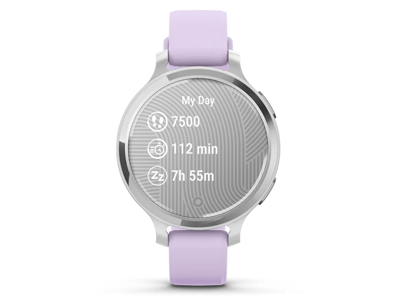
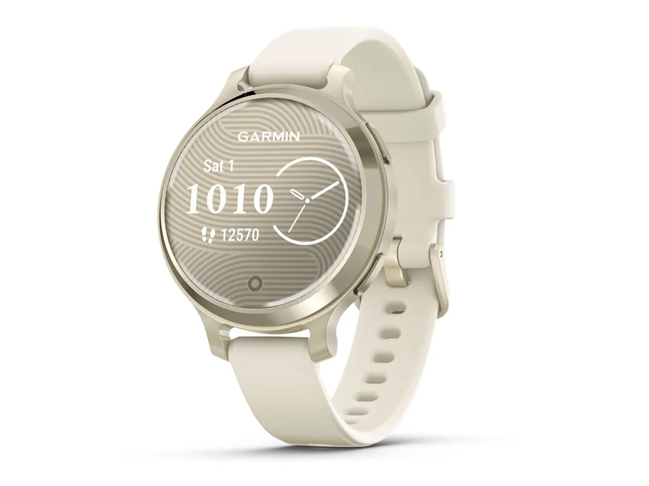
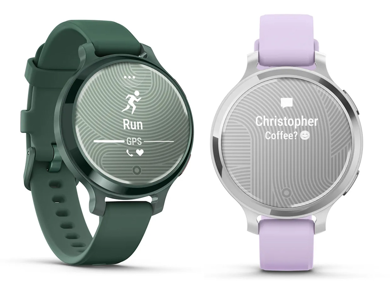
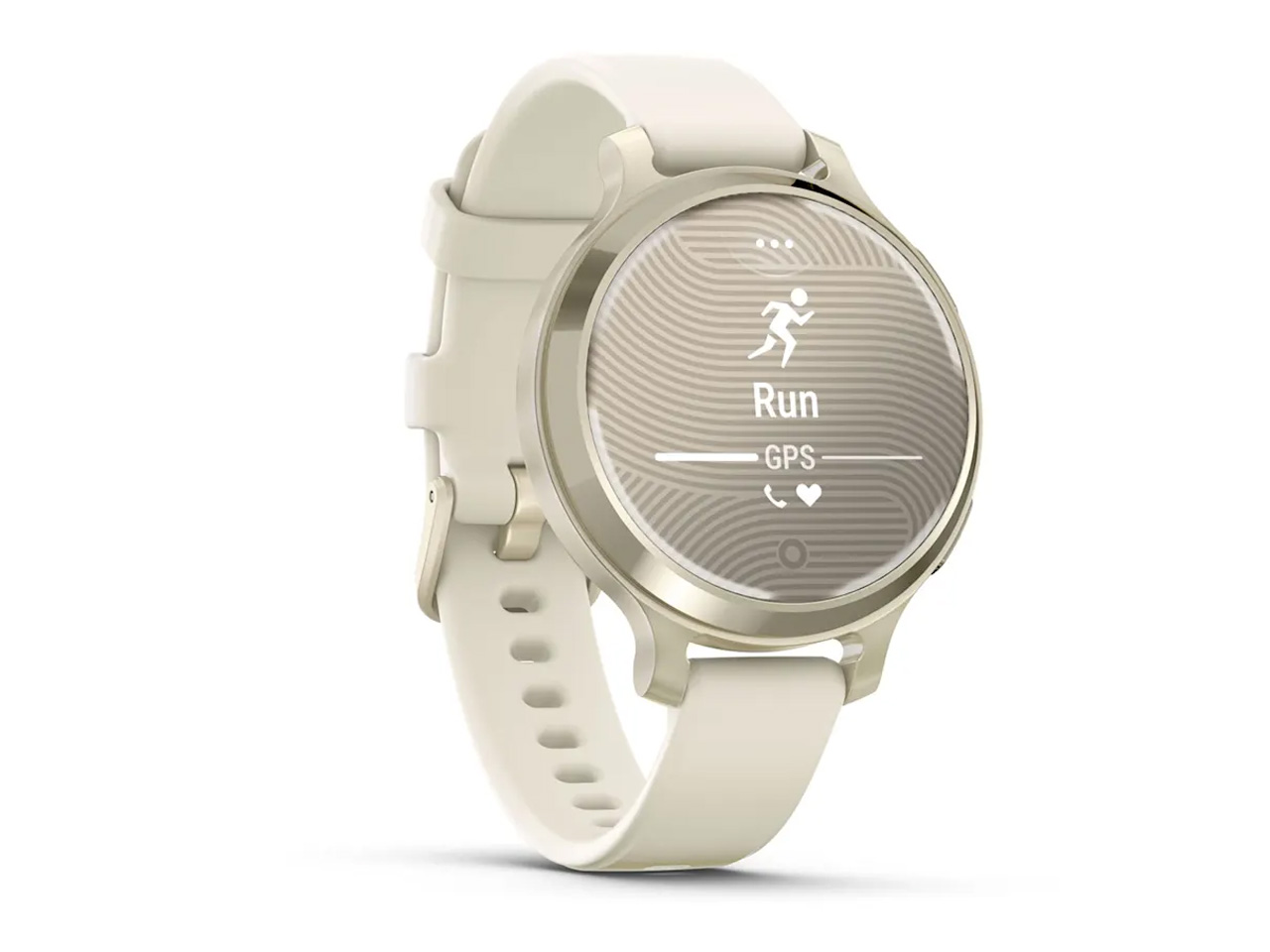
Called the Lily 2 Active, this is the smallest GPS-enabled smartwatch in the Garmin family. Perhaps for some that could mean the Lily 2 Active cuts corners, but it’s far from the fact. It’s a small, but fashionable feature-focused smartwatch that comes with nine days of battery life – if you are not using the GPS. With the GPS running all the time, the watch will trim the usage down to nine hours before requiring a recharge.

Designer: Garmin

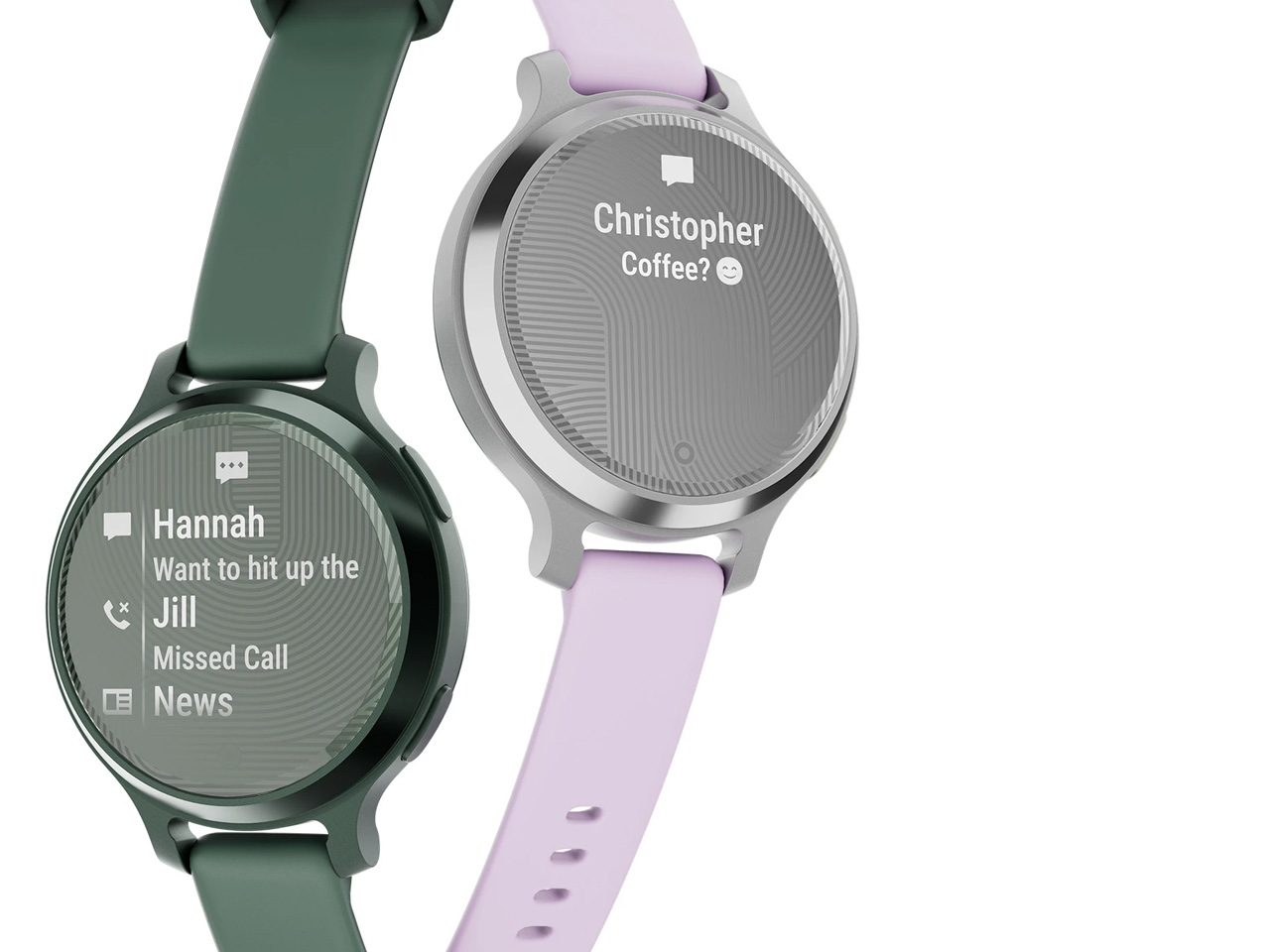
Of course, the Lily 2 Active has been created with a primary emphasis on women’s health tracking features. So, the watch can be used to keep track of the menstrual cycles, pregnancies, and also monitor the different sleep stages. Small but durable the watch has a metal casing and a hidden display that comes to life on a tap or with movement of the wrist.

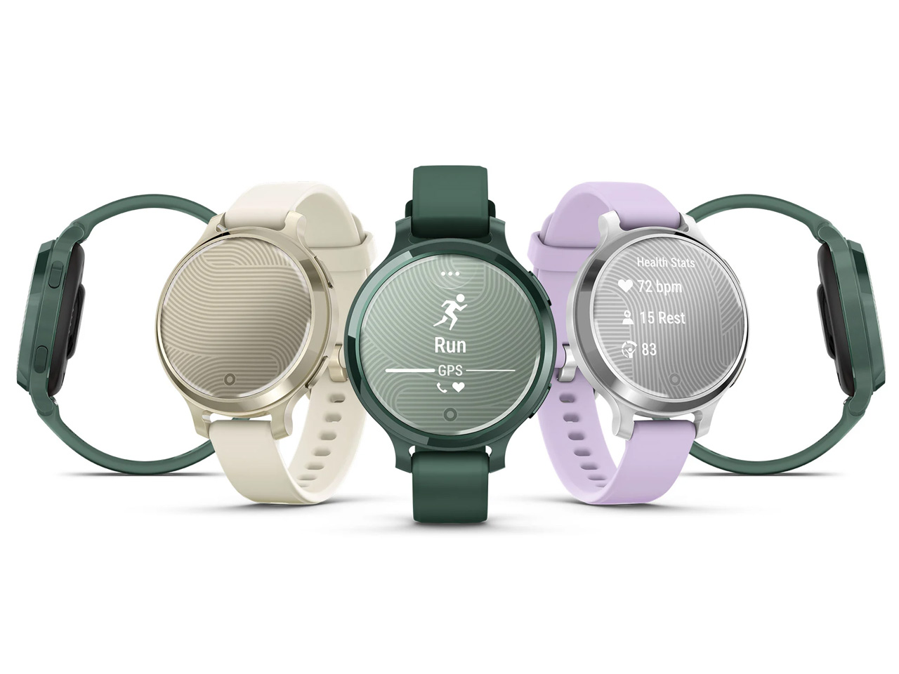
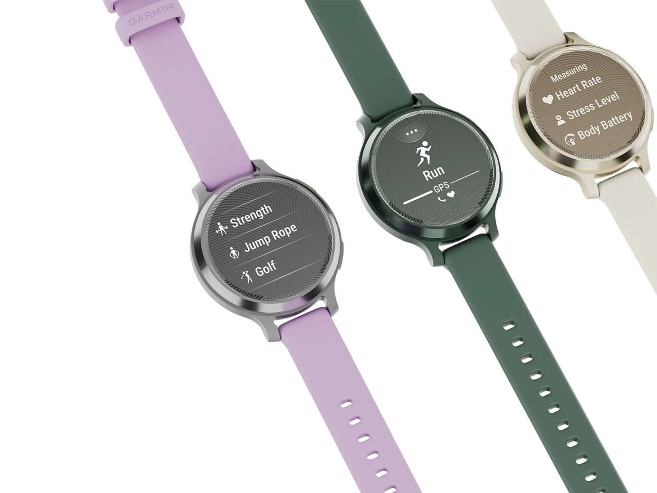
The watch is provided with two push buttons to select activities or toggle between screens. It comes preinstalled with workout features for cardio, yoga, tennis, dance fitness, strength training and more. Interestingly, the user can download the high-intensity interval training (HIIT) and yoga sessions to view the workout on the Lily 2 Active’s screen. With the videos playing directly on the wrist, you can ensure to follow the workout correctly even when you are outdoors without access to a larger screen device.

Since it is designed with all the health monitoring and wellness features, the smartwatch allows the wearer to keep track of their different sleep stages along with the continuous monitoring of the heart rate, Pulse Ox2, stress, and respiration. It accumulates information about the user’s night sleep and grants insight into their sleep quality with other wellness details in the morning. Built-in GPS can keep track of your outdoor activities, including walks, runs and more.

Lily 2 Active is compatible with Garmin’s Connect smartphone app and lets you make contactless payments using Garmin Pay. The watch works error-free with iOS and Android and comes in three color variants: Lunar Gold with Bone silicon strap, Silver with a Purple Jasmine silicon strap, and Jasper Green with a Jasper Green silicone strap for $300 apiece.

The post Garmin’s smallest GPS smartwatch ‘Lily 2 Active’ is designed for active women first appeared on Yanko Design.

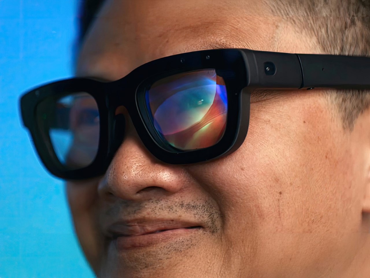
Meta’s futuristic Orion AR Glasses have Holographic Displays and Neural Control. Apple should take notes

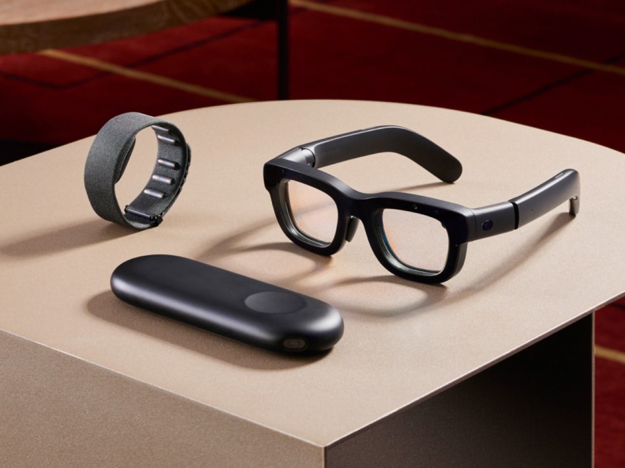
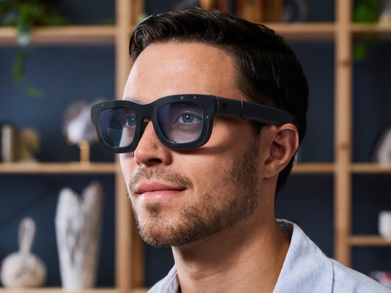
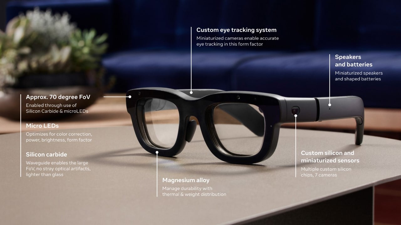
At the Meta Connect 2024 keynote, not only did Mark Zuckerberg debut actual Augmented Reality with holographic displays and neural control, it did so in a device that’s smaller, lighter, and one could argue, more socially acceptable (aka stylish) than Apple’s Vision Pro. Dubbed the Orion, it’s simply a developer prototype for now, but Meta hopes to refine the design, improve the displays, and actually sell it at an affordable price to consumers.

Designer: Meta

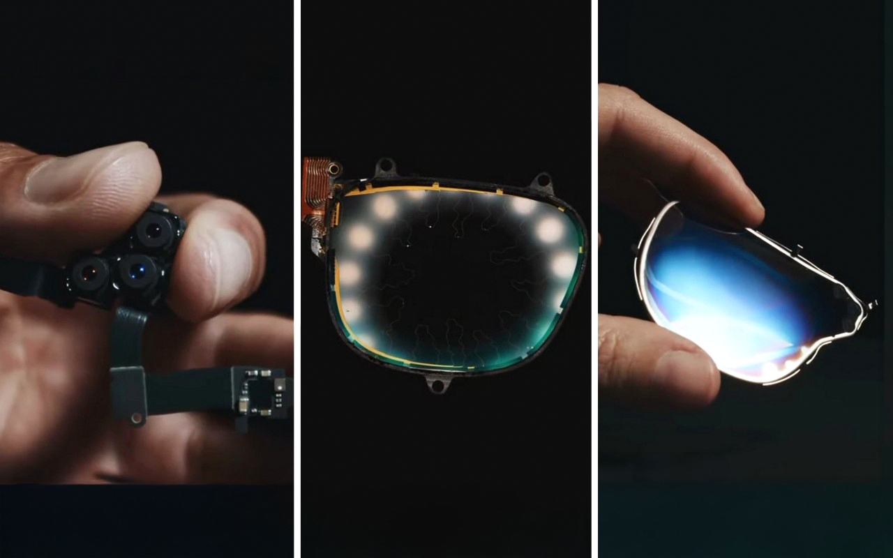
Orion is not a bulky headset—it’s a sleek, spectacle-like device that weighs under 100 grams, making it comfortable for extended use. This is an impressive feat considering the amount of technology packed into such a small form factor. While Meta Quest Pro and Apple’s Vision Pro are capable of mixed reality, Orion’s fully transparent, holographic display takes things to a different level. Instead of the passthrough experiences that blend digital elements on top of a live camera feed, Orion projects 3D objects directly into the real world using innovative waveguide technology. The frames are made from magnesium, a super-light metal known for its strength and ability to dissipate heat (something even NASA’s relied on for its space hardware).

The core of this magic is a set of tiny projectors embedded within the arms of the glasses. These projectors beam light into lenses that have nanoscale 3D structures, creating stunningly sharp holographic displays. Zuckerberg emphasized that you could go about your day—whether you’re working in a coffee shop or flying on a plane—while interacting with immersive AR elements like a cinema-sized virtual screen or multiple work monitors.

But it’s not just about visuals. The glasses also facilitate natural social interaction: you can maintain eye contact with others through the transparent lenses, and digital elements seamlessly overlay onto the real world. Need to send a message? Instead of fumbling for your phone, a hologram will appear before your eyes, letting you reply with a quick, subtle gesture. This fluid integration of the digital and physical worlds could set Orion apart from its competitors.

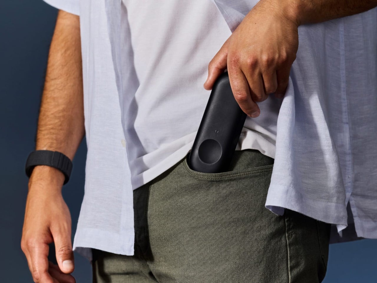
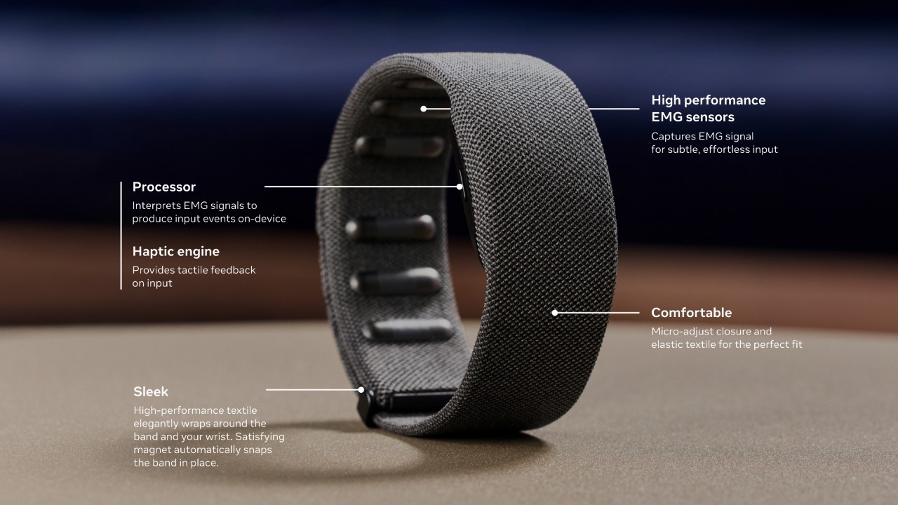
When it comes to control, the Orion glasses offer several interaction modes—voice, hand, and eye tracking—but the star of the show is the neural wristband. In contrast to the Vision Pro, which relies on hand gestures, eye-tracking, and voice commands, Orion takes the next step by reading neural signals from your wrist to control the device. This neural interface allows for discreet control. Imagine being in a meeting or walking down the street—gesturing in mid-air or speaking aloud commands isn’t always convenient. The wristband can pick up subtle electrical signals from your brain and translate them into actions, like tapping your fingers to summon a holographic card game or message a friend. This introduces a new level of human-computer interaction, far more intimate and nuanced than what’s currently available on the market.

While Apple’s Vision Pro and Meta’s previous Quest Pro have been praised for their intuitive interaction systems, Orion’s neural control represents a massive leap forward. It reduces the friction of interacting with digital elements by cutting down on the physical and vocal gestures required, creating a more seamless experience.

One of the key differentiators for Orion is its display technology. Unlike the Vision Pro or Meta Quest Pro, which rely on cameras to pass a live feed of the outside world onto a screen, Orion offers true augmented reality. The glasses project digital holograms directly into your field of view, blending with your surroundings. This isn’t just a camera feed of your environment with digital elements superimposed—it’s real-world AR with transparent lenses that you can see through as you would normal glasses. The holograms are bright enough to stand out even in varied lighting conditions and sharp enough to allow users to perceive fine details in their digital overlays.

Zuckerberg illustrated this with examples: receiving a message as a floating hologram or “teleporting” a distant friend’s avatar into your living room. The display architecture is entirely new, made possible by custom silicon chips and sensors integrated into the glasses, offering a level of immersion that’s more subtle yet more profound than the pass-through systems we’ve seen so far. In a private demo, he even played a metaverse version of Pong with key industry experts like Nvidia CEO Jensen Huang, and investors like Gary Vaynerchuck and Daymond John of Shark Tank.

For all its innovation, Orion is still in the development phase. Zuckerberg was candid that Orion is not yet ready for consumers. Instead, it will serve as a development kit for Meta’s internal teams and a select group of external partners. This will help refine both the hardware and software, as well as grow the ecosystem of apps and experiences that will make Orion valuable when it eventually hits the consumer market. There’s also the matter of affordability—Zuckerberg mentioned the team is working to improve manufacturing processes to bring the cost down. As it stands, this isn’t a device you’ll see in stores next week, but it’s a crucial step in realizing Meta’s vision for the future of AR.

The potential for Orion is vast. Zuckerberg envisions it as the next major computing platform, capable of reshaping how we work, play, and interact with others. By leveraging the power of true augmented reality with a groundbreaking neural interface, Orion positions itself as more than just a wearable gadget—it’s an entirely new way of interfacing with the digital and physical worlds. For now, it’s an exciting glimpse into what the future might hold. The Orion glasses may not be in your hands today, but their arrival could redefine the entire AR landscape in the years to come.

The post Meta’s futuristic Orion AR Glasses have Holographic Displays and Neural Control. Apple should take notes first appeared on Yanko Design.
Titanium Milanese Loop Review: Precision Engineering Meets Luxury in Apple’s Ultimate Watch Band

PROS:


  • Durable: Made from aerospace-grade titanium, the Milanese Loop is corrosion-resistant and built to handle tough environments.

  • Lightweight: The band remains lightweight despite being metal, reducing discomfort during extended wear.

  • Comfortable: The flexible mesh contours to the wrist, offering breathability and reducing irritation.

  • Custom Fit: Micro-adjustability down to 1mm ensures a perfect, snug fit for different wrist sizes and activities.

  • Sustainable: Constructed from 95% recycled titanium, aligning with Apple’s focus on environmentally responsible materials.

CONS:


  • Price: At $200, it's pricier compared to other Apple Watch bands.

  • Hair Pulling: The mesh design may cause slight pulling for users with wrist hair.

  • Indention Marks: A tighter fit can leave skin indentations after prolonged wear.

RATINGS:

AESTHETICS
ERGONOMICS
PERFORMANCE
SUSTAINABILITY / REPAIRABILITY
VALUE FOR MONEY

EDITOR'S QUOTE:

The Titanium Milanese Loop brings next-level engineering, rivaling Rolex's precision, durability, and seamless blend of luxury and functionality.
award-icon

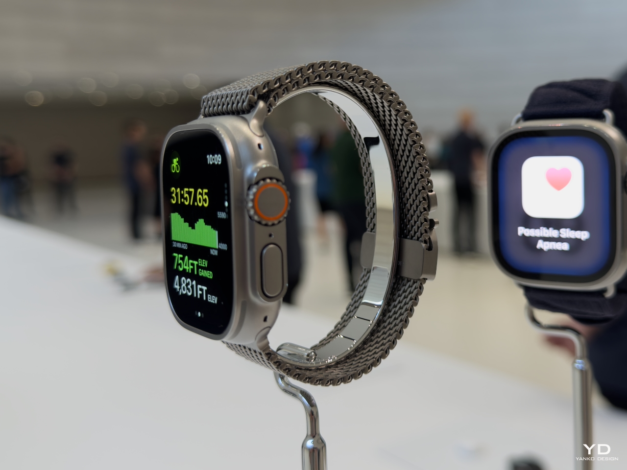
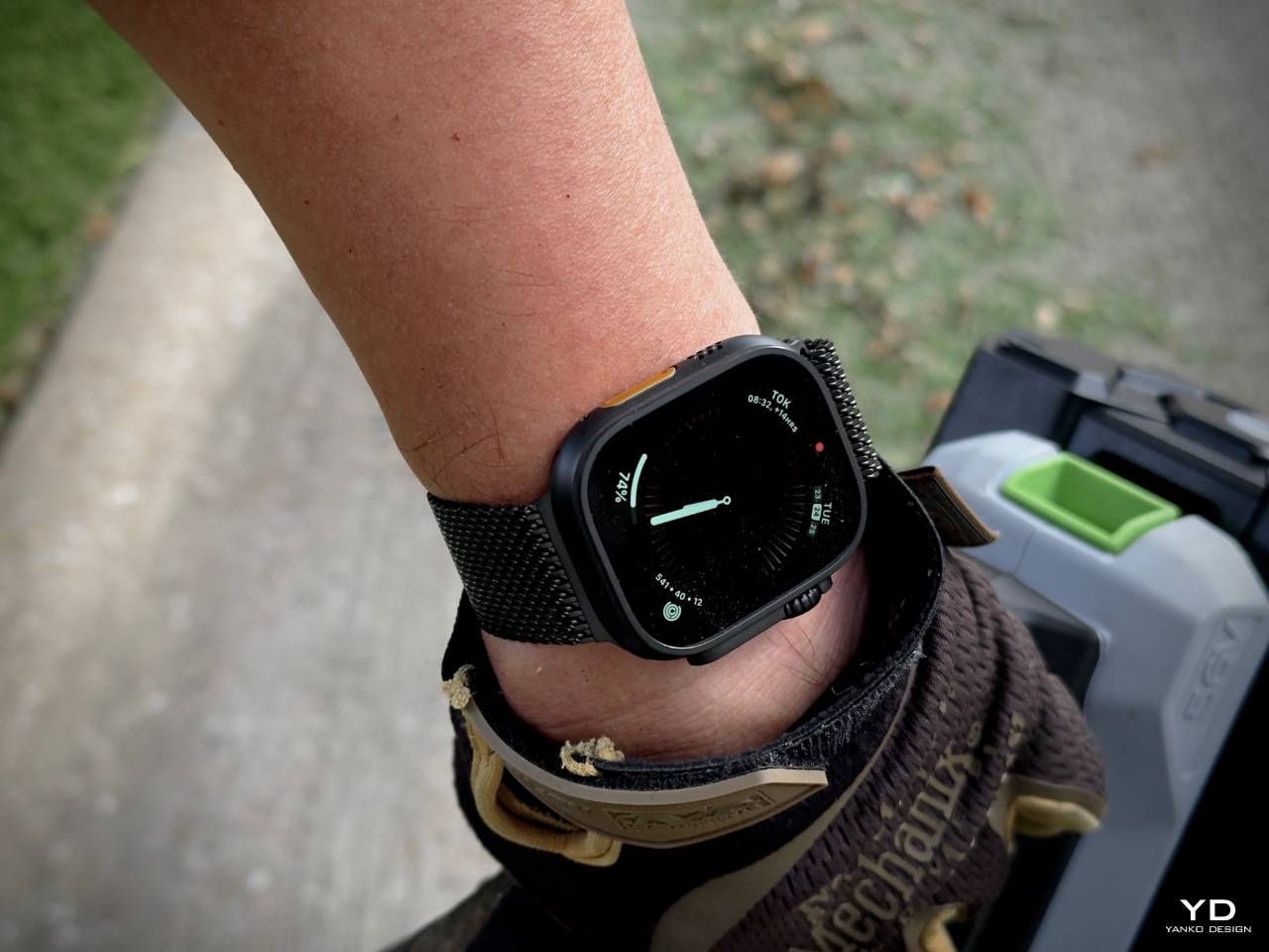
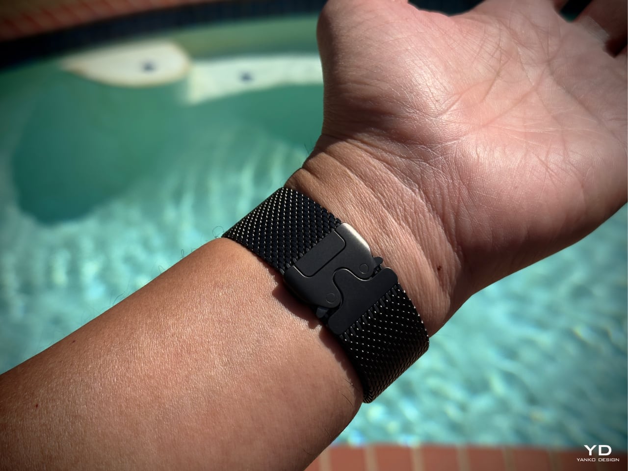
When I first saw the Milanese Loop for the Apple Watch Ultra 2 at the Apple Glowtime event, it immediately grabbed my attention as an impressive leap forward in band design. Inspired by stainless steel mesh historically used by divers, this new Titanium Milanese Loop is made from woven, corrosion-resistant titanium wire. It’s flattened and polished to a stunning satin texture that balances ruggedness and elegance. The parachute-style buckle features dual side-release buttons that close with an audible click, giving a sense of security whether exploring the ocean depths or heading out for a night on the town.

Designer: Apple

This band perfectly complements the Apple Watch Ultra 2’s rugged design, offering lightweight durability while looking refined. Whether heading into a meeting, swimming in the pool, hiking, or deep diving, I know the Titanium Milanese Loop can handle it without sacrificing style or functionality.

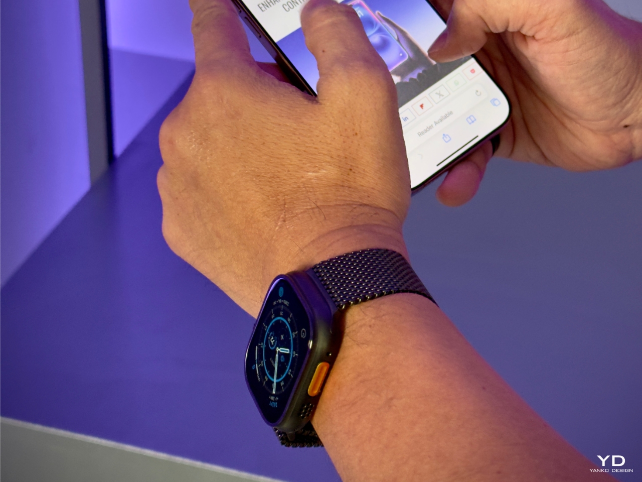
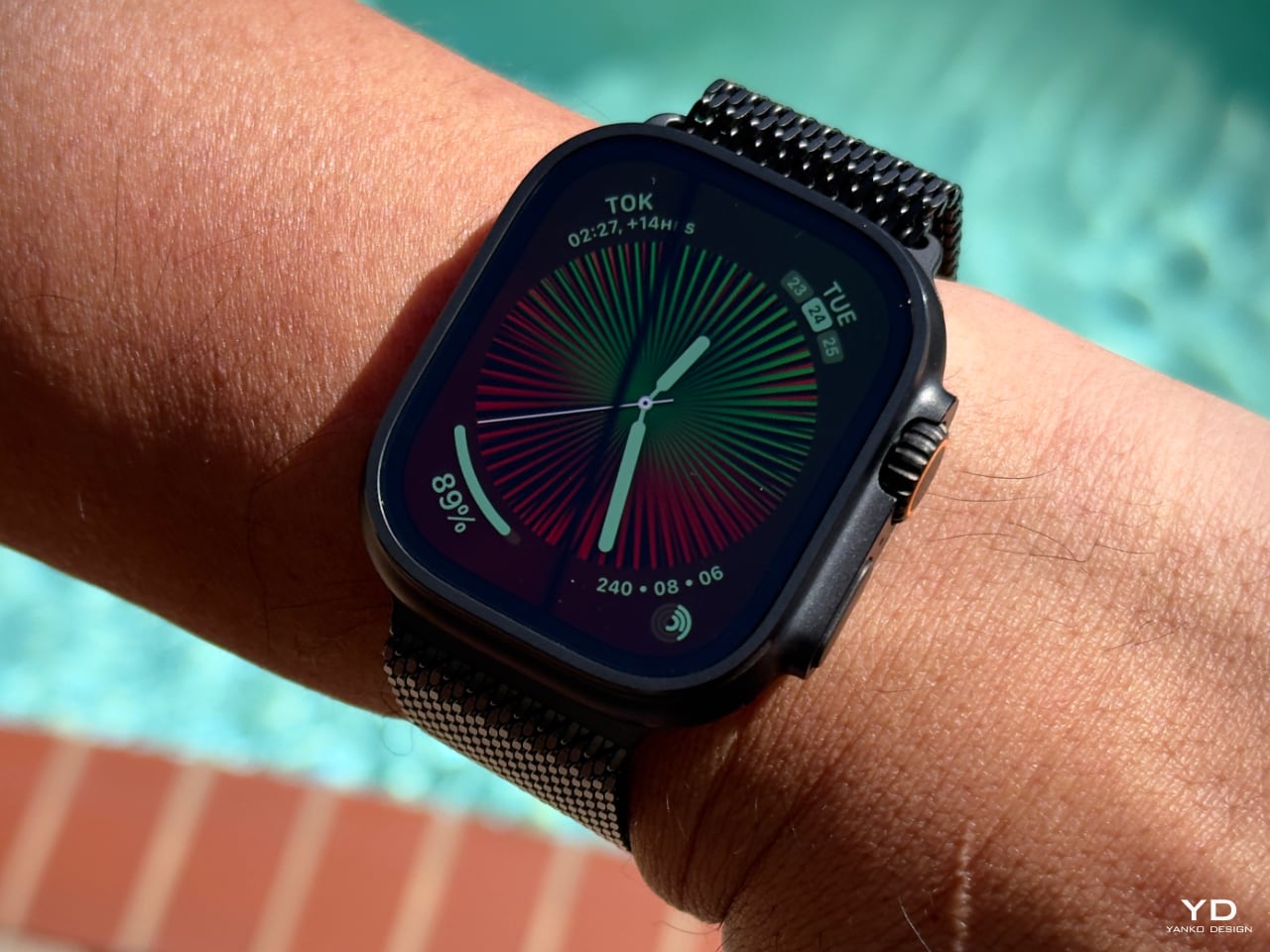
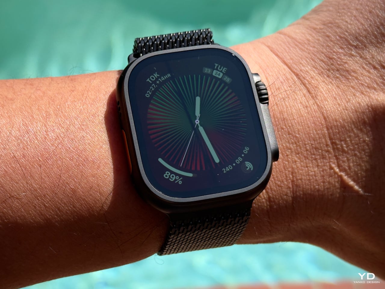
Now available in a striking new black titanium finish, the Apple Watch Ultra 2 proves why it’s the go-to choice for serious athletes and adventurers. Featuring the brightest display ever on an Apple device, the Ultra 2’s LTPO2 OLED Always-on Retina display delivers up to 3000 nits of brightness, making it highly visible even in the harshest sunlight. In comparison, the Apple Watch Series 10 offers a display brightness of up to 2000 nits and a wide-angle OLED that increases brightness by up to 40% when viewed at an angle. The Ultra 2 delivers battery life, lasting up to 36 hours during regular use and 72 hours in low power mode, compared to 18 hours of standard usage on the Series 10. Combined with the new Titanium Milanese Loop, the Apple Watch Ultra 2 represents a seamless marriage of aesthetics and performance, capable of handling the most demanding terrains while looking sophisticated enough for any occasion.

Design, Custom Fit, and Next-Level Engineering Marvel

The Milanese Loop design has a long history rooted in traditional chainmail used by divers, but Apple has reimagined it with a modern touch. The Titanium Milanese Loop, crafted specifically for the Ultra, caught my eye from the moment I saw it at the Apple Glowtime event. Made from aerospace-grade titanium, the band is lightweight and corrosion-resistant, offering strength and comfort—a perfect match for the Ultra 2’s rugged yet refined style.

What impressed me most was Apple’s commitment to craftsmanship, as the band is created through a meticulous process of weaving, flattening, laser-welding, grinding, and finely polishing the titanium wire to form a precise, interlinking mesh that balances both strength and flexibility. This design drapes comfortably on the wrist while maintaining durability. I immediately appreciated the dual-button, parachute-style buckle, which made adjusting my wrist’s natural fluctuations throughout the day incredibly easy. Whether due to temperature changes or the ebb and flow of daily activity, I could quickly loosen or tighten the fit without needing to remove the watch. This level of adjustment, down to 1mm, truly made the band feel custom-made for my wrist.

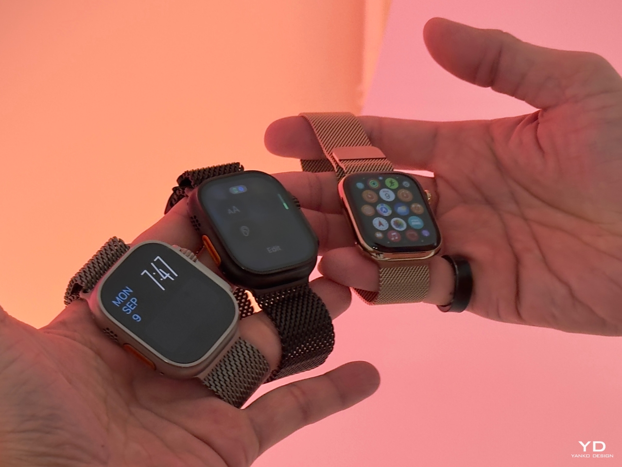
Apple’s decision to use titanium wasn’t only about strength and practicality for everyday use. The dual-release buckle offers peace of mind, providing a secure fit during various activities without any concern about it coming undone. Whether in natural or black titanium, the band perfectly complements the Ultra 2’s new black titanium finish. Achieved through a custom blasting process and enhanced with a diamond-like carbon (DLC) coating, this finish provides excellent scratch resistance, ensuring the watch and band look as good after months of wear as they did the first day I tried them.

The Titanium Milanese Loop combines aesthetics, ruggedness, and sustainability. Made from 95% recycled titanium, this band aligns with Apple’s focus on environmentally responsible materials. In my experience, it’s a stylish, practical, and durable accessory. This blend of qualities makes it a great long-term choice for anyone seeking a band that complements the Ultra 2’s versatility and style.

Fit and Comfort: Tailored for Performance

The Milanese Loop for the Apple Watch Ultra 2 is breathable and flexible, making it a great fit for all-day wear. Depending on your personal preferences, there are a couple of things to consider. While some users with wrist hair might experience slight pulling due to the mesh design, I haven’t had this issue myself.

As someone who prefers a snug fit, I tend to wear my watch a bit tighter to prevent it from moving around, a habit formed from years of wearing traditional mechanical watches. If you wear the Ultra 2 tightly, as I do, you’ll notice a slight indentation after a long day, but there’s no discomfort associated with it. It’s more about leaving a mark than feeling any pain. This tight fit keeps the watch in place, making it feel more secure during physical activities, whether hiking, diving, or running errands.

This band’s ability to adjust down to the millimeter makes it incredibly versatile for any wrist size. It’s great to know Apple offers an extra-long tail version for those needing additional length—whether to wear over a wetsuit or simply because of larger wrists.

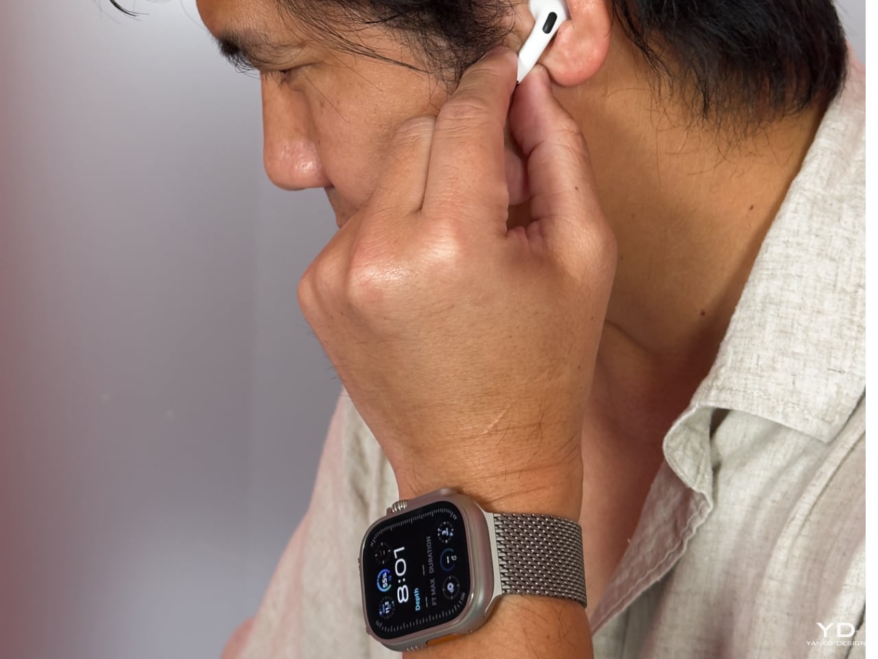
For me, the combination of the Titanium Milanese Loop and the Apple Watch Ultra 2 is all about striking the right balance between durability, comfort, and design. It’s the kind of band that seamlessly fits into my daily life, whether I’m out hiking, working in the yard, or tackling outdoor adventures. This band doesn’t just look good; it’s made to endure, and it pairs perfectly with the rugged nature of the Ultra 2. The thoughtful engineering and comfort of the Milanese Loop make it feel like it’s built to last, keeping up with the adventurous spirit that the Ultra 2 embodies.

Band Size and Fit

I went with the medium size for the Titanium Milanese Loop, which fits perfectly. The buckle centers squarely on the back of my wrist, which, for someone like me with a bit of OCD, brings a sense of balance that I appreciate. Wearing a watch every day is an intimate experience, and I pay close attention to how it sits—whether it’s a mechanical watch with a deployment buckle or a tang, every detail matters. The centered buckle feels right and adds to the comfort of wearing the Ultra 2 all day.

Apple Watch Ultra 2 on Titanium Milanese Loop

At the Apple event, I had the chance to try on the small size, but I could barely get the watch past my knuckle. Unless you have particularly thin wrists or plan on wearing this over a wetsuit, I’d recommend opting for the medium. It strikes the right balance for everyday wear, and it offers enough room for quick adjustments when needed.

Here are the official band size details:

  • Small: Fits wrists 130–160mm.
  • Medium: Fits wrists 155–185mm.
  • Large: Fits wrists 180–210mm.

With those ranges, the medium size should comfortably accommodate most wrist sizes. However, for anyone needing extra length—especially for wearing over bulkier gear like a wetsuit—the large size is the way to go. In my experience, getting the right fit goes a long way in maximizing the band’s comfort and aesthetics.

Value: A Long-Term Investment

Priced at $200 on its own or $100 more when bundled with the Apple Watch Ultra 2, the Titanium Milanese Loop might seem like a luxury option for an Apple Watch band. However, compared to titanium bracelets from brands like Rolex and Omega, which typically cost in the range of thousands of dollars, the value becomes clear. Apple has crafted a premium product that brings the high-end feel of titanium—usually reserved for much more expensive timepieces—into the world of wearable tech at a fraction of the price.

For someone like me who regularly upgrades their Apple Watch, the band’s value goes beyond the Ultra 2 itself. Apple’s consistent design language across its product line ensures this band will likely remain relevant with future watch models. Investing in this Titanium Milanese Loop means you’re getting a durable and stylish band that will serve you through multiple upgrades.

Another critical factor is the dual-lock system, which offers unbeatable security. Whether I’m out hiking, diving, or just going about my daily routine, I know the band is securely fastened, giving me peace of mind no matter what. Its durability, ease of use, and ability to adapt across future models make this band a smart investment for anyone who values functionality and design in their Apple Watch accessories.

Final Thoughts

The Titanium Milanese Loop for the Apple Watch Ultra 2 has quickly become one of my favorite bands. It offers that perfect mix of durability, premium design, and all-day comfort, whether in the field or just going through my daily routine. I’ve been wearing it for everything from outdoor activities to long workdays, and it never fails to deliver on comfort and style. I’ll continue to revisit this band in future articles as I spend more time with it. If you have any questions or thoughts about the band, feel free to drop me a note—I’d love to hear your feedback!

The post Titanium Milanese Loop Review: Precision Engineering Meets Luxury in Apple’s Ultimate Watch Band first appeared on Yanko Design.

Helmet helps mitigate hair loss for cancer patients undergoing chemotherapy

One of the most common side effects on patients undergoing chemotherapy is the loss of hair. It may seem like not a big deal anymore these days because people are more “accepting” of baldness, but there is still of course an effect on self-esteem and self-image of the patient. They say that hair loss is one of the most traumatic parts for them when it comes to their cancer treatment. A new product that will help them prevent this chemotherapy side effect will soon be available for commercial purchase.

Designer: Luminate

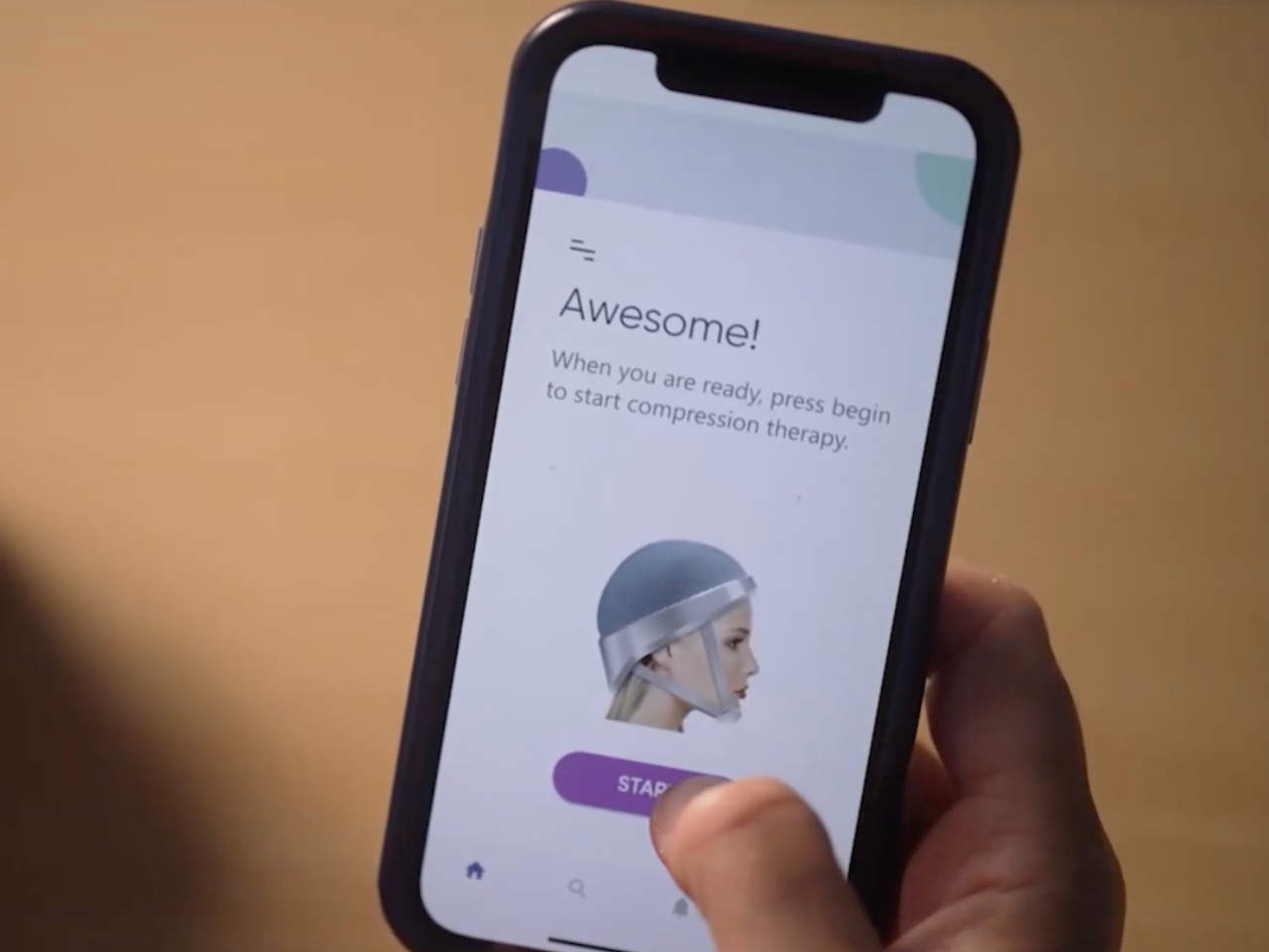
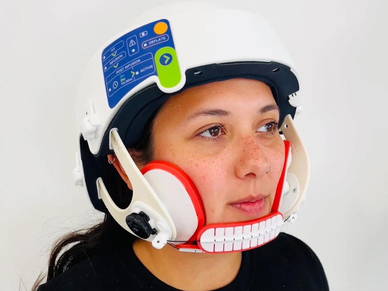
Lily is a helmet created by cancer treatment tech startup Luminate. The basic idea for the device is that when worn during chemotherapy sessions, the helmet applies pressure across the scalp that stops the chemicals from getting into the patient’s hair follicles. The helmet is also made from soft materials so it’s still comfortable when worn and will not add to the common discomfort patients experience when having their chemotherapy session. Just think of the helmet as a compression garment for the head.

The wearable device looks like your typical helmet but with additional paddings on the cheek and under the chin. The way it’s built and designed is to bock off the capillaries to prevent the toxic chemo cocktail from affecting the patient’s hair. In their initial trials, 75% of the participants retained their hair while undergoing chemotherapy while wearing the Lily helmet. There will be another trial this November involving 85 patients across the U.S.

Luminate is also developing a glove and boot set called Lilac that will help prevent neuropathy, another side effect of chemotherapy. The company’s goal is to make cancer treatments more comfortable for patients by creating products that will address the side effects.

The post Helmet helps mitigate hair loss for cancer patients undergoing chemotherapy first appeared on Yanko Design.
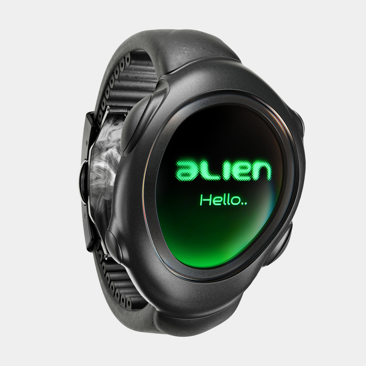
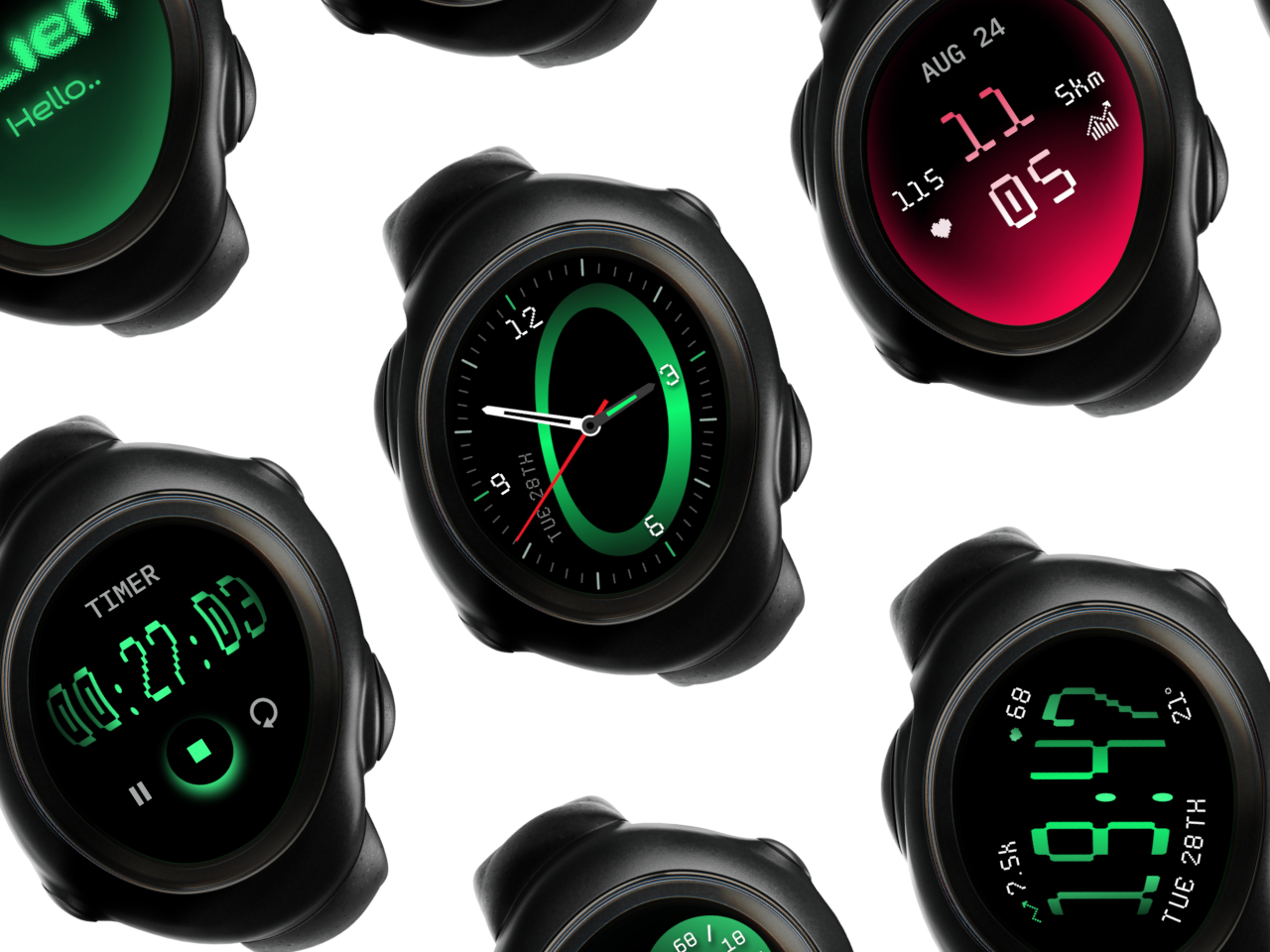
Alien-inspired smartwatch concept eschews conventional design for more organic aesthetics

Smartwatches today have evolved from miniature smartphones on our wrists to miniature health clinics on our wrists. The design of these wearable devices has finally settled down to a handful of designs, most of which try to mimic the appearance of classic timepieces. There is, however, still plenty of room for exploration, for designs that redefine the product category or challenge the status quo. This design concept, for example, tries to look farther ahead into the future, when conventions no longer hold water and where today’s unfamiliar, alien aesthetics would ironically look more natural and more human.

Designer: Olga Orel

Smartwatches had a hard time finding its niche in the market. They were too technological to match the majesty of mechanical watches, but also too underpowered to be the multi-purpose wrist-worn communicators of science fiction. In the end, smartwatches today adopted the core design convention of traditional wristwatches, be they the sporty kind or the luxurious timepieces. But does it really have to be that way? Do smartwatches need to look like, well, watches?

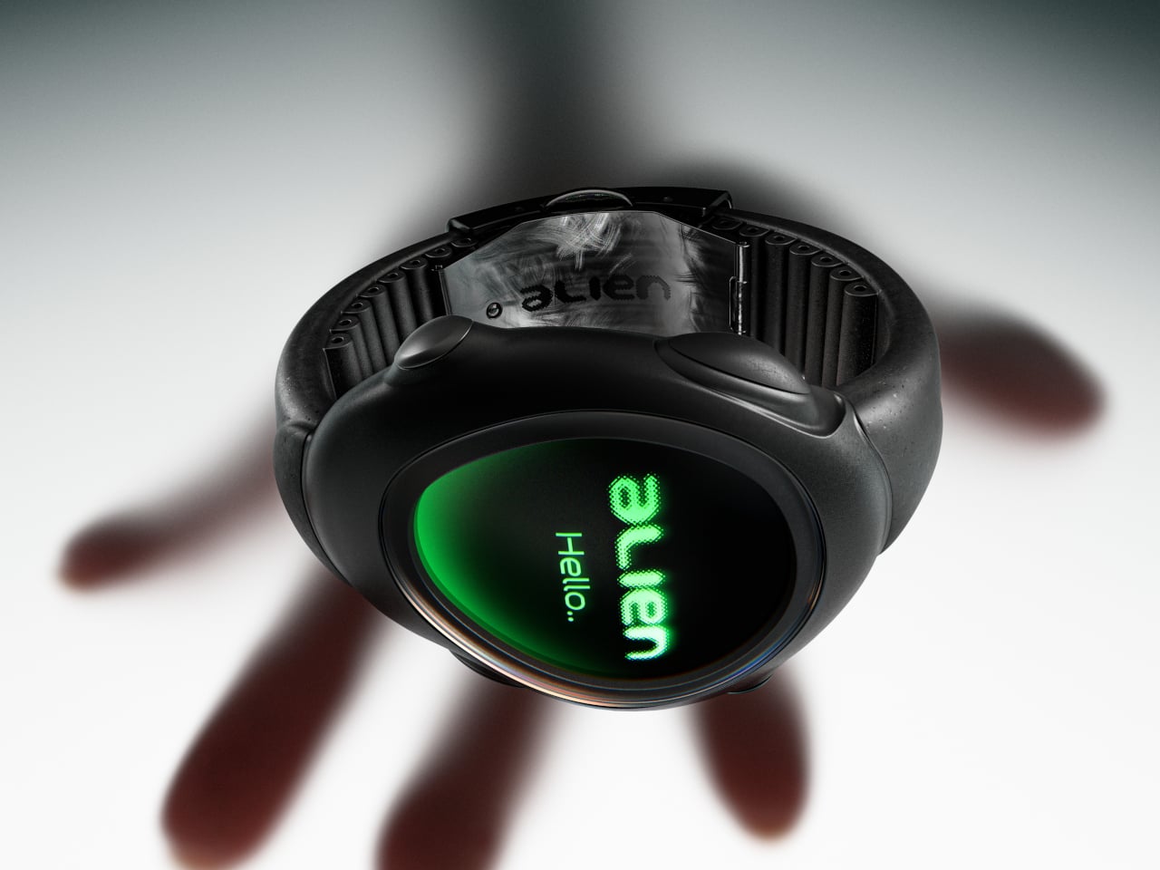
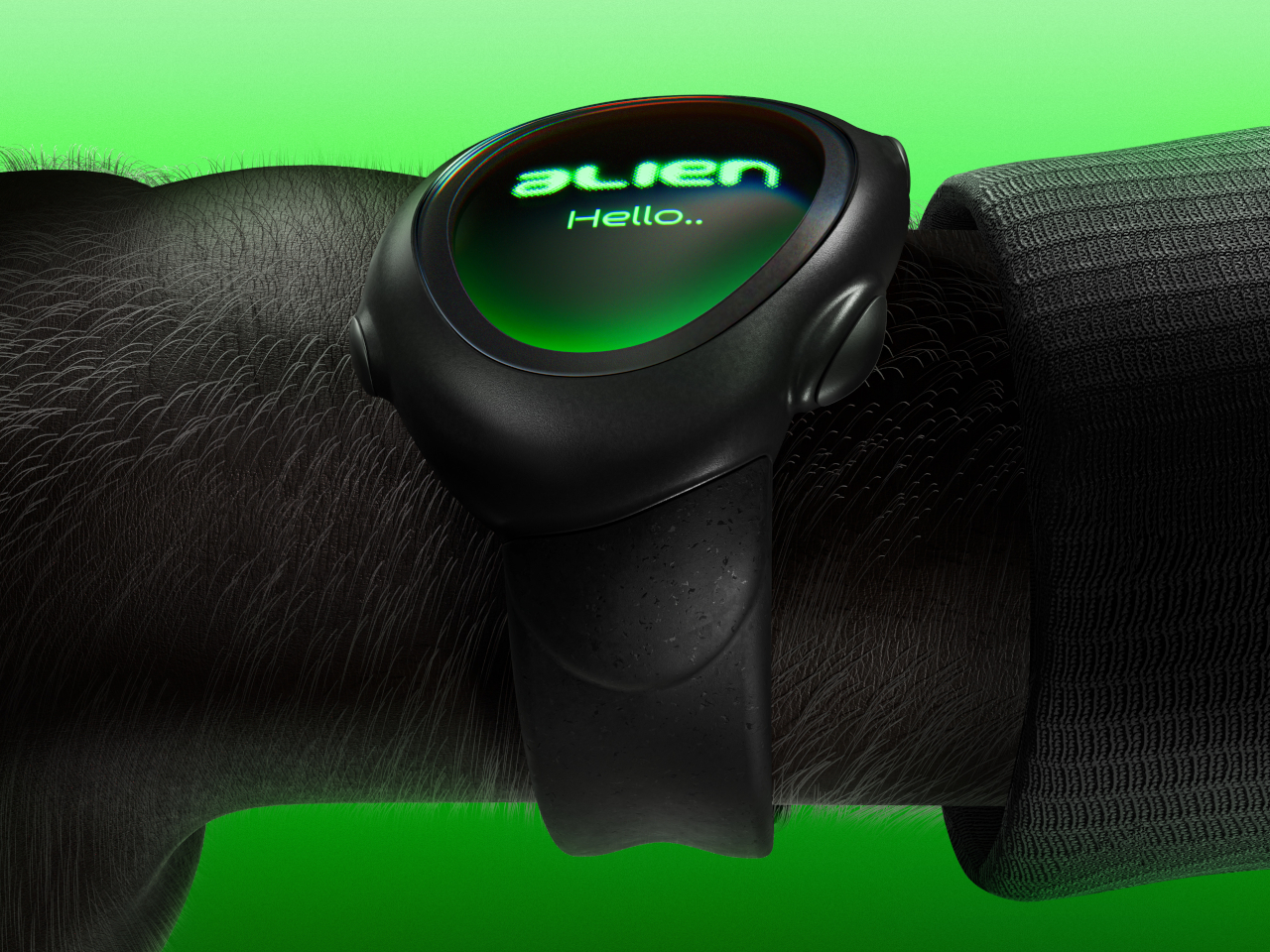
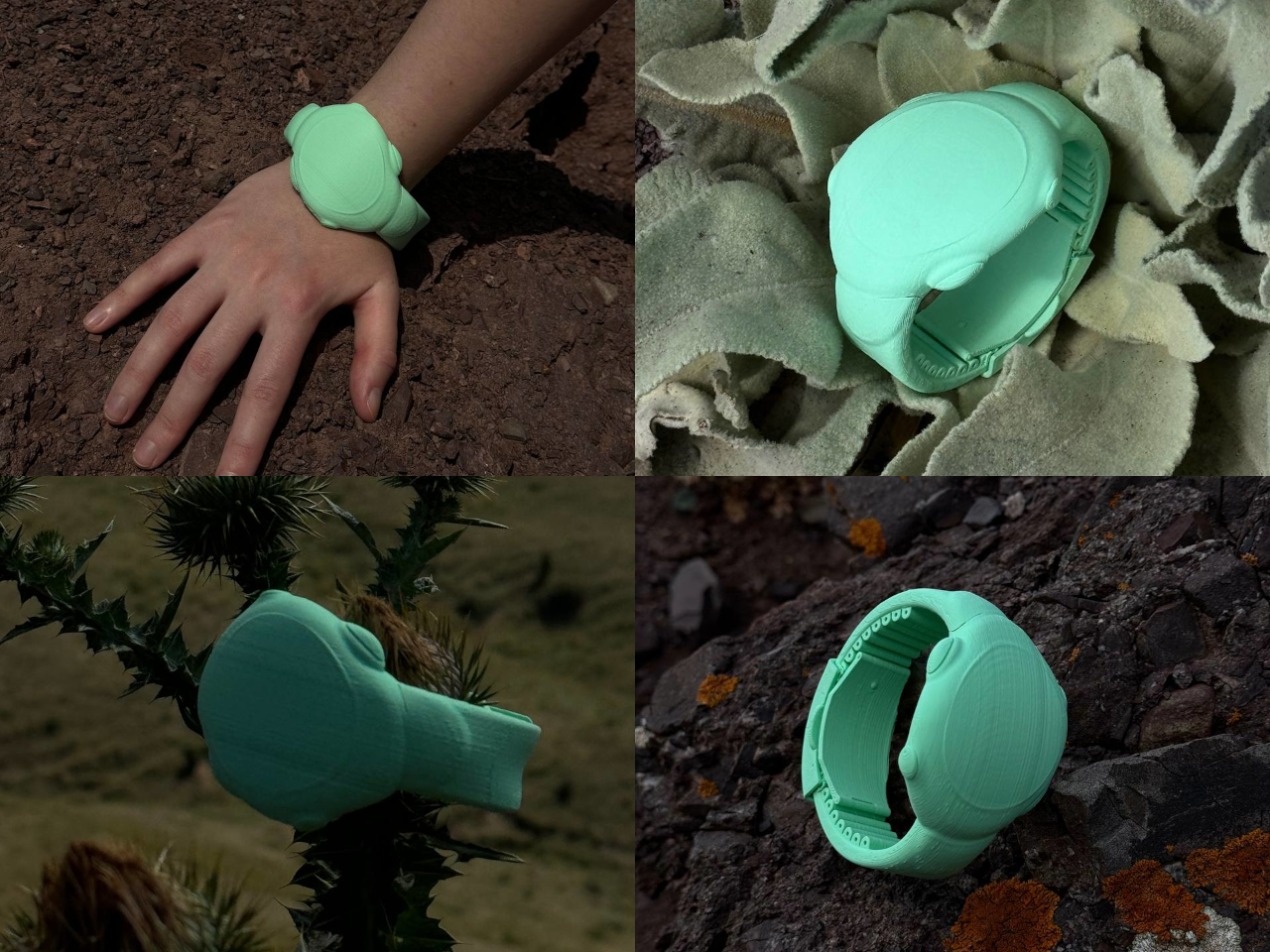
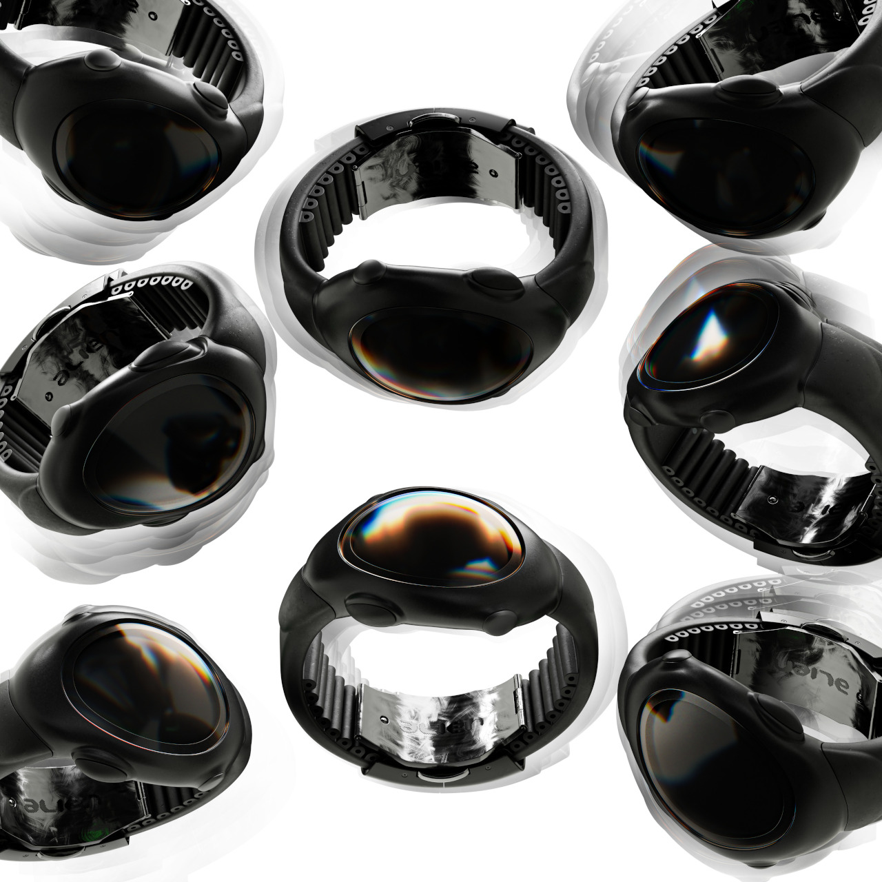
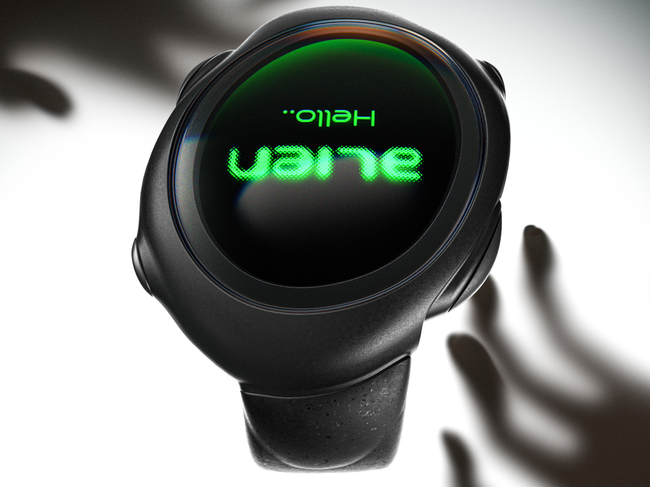
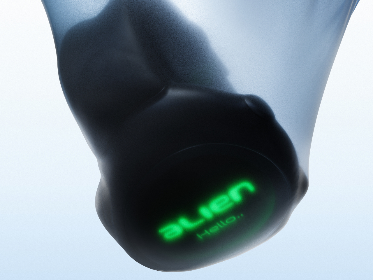
The ALIEN concept gives an empathic “no,” embracing a design language that is more organic and ironically closer to us than its extraterrestrial name would suggest. Its asymmetrical and amorphous design, not to mention the matching domed display, gives it that otherworldly character seemingly pulled out from some 90s sci-fi flick, with its eerie green glow and dark brushed metal surface. Of course, there’s nothing to stop a manufacturer from using other color motifs or materials, but it would still look alien compared to common smartwatches.

The irony is that, freed from the restrictions of circular and square watches, ALIEN can take on shapes that better conform to people’s wrists, offering a more natural, more ergonomic, and more pleasing curvature that is more human-centric. Even the buttons seem to organically grow out of the watch’s body rather than just jutting out like an artificial add-on. And unlike most smartwatches today, it isn’t content to have just one button but can have as many as four in each corner.

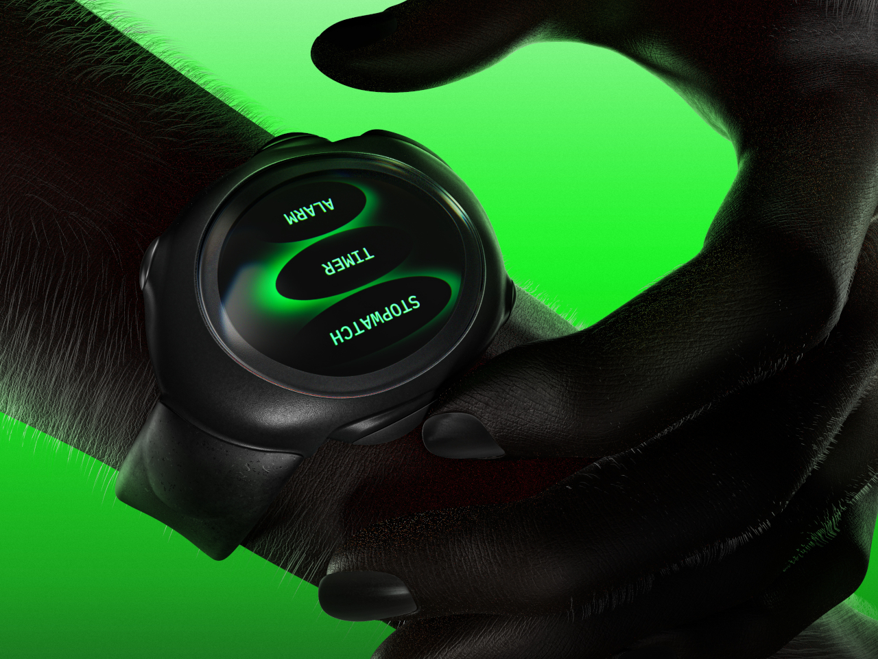
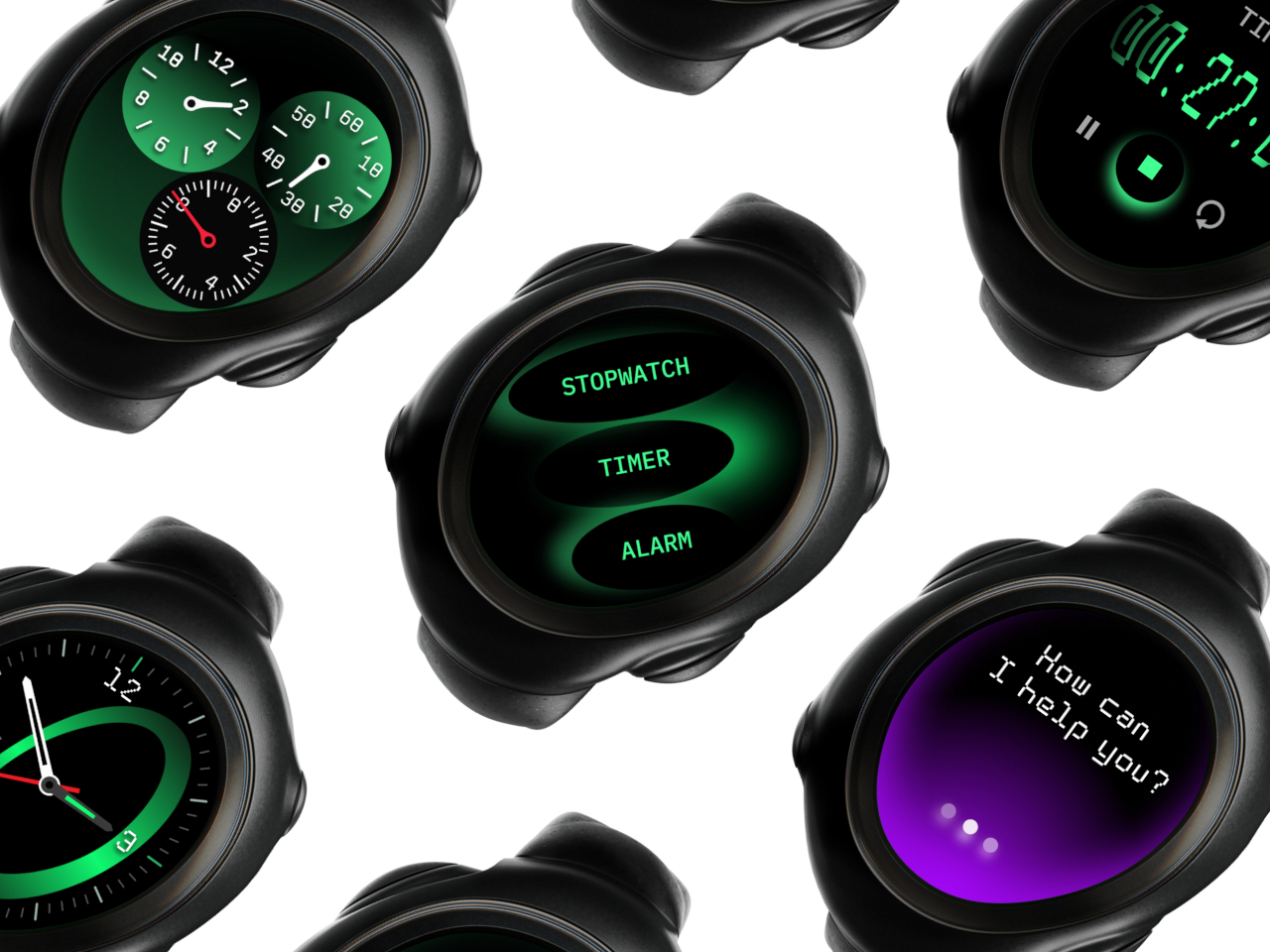
This unconventional design also changes the user experience, though not always in good ways. Because the shape of the screen is non-standard, there is more flexibility for different UI elements and arrangements, but it can also make things more confusing as well. Humans are creatures of habit, and smartwatches try to offer a uniform experience across different models or even platforms to make it easier for owners to switch from one watch to the next. That is, unfortunately, one of the disadvantages of this concept design, making the interaction and experience a little foreign and, well, alien.

The post Alien-inspired smartwatch concept eschews conventional design for more organic aesthetics first appeared on Yanko Design.
Breaking Barriers: How Apple’s AirPods 4 Bring Active Noise Cancelation to Open-Ear Earbuds

There are moments when technology integrates so seamlessly into our lives that it feels like an extension of ourselves. That’s the sensation I experienced with Apple’s new AirPods 4, featuring Active Noise Cancelation (ANC). Recently, I had the privilege of delving into the creation of these groundbreaking earbuds with two of the minds behind them: Kate Bergeron, Apple’s Vice President of Hardware Engineering, and Eric Treski, Director of AirPods Product Marketing. Their insights revealed the technical marvels of the AirPods 4 and the dedication and innovation that went into bringing ANC to an open-ear design—a feat many thought impossible.

Designer: Apple

Innovation Sparked by a Global Pandemic

The journey to integrate ANC into a non-ear-tip design was anything but straightforward. Amid the COVID-19 pandemic, a time fraught with challenges, Apple’s engineering team saw an opportunity to innovate.

“Kind of like right in the middle of COVID, in a very small group, we had a demo put together by our fabulous acoustic engineers who basically tried to work ANC into a non-occluding form factor,” Kate recounted. “Of course, it wasn’t perfect because it was a little while ago, but we said, hey, we think that there’s something here and we should really work on this.”

This account highlights the team’s resilience and creativity. Despite global disruptions, they pushed forward, laying the groundwork for what would become the AirPods 4.

Designing for Universality: The Pursuit of the Perfect Fit

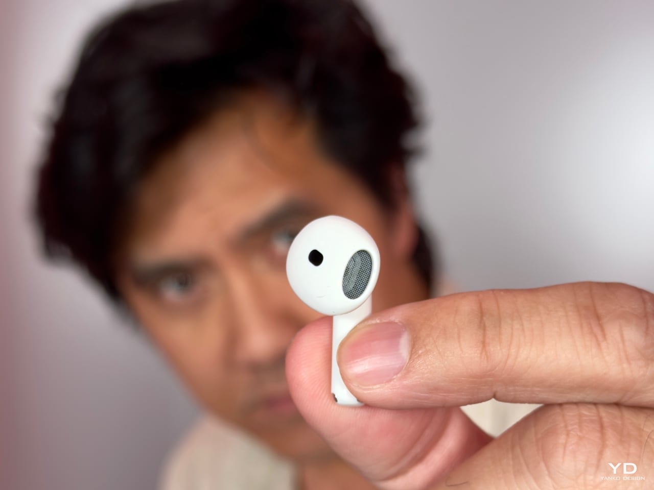
Apple has always focused on creating products that are aesthetically pleasing and universally accessible. With the AirPods 4, this concept takes center stage. The earbuds might look familiar at first glance, maintaining the iconic stem design that has become synonymous with Apple’s audio products. However, the fundamental transformation lies in the details—a culmination of years of ergonomic research and user feedback.

Apple AirPods 4 + ANC

“We began to educate ourselves and figure out what it is about fit and comfort that really matters to people,” Kate shared. “How do we get more conversant in the physiology and try to figure out what the best fit for as many people as possible can be?”

Creating a non-ear-tip form factor presented unique challenges. “We’re trying to make AirPods stay in your ears, and we don’t have the advantage of the compliance of the tip to help us out,” she explained. The team developed a comprehensive database of ear shapes from around the world, allowing them to model and test various designs virtually before creating physical prototypes.

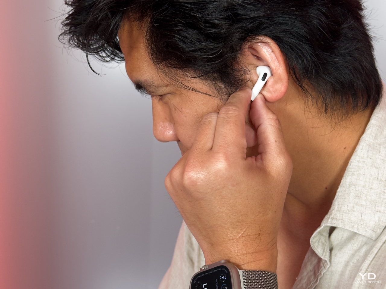
Kate’s team delivered a design that feels light and natural in the ear. In my own experience, the AirPods 4 felt almost weightless. The smooth contours of the earbuds nestled comfortably in my ears, and I could wear them for hours without any discomfort. During two international trips to Berlin and London, I swapped between the AirPods 4 and the AirPods Pro 2. Despite their completely different designs, I found the comfort and fit nearly identical. Eliminating the ear tip enhances comfort and simplifies the user experience—no more fumbling with different sizes or worrying about replacements.

The Art of Minimalism: Less Is More

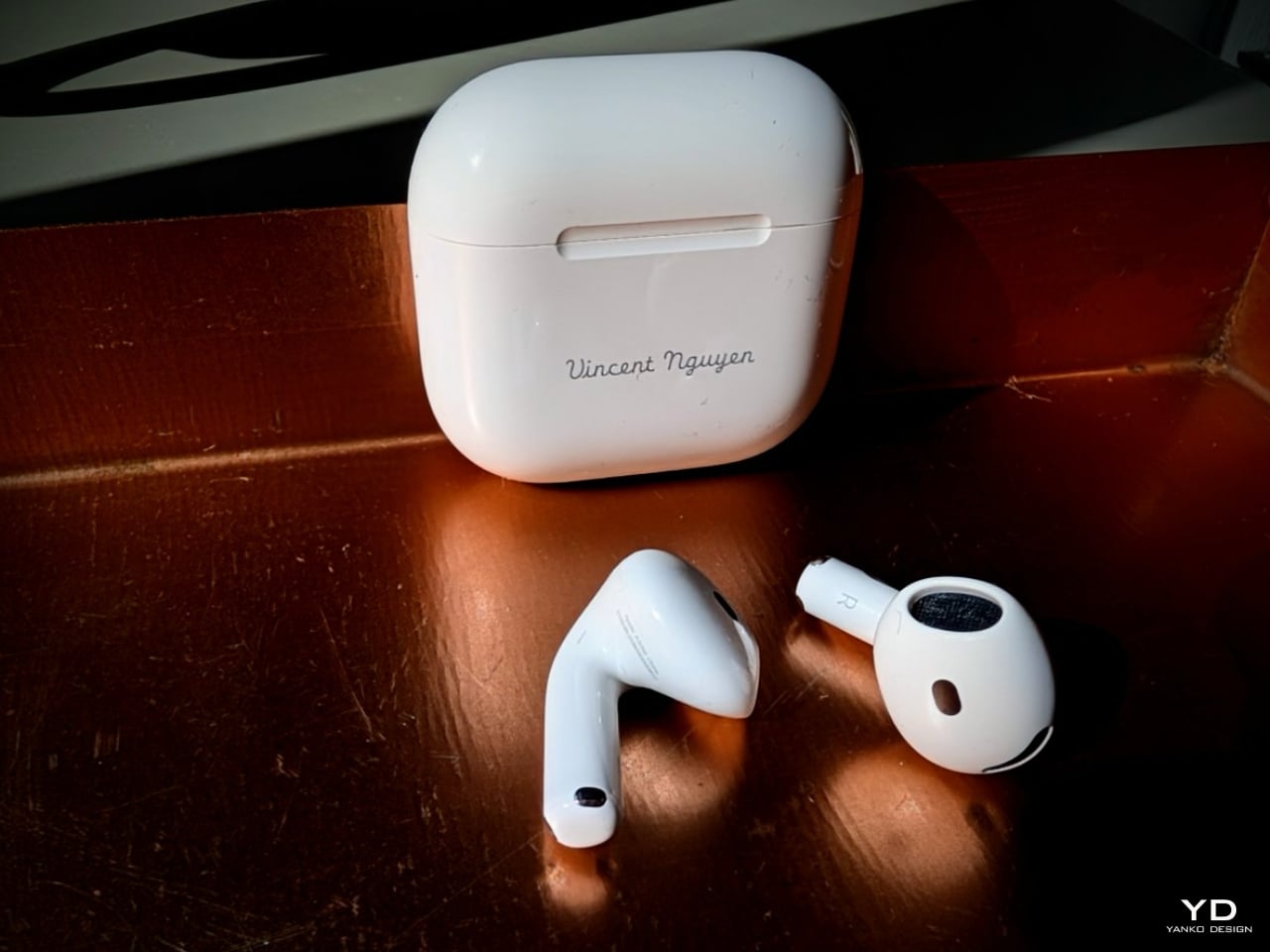
The AirPods 4 embody Apple’s mastery of minimalist design. The absence of ear tips allowed the team to create a smaller, more streamlined case.
“Without having to accommodate an ear tip in the width of the case, we’re able to shrink it right down,” Kate noted. “It’s our smallest case.” Indeed, the case is remarkably compact—small enough to fit comfortably in the tiny coin pocket of your jeans.

The tactile experience has been carefully considered. The hinge mechanism provides just the right amount of resistance, and the magnetic closure offers a satisfying click. Every detail contributes to an effortless user experience.

Another subtle yet impactful change is the removal of the physical pairing button. Eric demonstrated the new pairing method, explaining how tapping the case twice uses the accelerometer inside to sense vibration, simplifying the process.

Engineering the Impossible: ANC Without Ear Tips

One of the most groundbreaking aspects of the AirPods 4 is the integration of Active Noise Cancelation in a non-ear-tip design. Traditional ANC relies heavily on passive noise isolation provided by ear tips, so the team had to rethink the entire approach.
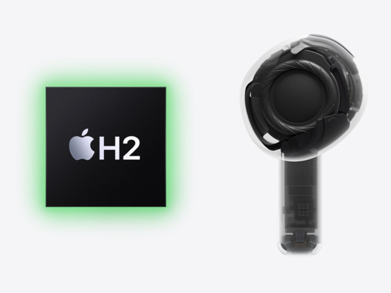
The H2 chip became essential to unlocking this performance. With its more power-efficient design, Apple was able to shrink the size of the components while maintaining the level of ANC that users expect.

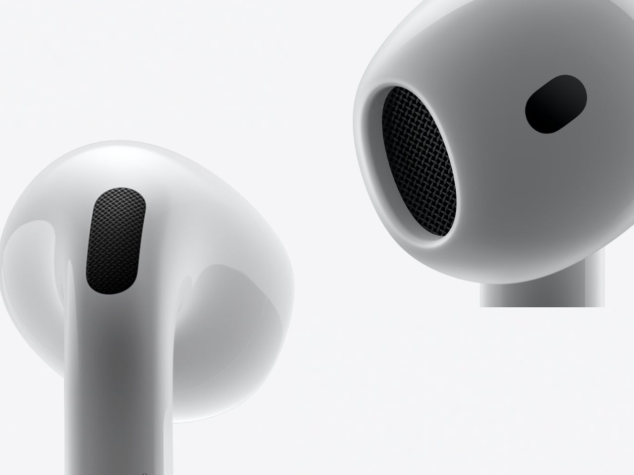
They meticulously arranged the components to maximize sound quality and ANC effectiveness. “We incorporated advanced microphones both inside and outside the earbud,” Kate explained. “Adjacent to the driver is a reference microphone, which allows us to continually monitor the sound in your ear. Then, outside your ear, we use an additional microphone to monitor the outside world.”

Eric added, “It’s extremely important that the adaptive EQ mic is working very fast—up to 200 times a second—to ensure that it’s constantly monitoring what you’re hearing, both from a noise-canceling perspective and an audio quality perspective.”

The precision required for this process is astounding. Without the seal of an ear tip, external noises can easily seep in. The H2 chip’s computational power enables real-time adjustments, ensuring the ANC remains effective even as the earbuds shift slightly during movement.
Adaptive EQ, Audio Quality, and Hearing Protection

Beyond noise cancelation, the AirPods 4 delivers an impressive audio experience through adaptive EQ, which fine-tunes the sound to suit your environment and the shape of your ear. “Every ear is unique, and so is every listening situation,” Eric explained. “Our goal was to provide consistent, high-quality audio no matter the circumstances.” Whether listening to classical music or country, the clarity and richness of the sound are immediately noticeable. The bass is full without overpowering, while the treble remains crisp and clear. The adaptive EQ enhances the nuances of each track, providing an immersive listening experience.

The H2 chip plays a crucial role in this, enabling real-time processing of audio signals and allowing the earbuds to adjust frequencies dynamically. “The H2 chip enables us to maintain this level of precision,” Kate shared, highlighting how it keeps audio quality consistent across various environments.

One key advantage of this open-ear design is the ability to enjoy audio at lower volumes, thanks to effective noise cancelation. By reducing the need to increase the volume in noisy environments, the AirPods 4 helps protect hearing over time, making them a great option for users who want to preserve their hearing without compromising on sound quality or comfort.

Seamless Integration: The Magic of Connectivity

A defining aspect of any Apple product is how seamlessly it integrates within the ecosystem. The AirPods 4 enhance this experience. Switching between my iPhone, iPad, and MacBook was incredibly fast—almost imperceptible.

According to Eric, the goal was for the AirPods 4 to be something you don’t have to think about—the experience should just work, whether you’re on a call, watching a video, or switching between devices.

The seamless handoff is powered by iCloud syncing and the advanced capabilities of the H2 chip. Apple wants this process to feel completely natural, with all the complex technology hidden behind the scenes.

During our conversation, an analogy that came to mind was comparing seamless connectivity to shifting gears on a high-performance car. “To me, this is as seamless as shifting gears on a Porsche,” I said. It’s just like that dual-clutch—it’s so seamless.”

Navigating Limitations: Transparency and User Trust

While the AirPods 4 offer impressive features, Apple is transparent about their limitations. Although the open-ear design can’t match the noise isolation of in-ear or over-ear models, the AirPods 4 were optimized to deliver the best performance possible given the constraints.

This honest approach fosters trust between the company and its users. Apple remains committed to ensuring that user satisfaction remains the top priority.

Final Thoughts

The AirPods 4 with ANC represents a significant advancement in personal audio, showcasing Apple’s dedication to thoughtful design, user well-being, and seamless integration. Apple has set a new standard by overcoming the challenges of incorporating advanced features into a minimalist and comfortable form factor.

For users seeking convenience, comfort, and effective noise cancelation, the AirPods 4 is remarkable. They may not replace specialized equipment for audiophiles or professionals, but they excel as daily companions that enrich our lives in meaningful ways.

As someone who values technology and simplicity, I find the AirPods 4 perfectly incorporates these principles. From morning podcasts to evening music sessions, they have become indispensable. The comfortable design allows me to wear them for extended periods, and the intelligent features keep me connected without feeling tethered.

I was particularly impressed by their everyday convenience. “I absolutely love this after testing many other products,” I shared with Eric and Kate. Being able to take them out, use them effortlessly, and not have to fumble—that’s an everyday luxury.

As technology evolves, products like the AirPods 4 set the benchmark for what is possible when design and innovation work together. Bringing Active Noise Cancelation to an open-ear earbud is a significant leap forward, redefining expectations and opening new possibilities.

The post Breaking Barriers: How Apple’s AirPods 4 Bring Active Noise Cancelation to Open-Ear Earbuds first appeared on Yanko Design.