Tag Archives: web app
Windows 10 is installing Office web apps without asking permission
Google is making it easier to create apps using Chromebooks
Microsoft and Google team up to bring more web apps to the Play Store
PAX skirts Apple’s vape app ban with a web version
Google reveals its timeline for killing off Chrome apps
 Chrome apps have been on death row since Google announced in 2016 it would wind down support. Almost four years later, the company has finalized its timeline for phasing them out across Windows, Mac Linux and Chrome OS.
Chrome web apps will soon tout desktop-like speed
 If web apps are going to truly replace native apps, they'll need the near-instantaneous responsiveness of desktop apps. That appears to be on the horizon, thankfully. Google is unveiling Chrome tools that will help web apps run as quickly as their...
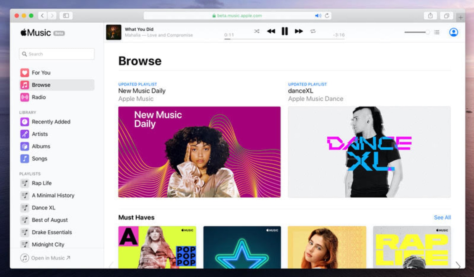
Apple Music comes to browsers today with a beta web player
 Apple Music is making its debut in browsers today as Apple continues to untangle its media services from the confines of iTunes. If you're a subscriber, you can check out the public beta of the web player by signing in with your Apple ID.
Hell is Other People: Antisocial Media
There are times in your life where you just want to be in the company of yourself. Unfortunately, you can’t choose to avoid people when they’re already there, right in front of you, and it’s just rude to walk on by without saying hi or exchanging pleasantries at that point.
Social media is all about getting social and being with people – at least virtually. Antisocial media is the opposite of that, and Hell is Other People is a product of an experiment based on this concept by Scott Garner.

Hell is Other People is basically a web app that uses data from your Foursquare account to check and determine the current location of your friends, family, and other contacts. It will then map out a route for you that avoids any place where people you know are checked in.
It truly is an app for the antisocial.
Scott did a test run on the app when he took a walk in Manhattan following the “safe zones” marked by Hell is Other People. You can check out what happened (and whether the app was right or not) in the clip above.
[via C|NET]
Tweetdeck for web and Chrome updated with cleaner user interface
If you're an avid user of Tweetdeck, we hope you're also okay feeling the brisk winds of change. The browser-based app, as well as the version on Chrome, has been updated with a fresh and clean user interface. The new design moves all of your options, settings and other buttons to one simple navigation bar on the left side of the app. The sidebar can be expanded to reveal more information about each icon, though most of what you see there will also appear if you simply hover your cursor above the associated symbol. The new interface also adds improvements to lists and settings as well.
Filed under: Desktops
Source: Tweetdeck
