Tag Archives: website
Chrome may shame slow-loading sites with ‘speed badging’
 While there are many, many worse things going on in the world than waiting far too long for a website to load, that's bound to tick off even the most patient of us. Google's not standing idly by, though, as it might start naming and shaming sites tha...
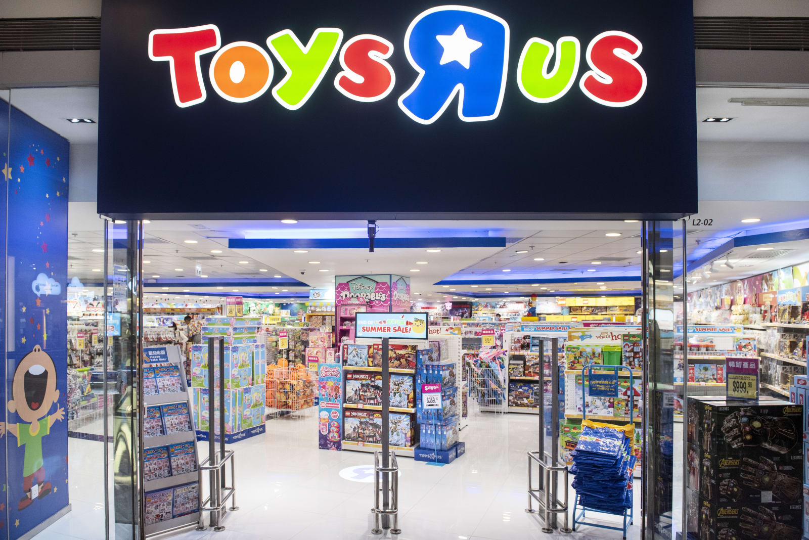
Toys ‘R’ Us debuts a new website, but you’re really buying from Target
 Just in time for the holiday season, the Toys "R" Us website is back, with one big difference: Target is powering the revived ToysRUs.com. When you go to complete a purchase on the latter, it redirects you to Target's website to check out.
PDF, Printed Document, or Portfolio Website? What works the best for job applications?
Hey I’m Sam and I do design. Some of the most popular YouTube videos I make are about portfolios and tips on getting a design job. For that exact reason, I wanted to write about portfolios here so I can share this information with you.
Sharing your work as a creator can be a daunting task, especially if you’re attempting to summarize solving a complex problem that took 6 months to define, and 6 months to develop the solution. In situations like this, it’s important to remember that the reader (your recruiter) must understand the project at face value as they’re speed-browsing through hundreds or even thousands of job applications. I make a point in my videos to flick through portfolios as fast as possible when first looking at them, with no time to read the headings or the body text. This reflects exactly what happens in industry, even if it does appear unfair to the designer on the other side of the portfolio. This is also the reason why each portfolio should be tailored to the job you’re applying for. For example, a red carpet set designer won’t be interested in seeing the baby walker that you designed (true story, I didn’t get that set design job).
Every employer will have different application specifications. My current job still asks for a PDF portfolio from students. We ask for them because we can archive them, and pull them out if we have a specific project that the specific designer can help with. And if they supply a completely different type of portfolio? Well, it unfortunately shows they can’t follow employer instructions. Next!
Beyond specific employer instructions, how should you show your work? There honestly isn’t one perfect be-all-end-all format. There are pros and cons to all of the solutions, so let’s run through some of them now to help you decide which is best for you.
PERSONAL WEBSITE
A personal website is a great way to show creativity and give the impression of a professional and well established designer. The pages and layout are also a showcase of how you think and organize information, and the format of a website means you can have multiple types of projects that your potential employer can choose to look for, or choose to ignore if they don’t suit the particular role available (just like a baby walker or set design). A personal website is great for these reasons, IF it works. The problem I personally had with my first portfolio website, especially as a student, was that it was expensive to keep it running. It came to the point where I needed to choose between renewing the website domain, or eating that week. I chose the latter. That meant that any potential employers that I had given my website details to now couldn’t find me if they had a project that would suit my talents. And even if they could find me through the email address I also gave them, a broken website gives a horrible impression anyway.

PDF DOCUMENTS
A PDF document is a traditional method by today’s standards. They lack the fancy animations that websites can have, and they need to be emailed around and stored locally. However, this can also be seen as a positive point, as each portfolio can be tailored to include only the most relevant project for maximum impact with employers. Having a PDF that pinpoints the exact type of projects that the employer needs help with shows that you are capable not only of the design work itself, but also understand the company’s needs and shows how you can help. If a website is a great place for employers to come and choose what they’re interested in, a PDF is a great way for you to show that you understand what they need.
However, dealing with file sizes and compression can be the difference between a 500mb monstrosity, and a file that’s pixelated beyond recognition. This is the final hurdle of a PDF document, and one that many designers trip on. A sensible file size is 5mb-10mb, and there are ways to compress your document while keeping the image quality high. I have a YouTube tutorial on that very problem!
PHYSICAL PRINTED BOOK
A physical copy leaves the most impact on a potential employer. In a world where everything is increasingly digital, it seems that providing a beautifully made book always provides that “wow” moment. There is just something about turning each page to reveal the next piece of information that is so satisfying, and the physicality of it often means that I would flick through a book slower than I would a PDF.

However, there are of course drawbacks with a physical portfolio. They are expensive. Very expensive. And it’s almost impossible to tailor each portfolio to include the exact projects specific to the job at hand. I’ve seen workarounds with binders and replaceable pages and projects, but that gets even more expensive.
In addition, while books are suited to archiving and being stored, they don’t possess the magical “search” feature that PDF’s and websites have. In 6 months time if I have a project that a designer could help with, and I can only vaguely remember that their work was in a book (and definitely can’t remember their name), then it takes a lot of effort to go searching. The effort I might spend searching could easily be re-assigned to finding a new designer with similar skills, even if the “wow” factor of the book was so nice 6 months ago.

COMMUNITY PORTFOLIOS
Community websites like Behance are more stable than personal website, but they also bring attention to the competition and their design work. While it’s very easy to plug in your images and copy into the pre-existing templates with fancy animations, it’s also true for every other designer on that website. The very nature of these types of sites mean that they make it oh-so easy to click through to find more designers and more work.
It could work in your favor by showing your projects are better than the competition, or it could show other designers and their work as well. You can rest safe in the knowledge that your links are going to work for as long as your project is on the website, but is it worth also potentially exhibiting the competition too?

THE BEST OF ALL WORLDS
It may be a catch-all cliche, but I do think it’s best to have a mix of portfolio types up to date at all times. It’s really important to be able to provide a current portfolio at any given moment as you never know when the next opportunity can come along. The best plan of action is often to use two or more types of portfolio for the same submission. PDF portfolios plus physical or website is also common. Remember, if specified, always listen to the employer’s instructions when it comes to formatting. Beyond that, a portfolio is a reflection of your mindset and your creativeness. The more creative you can be with a portfolio, the better. But don’t forget what a portfolio is used for once it’s left the drafts folder on your computer and out in the real world: it should be to the point, tailored, archive-able, and searchable. Oh, and don’t forget the “wow” factor.

ABOUT THE AUTHOR
Sam Gwilt is an industrial designer with an eclectic mix of skills. He graduated Brunel University London and worked for Paul Cocksedge Studio, specializing in bespoke lighting installations and exhibitions internationally. He now works with clients globally at consultancy Precipice Design, and also runs an Instagram Page and YouTube channel – Sam_Does_Design – where he shares industry tips with the community.
White House launches site to highlight AI initiatives
 Now that the US government has been ordered to prioritize AI, it's launching a website to promote its AI efforts. The newly available AI.gov showcases a number of initiatives over the years, including Obama-era moves like the strategic AI research p...
Why Cloud Hosting is a better Choice for your e-business Website?
Why Cloud Hosting is a better Choice for your e-business Website?
Google wants to change the way we interact with URLs
 Google's done a lot with Chrome -- and by extension, our relationship with the internet -- in its relatively short life. Autofill, ad management, web encryption... These are all things that were at one time pretty ground-breaking, but which we now si...
Build Your Website with This Affordable Squarespace Alternative
Building a website can be expensive and demanding — which is why all-in-one solutions like Squarespace have been rising in popularity. With rising demand, however, come rising prices, and the per-month cost of Squarespace ranges from $12 to $18 — which is over a thousand dollars over the next five years. Luckily, Obior is a great alternative offering a very similar product for only $39.99 for life.

Like Squarespace, Obior features a templated solution that allows you to design and customize a profesttional looking website with zero coding experience. They also handle website hosting and backend needs like cybersecurity and SEO so you can focus on filling your site with great content. You can even set up a social media account to display and auto-update if it fits your site’s concept. You can connect your own domain name, and there are no set limits on bandwidth or storage with Obior either. There’s also support for custom HTML & CSS if you want to go beyond what the templates have to offer.
The best part is that with this exclusive deal, you can purchase a subscription now and never worry about the future compounding cost of operating your site again. Pay just $39.99 in the Technabob Shop and never pay another hosting fee with Obior.

