Modular Coffee Machine lets you vertically add an Ice Maker and Cup Washer to your Brewer

It’s sort of reminiscent of how some homes stack washing machines and dryers one above another… but imagine that scaled down ever so slightly and dedicated to your coffee. Meet UOCO, a modular all-in-one coffee machine that does just more than brew you a stellar cup. Designed to even resemble the washing machine with its clean, boxy aesthetic, the UOCO is a stackable appliance that lets you add extra modules to your coffee maker. Sure, its central feature is the coffee machine itself, but the UOCO also features an ice-maker, and a cup-washer that attach to the coffee machine, giving you an all-in-one vertical station for making ice lattes, and then washing your glass/cup after!

Designer: Yui Jo

Designed by Yui Jo, a student at the Hongik University in Seoul, UOCO is much more than your tabletop coffee maker. In fact, it isn’t a tabletop appliance at all. Large enough to be a floor-standing gizmo, the UOCO is significantly larger than your Keurig or Nespresso maker… but it’s also thrice as efficient.

The UOCO features three distinct modules that stack one on top of the other, connecting through a central port that supplies power to all three gadgets. Right at the top is an ice-maker, which delivers perfect ice cubes to go into your iced coffee. At the center is a pod-based coffee extractor that works just like your Keurig and Nespresso machines. Place your cup inside, add a pod to the tray, and press a button to watch fresh coffee percolate and pour right into your drinking vessel… with or without ice. Once you’re done enjoying your beverage, the cup/mug goes into the third, lowermost vessel – the cup washer. Working like a scaled-down dishwasher, it rinses your cup with hot water, cleaning it inside out and drying it for your next round of caffeine.

Scaled-down design prototype

It seems odd that Yui Jo didn’t opt for more coffee-adjacent modules like a roaster or grinder… but that’s the beauty of UOCO’s open framework. You can add modules as you go, and the UOCO can easily feature a non-pod-based coffee machine option with roasting and grinding capabilities too. Ultimately, the aesthetic is really what matters here. It’s clean, industrial-looking, and adds quite a touch of modernity to your home. You can even opt for colored modules, creating a nice color-blocking totem that goes with your decor.

The post Modular Coffee Machine lets you vertically add an Ice Maker and Cup Washer to your Brewer first appeared on Yanko Design.

This gorgeous Umbrella-inspired lampshade can be opened or closed to adjust brightness

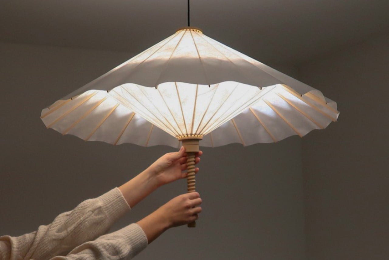
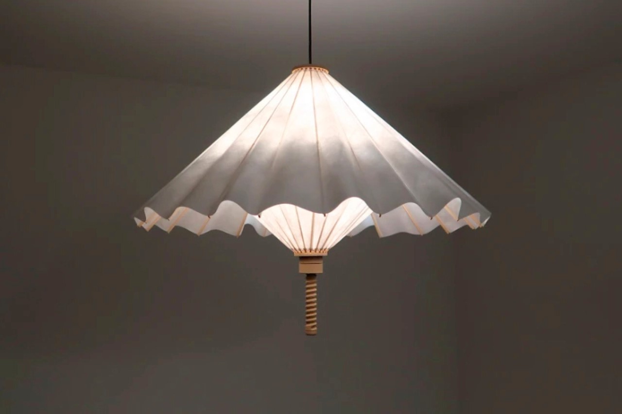
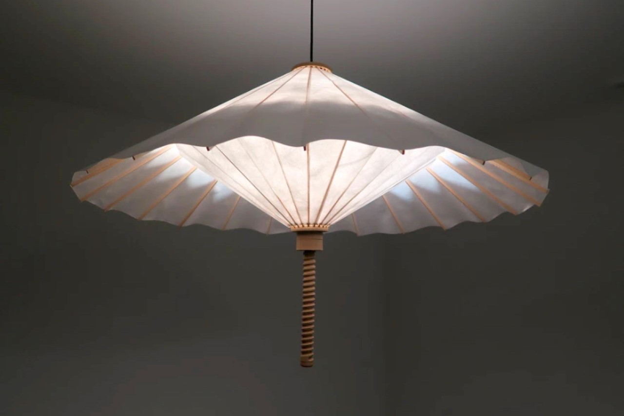
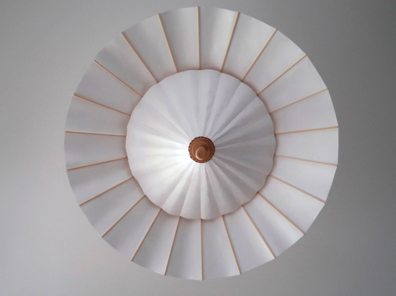
A worthy winner of last year’s Tyvek Design Awards, the Wagasa Lamp has a beautiful design and an even more alluring interaction that lets you adjust the lamp’s brightness. Taking inspiration from the shape of an umbrella or parasol, the lamp comes with a shade made from flexible Tyvek fabric (developed by DuPont) attached to wooden rods. The lamp can be unfurled or shut like an umbrella, exposing or enclosing the empty space within, which increases or decreases the amount of light that makes its way out of the lamp. This unique interaction gives the Wagasa Lamp just one of those beautiful user experiences that makes it an instant crowd favorite – but even more importantly, the lamp’s innately Asian/Japanese aesthetic makes it a wonderful inclusion in any minimalist or oriental-themed home!

Designer: Solenn Roch

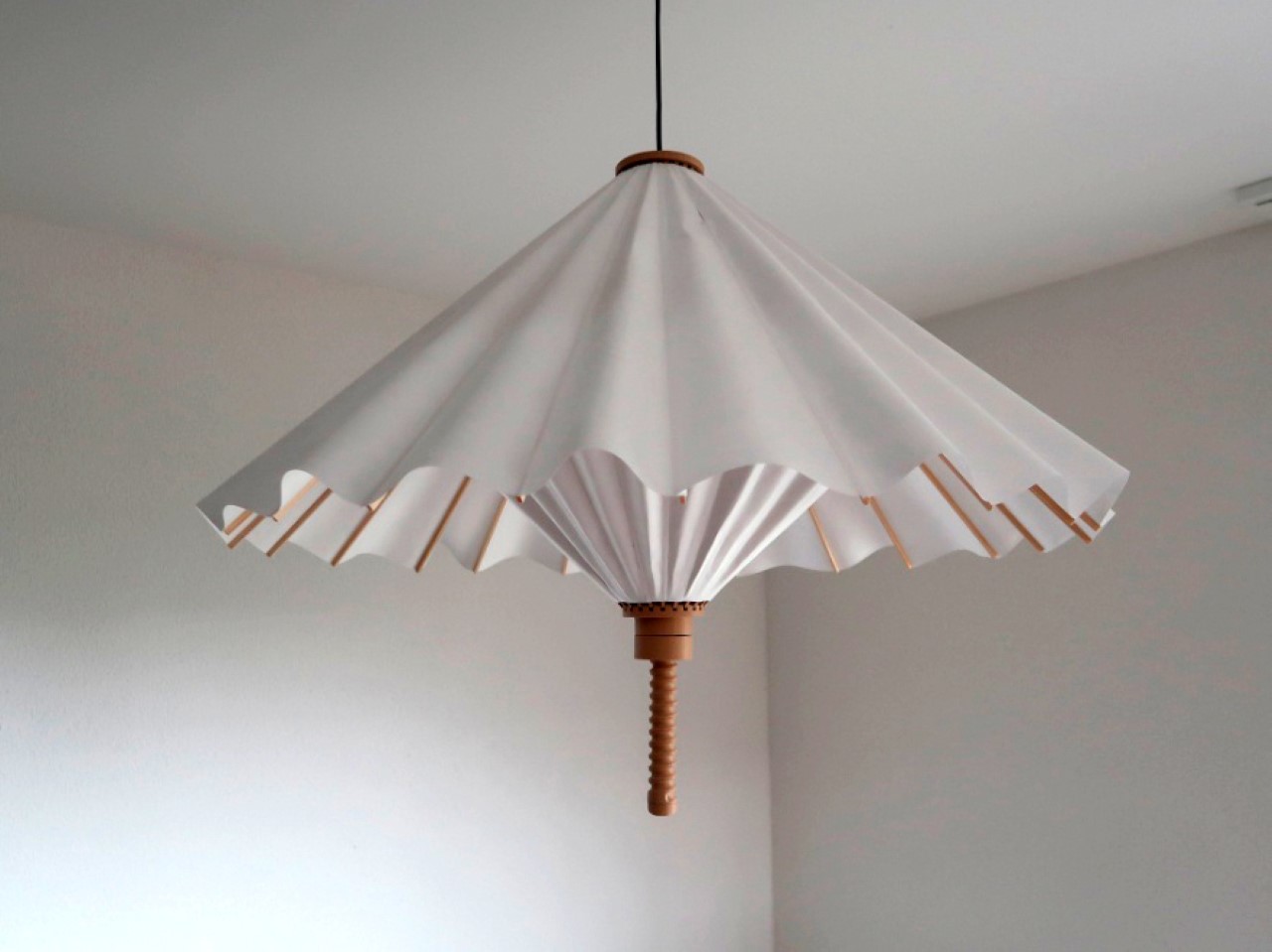
The Wagasa lamp’s design comprises just two materials outside the lamp’s bulb and electrical housing. You’ve got the Tyvek shade, made of two sheets of the synthetic paper-like material, and a wooden structure that holds the Tyvek shades up, allowing you to adjust their position. “The translucent Dupont Tyvek material diffuses light softly, creating a warm atmosphere,” mentions Swiss-based Solenn Roch.

The design is almost identical to the kind of umbrellas found in cocktails and drinks, and operates the same way too. Here, a threaded base lets you rotate a knob to adjust the open-ness or closed-ness of the umbrella, while the outer umbrella cone’s width helps determine the lamp’s brightness. When completely opened/horizontal, the lamp allows much more light to filter outwards from the top and bottom, diffusing wonderfully through the Tyvek shade. Close it, however, and the conical area decreases, also closing the empty space inside the lamp to create a smaller illuminating area. The controls aren’t precise, but they’re fun as heck, and you’ll find yourself constantly reaching for the rotating knob to show off the lamp to your guests!

The current prototype is made out of 3D-printed plastic parts, although Solenn hopes to make a version out of natural wood soon.

The beauty of the Wagasa lamp lies entirely in its simplicity and playfulness. In a lot of ways, principally, it works quite similar to the IKEA PS 2014 Pendant Lamp, but while that lamp allures with its uniquely faceted pattern, this one is just a call-back to a simpler time, coupled with a wonderfully Eastern-themed minimalist aesthetic.

The post This gorgeous Umbrella-inspired lampshade can be opened or closed to adjust brightness first appeared on Yanko Design.

10 Iconic & Influential Women Designers Of The Last Century

8th March is celebrated as International Women’s Day, and rightly so, although in all honesty, we deserve every day to be Women’s Day! Women’s Day is the result of the efforts of a lady called Clara Zetkin, the leader of the ‘Women’s Office’ for the Social Democratic Party in Germany. In 1910, she proposed that every country should have a celebration every year on the same day – a Women’s Day, a day when women could press for their demands. Cut to 2024, and Women’s Day is a 24-hour period where we widely celebrate the women all around us, and in every aspect of our lives. And we’re taking it upon ourselves to celebrate the iconic women in our design world! These women paved the path for women in the design and architecture industry, changing the perceived status of women in this arena, and making space for their successors to push boundaries liberally and without hindrances. Although even today there is a gender disparity in the design world, with women designers facing experiences of bias and prejudice, and with the product and industrial design world being primarily 78-95% male. But let’s take a moment to celebrate these iconic women designers, creators, and innovators and raise a toast to them!

1. Zaha Hadid

The late Zaha Hadid was the first woman to win the Pritzker Prize for Architecture in 2003, and also the first female star architect who managed to transform, and deeply influence the status of women in the design world. Known as the ‘Queen of the Curve’, her unique creative vision positively impacted and changed the design and architecture world, while also establishing that a woman can conquer these worlds in her unique way and style. Her feisty personality, intense determination, and desire to challenge the design status quo supported her in consistently pushing the limits of form and function. Her first major public building  – the Rosenthal Centre for Contemporary Art in Ohio opened in 2003 and marked an important turning point, where critics and the rest of the world accepted her as the force she truly was.

2. Ray Eames
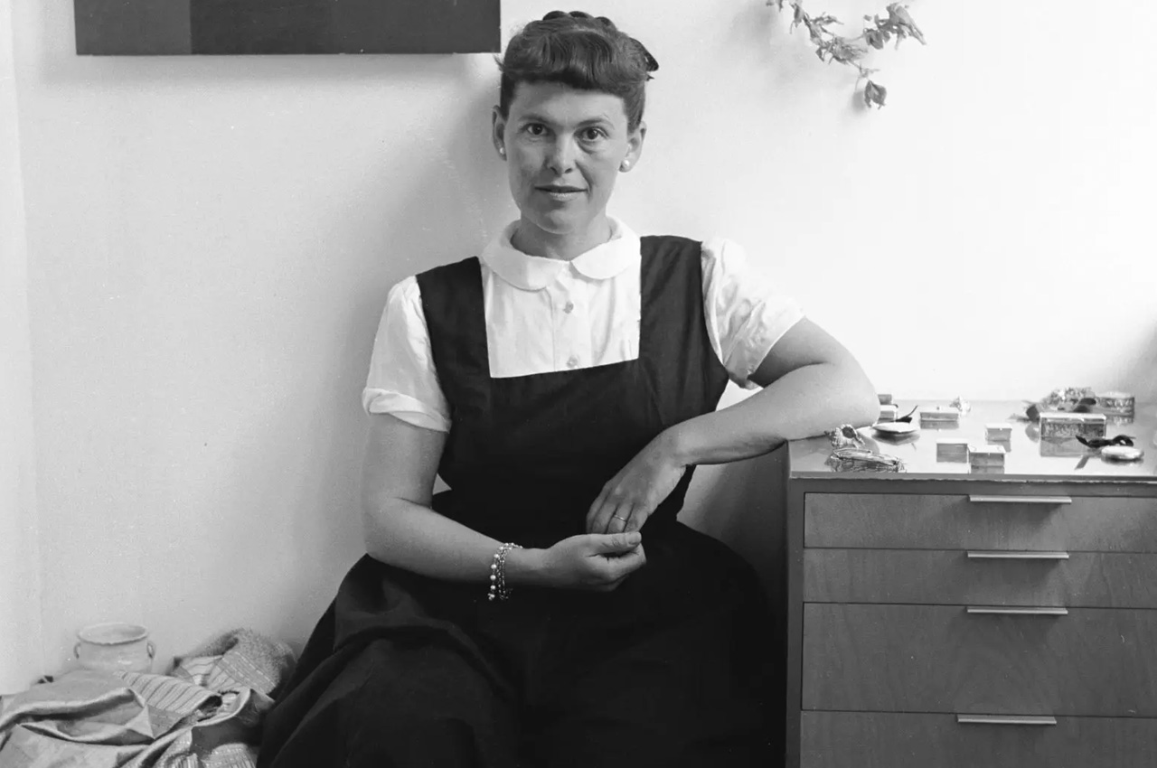
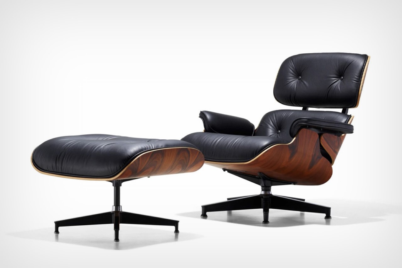
Everyone’s heard of the Eames Lounge Chair. It was the centerpiece of any office in the 1960s and 1970s, and it has still maintained its relevance and value even today. You’ve probably heard of the mastermind behind it – Charles Eames, but you may not be aware of his wife Ray Eames, who played an equally important role in its birth and creation. The duo spent most of their time experimenting with plywood, which led to their first mass-manufactured product – a molded plywood leg splint that would be purchased in abundance by the US Navy. They played around with different materials, using fiberglass, aluminum, leather, and plywood to build furniture. Even after Charles died in 1978, Ray continued to spread their design philosophy and beliefs through her writing and numerous talks.

3. Hella Jongerious

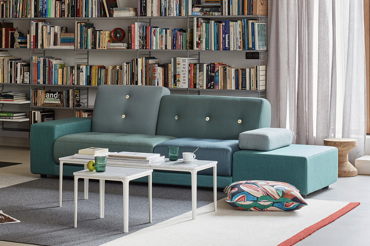
The Dutch designer Hella Jongerious is considered a master of colors and texture in her profession of industrial design. The strong-headed and independent designer once said “Design is not about objects. Design is about relations”. She founded her studio called the Jongeriuslab studio in 1993, and since then has worked with major clients such as Maharam, Danskina, IKEA, and KLM. Through her work with textiles, ceramics, and furniture, she has highlighted the importance and magnitude of colors and surfaces in contemporary designs. She designed the Polder Sofa for the Swiss company Vitra, which is one of her most distinctive and popular pieces. It is inspired by her home country – the Netherlands and is a beautiful mixture of asymmetrical shapes and cushions in various colors and fabrics.

4. Neri Oxman

Israeli-American architect, designer, and professor Neri Oxman is the founder of the Mediated Matter Group at the MIT Media Lab. Her work is incredibly pioneering, and she had to coin the word “material ecosystem” to describe it. She combines technology, biology, and design to create astounding projects such as the Silk Pavilion and the Wanderers Wearable Skins, which pushed the boundaries of what fabrication and design could do. Her 3D-printed wearable skins are designed for interplanetary pilgrims, and they have been merged with synthetically engineered microorganisms to make the hostile habitable.

“Nature does not come together. “It expands,” she said at Design Indaba. “At this point, there is a collision between the worlds of civilization and nature.” It is a gradual process, but they are coming together.”

5. Kazuyo Sejima

Kazuyo Sejima is a Japanese architect, and also the second woman to win the Pritzker Architecture Prize in 2010, following Zaha Hadid’s lead a few years later. Sejima claims, “Being an architect. I am just interested in making architecture.”, and this comes through in her clean, minimalist, and yet innovative design style. Her works are highlighted by a subtle and minimal character, and they often playfully blur the boundaries between interior and exterior spaces. One such project is the Laview commuter train, which features massive windows, and a curved edge glass nose. The commuter train was designed to make the passengers feel like they’re at home, instead of on a train moving between Tokyo and Saitama. The carriages were created to make the passengers feel comfortable and at ease, mimicking the experience of sitting in your own house.

6. Florence Knoll Bassett

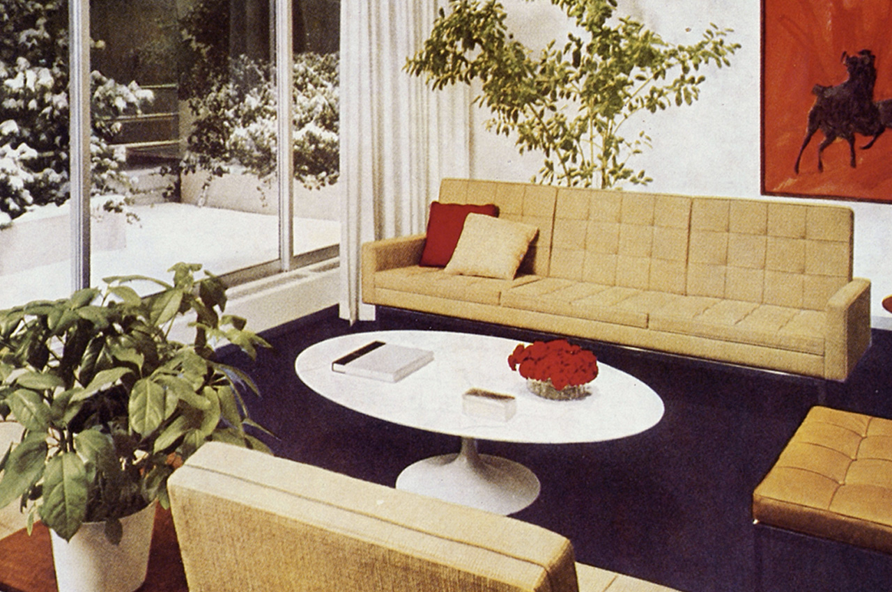
Florence Knoll Bassett was an American architect and furniture designer who completely revolutionized and transformed the design of workplaces, in turn shaping the mid-century modern design movement. She was trained by the three giants of European Modernism – Marcel Breuer, Walter Gropius, and Ludwig Mies van der Rohe, which helped her immensely as she began working for her husband’s furniture company, which was later named Knoll Associates. She created the concept of the modern open-plan office, truly reimagining workplace spaces. Her open-plan ‘Knoll look’ interior completely rejuvenated the office landscape of corporate America, and the impact still lingers on how offices are designed today. She took over Knoll Associates after her husband died in 1955, and the company continued to grow and flourish under her leadership.

7. Greta Magnusson-Grossman
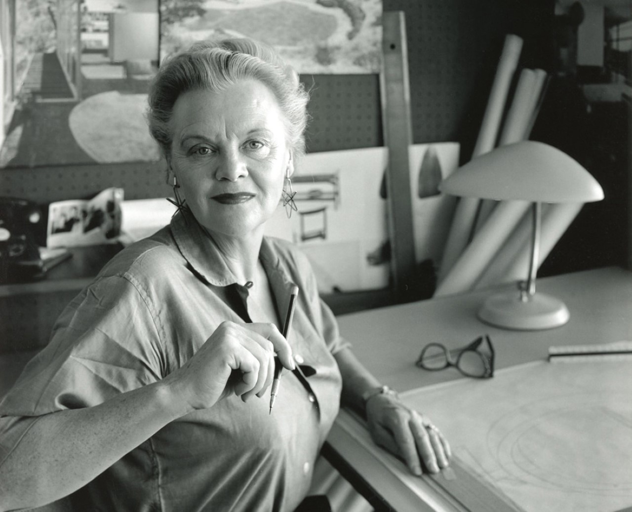
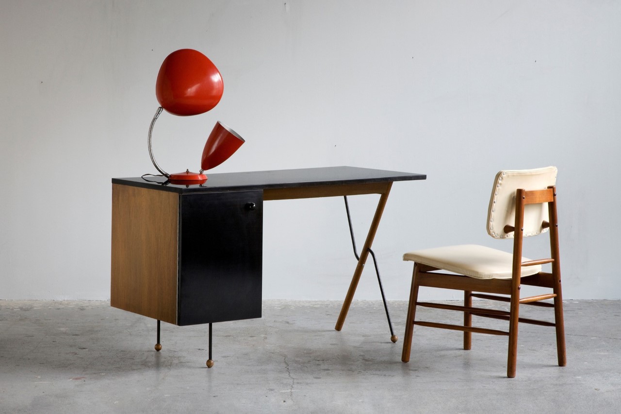
Greta Magnusson Grossman, a Swedish designer, seamlessly merged Scandinavian sensibilities with the midcentury design movement in California in the 1940s. Grossman was not only renowned for her furniture designs but also for her architectural projects, particularly homes in the Los Angeles area, which embraced open floor plans and integrated with the surrounding landscape. Despite her success in architecture, Grossman is best known today for her lamp designs, notably the Grasshopper floor lamp and the Cobra table lamp, both of which have gained iconic status in the midcentury-modern design canon. Towards the end of her career, Grossman also taught furniture design at UCLA from 1957 to 1963.

8. Suzanne Vanderbilt

Suzanne Vanderbilt, a trailblazing auto designer at GM, began her career as one of the original Damsels of Design. Vanderbilt joined GM after graduating from Pratt Institute in 1955 and worked on automotive interior design for Chevrolet and Cadillac. Her innovative work included patents for ergonomic automobile seats and safety switches, although these were never produced. Despite facing setbacks and sexism, she persevered, rising to become chief designer of Chevrolet’s Interior Studio by 1972. Vanderbilt’s career was marked by a pursuit of perfection and creativity, reflected in her dedication to automotive design. Her pursuits in the male-dominated automotive industry helped pave the way for other women designers like Diane Allen and Michelle Christensen.

9. Diane Allen

Diane Allen is a senior designer manager at Nissan Design America in San Diego, and she also manages the design programs for the Nissan brand assigned to NDA by the Nissan Global Design Center in Japan. She designed the 2016 Nissan Titan, which is a heavy-duty pick-up truck made from pure gearhead muscle, and capable of hauling everything from boats to horse trailers! She manages the design process of the TITAN family of trucks – overseeing the design concept and sketch development to the production sheet metal, and designing and prototyping of all the different parts, accessories, and wheels! She also managed the Nissan 350Z and 370Z sports coupes, the Rogue crossover SUV, and the Infinity QX56 SUV.

10. Michelle Christensen

Michelle Christensen made history by becoming the auto industry’s first female to lead the development of a supercar when she headed the 2017 remodel of the iconic Acura NSX. It is a second-gen hybrid supercar that was named “Performance Car of the Year” by Road & Track. The launch of the automotive was highly awaited, as it was being re-released 25 years after its original debut. She graduated in transport design from the Art Center College of Design in Pasadena, California, and went on to work for Honda, General Motors, and then Acura – the luxury division of Honda.

The post 10 Iconic & Influential Women Designers Of The Last Century first appeared on Yanko Design.

Fashion Meets Technology with this 3D printed dress that comes with moving eyes and uses a brain sensor

Fashion has always been a powerful means of self-expression, allowing us to convey our moods, emotions, and individuality to the world. But what if fashion could go beyond mere aesthetics and help us communicate the complex state of our minds? Anouk Wipprecht, a visionary Dutch designer, has embarked on an intriguing journey to merge fashion and technology, resulting in an innovative creation known as the ScreenDress. This avant-garde white dress adorned with peculiar “eyeballs” promises to revolutionize how we express and perceive our cognitive load throughout the day.

Designer: Anouk Wipprecht

The concept of “cognitive load” refers to the mental effort required for processing information and managing tasks at any given moment. In our modern lives, we are bombarded with a ceaseless stream of distractions, from smartphone notifications to background chatter, creating a constant mental juggling act. This overload of information often leads to stress, fatigue, and frustration, and yet, many of us remain blissfully unaware of our cognitive loads.

Wipprecht recognized this prevalent issue and saw an opportunity for fashion to provide a solution. As she puts it, “Fashion can help the wearer communicate with other people about what is going on inside their own bodies.” The ScreenDress is her groundbreaking attempt to make this idea a reality.

The ScreenDress is not your average piece of clothing. It features a striking neckpiece adorned with six round displays that resemble eyes, complete with an iris and a pupil. This neckpiece is intricately connected to a headband worn by the user, which, astonishingly, tracks brain waves. Developed by technology firm G.Tec, this headband uses brainwave data to estimate the wearer’s cognitive load, and this information is then visually conveyed on the displays.

The innovation lies in how the dress visually represents cognitive load. As the wearer’s mental burden increases, the pupils in the eye-like displays dilate wider and wider. Conversely, when cognitive load lessens, the pupils constrict. This visual metaphor is not only creative but also incredibly intuitive. Humans instinctively look at one another’s eyes to gauge their emotions, making this choice of representation particularly effective.4

Wipprecht’s ambition didn’t stop at creating a fashion statement; she employed cutting-edge technology in the dress’s construction as well. Collaborating with HP, the gown was 3D printed using a specialized form of nylon. This material, while lightweight, possesses the strength necessary to support the embedded electronic components, ensuring that the dress is not just visually impressive but also functional.

As of now, the ScreenDress remains a conceptual creation and a form of performance art. However, Wipprecht’s vision extends beyond the realm of avant-garde fashion. She envisions a world where fashion can play a role in helping us navigate the stresses of everyday life. If our garments could reflect our cognitive load to those around us, it might foster better understanding and empathy.

Imagine your partner recognizing your heavy mental workload and choosing to defer a difficult conversation to a more suitable time. Picture your colleagues at work discerning your overload and deciding to wait for a more opportune moment to share their experiences. In a world grappling with a mental health crisis, Wipprecht’s innovation challenges us to rethink how we deal with stress. Rather than hiding it, what if we could express it, allowing the world to adapt to our mental states?

The ScreenDress is poised to address those all-too-familiar moments when we’re drained and someone asks, “Are you okay?” This innovative creation has the potential to act as a preemptive buffer against emotional breakdowns, offering a new way to bridge the gap between our inner worlds and external interactions.

In a society where mental health awareness is more critical than ever, Anouk Wipprecht’s ScreenDress reminds us that fashion is not just about looking good; it can also be a powerful medium for understanding, empathy, and, ultimately, a more harmonious coexistence. The future of fashion may well be one where our clothes speak not just of our style but of our minds.

The post Fashion Meets Technology with this 3D printed dress that comes with moving eyes and uses a brain sensor first appeared on Yanko Design.

This public eVTOL seats up to 6 people at a time for the quickest air-taxi rides in the city

As a species that’s increasingly embracing the idea of space travel, it feels like our cities still depend too much on roads for transport. It isn’t just time for flying personal cars, it’s time for public eVTOLS that allow the masses to travel from one point to another. In comes Linker, a 4-6 seater eVTOL that helps slash commute times by a large fraction, and allows you to travel anywhere within the city in style. The autonomous eVTOL features wings on each side with a spacious cabin in the middle. Large windows on either side of the cabin offer occupants a stunning view of the city as they travel through the air, and the eVTOL also features stowage area for luggage and cargo, allowing it to work as more than just public transport.

Designer: Joowon Lee

Designed as a graduation project during Lee’s time at the Hongik University in Seoul, Linker aims at tackling the problem of over-urbanization that sees a city getting cramped with buildings and roadways not being able to accommodate the influx of the urban population. The eVTOL has the ability to take off and land on the terraces of buildings, offering an A-to-B transport solution that uses the sky rather than adding to the hubbub of crowded roadways.

The eVTOL opts for a plane-like architecture, with two massive wings and three adjustable propellers on each wing. The six propellers face upwards during take-off and landing and then rotate to face forward after the vehicle is airborne, shifting from a helicopter to an airplane format.

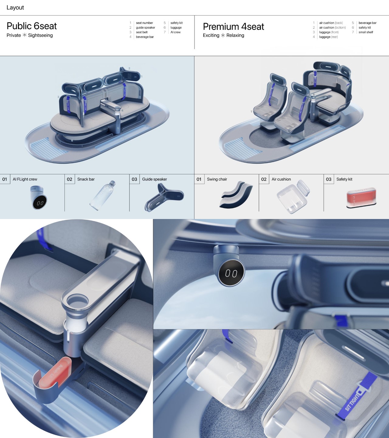
The Linker’s interiors propose an interesting shapeshifting setup too. The eVTOL can sit either 4 people in a traditional car/airplane-style seating arrangement, or seat as many as 6 people in an ellipse facing outwards. The former arrangement would come at a premium, while the latter would be more like a public option, akin to traveling by bus.

The post This public eVTOL seats up to 6 people at a time for the quickest air-taxi rides in the city first appeared on Yanko Design.

A Step Towards Sustainable Personal Care With Upcycled Deodorant

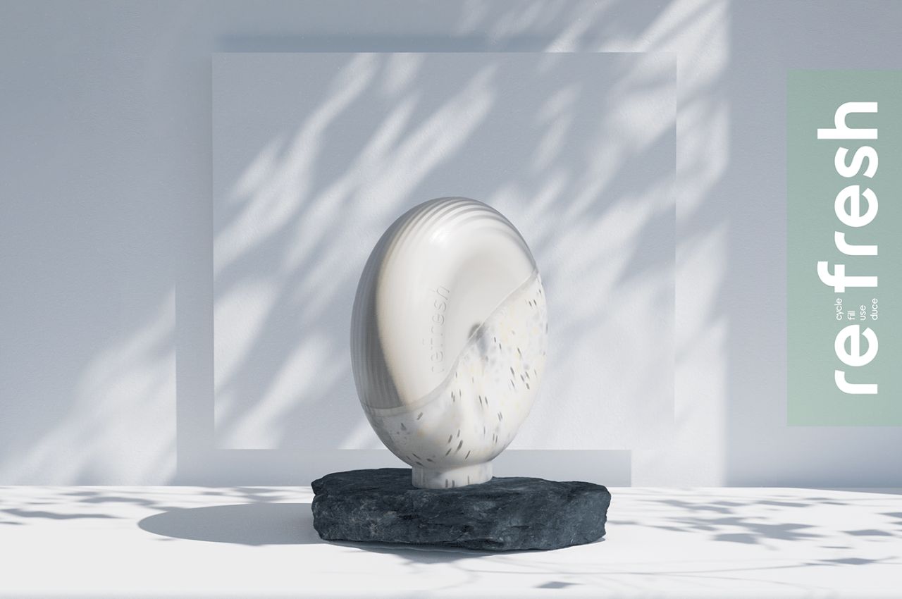
In today’s world, where sustainability is at the forefront of consumer consciousness, innovative solutions that challenge the status quo are celebrated. One such groundbreaking product is Refresh, a sustainable and refillable deodorant that redefines personal care standards while making a significant impact on environmental conservation.

Designer: Elanur Aslan

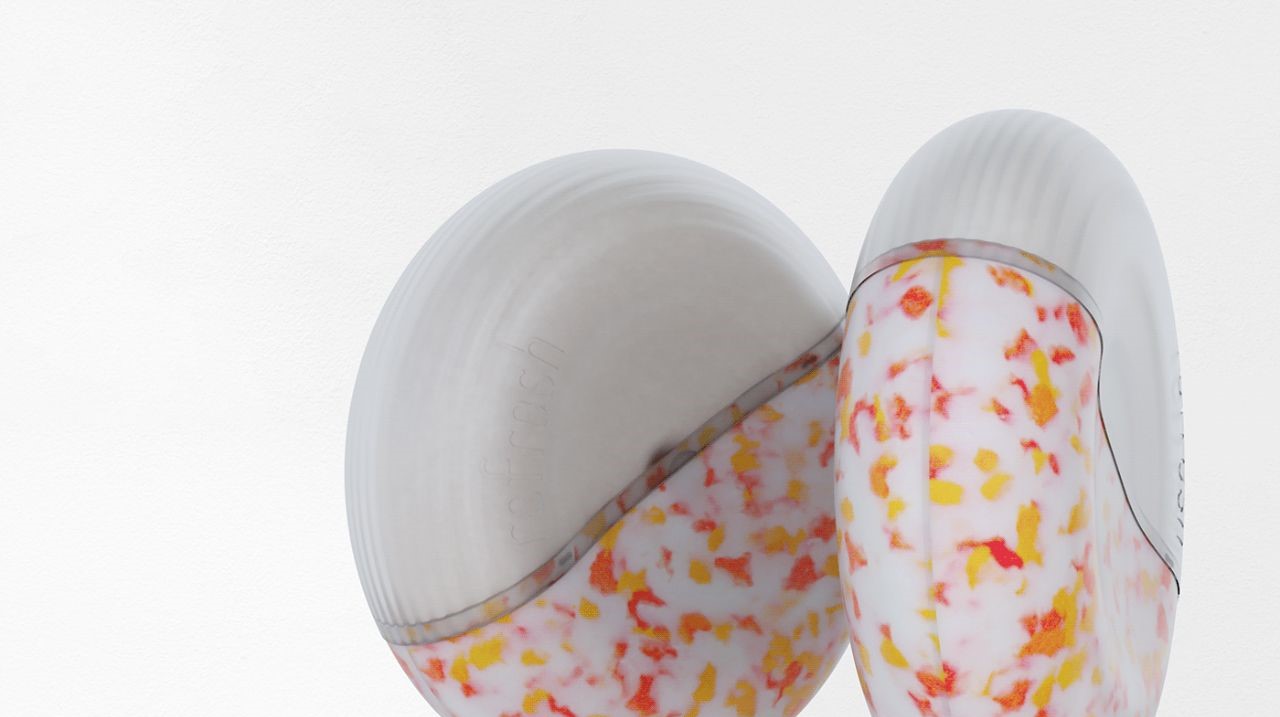
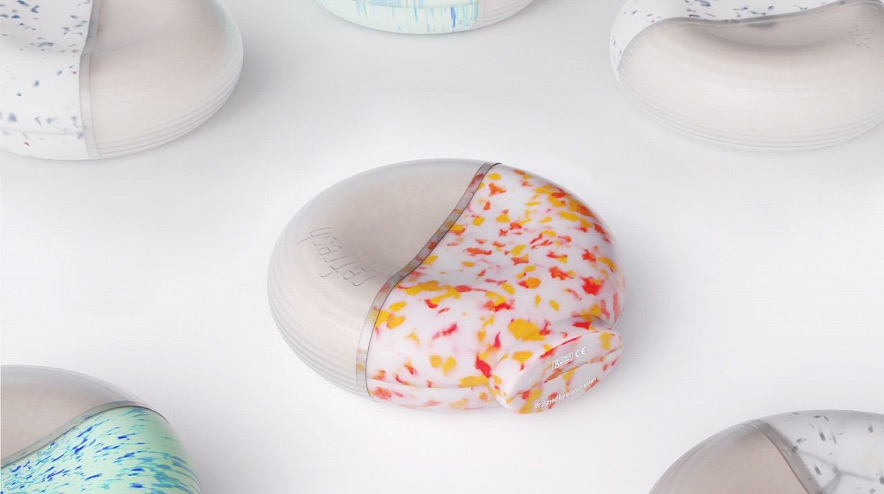
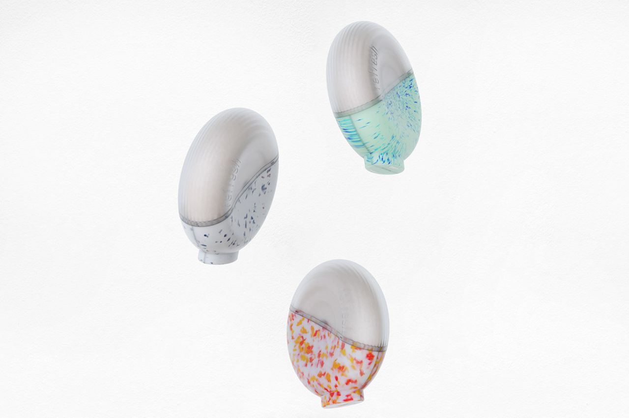
Refresh takes sustainability to new heights by upcycling waste plastics to create its packaging. This ingenious approach breathes new life into discarded materials, giving them a renewed purpose and diverting them from landfills. By doing so, Refresh not only reduces the burden on our environment but also sets a precedent for responsible consumption and production.

One of the standout features of Refresh is its refillable design. The inner chamber of the deodorant is easily replaceable, allowing users to extend the life of the packaging. This simple yet effective innovation curtails the need for new plastic manufacturing, which is a significant contributor to plastic waste in our oceans and landfills. By embracing this refillable concept, Refresh encourages consumers to be part of the solution to the plastic pollution problem.

The ergonomic design of Refresh ensures effortless application, making it a user-friendly choice for those seeking a sustainable alternative to conventional deodorants. Beyond functionality, Refresh’s departure from traditional deodorant packaging exemplifies a commitment to forward-thinking sustainability. It sets a new standard for personal care products, emphasizing that sustainability should be a cornerstone of our daily routines.

In a world where sustainability is a shared responsibility, Refresh is a beacon of hope. By diverting plastics from landfills, this innovative product conserves valuable resources and reduces energy consumption. It embodies the principles of a circular economy, where materials are repurposed and given a new lease on life. Recycling waste plastics through high-pressure compression not only lessens the harm to our environment but also reduces the demand for new plastic production, ultimately reducing our carbon footprint.

Refresh encourages us to reshape today for a sustainable tomorrow. By choosing to refill and reuse, we contribute to a cleaner and more responsible future. The availability of deodorant refills ensures that the product remains effective for the long term while promoting responsible consumer behaviour.

yanko design images to size – upcycled_deo_sustainable_04

However, Refresh is not just about sustainability; it’s also about aesthetics and functionality. Its sleek lines, innovative use of recycled materials, and ergonomic shape come together to create a harmonious blend of form and function. When you choose Refresh, you’re not only making a statement about your commitment to the environment, but you’re also embracing a product that aligns with your discerning sense of style.

In conclusion, Refresh is a game-changer in the personal care industry. It sets a new standard for sustainability by upcycling waste plastics, promoting refill and reuse, and offering a product that combines aesthetics and functionality. By choosing Refresh, you’re not only making a responsible choice for today but also investing in a cleaner, more sustainable future. It’s a reminder that sustainability should be at the heart of every product we use and every choice we make.

yanko design images to size – upcycled_deo_sustainable_05

The post A Step Towards Sustainable Personal Care With Upcycled Deodorant first appeared on Yanko Design.

How the Schools and Classes of The Future Merge Tech with Hands-on Learning

In today’s digital age, children are growing up with a deep familiarity and comfort in both the real and virtual worlds. As technology continues to evolve and become more pervasive, there is an opportunity to enhance traditional teaching tools with virtual reality (VR) devices. SQUASHY, a groundbreaking virtual reality wearable device for children, aims to bridge the gap between the digital and physical realms, offering a transformative formative education experience. By stimulating the five senses, SQUASHY replaces traditional teaching aids and introduces an exciting and immersive approach to learning.

Designer: Eunhye Sim

The application of virtual reality and digital technology opens up new possibilities for education, providing children with a broader and more captivating learning experience. SQUASHY recognizes that while digital education offers convenience and accessibility, it is essential to preserve and complement the unique aspects of reality-based education. The device seamlessly integrates virtual and physical worlds to provide a comprehensive educational experience that sparks curiosity and fosters engagement.

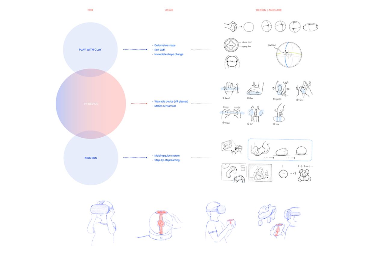
SQUASHY acknowledges the invaluable role of hands-on learning and the tactile experiences that traditional teaching aids offer. Clay, as a symbol of formative education, has the power to stimulate children’s creativity and imagination. With SQUASHY, children can experience the multidimensional nature of formative education by transforming virtual clay into desired shapes using their hands. By combining the freedom of self-expression with systematic guidance, SQUASHY empowers children to explore various formative gestures and processes.

Understanding the importance of comfort and accessibility, the creators of SQUASHY have taken into consideration the average hand size of 6-year-old boys and girls. The device’s size allows children to hold it effortlessly, regardless of whether they use one or both hands. This ergonomic design ensures that children can fully engage with the device, maximizing their learning potential and enjoyment.

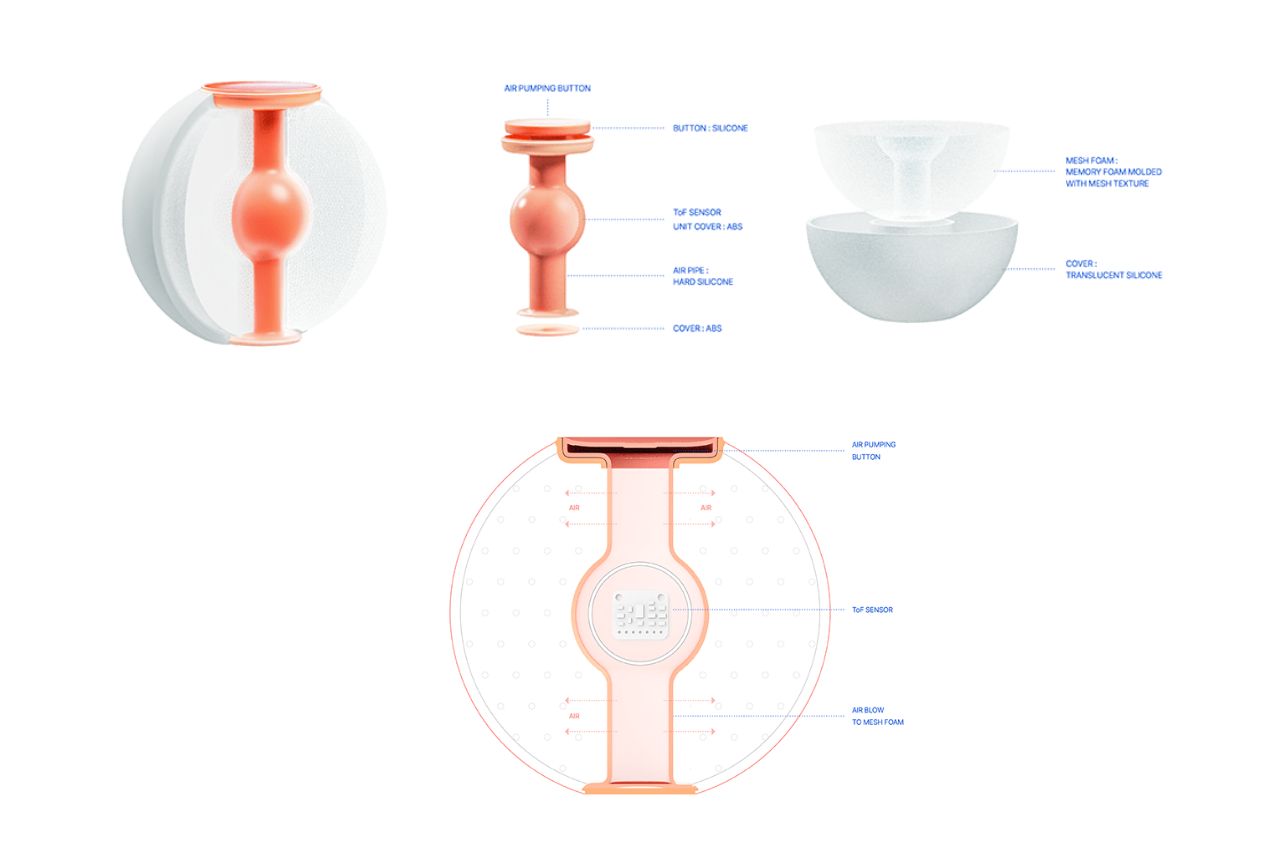
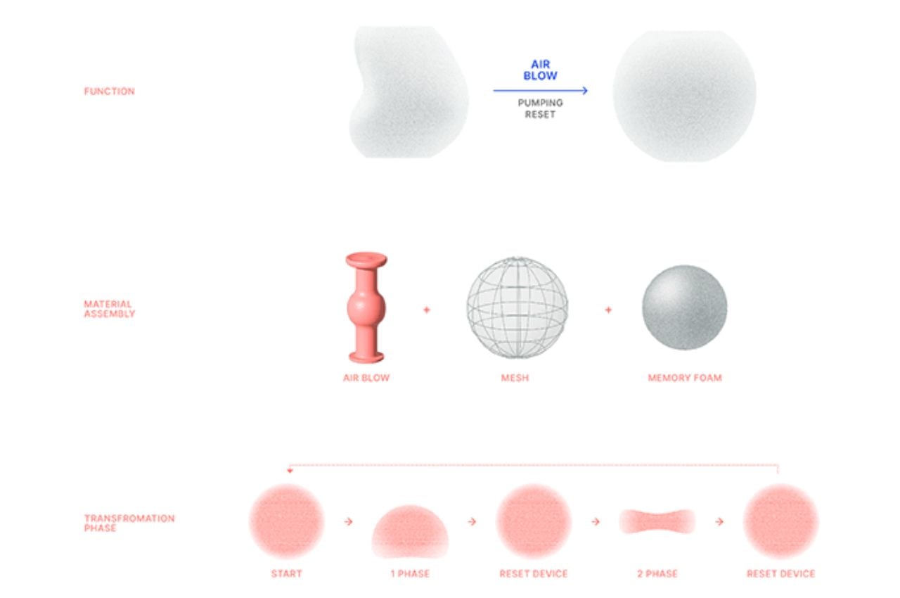
SQUASHY’s training program offers a diverse range of forms for children to complete. With the guidance provided, they can learn step-by-step formative processes and gestures. The device incorporates a Time-of-Flight (ToF) sensor within its silicon column, which recognizes the user’s hand motions to deform the virtual clay. Should the device lose its shape, a simple press of the top reset button restores it to its original circular form. This interaction is made possible by the integration of memory foam and an internal air blow device.

Charging SQUASHY is a hassle-free experience thanks to its magnetic coupling cradle. When the device is placed on the cradle, it securely connects and charges. Additionally, the cradle doubles as a Bluetooth pairing hub, allowing the VR device and SQUASHY to pair effortlessly. This functionality ensures that children can carry SQUASHY with them without the need for any further operations on the device itself.

One of the remarkable features of SQUASHY is its ability to bridge the gap between the virtual and real worlds. Children’s virtual modeling data can be 3D printed, enabling them to hold their creations in their hands and experience a tangible sense of accomplishment. This seamless integration of digital data with physical objects adds a new dimension to their learning journey, further enhancing their satisfaction and sense of achievement.

While SQUASHY offers convenience and state-of-the-art technology, it lacks the importance of children interacting with real materials in a natural manner. By introducing textures and encouraging the use of SQUASHY in conjunction with traditional craft lessons in schools, children can enjoy the best of both worlds. They can explore the convenience and creativity of virtual reality while still experiencing the tactile nature of real-world materials.

SQUASHY represents a transformative shift in children’s formative education, combining the immersive capabilities of virtual reality with the physicality of real-world experiences. By stimulating the five senses and seamlessly integrating digital and analog learning, SQUASHY offers a holistic educational approach. With its intuitive design, tailored size, and convenient features, SQUASHY empowers children to unleash their creativity, explore diverse forms, and embark on a captivating educational journey that prepares them for the evolving digital landscape while preserving the unique qualities of reality-based education.

The post How the Schools and Classes of The Future Merge Tech with Hands-on Learning first appeared on Yanko Design.

Small Homes Could Benefit From This Cleverly Designed Ottoman Stool with a Built-In Storage Shelf

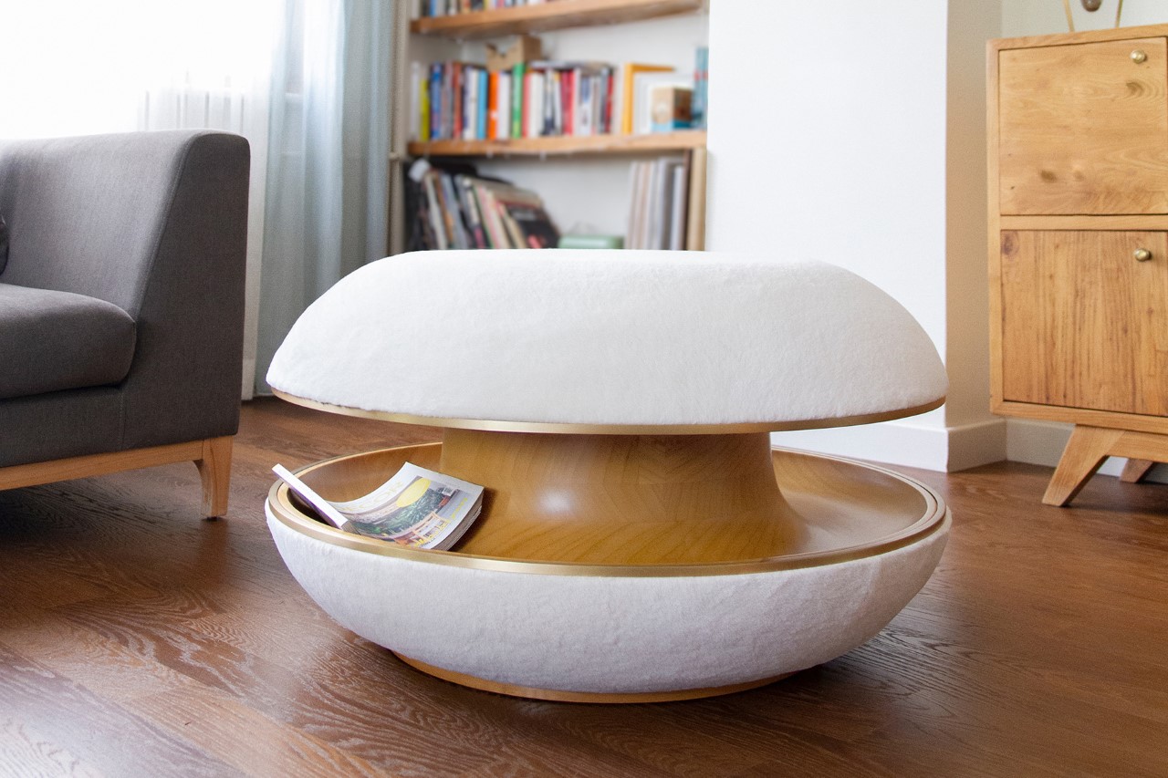
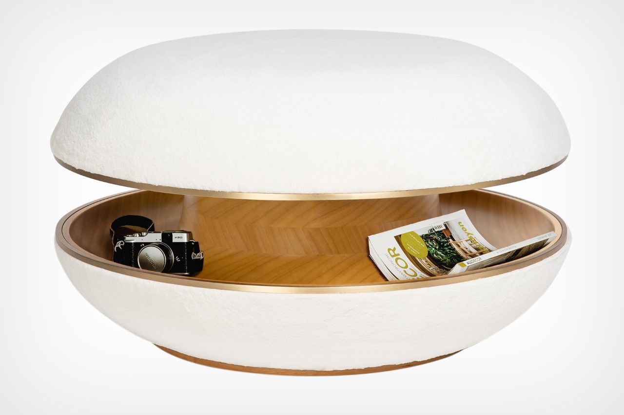
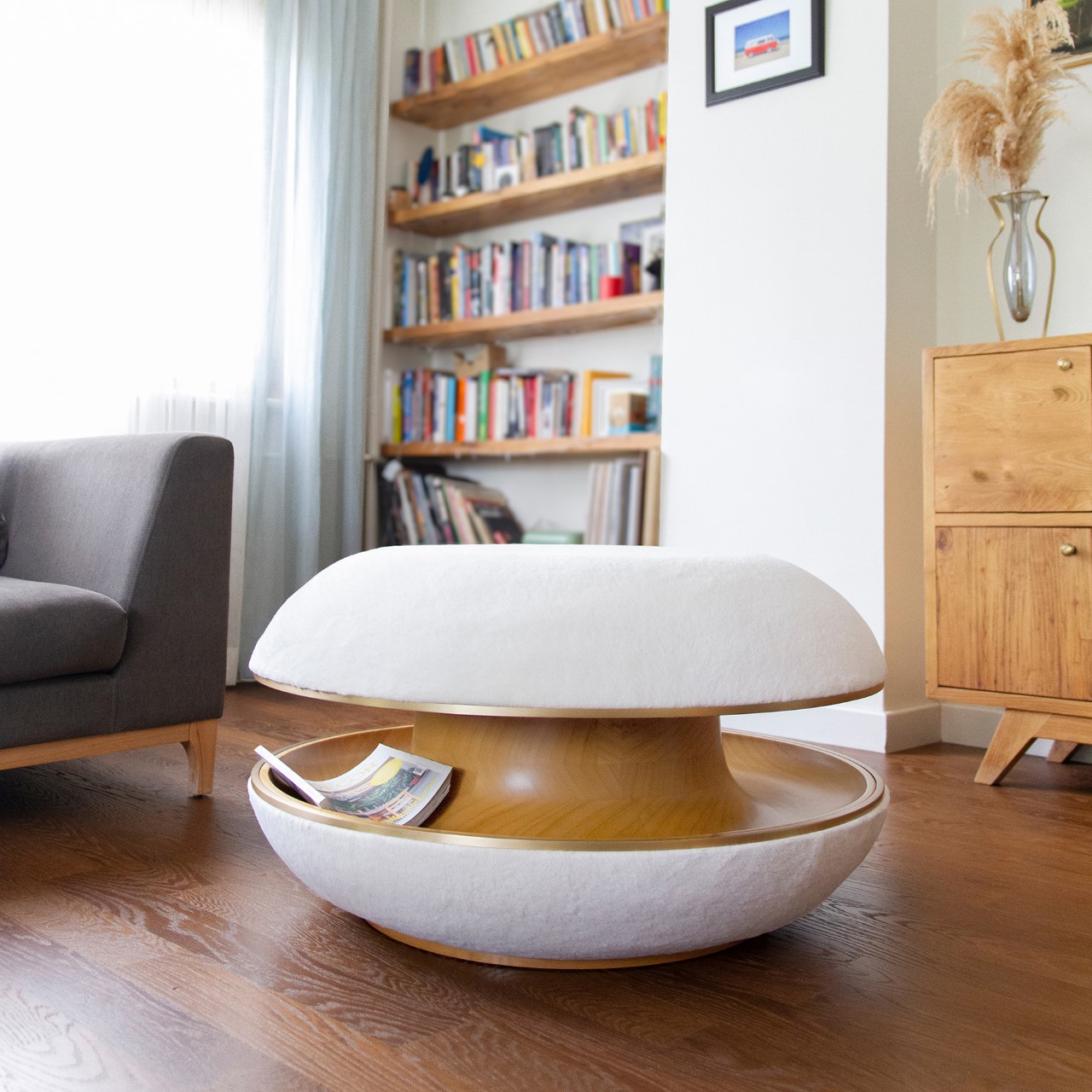
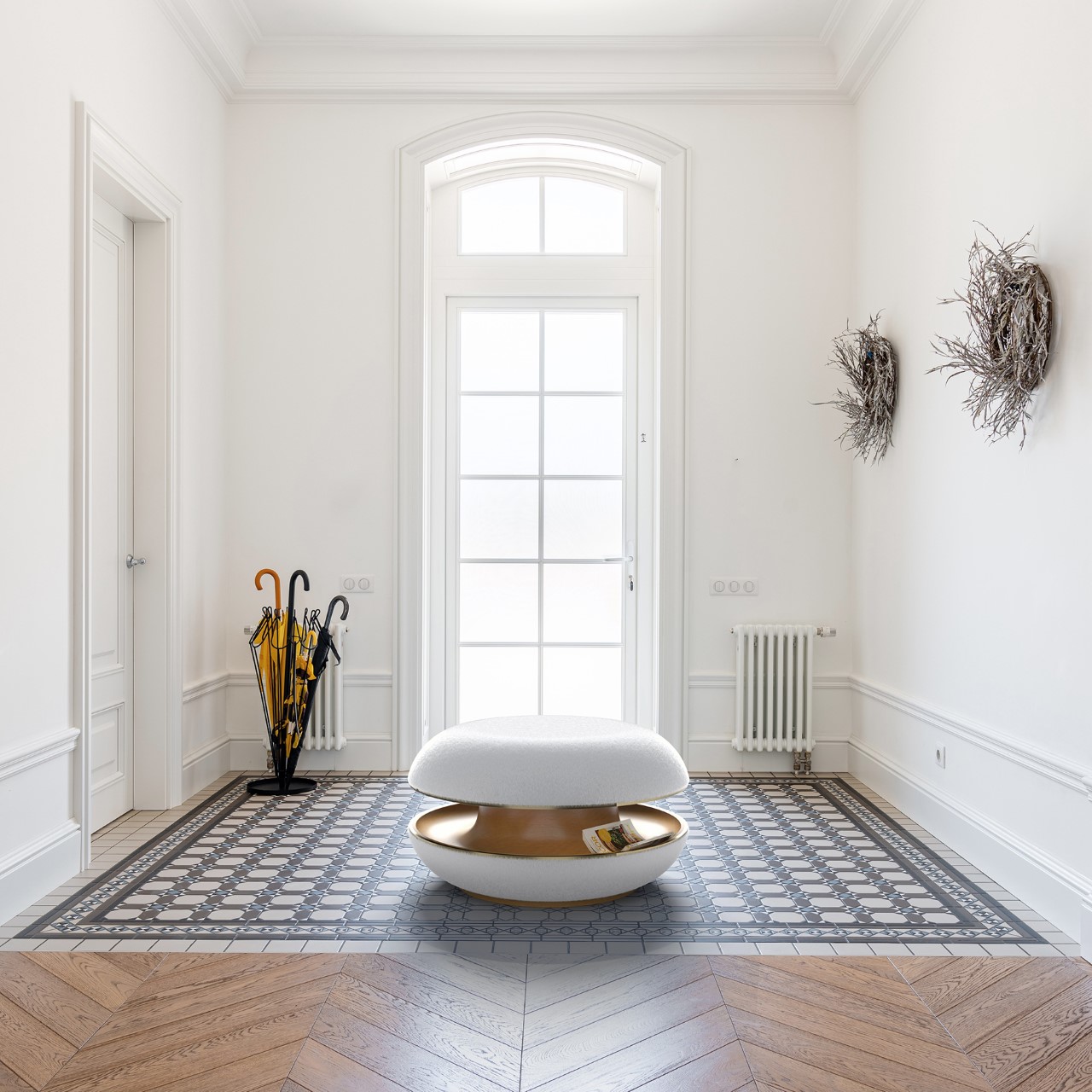
I’m not one to advocate for folding furniture because they look incredibly utilitarian (unless it’s the Transformer Table), but I definitely love furniture that’s multifunctional. Take the Berliner Pouf for example. Designed to look like a visually eye-catching pouf, the Berliner also doubles up as a storage shelf thanks to its wormhole-like cavity running through the middle. This cavity doesn’t affect the pouf’s comfort in any way, but it adds a unique feature to it, giving you the perfect place to store books, magazines, and remotes, or even use it as a lounging space for small pets!

Designer: Tugce Sonmez Evin

“In today’s housing or workplace understanding, space is a thing that we all want to save. Instead of filling each void with another object, we all seek smart solutions to save some unaccompanied space for a feeling of comfort. Berliner is designed for this purpose,” says the Berliner’s designer, Tugce Sonmez Evin.

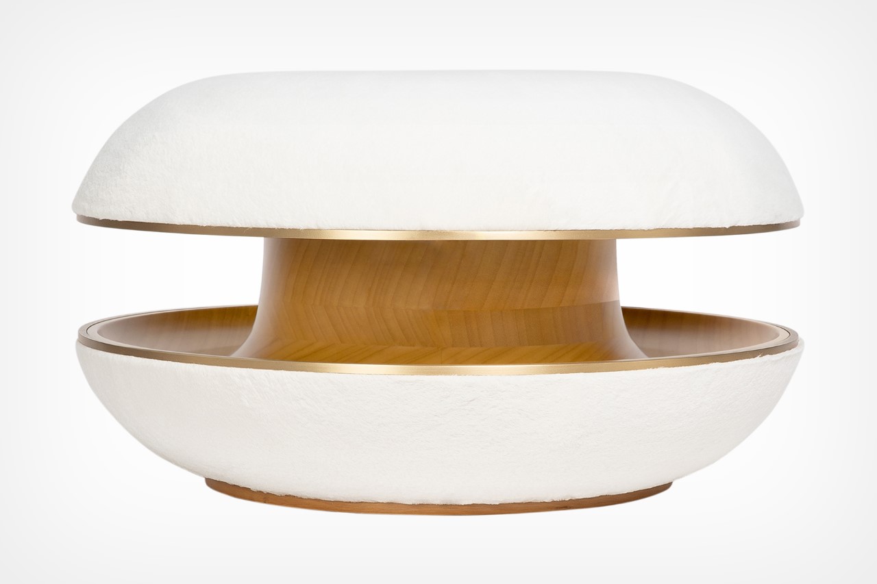
The Berliner gets its name from its resemblance to the eponymously named iconic German pastry, which also has a slice running through its center that’s then filled with cream. The Berliner Pouf replaces that with a concave inner surface, spacious enough to store reading material like books, magazines, newspapers, or even regular living room items like chargers, pet toys, etc.

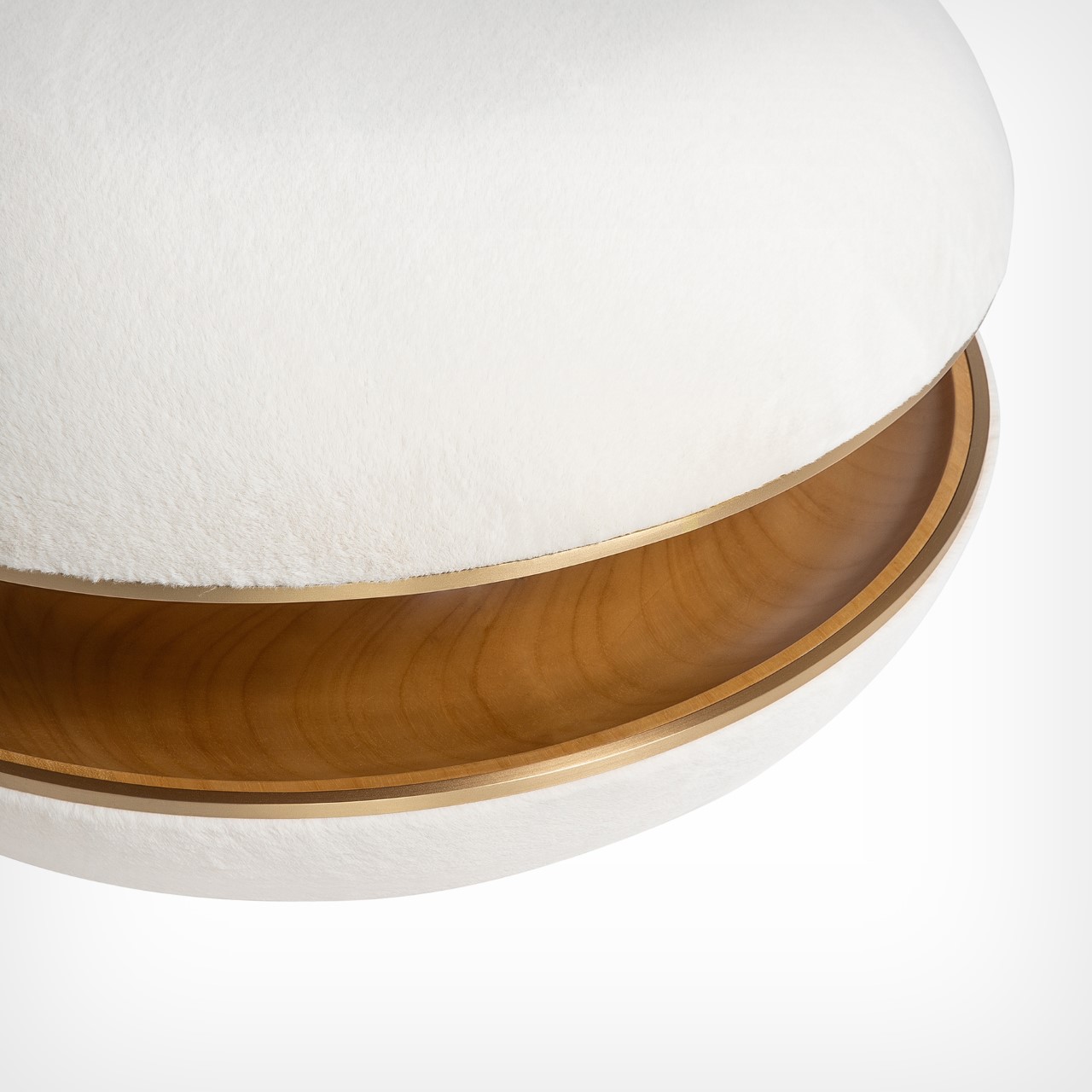
The Berliner Pouf can be visually divided into its two distinct parts. The soft outer, and the wooden interior. The wooden core is hand carved on a turning lathe from Ayous timber, and is layered with foam on the top and bottom, that’s then capped with faux fur for a comfortable seating experience. The area separating the wood from the fur is lined with brass detailing, giving the pouf a touch of elegance. The brass rings are bent by hand and welded to fit tight. All production is a close collective work of 3 ateliers working with different materials. While the initial production is finished by hand, the design is suitable to be produced by CNC machines.

The Berliner Pouf is a Silver Winner of the A’ Design Award for the year 2023.

The post Small Homes Could Benefit From This Cleverly Designed Ottoman Stool with a Built-In Storage Shelf first appeared on Yanko Design.

This foldable “Venus of Willendorf” inspired chair literally puts you in the lap of art history

The Venus of Willendorf is a significant figure in art history since it is thought to have been created between 30,000 and 25,000 BCE, making it one of the world’s oldest known works of art to have been discovered.

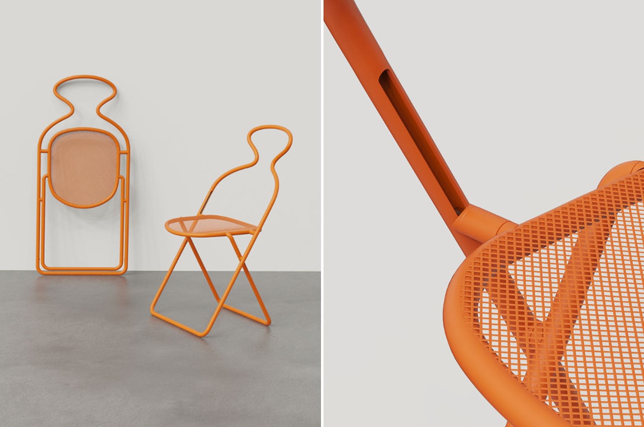
Furniture design is an art that seamlessly merges aesthetics with functionality. The Venus Folding Chair, with its gorgeous design and usefulness, is an excellent example of this idea. This foldable chair not only provides a cozy seating option but also gives any room a sense of style and history. The Venus Folding Chair, which was created with great care and attention to detail, stands out as an example of how form and function can be creatively combined. Because any chair represents a similar sitting person, allowing people to be comfortable, this figure of a sitting woman can be changed into a chair. It’d be similar to sitting on her lap.

Designer: Lameice Abu Aker and Eva Castany

Rendered on KeyShot: Click Here to Download Your Free Trial Now!

The design and shape of most Venus sculptures are identical. They are often lozenge-shaped, with a large fat belly tapering to the head and legs, and no arms, feet, or face detail. Furthermore, their sexual organs are deliberately exaggerated.

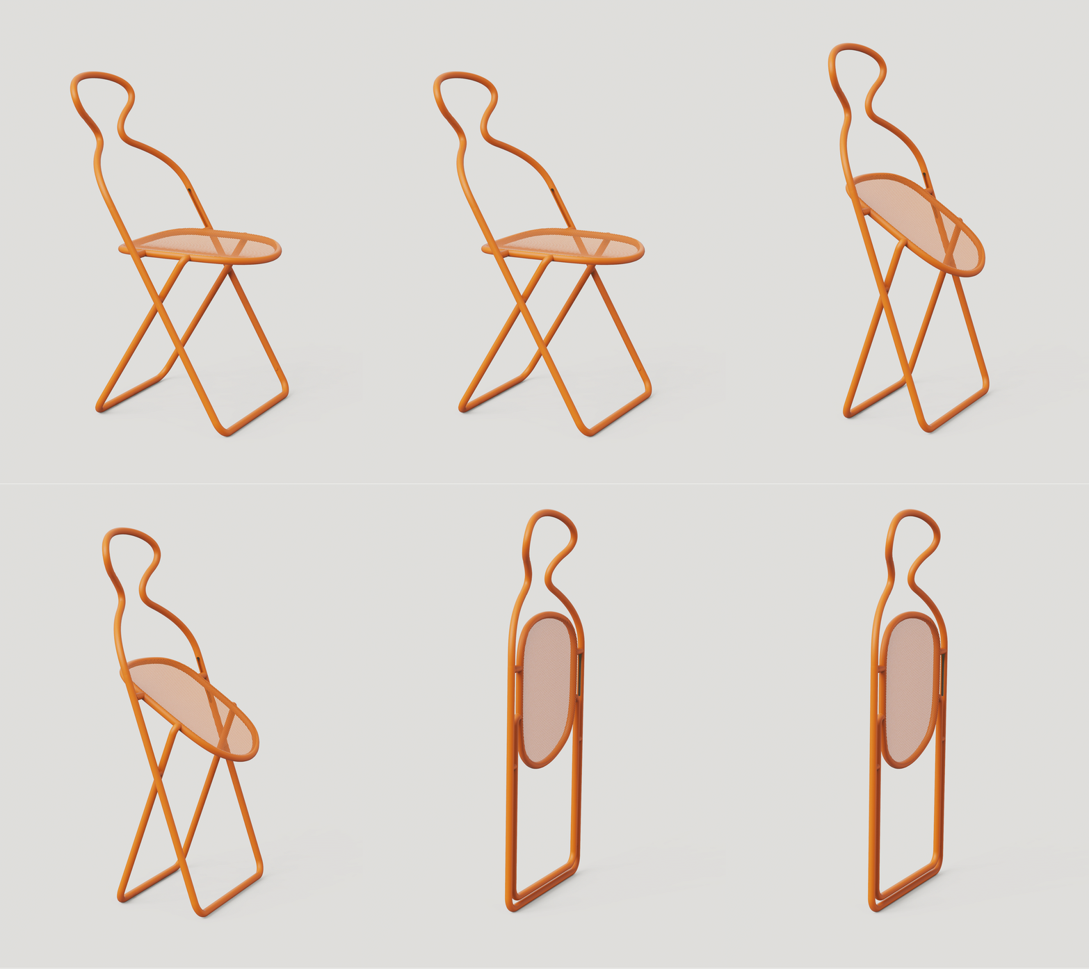
The Venus Folding Chair’s space-saving folding mechanism is one of its most notable characteristics. The chair’s fold-and-store capabilities make it a practical and convenient design. For people with limited room or those who frequently host events or gatherings, this option is especially helpful. A chair is an excellent option for tiny flats, outdoor events, or temporary seating arrangements due to its compact and folding design, which makes storage simple. The form of the figure was outlined by the designer and translated into a chair. It has 2 points of joinery on either side of the chair which have channels for the lower structure to slide upward when the chair is in the folded state.

This creative and simple design can be disassembled very easily into just 4 parts; the mesh seat, the back structure, the front support, and the base.

The chair is a sustainable product on multiple levels. The foldable design can be flat-packed which allows it to be stacked and transported easily. This makes the product transport-efficient and reduces its carbon footprint, allowing more chairs to be shipped in the same amount of space. It can be used around the house as an extra chair as well and can fit in the minimum available space. The single-line nature of the chair makes it even easier to pick up and move around as it has the space to be held all across. Overall, it’s surely a conversation starter and a great pick for history and art buffs who enjoy the evolution and adaptations of classics.

Gif 1

The post This foldable “Venus of Willendorf” inspired chair literally puts you in the lap of art history first appeared on Yanko Design.

These new-generation candles add a calming process to your bedtime routine

Don’t we all fall asleep every night while scrolling through our phones? Attending to all of the notifications received throughout the day feels like a responsibility. However, responding to any of these notifications opens up an entire thread of messages, causing you to lose track of time and fall behind on your sleep routine.

People in the pre-tech era had better sleeping habits. Blue light is harmful to the eyes and affects one’s circadian rhythms (aka sleep-wake cycle) which is why it is recommended that one does not look at any screen till two hours before sleeping in order to have a good and well-rested sleep.

Designer: Pelin Özbalcı

gif 1

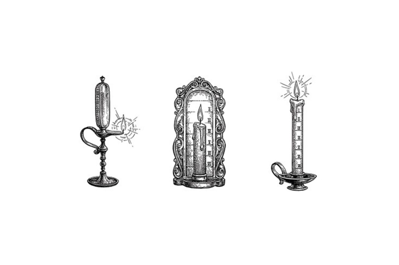
Candles were utilized for purposes other than fragrance in the past. Candle timers are thin candles with evenly spaced markings that, when lighted, represent the passage of time. They also provided a soothing environment to promote one’s circadian rhythms but lacked the ease and dependability of modern technologies. Many people find it difficult merely to lie down and sleep. Our minds are glued to the distractions that the screens offer. We wait till our eyes fatigue and dry out and we can no longer stay awake. This one-of-a-kind method for truly unwinding and relaxing your mind is exactly what you need to incorporate into your everyday sleep regimen.

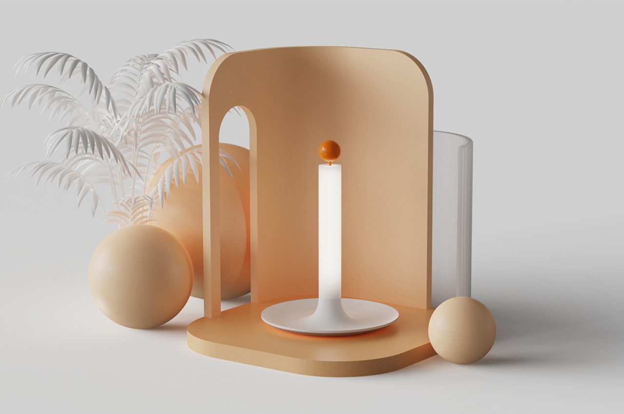
CClock is a modern-day candle timer that incorporates simple mechanic controls while retaining the simplicity and tranquility of traditional candle clocks. This product allows one to reap the benefits without having to worry about running out of wax.

The clock features an adjustable lever and a darkened timer, allowing customers to personalize their experience and adapt it to their preferred ambiance. This keeps a person preoccupied and disconnected from the screen one can zone out and eventually fall asleep by watching the candle burn out. The approach encourages a healthy sleep cycle. However, the use of yellow light as an alternative to the currently recommended white light can be looked into it. Yellow light is better suitable for resting eyes and would improve the peaceful experience by proving beneficial for circadian rhythms.

gif 2

The body of the battery-operated CClock has a sleek and modern appearance and is accented with six orange dots, each signifying 10 minutes of total timer capacity for a maximum of 60 minutes. This allows customers to set their desired relaxation time easily and correctly, with clear and easy indicators that improve usage and convenience.

CClock can also be used as part of the ambient lighting in a room. To illuminate the entire product, flip the lever upwards once it has reached its maximum position and has darkened entirely. This operation will disable the timer and allow the candle to burn completely and indefinitely. This function gives users more freedom in how they use the device by allowing them to switch from timed relaxation to full candlelight as needed.

The design can be upgraded by adding a feature of the sunlight alarm. Sunlight alarms are lights that progressively brighten up at a set time allowing you to gradually experience and wake up as the sun rises. Combining the 2 products would undoubtedly upsell this thoughtful design.
The candle’s framework is intended to be versatile. In addition to serving as a stable platform for the electronic candle and lever mechanism, the base has a small compartment for rings or other small things. This enhanced functionality allows consumers to store jewelry, hair accessories, chains, earphones, or any other valuables while using the device in a convenient and secure location.

The post These new-generation candles add a calming process to your bedtime routine first appeared on Yanko Design.