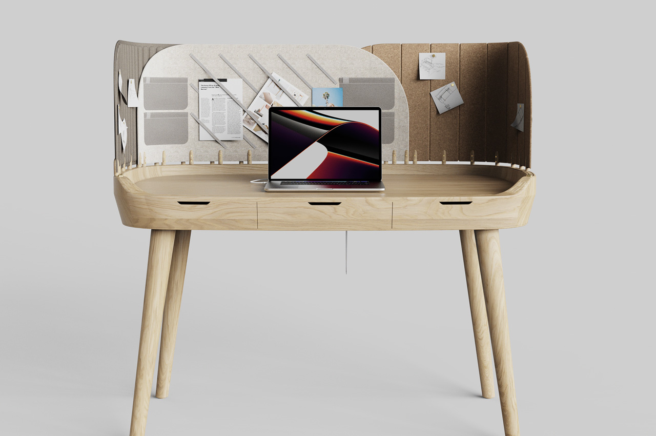
The TABS desk features multiple modular tabs to help you focus on the task at hand + streamline your work process

I spend a substantial amount of my day on my desk, typing away to glory. Most of the time I also end up eating my meals on it! And binge-watching on Netflix as well. And I’m sure that’s the case with most of us, since working from home became the new norm, and our home offices became our new hang-out spots. But having a great desk is really important! Simply a ‘good’ desk won’t do either. A great desk helps us work comfortably and effectively. It puts us in the right mindset, helping us achieve our daily productivity goals and checkmark all the tasks on our to-do list! Not only should our desks be clean, but they should also sport an ergonomic and functional design! And good looks are an added bonus. And finding a desk that does all of the above can be a Herculean task. But worry not, I’ve found the perfect desk for you – the Tabs desk.

Designer: Pelin Özbalcı

Rendered on KeyShot: Click Here to Download Your Free Trial Now!
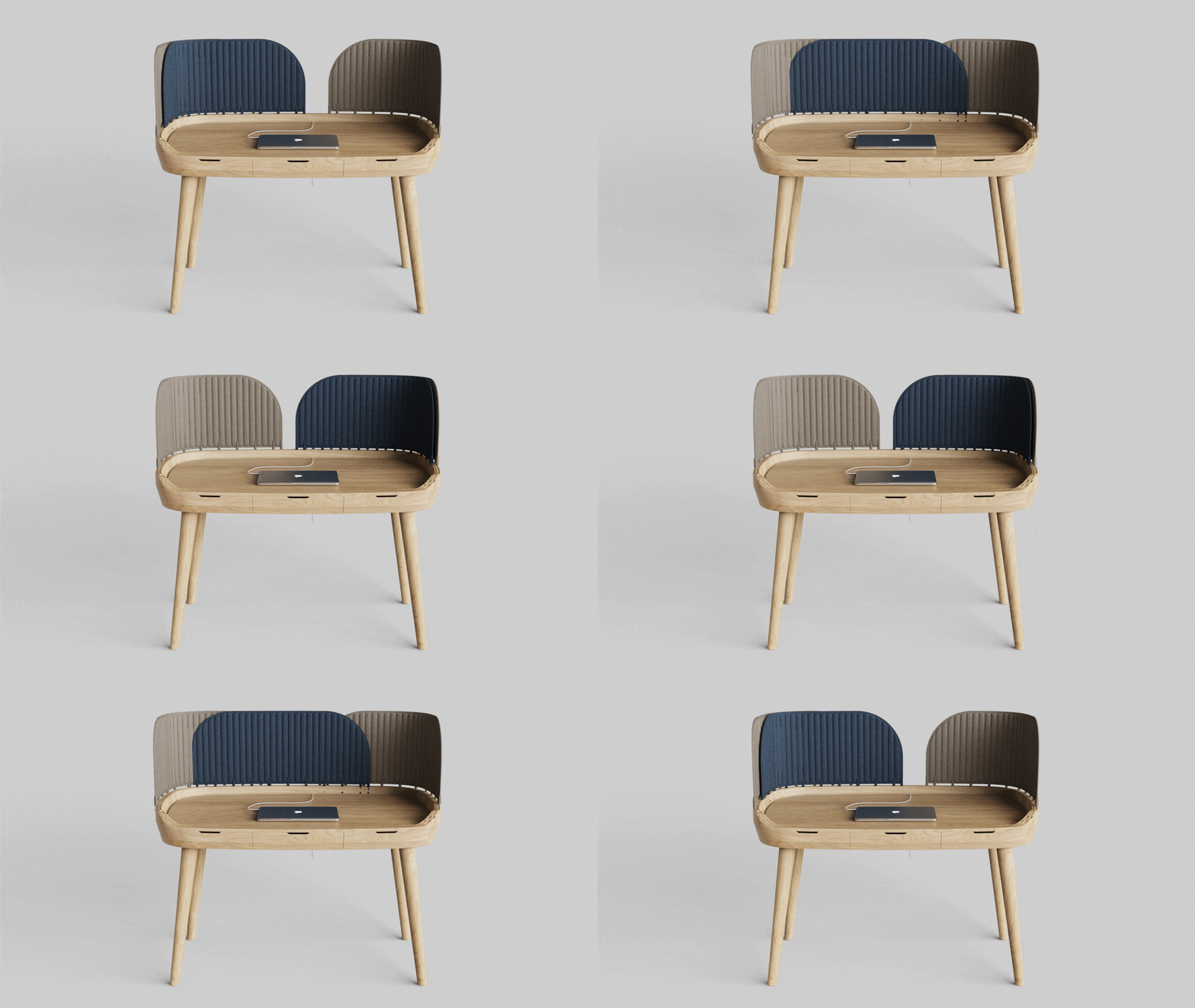
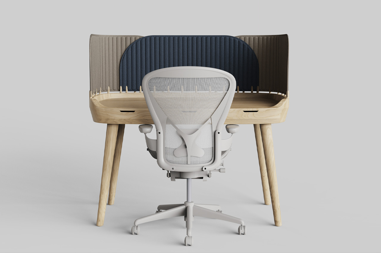
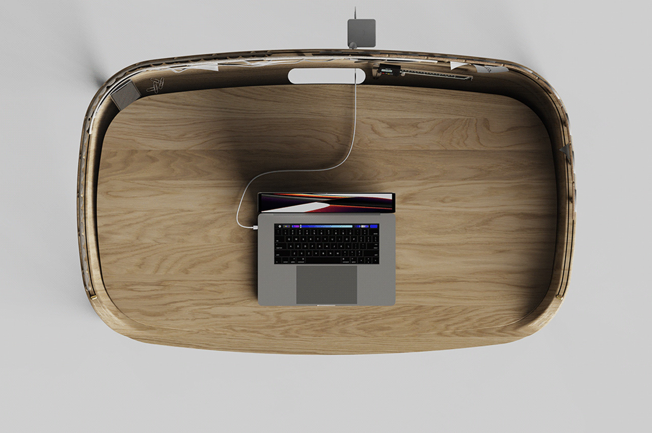
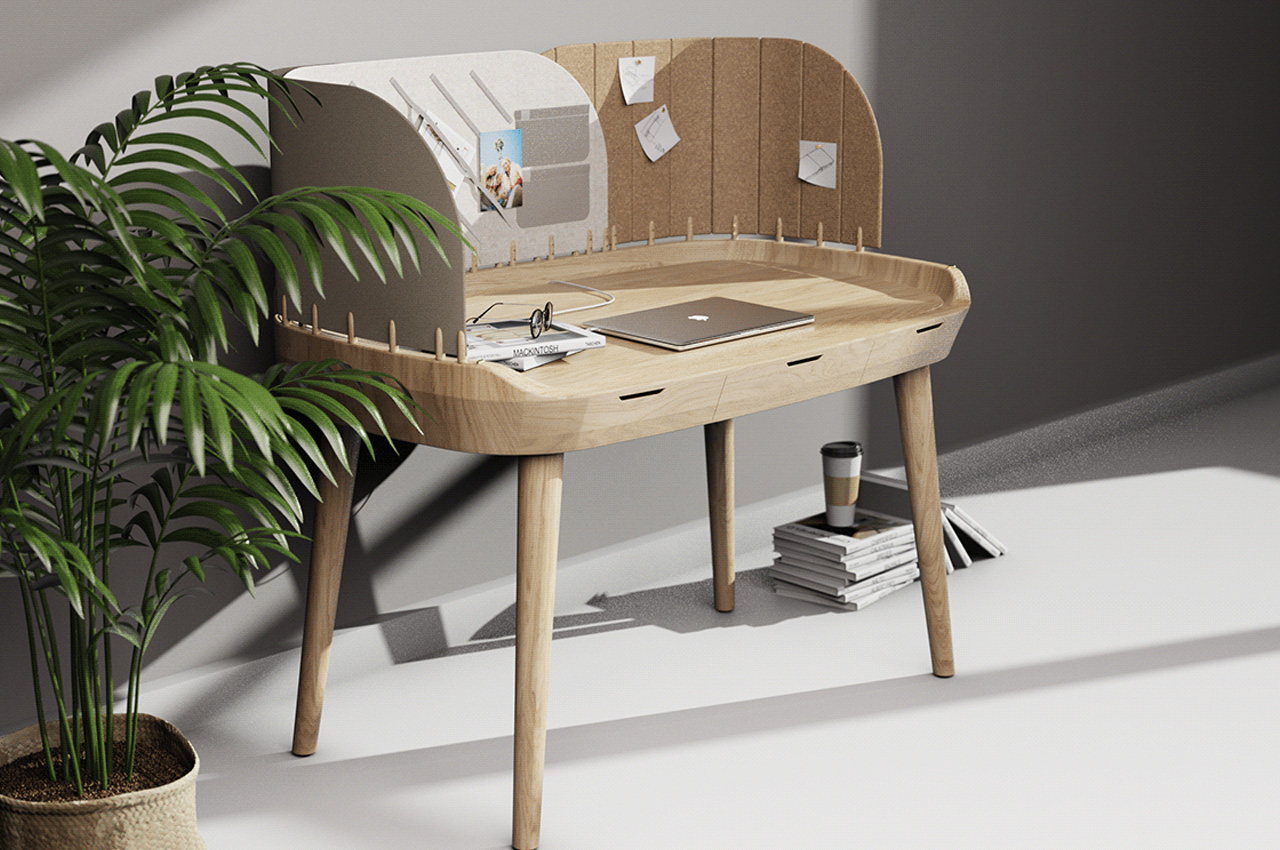
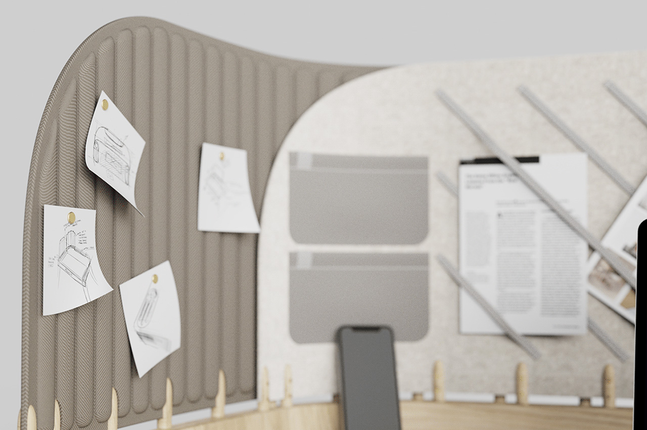
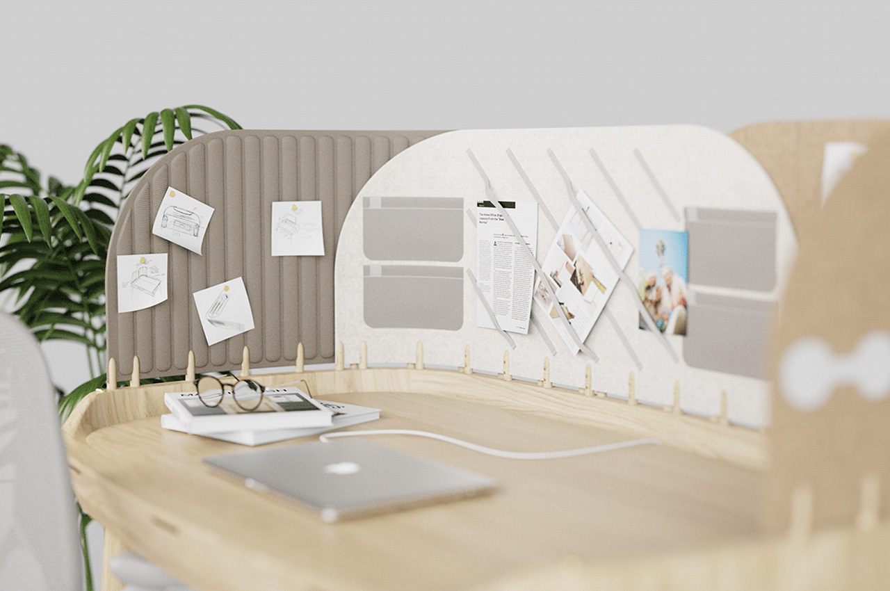
Designed by Pelin Özbalcı, the Tabs desk is designed for those who easily get distracted from their work. In today’s day and age, we are constantly consuming different kinds of content, and media, as a result of which our attention span is declining steadily. We find ourselves consistently procrastinating (the only thing we’re probably consistent at) and find it difficult to pay attention to any task for a long span of time. Much like the Windows tabs on our laptops and computer, the Tabs desk has also been equipped with different tabs. There are three tabs built using three different materials – the Fabric tab, Felt tab, and Cork tab. The tabs have been installed on a double rail system, attached to the table, allowing you to move the modular tabs around.
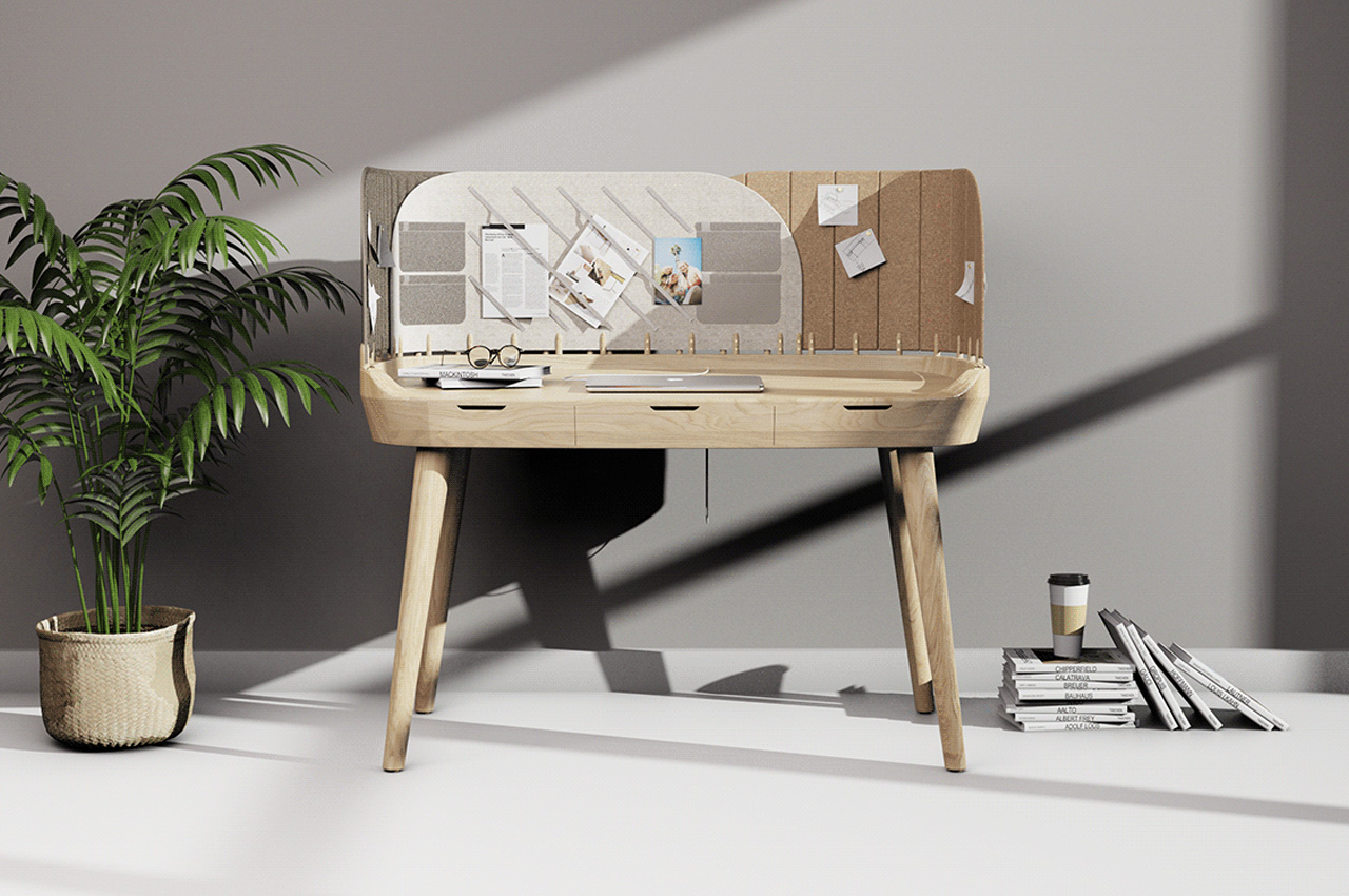
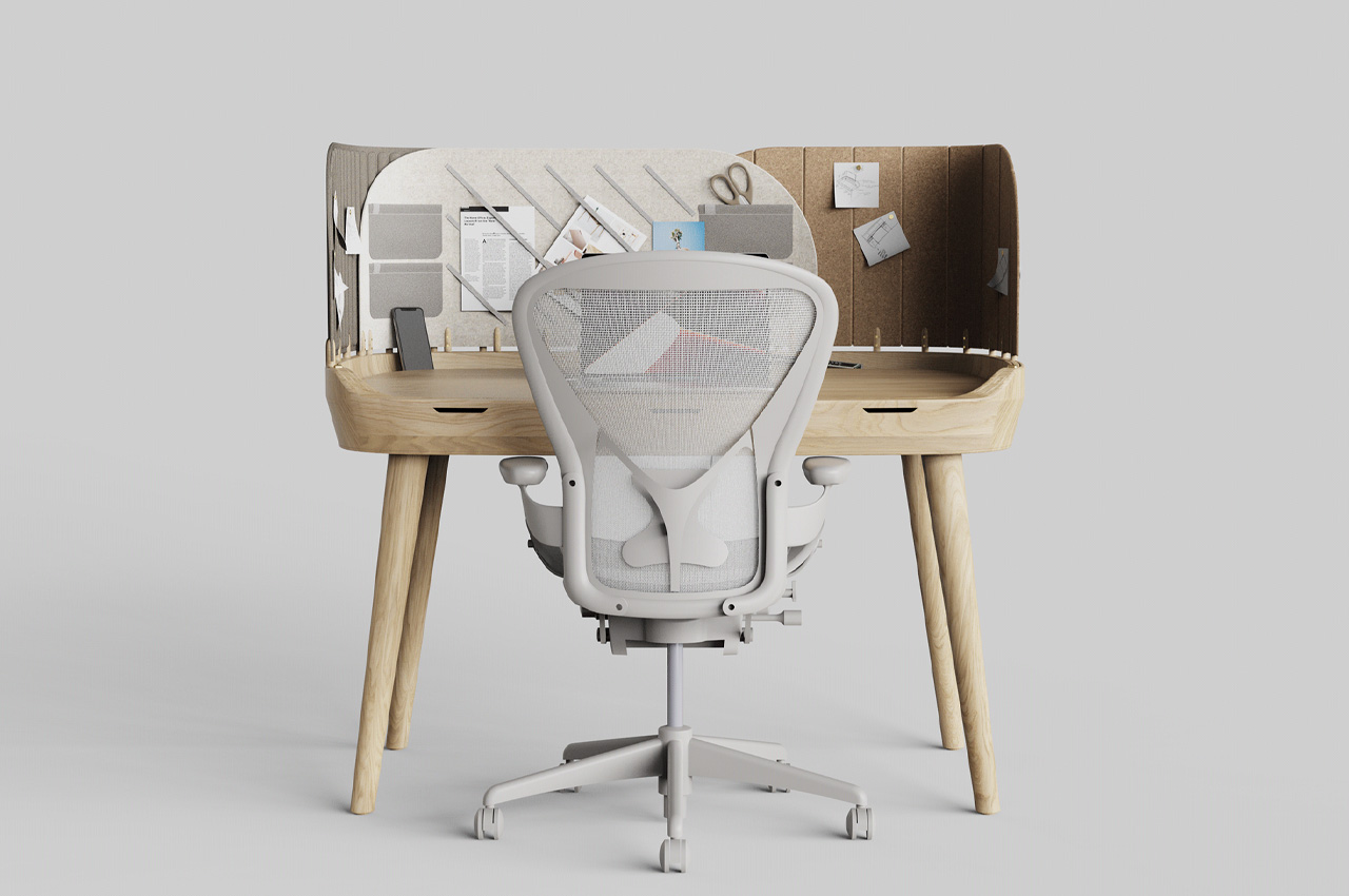
You can use the Fabric and Cork tab with thumbtacks, attaching your important notes and documents to them, while you work. The Felt tab features elastics and pockets which can be used to display notes and documents as well, or to store items. You can move the tabs around, and place the subject you’re working on in the tab in front of you, while the other tabs with tasks that need to be attended to later, can be covered, preventing your attention from fluctuating. Once you finish a task, you can move that tab away, and start working on the next tab. This is an excellent way to help you to focus on tasks one by one, without overwhelming yourself or taking up more than you can handle. This ensures that our work process becomes more streamlined, and focused.
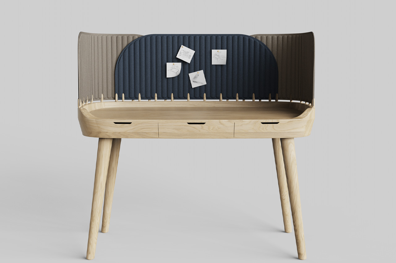
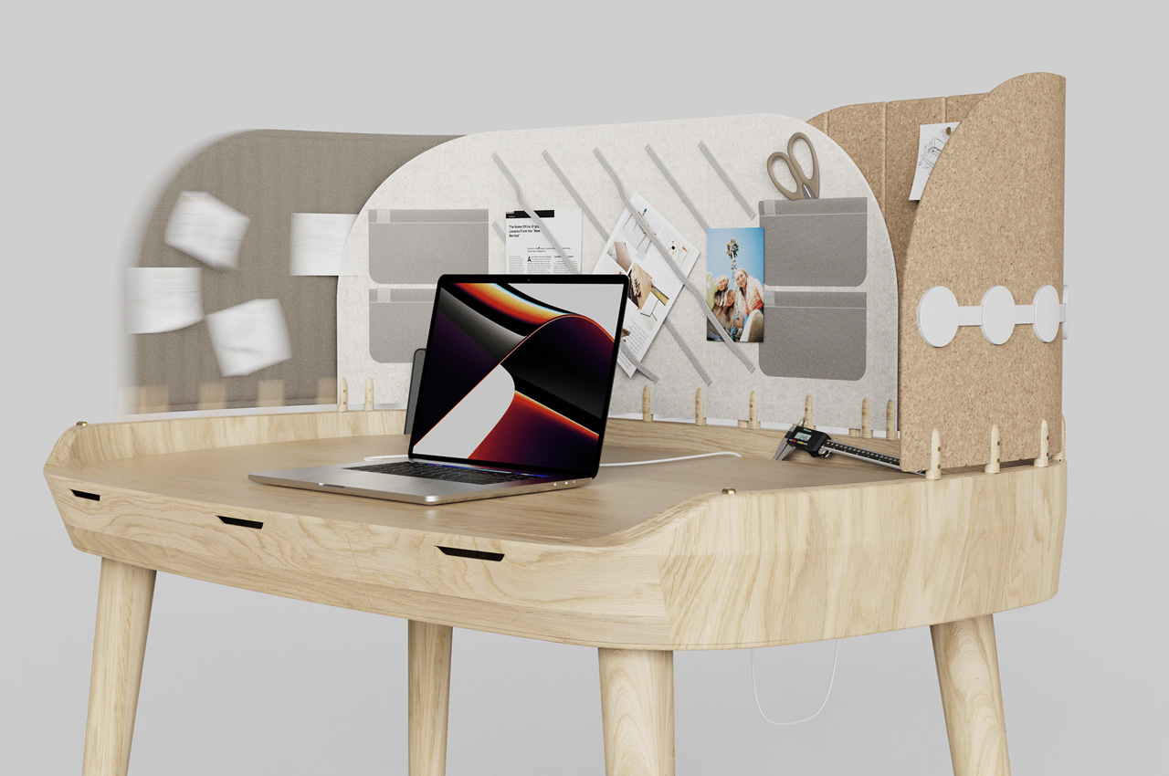
The tabletop of the Tabs desk has been kept quite simple and minimal, although the desk has been equipped with three drawers, below the tabletop. The drawers seamlessly blend into the sides of the table, without standing out.
The post The TABS desk features multiple modular tabs to help you focus on the task at hand + streamline your work process first appeared on Yanko Design.

Coffin Office Chairs: Perfect for Your Dead End Job

Presumably created as a powerful social commentary on how we’re killing ourselves at work, these office chairs were designed to resemble coffins. They do not look comfortable. Still, being uncomfortable is a small price to pay for looking cool when you’re attending the annual vampire conference.

I think the chairs are an interesting juxtaposition because dead in the ground or alive in the office are the last two places I ever want to be. These chairs really spoke to me. And they said, ‘Get out from under this horrid fluorescent lighting, go outside, be free!’ And that’s how I just lost my job. Anybody hiring?

My only real complaint is how little armrest there is. I need thick, cushioned armrests, so my arms don’t hurt. I guess these chairs aren’t about cushioning your elbows, though. They’re about reminding you of the fleetingness of life. Every moment is precious; pet your dogs often – that’s what I got out of this.

[via 9gag]

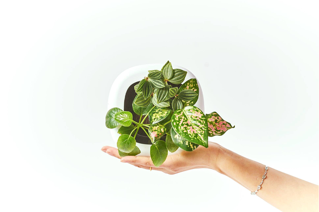
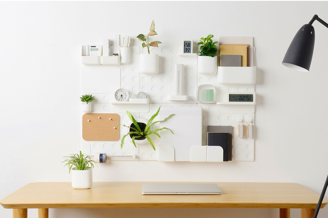
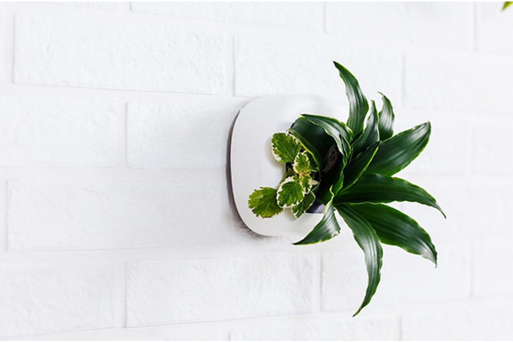
Liven your workspace up with this wall organizer that doubles as a vertical garden!


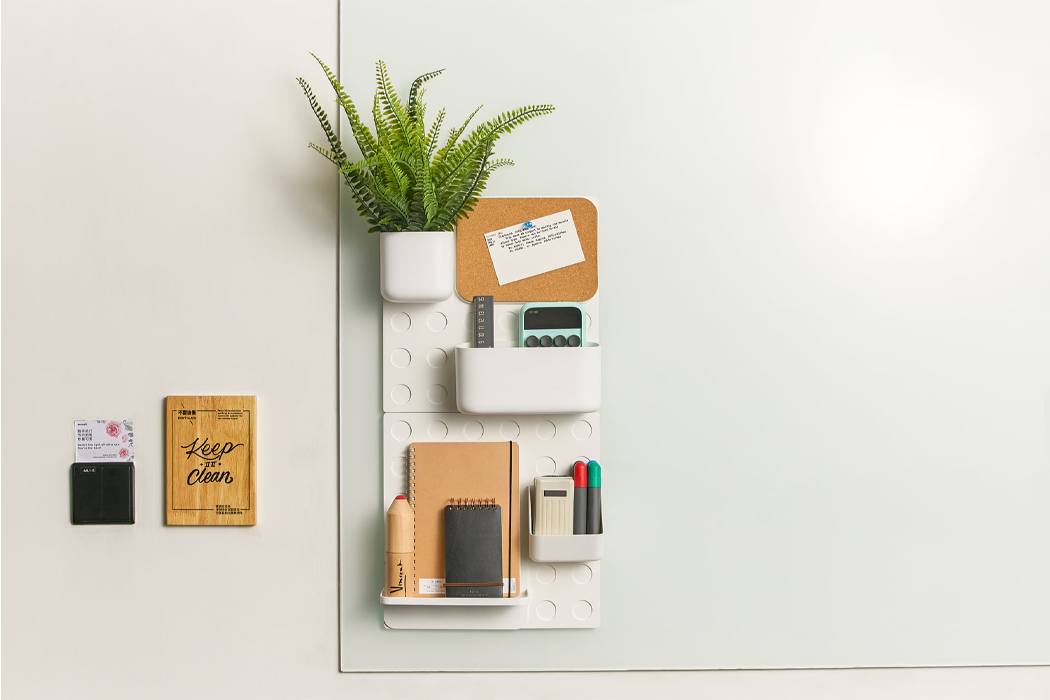
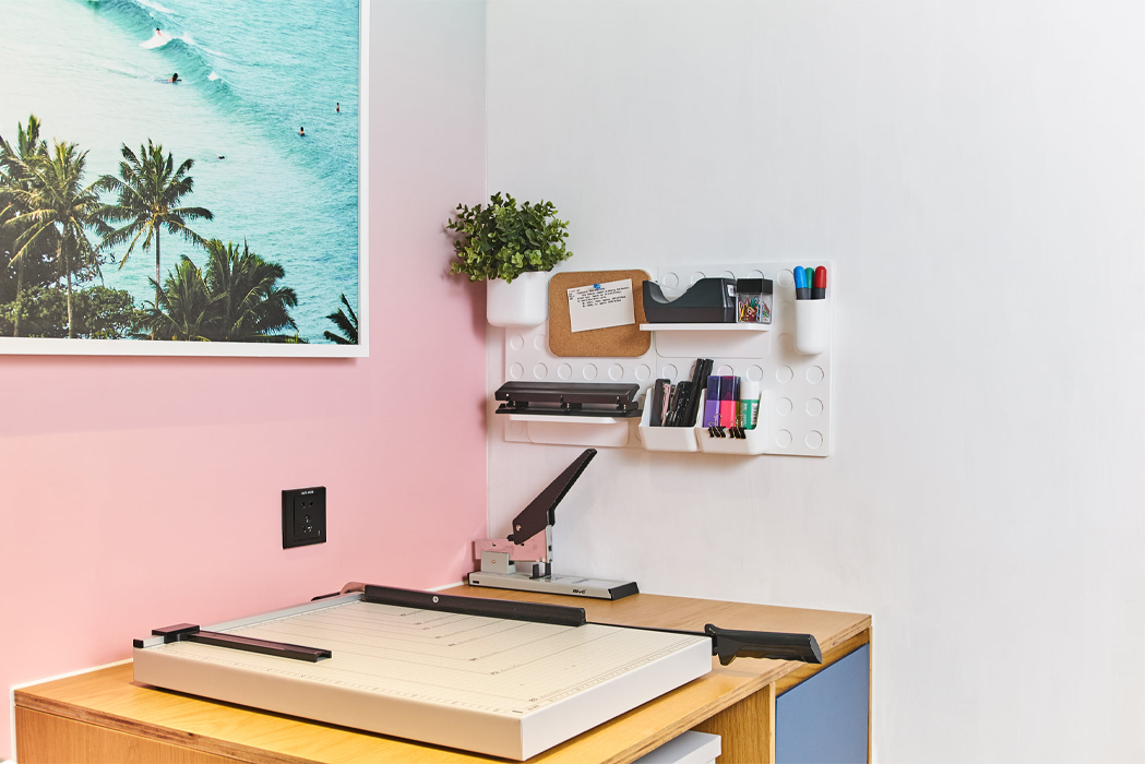
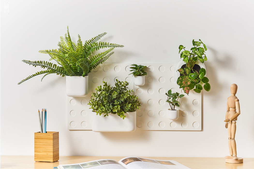
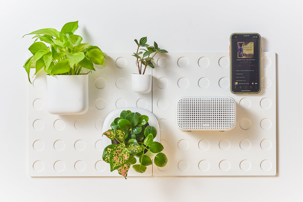
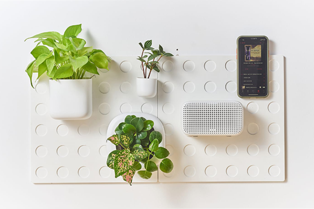
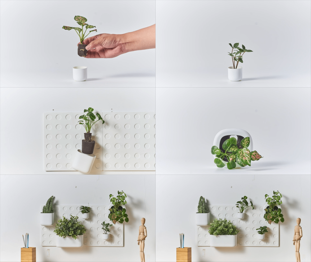
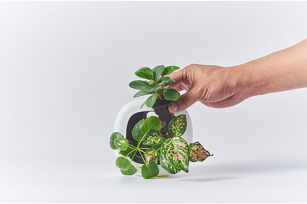
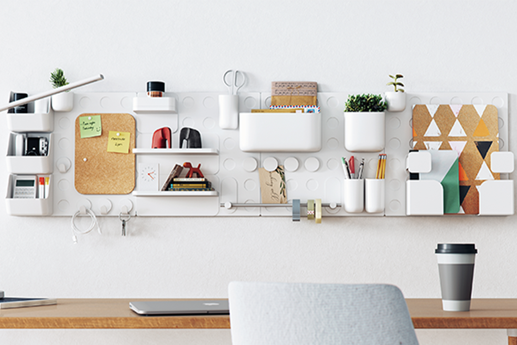
One of Cliclap’s defining features is the vertical garden module that allows the user to secure their own plant into the wall organizer, using one of Cliclap’s pots, and magnetically attach the pot to the grid wall.

Small spaces can get messy quickly and with stay-at-home orders getting reinforced, busy time spent working from home will only increase. We’re all looking for new ways to keep our workspaces decluttered. Cliclap offers one new way to keep tidy by combining home gardening with office organization. Desks and offices get busier and busier as the workday progresses, which might lead to frequent cause for distraction, loss of focus and productivity, and general chaos and confusion. The debut of Cliclap, a modular, office wall organizer, helps take on all that mess by offering countless combinations for magnetic, wall organizers that can easily be mounted to any solid wall or surface.

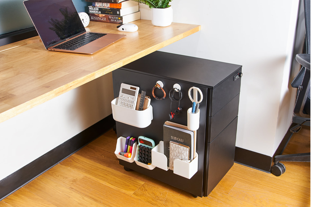
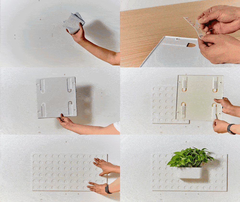
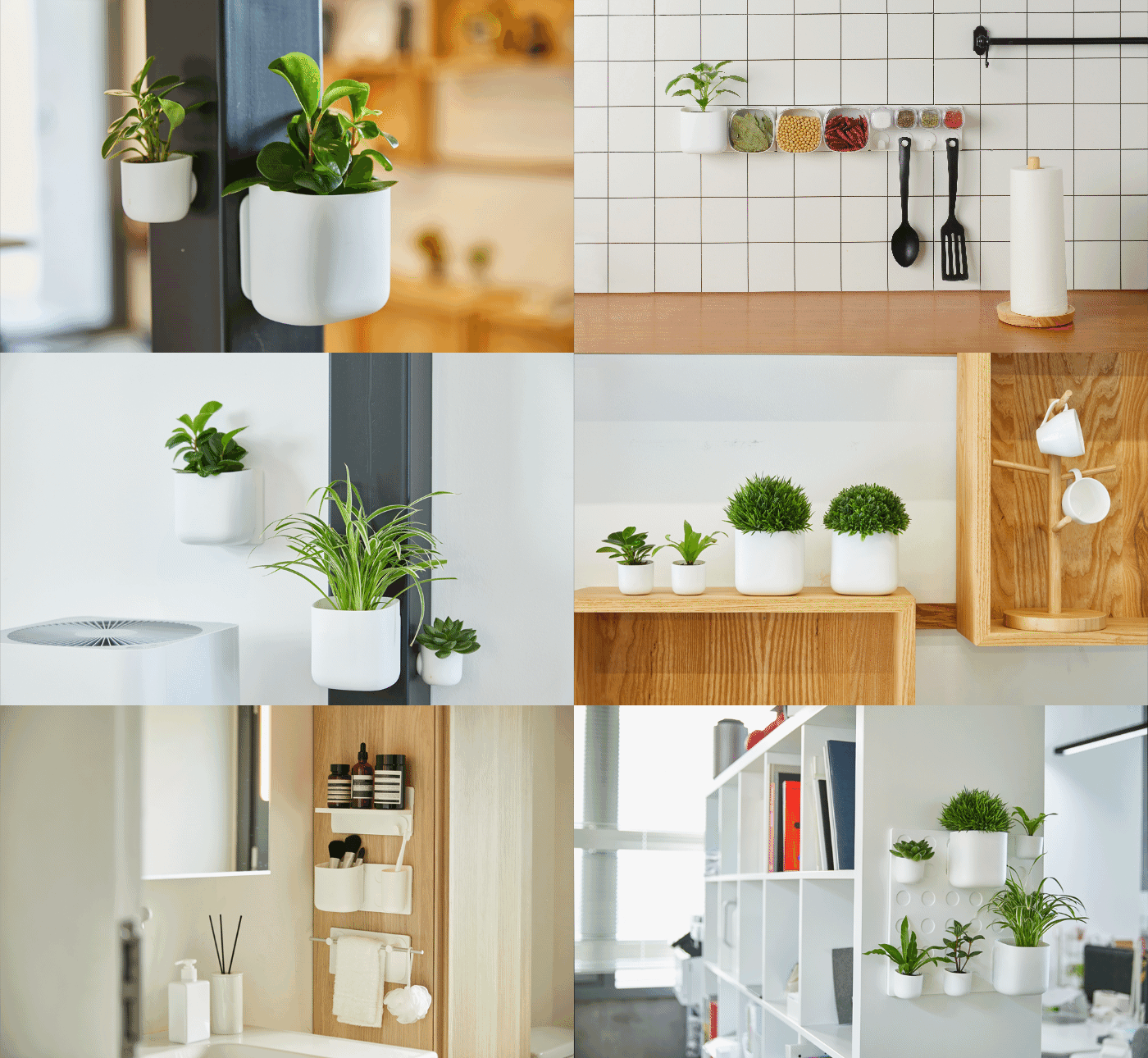
Whether you need organization in your office, bathroom, kitchen, or any other room, all you need is a vertical, firm surface to mount Cliclap and then let your organizational needs figure out the rest. Cliclap comes with adhesive backing, four 3M Command Strips, one in each corner, that attaches onto the preferred wall, and then there are a plethora of varying, magnetic modules to choose from and attach to each wall mount, which carries up to 8 pounds. By incorporating the adhesive backing, users can rest easy knowing that no matter what, their walls won’t be damaged, making this the perfect wall organizer for rented spaces such as apartments or workspaces.

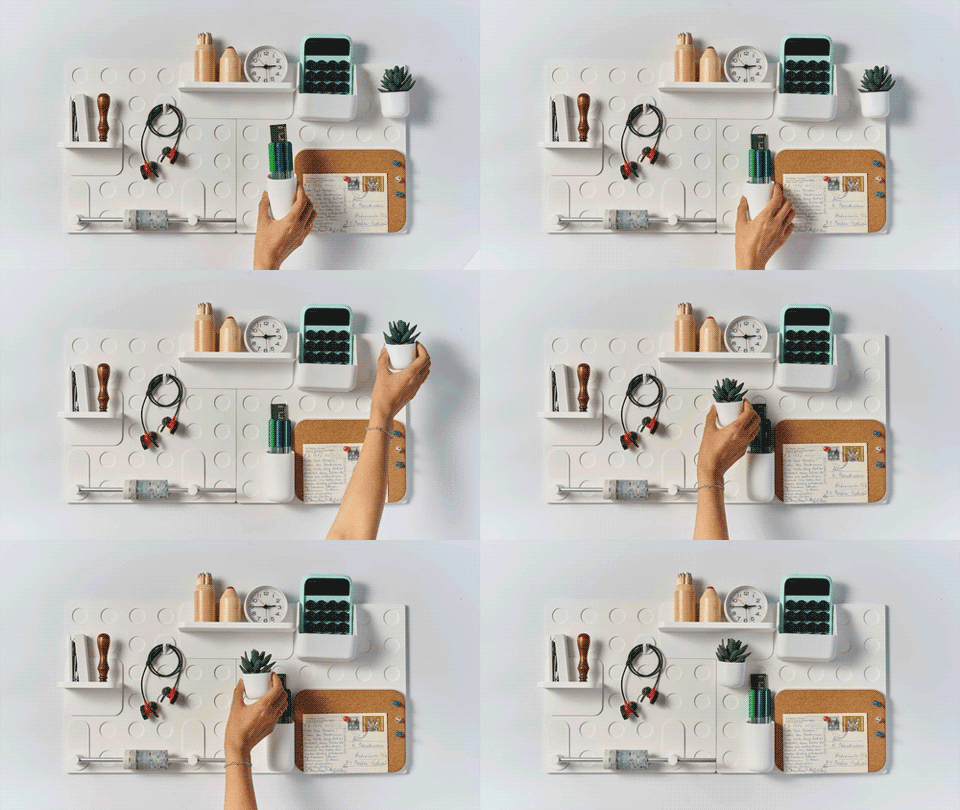
Alternatively, Cliclap can be mounted to any wall by using screws, so if it is a more permanent space, Cliclap can hang as long as you’d like. The magnets, once attached to the accompanying wall mount, can hold up to four pounds each and users can choose from different containers to meet your different organizational needs: clips, hooks, pots, writing pads, cork boards, shelving units, document folders, hangers, and trays are some options.

The optional pots come in five variations, including a planter pot. In order to utilize Cliclap’s vertical garden feature, the designers implemented the use of PAFCAL, an organic and recyclable product made from a combination of sponge and ground matter that essentially replaces messy and muddy plant-soil thanks to the sponge material that absorbs water for the plant’s future and consistent nourishment. By using this type of plant-care, Cliclap made it possible to include vertical gardening as one of the functions for this mess-free wall organizer.

It’s easy to get frustrated with the limits that come with tight corners, but the designers behind Cliclap want to help make the most of them. Cliclap is an alternative to traditional desk storage and it hangs on any surface for the long run. So when it comes to organizing your own small space, whether it’s your woodshop in the garage, your art studio in the backyard shed, or your home classroom, Cliclap won’t take up any room on the floor or prime real estate on the desk, or any more than it has to – just that blank space on the wall no one’s using anyway.

Easily mount your Cliclap with 3M Command™ Strips, and then remove your wall grids at any time without leaving any marks!
Designer: Cliclap x Innova


stay goodbye to cluttered pen stands, table clocks and sticky notes – this ultimate desk organizer has it all!

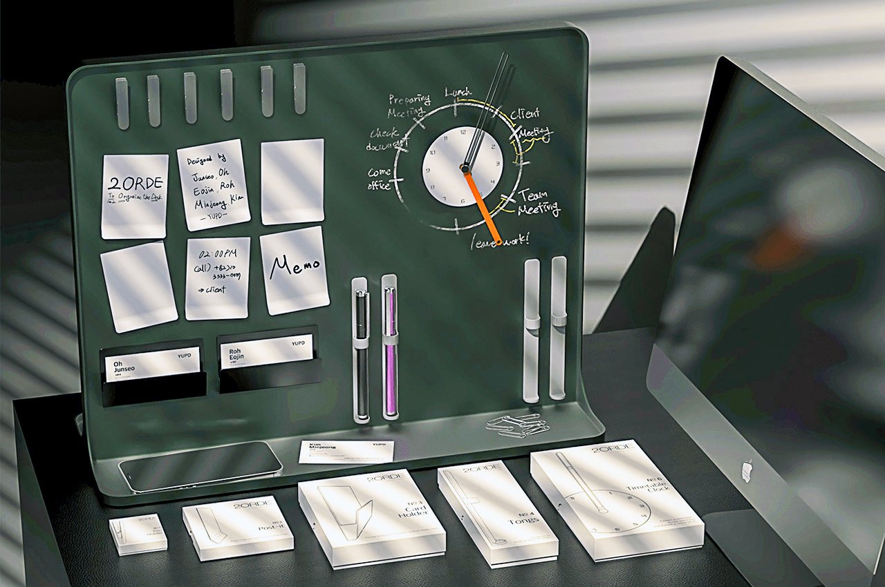
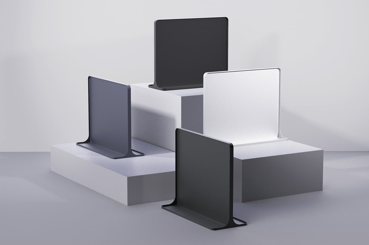
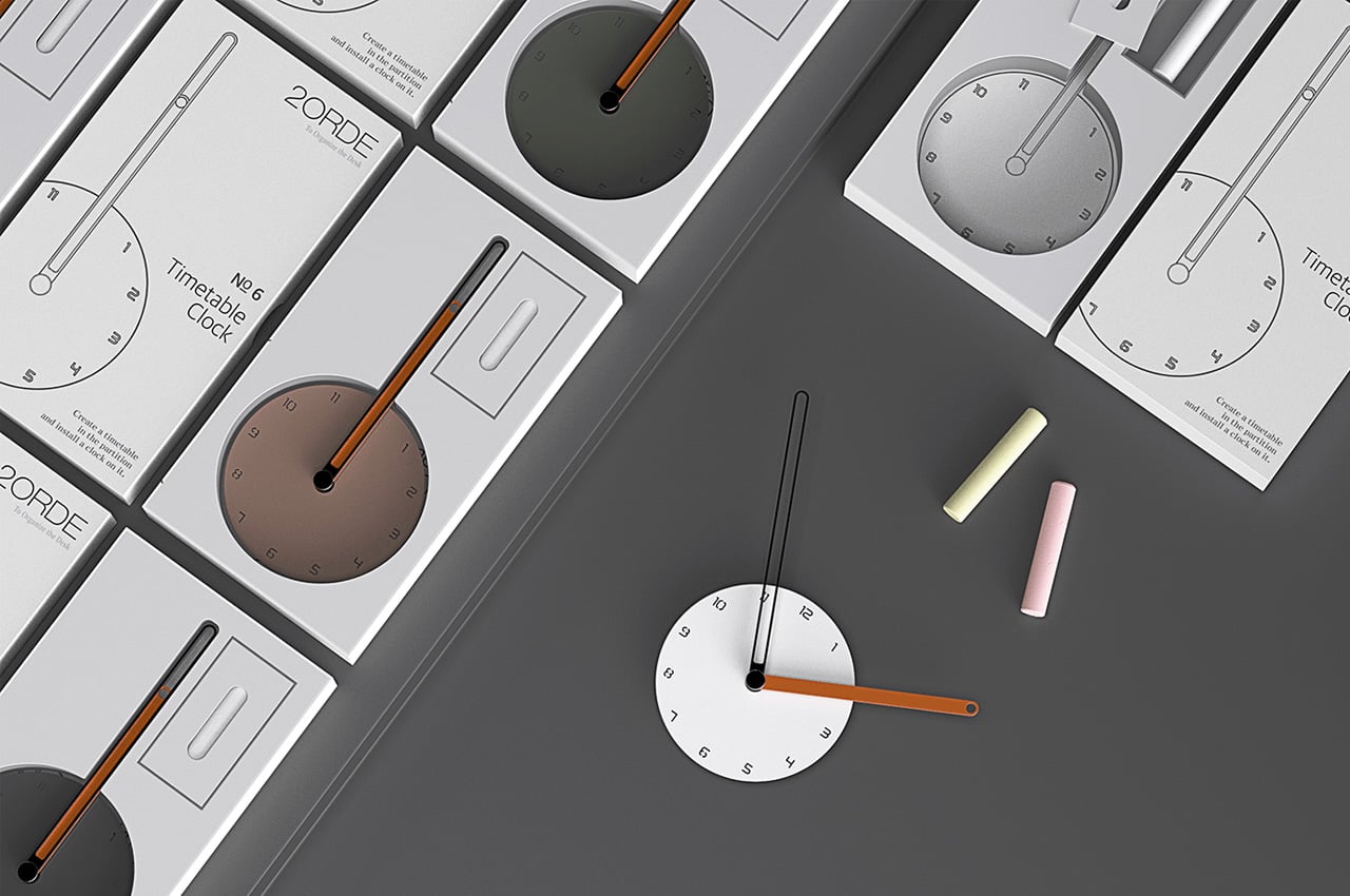
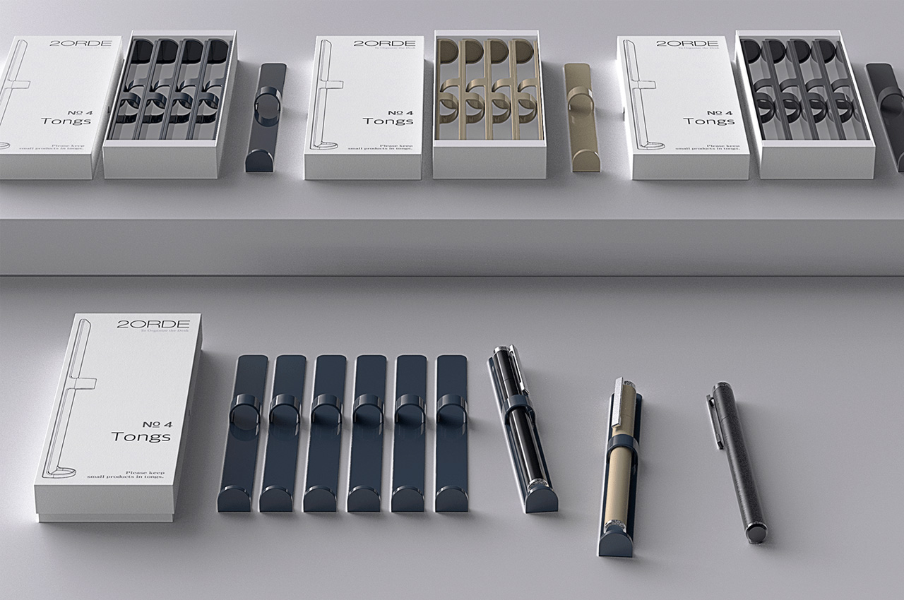
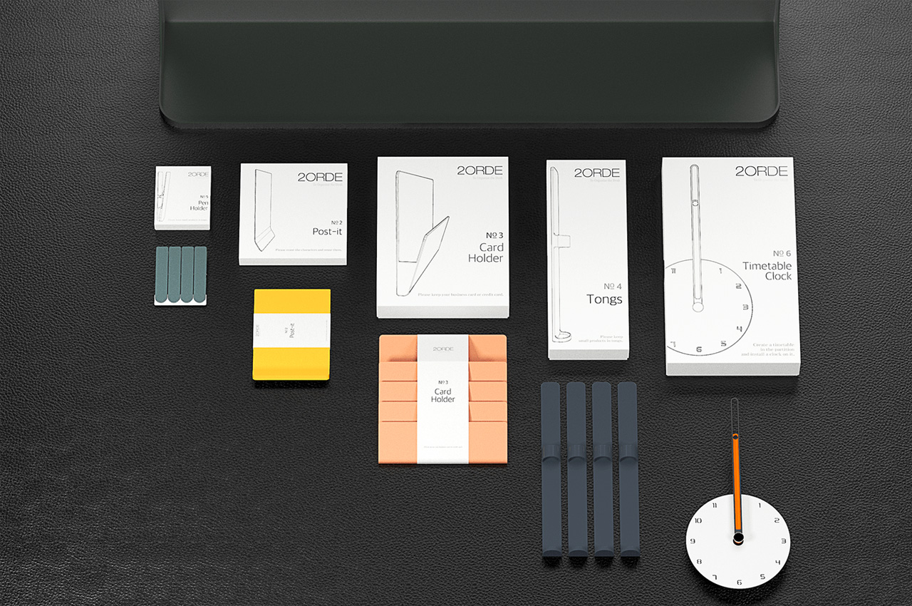
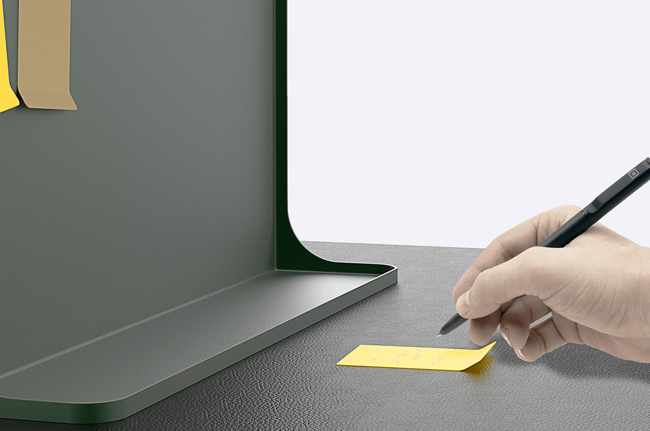
2ORDE is designed to create an environment that gives a sense of uniformity to the work desk and, owing to its multiple-use approach, makes finding office supplies convenient.

Keeping the home-office desk organized is like forcing a round peg through a square hole. There are endless desk organizers you can find on the market for your help, but most of them are about aesthetics than function; and if you go for functional options, you end up compromising on the aesthetics. Striking a uniform balance between the two, and delivering on multiple forms than just one, a group of designers has come up with 2ORDE, the ultimate desk organizer you won’t look beyond!

Since the pandemic, the home office workstation has become the place where we spend most of our time. In such a scenario, when you want to get something done and you don’t find the right supplies, you’re bound to go berserk. To save you the day and help you organize the desk and store out-of-order articles creatively, 2ORDE arrives in form of a stable notice board with its own set of supplies.

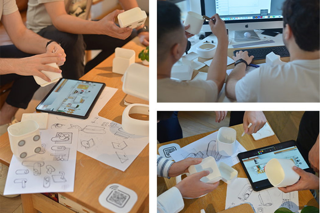
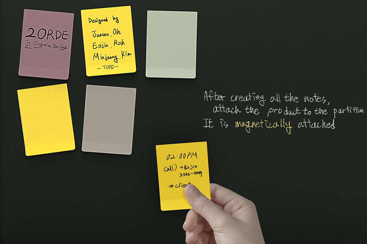
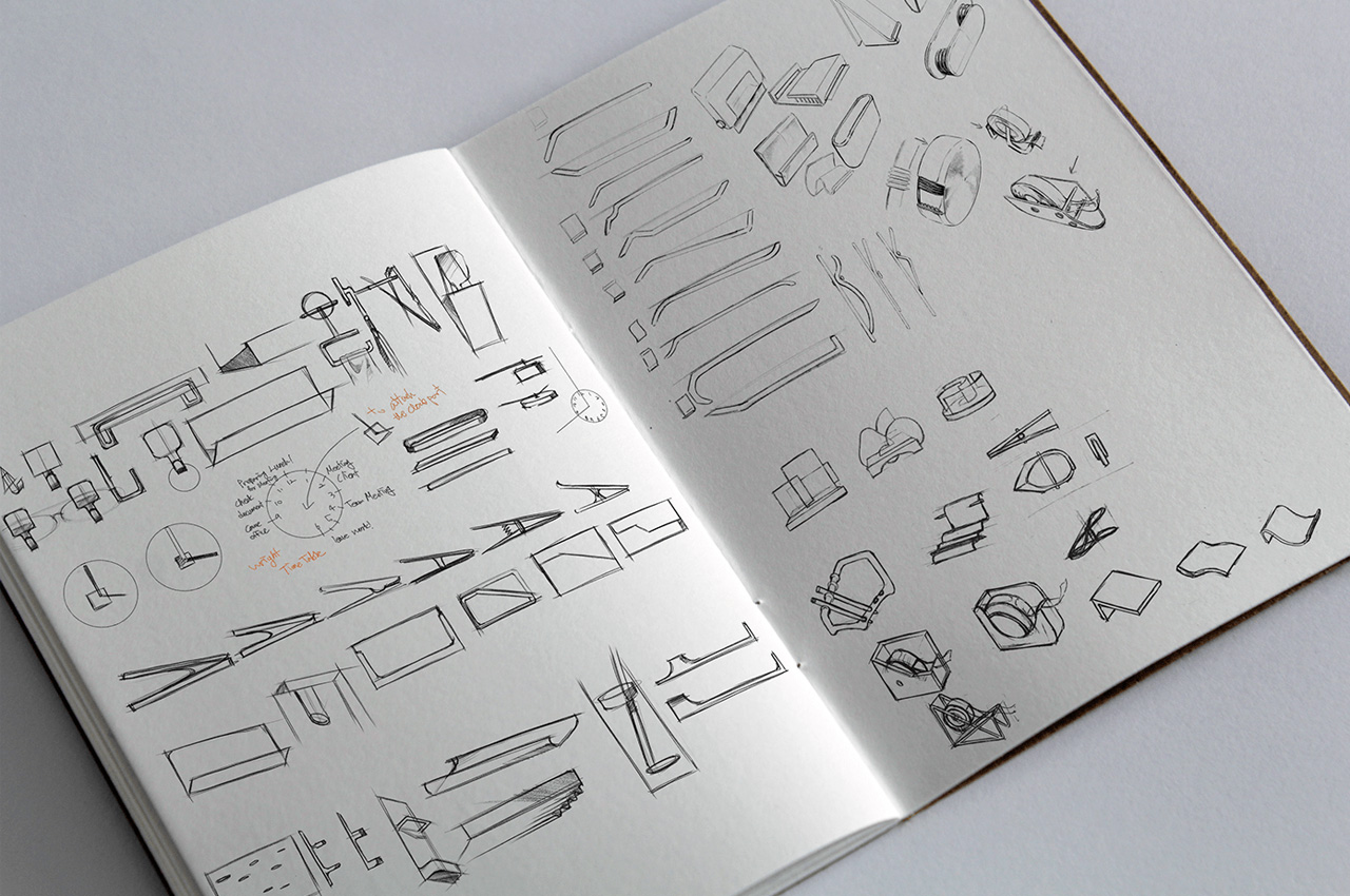
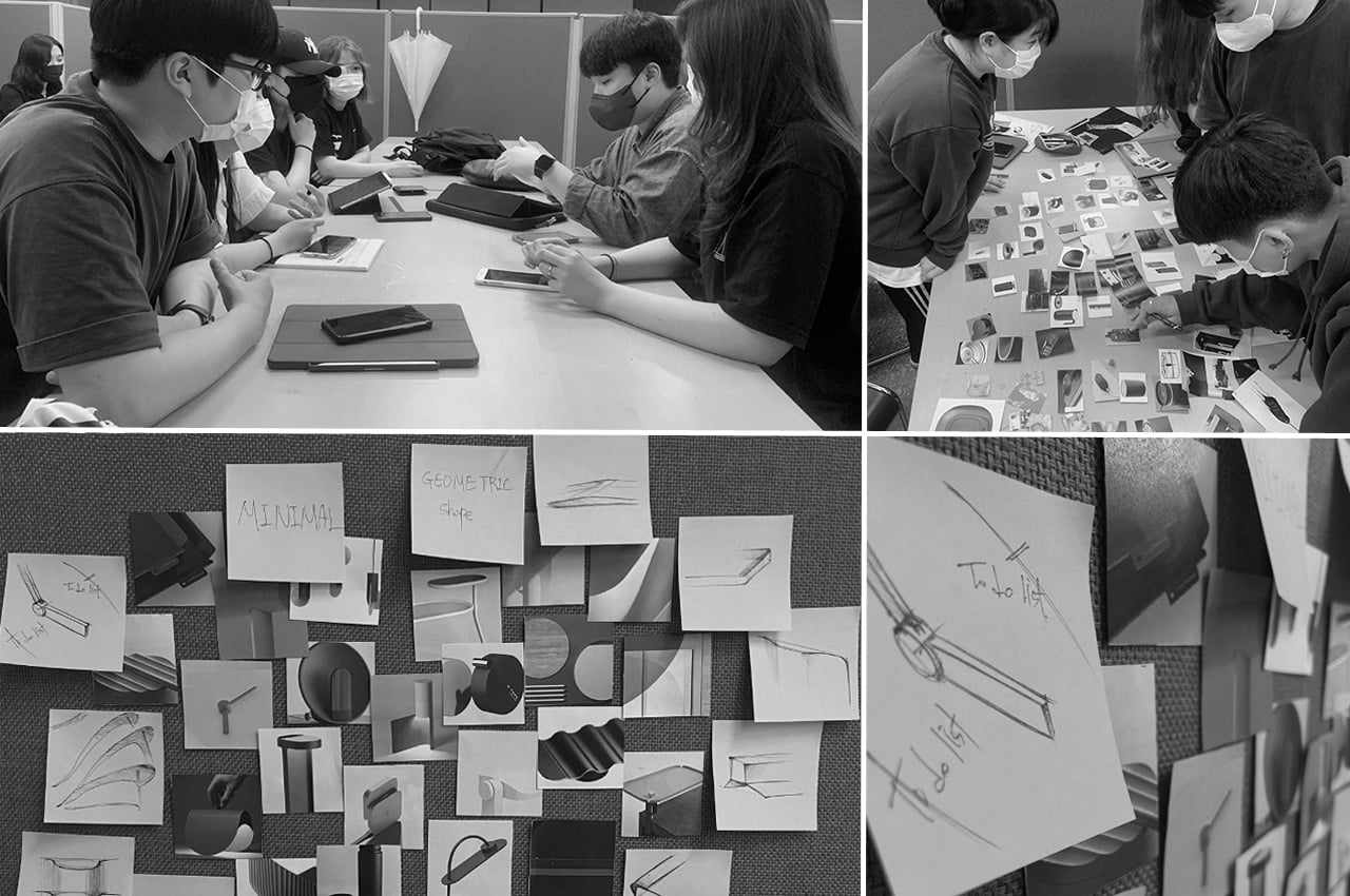
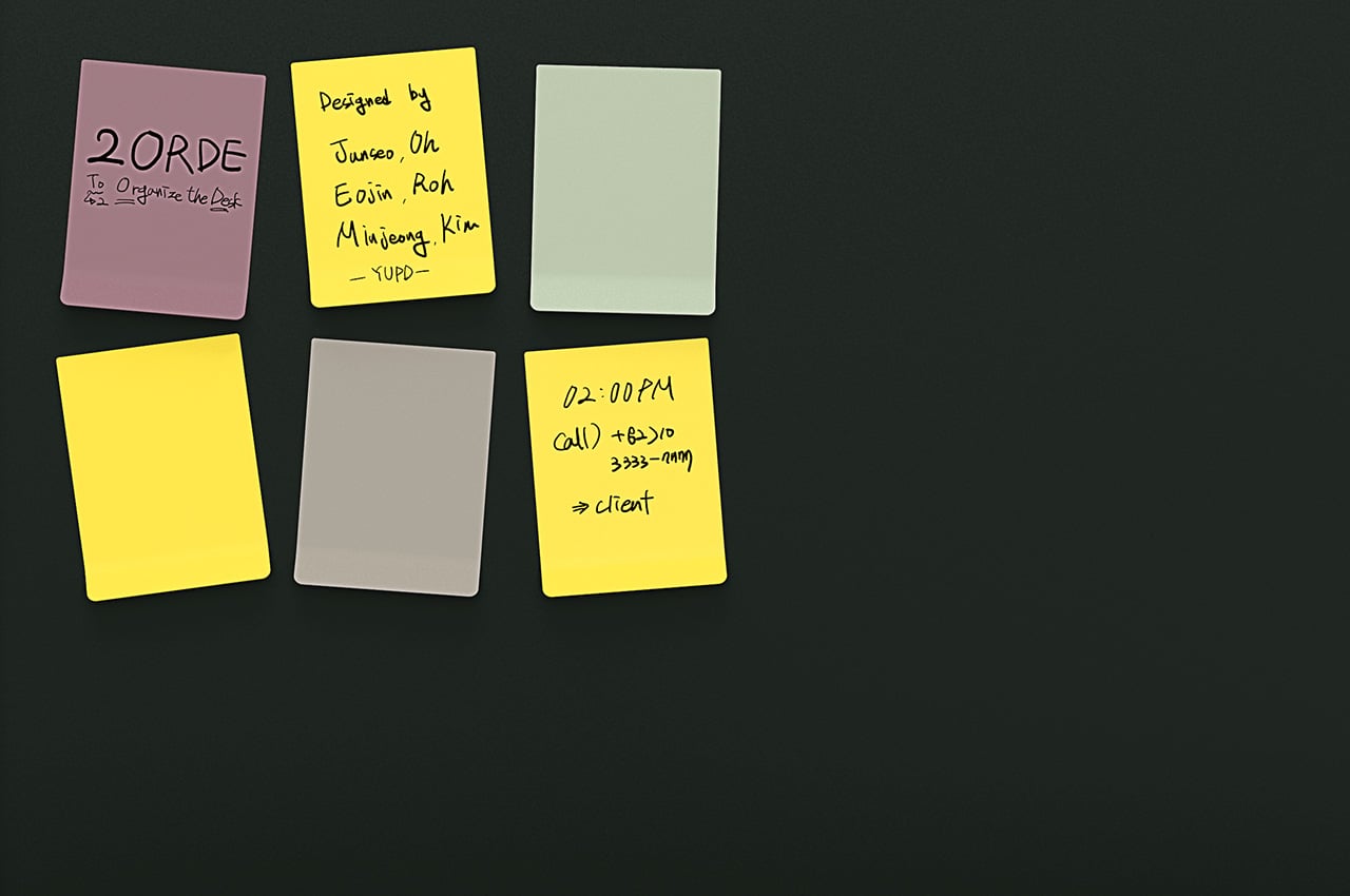
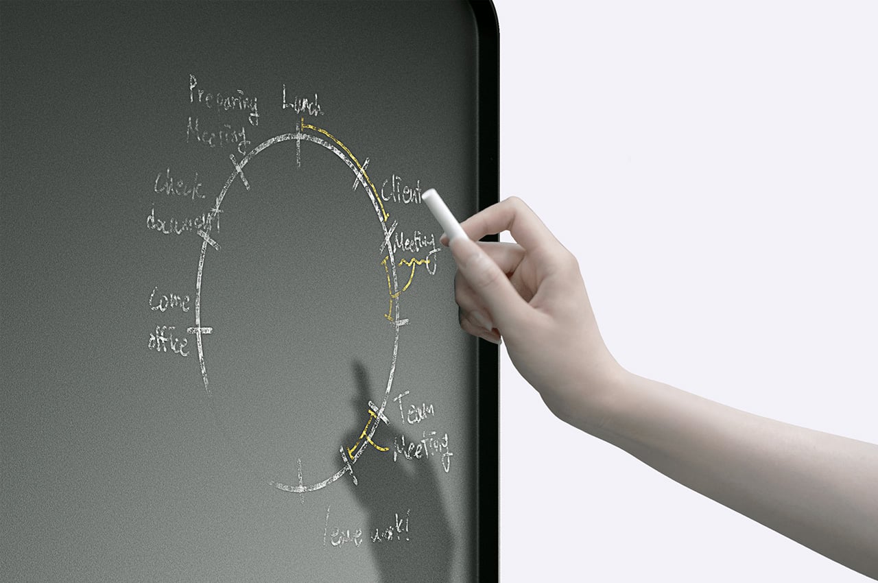
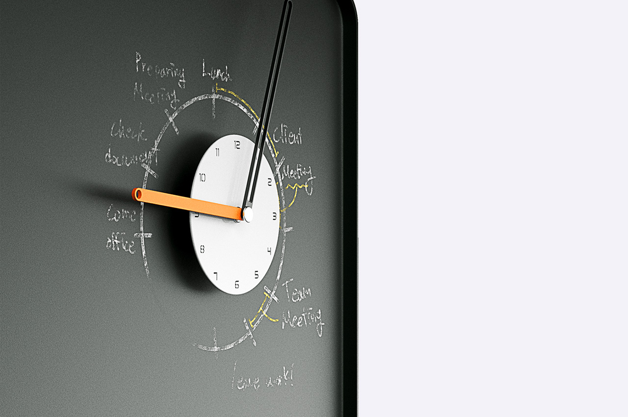
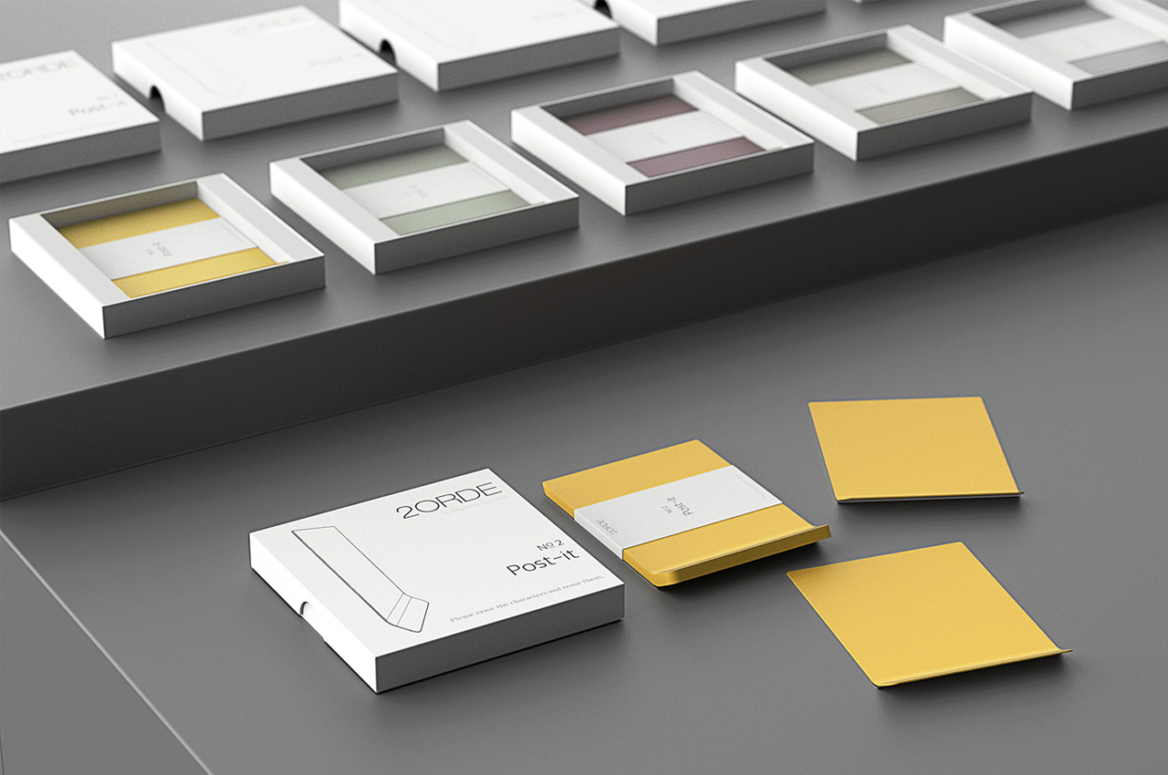
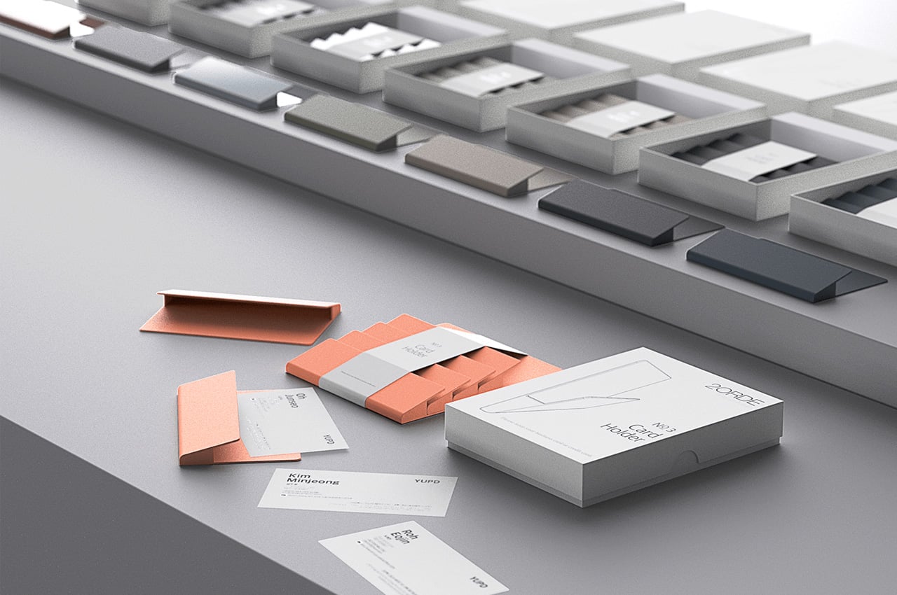
After a host of barnstorming sessions, mockups, and feedbacks – the designers Junseo Oh, Eojin Roh and Minjeong Kim arrived at a magnetic board in matte finish. Perfectly stable on its broad base, the 2ORDE is more than just the board. It is provided with a set of colorful sticky notes. These fasten magnetically to a section of the board, leaving the other part for you to detail your to-do with chalk and then paste a functional clock on it to glace at what schedule fits your time.

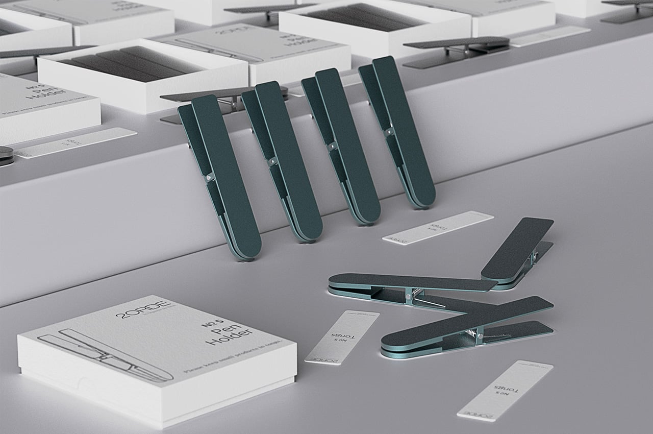
Even more interesting is the fact that these sticky notes are erasable; designers claim no matter the pen you use, you can rub it and move on without a speck of doubt. The provided pen holder also clings onto the magnetic board and lets you have your pen collection right in focus.

This sleek blade-free desk fan is your portable companion in summers as well as winters!
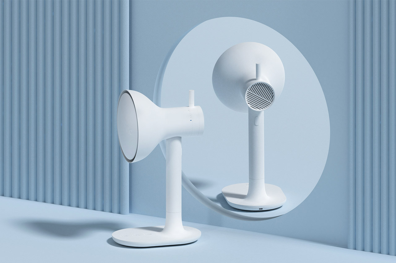
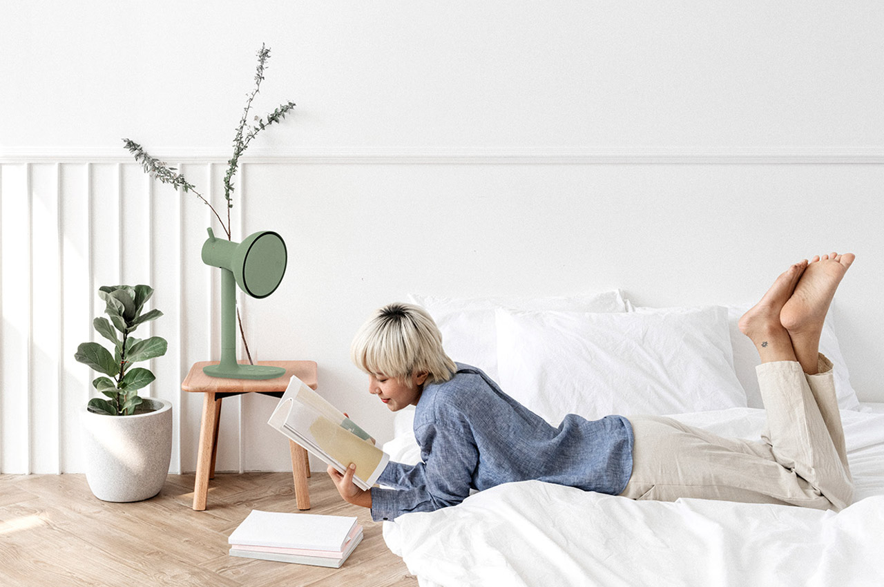
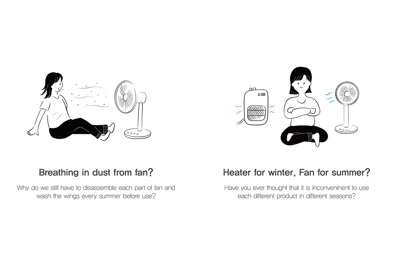
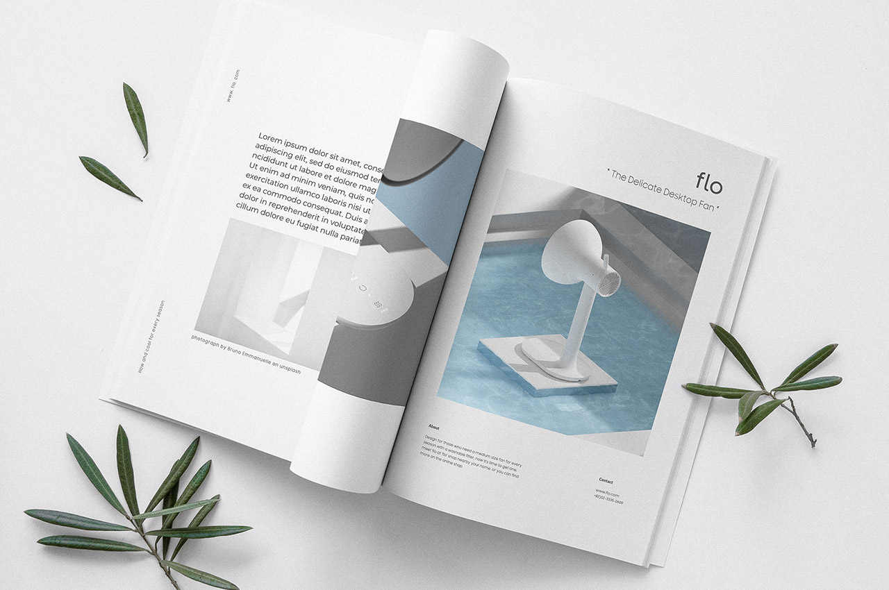
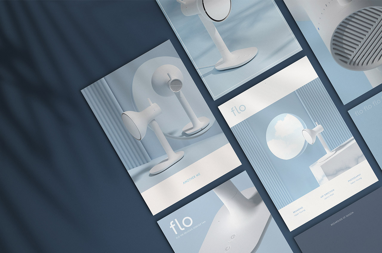
Sharing office space, the biggest problem, after having to listen to my co-working space neighbor aka my husband speaking on a call is trying to regulate a temperature that works for us. I love staying warm – the AC temperature goes lower than 20 and my fingers start freezing whereas my husband sweats bullets while staying in a 25-degree temperature. That sweet spot, it’s almost a myth for us! What I need is a solution that works for both of us depending on the season – and flo, by designer Soyoung An seems to be an apt design for my needs!
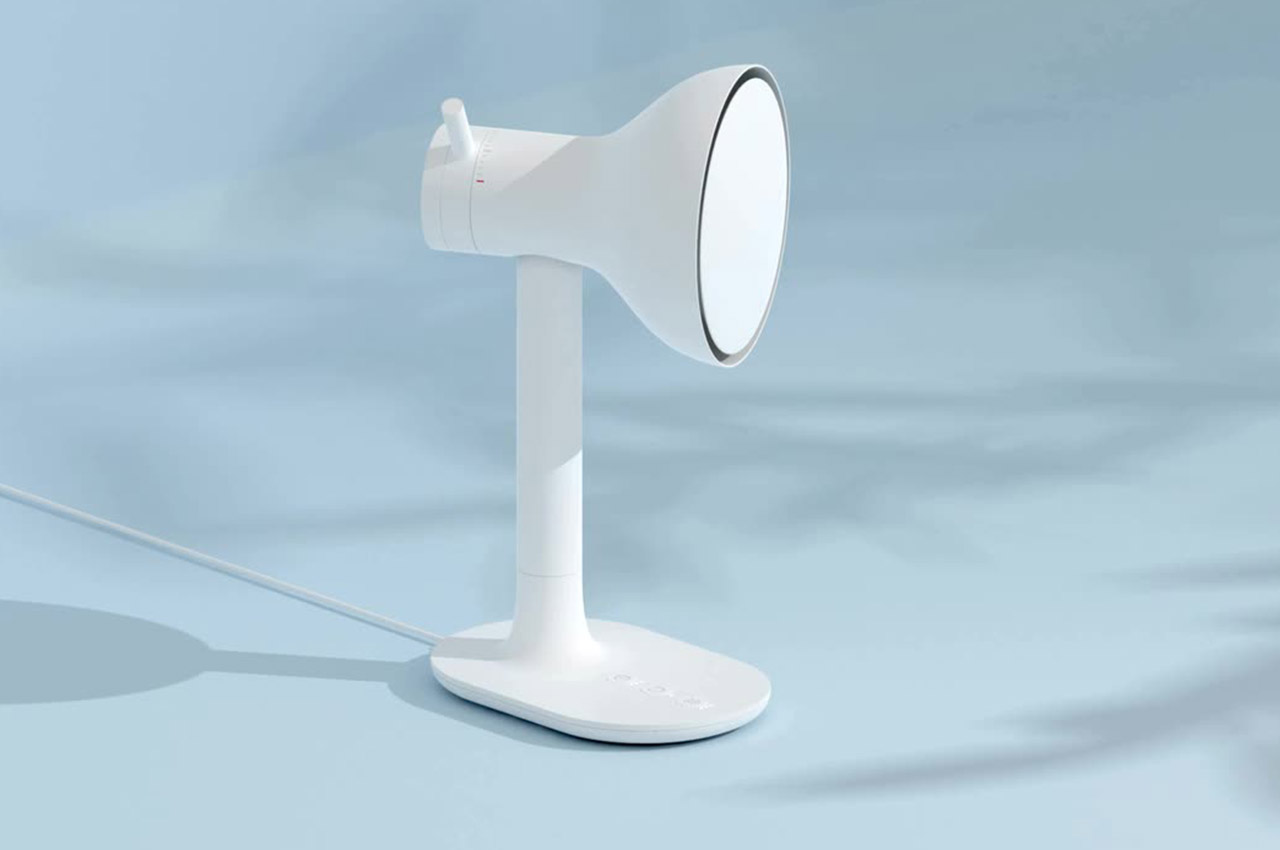
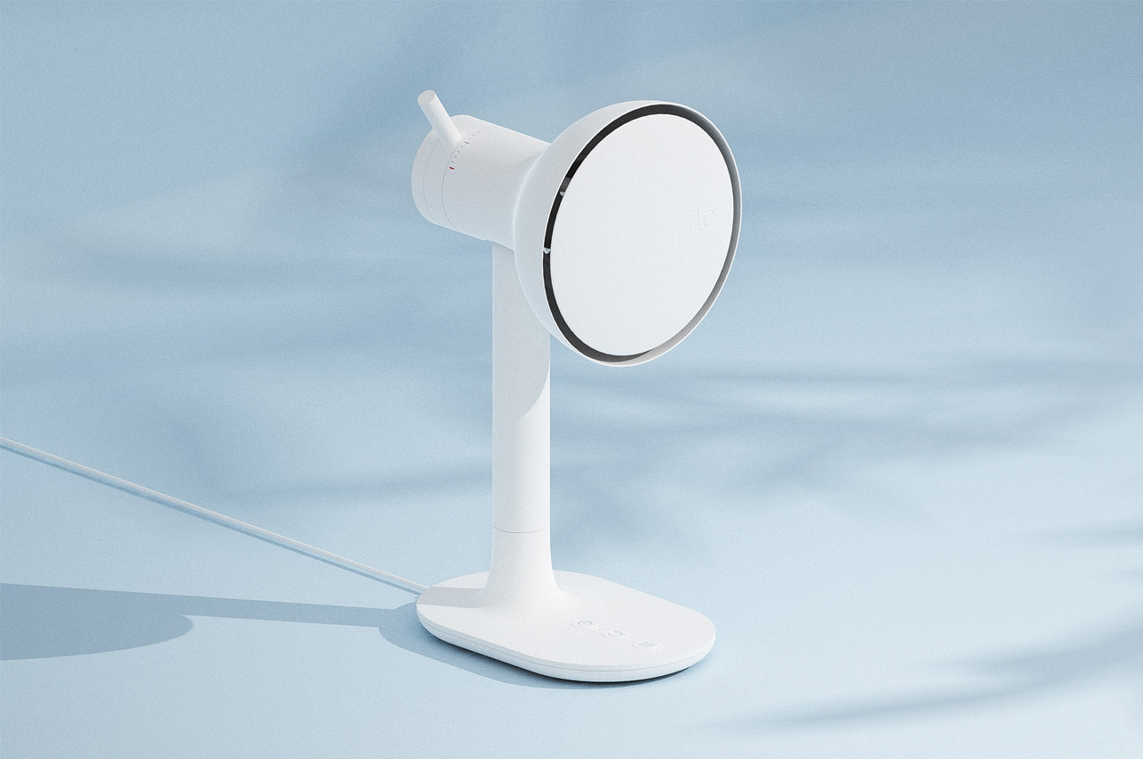
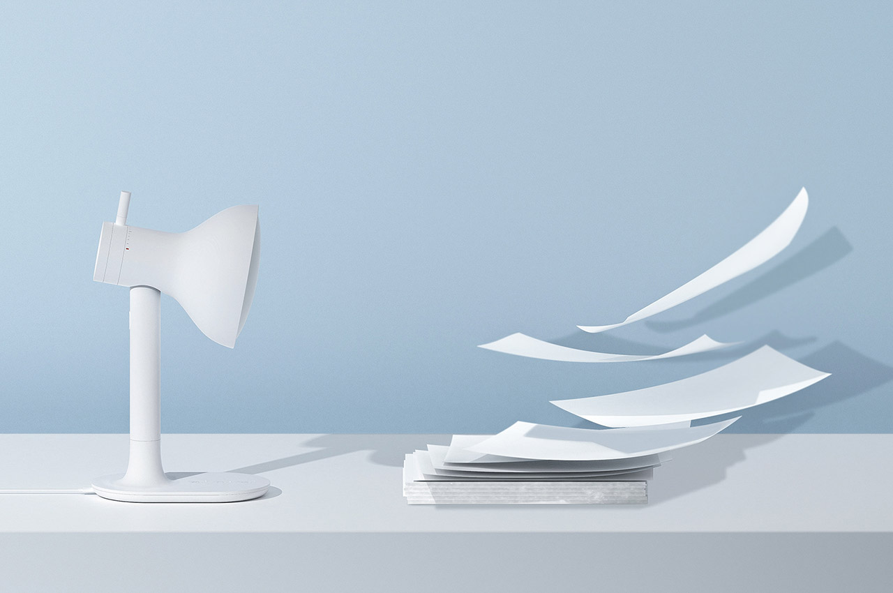
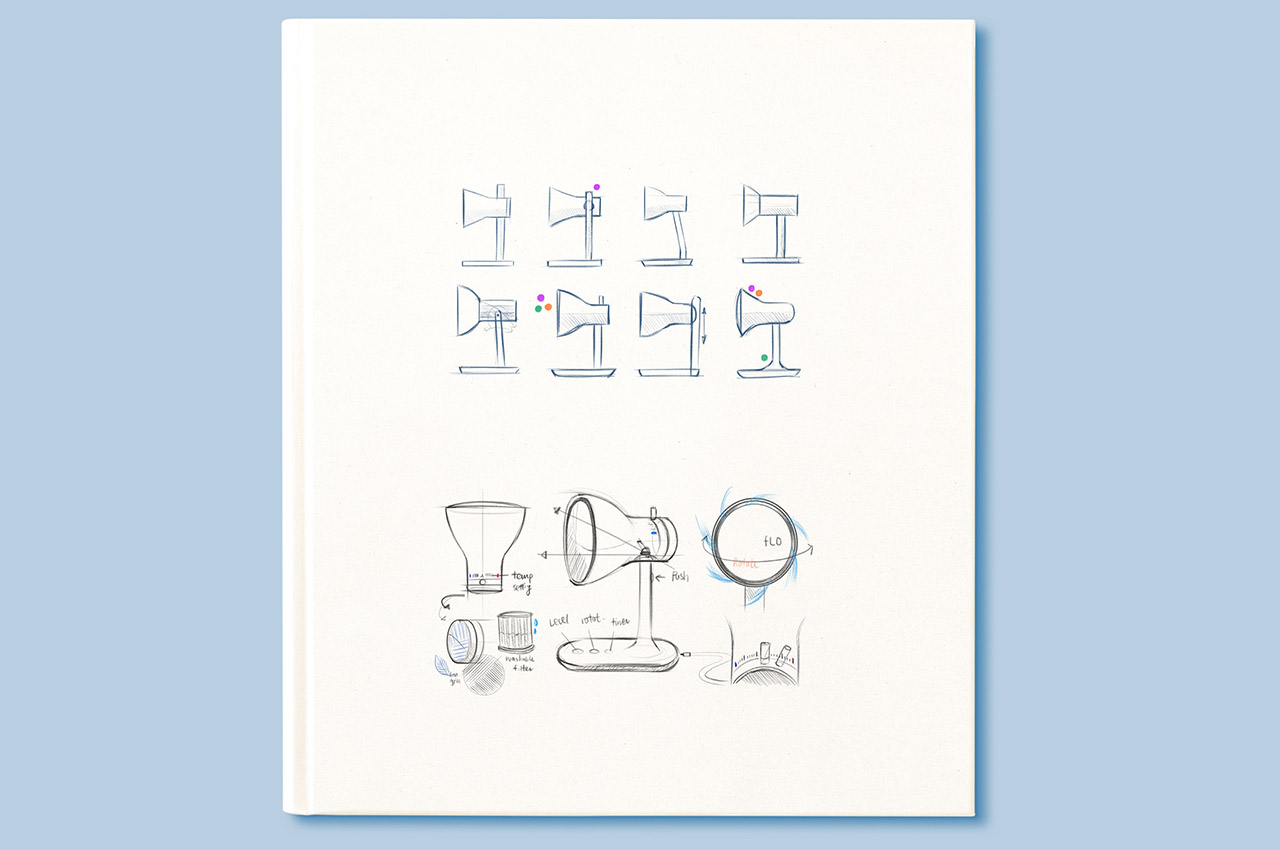
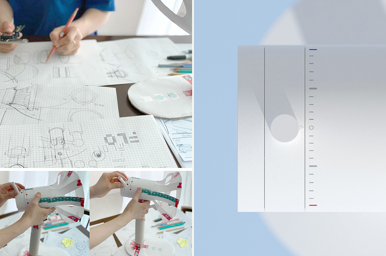
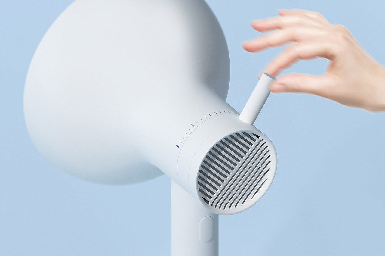
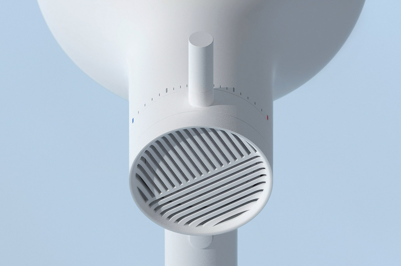
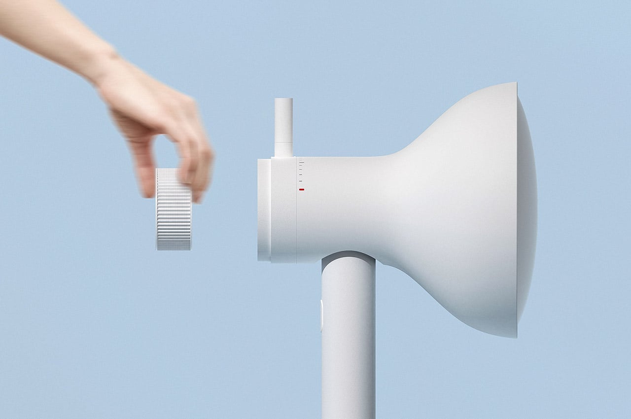
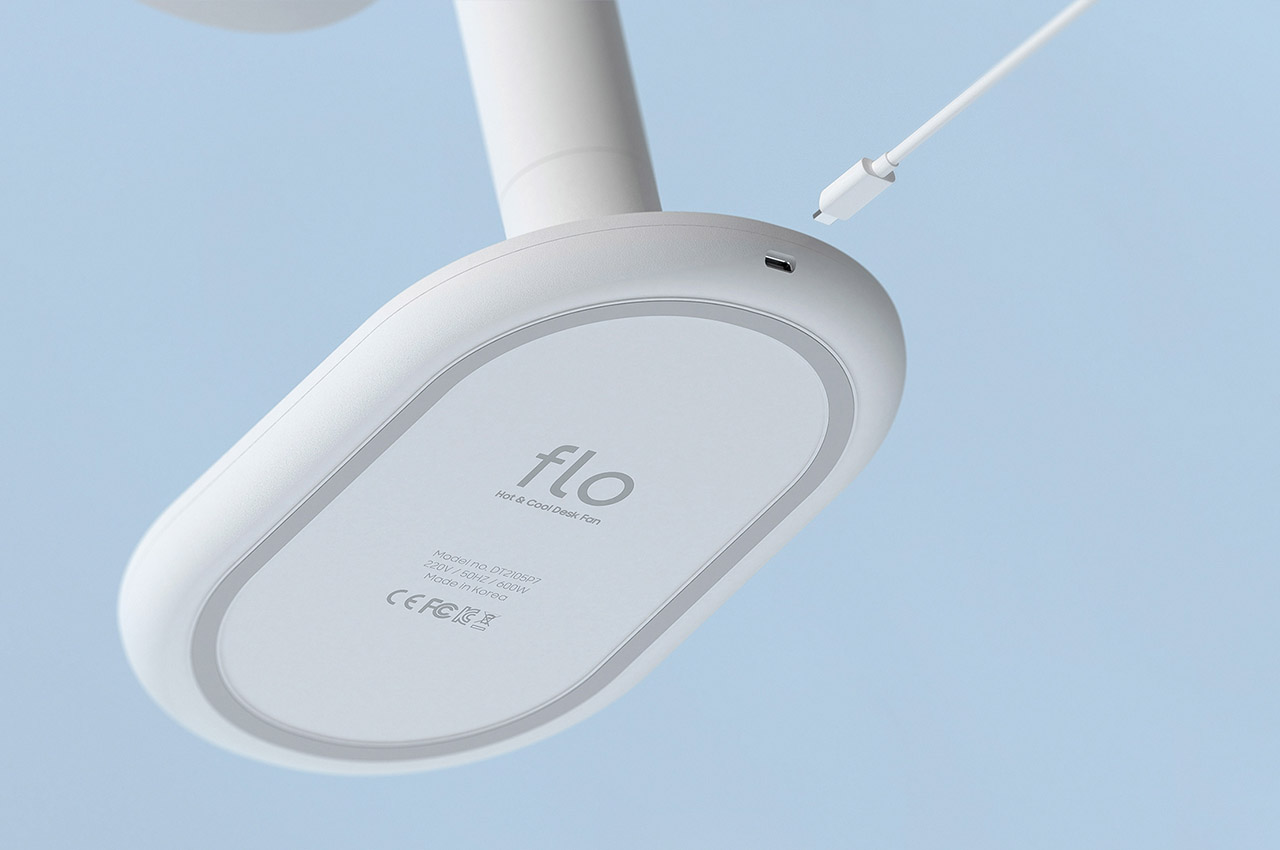
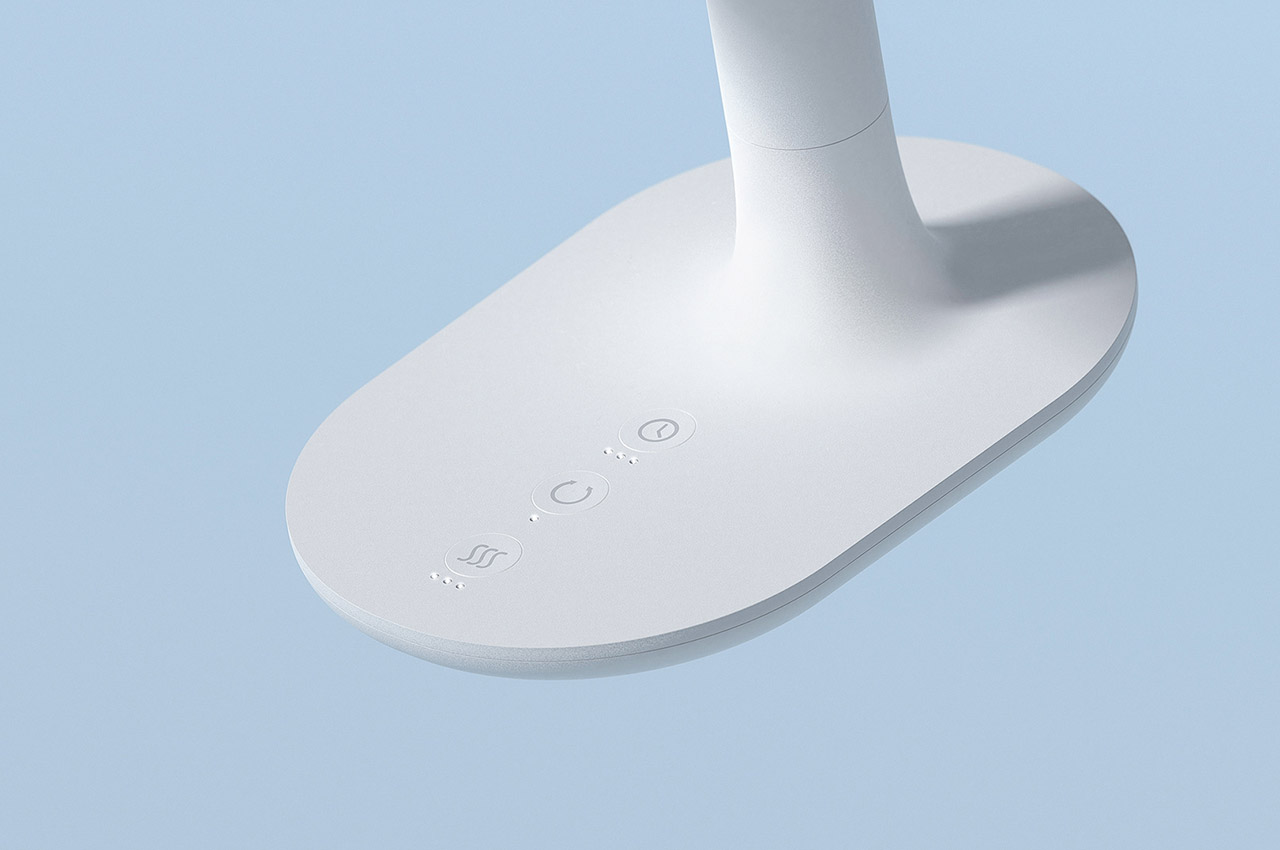
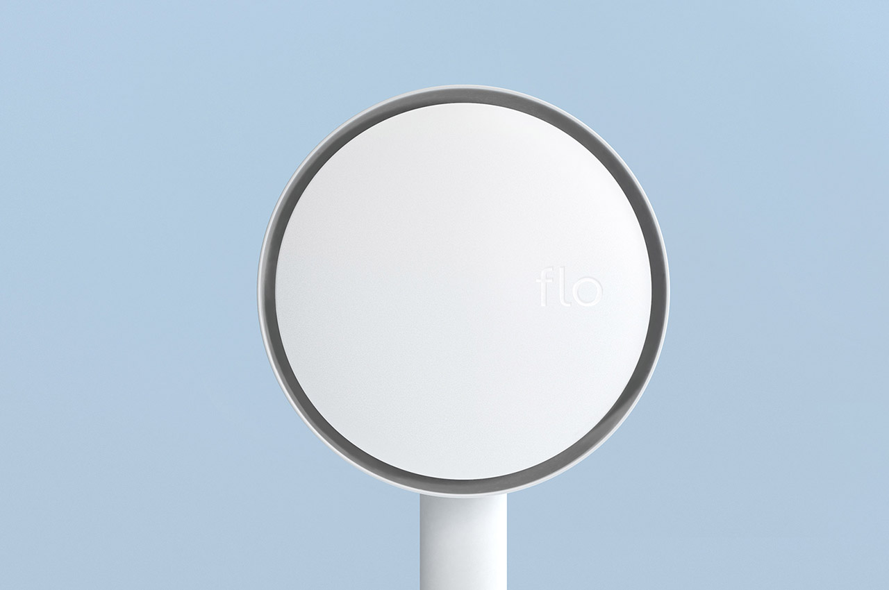
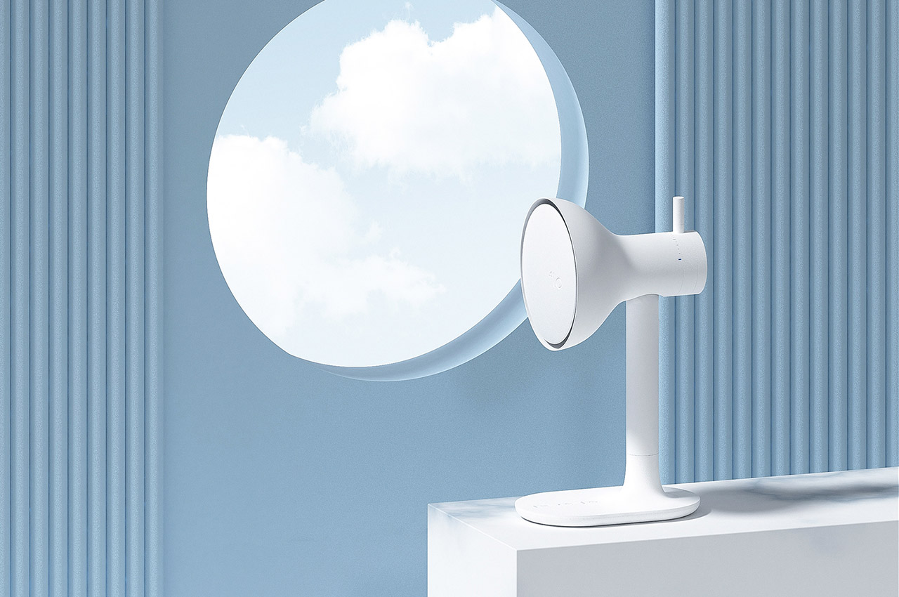
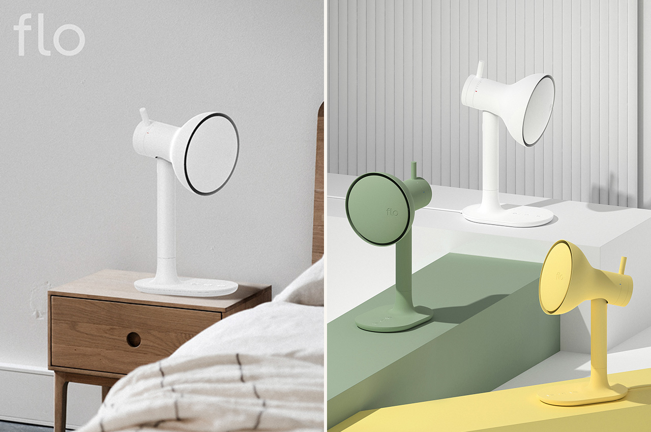
The flo is a desk fan that is portable by nature. The fan’s facade is actually covered – no more hurting your finger by occasionally poking into the blades. The fan can be regulated using a temperature dial at the back of flo – allowing you to easily switch between heating and cooling functionalities. One of the better functionality of the design is the use of a filter, that purifies the air being thrown at you, rather than having the dust from your fan blades being thrown at you. The fan also uses a simple USB-C cable to stay charged at all times. Flo’s aesthetics are simple, yet minimal, making it an easy to own and use piece over the years. And given how it works for all seasons – it reduces the storage space required for the off-seasons.

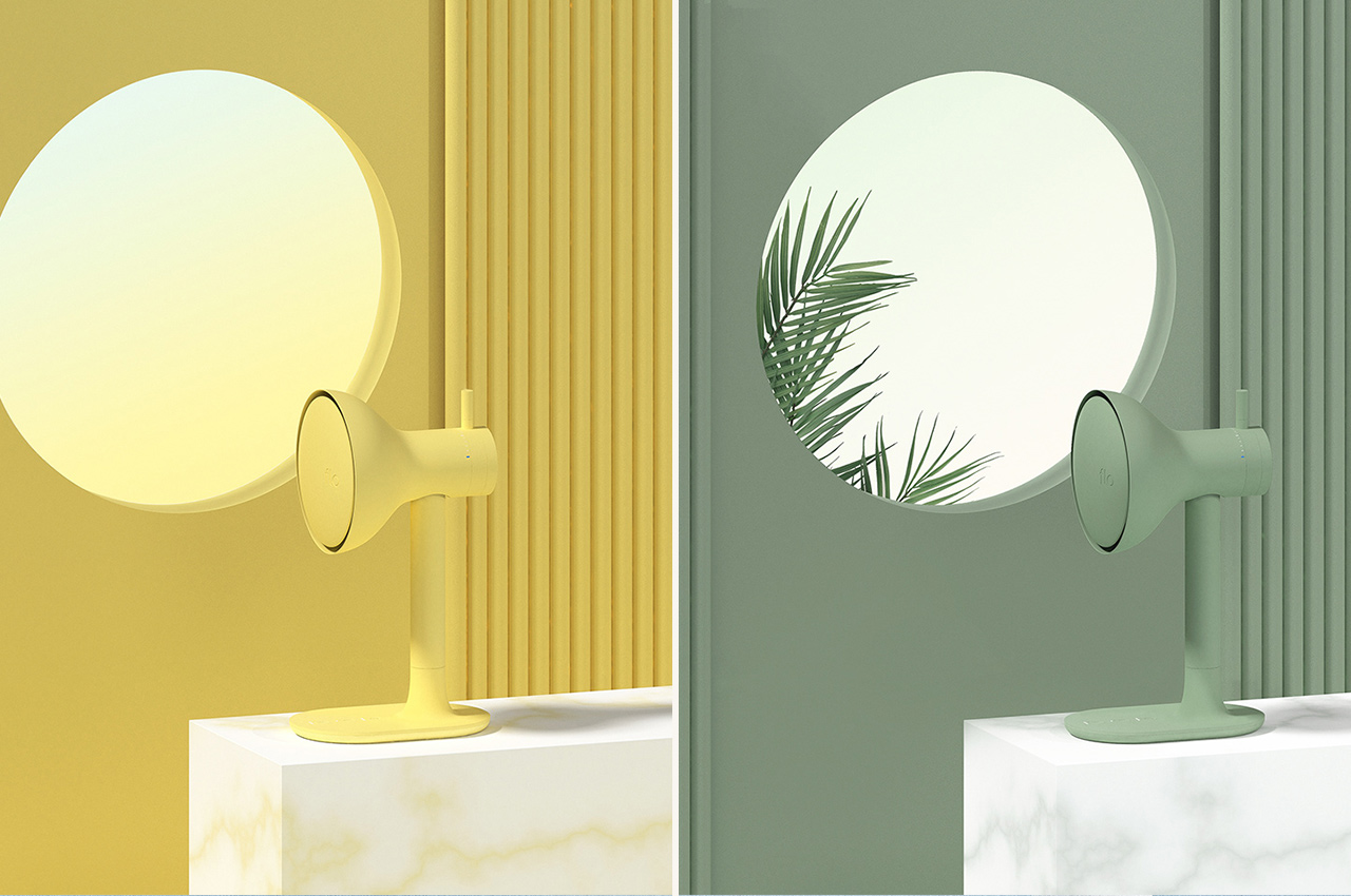
Muted colors of the flo elevate this design from an ordinary accessory to a statement piece in your setup. The design is also simple, almost intuitive to use with an upgraded functionality – isn’t that what great product design is all about!

Designer: Soyoung An


1

This easily swiveling projector is set to redefine our presentations. Watch the video!


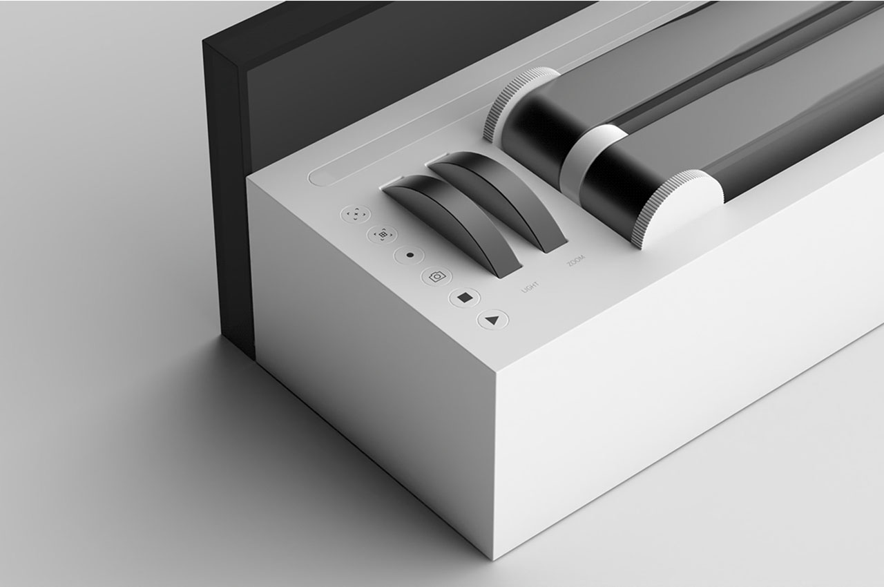
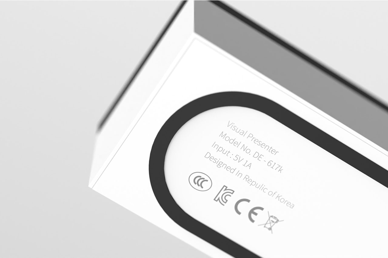
I remember the days in grade school when the big, clunky projector would come rolling down the center of the room for a math or history lesson. Even in work settings, the projector comes in handy to put documents and visual presentations up on the wall so everyone can follow along. Technologically, we’ve moved past the need for projectors, but recent setbacks brought on by the pandemic have inspired one designer to bring them back to life. In collaboration with Designer Dot, designer Dongeon Kim created the Visual Presenter, a projector for the modern world.

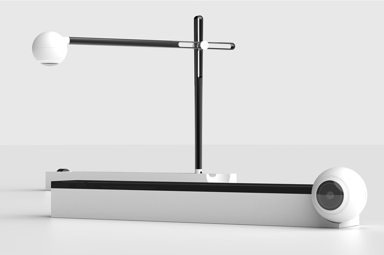
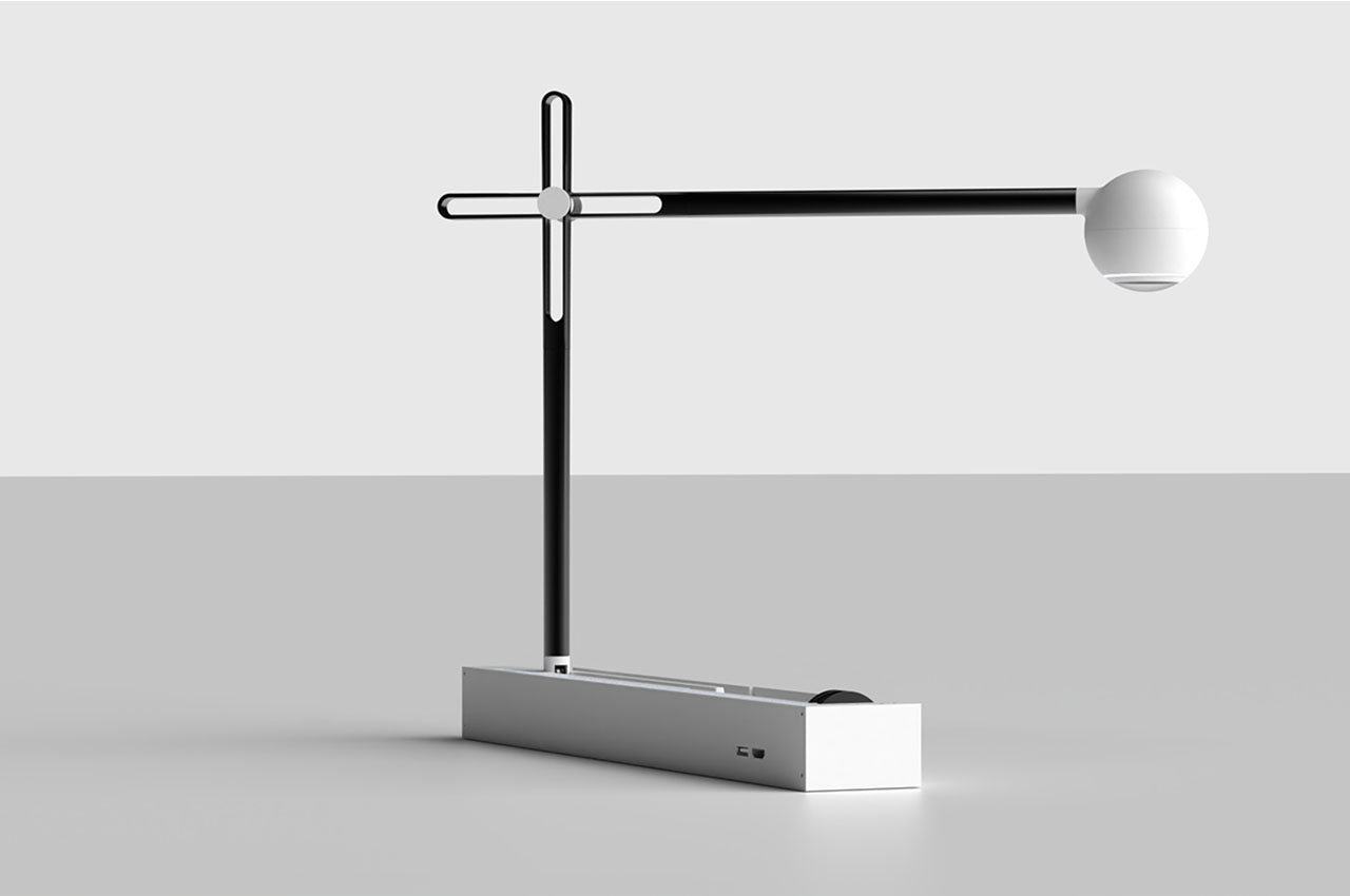
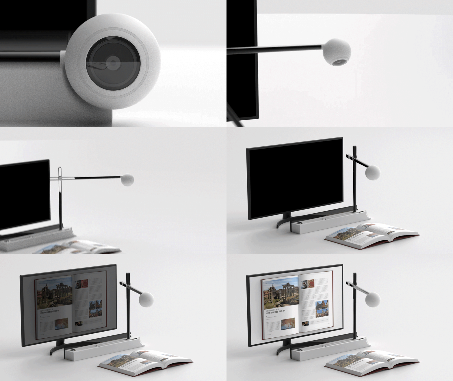
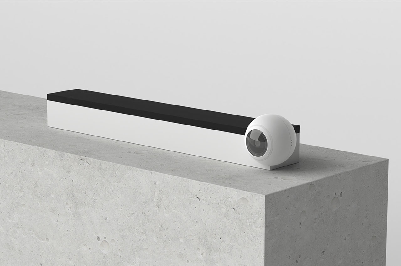
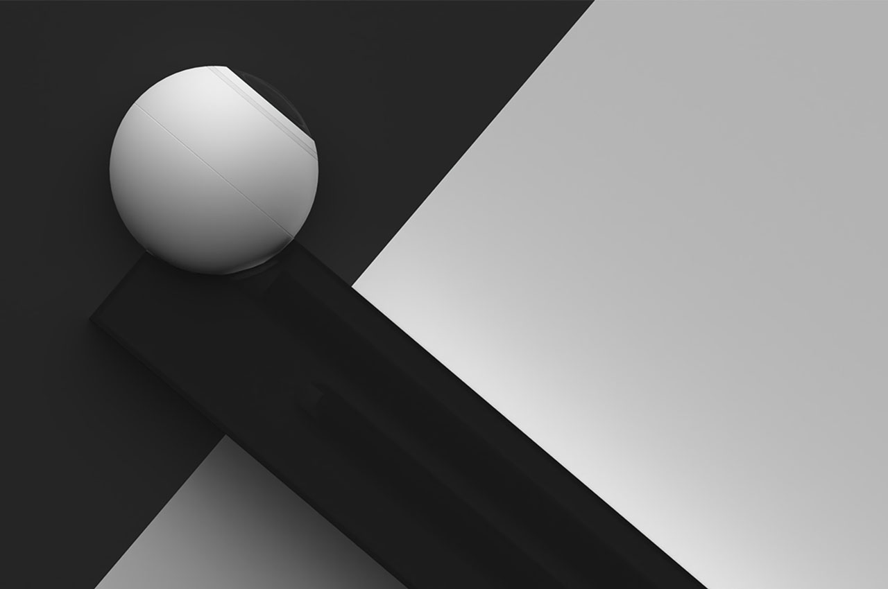
Since most of our work now is taking place over Zoom or, more generally, on the computer, the convenience of handing out physical documents for the whole team to follow along has been lost. Noticing a potential need for the projector to come back to life, Kim designed his Visual Presenter. Ditching the clunk of old-school projectors for an extremely minimal and slim design, the Visual Presenter is a foldable and extendable projector that forms the same shape as a modern desk lamp.

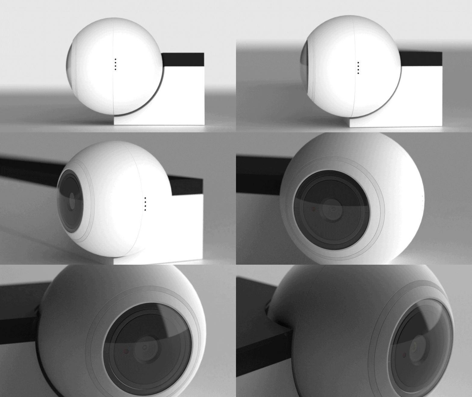
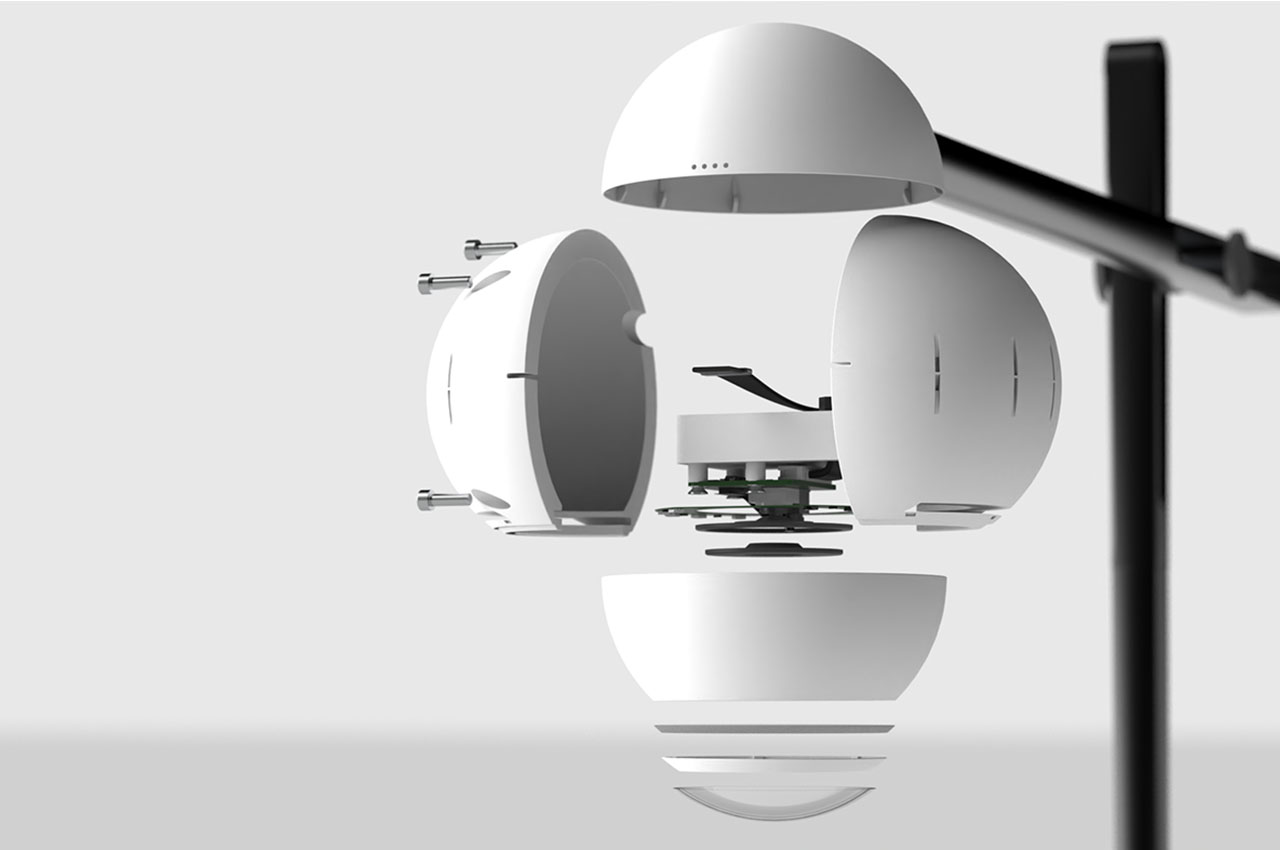
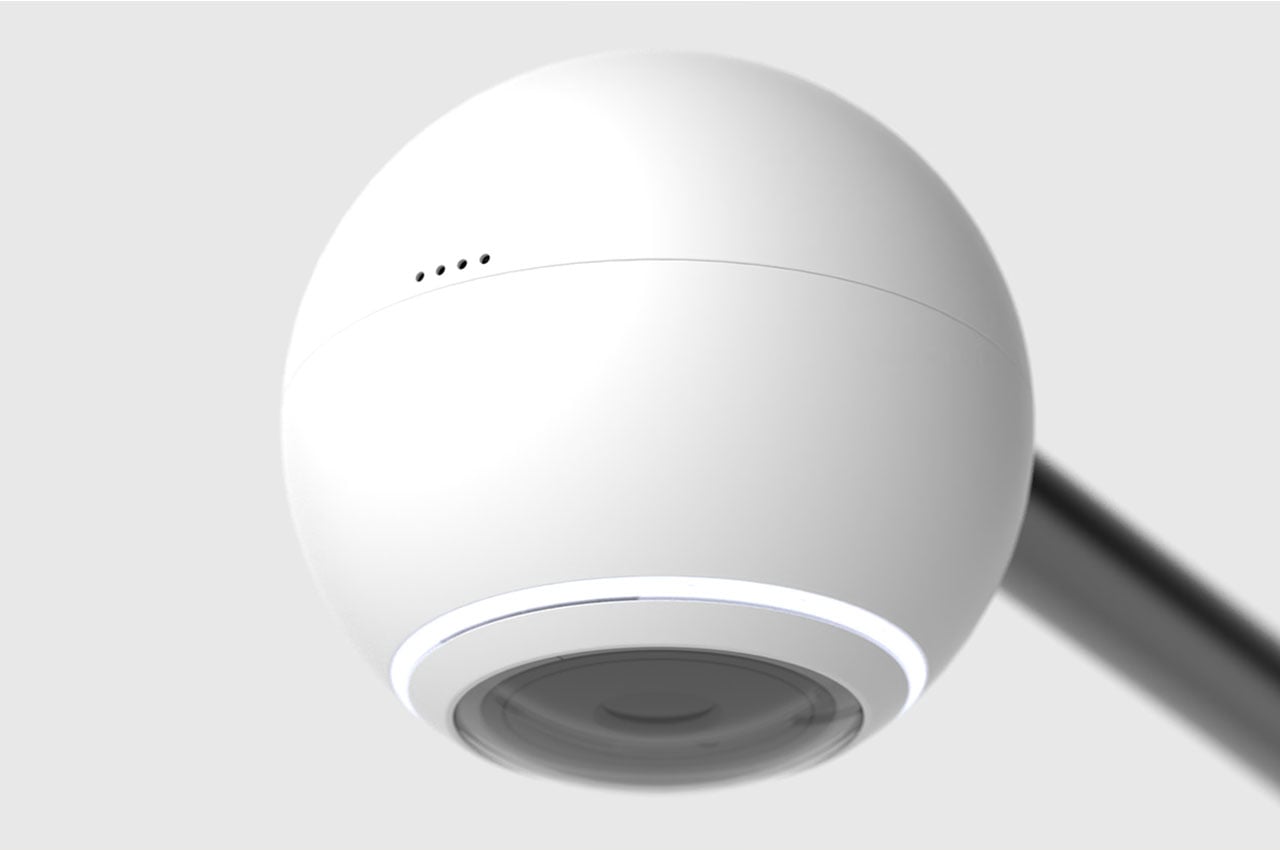
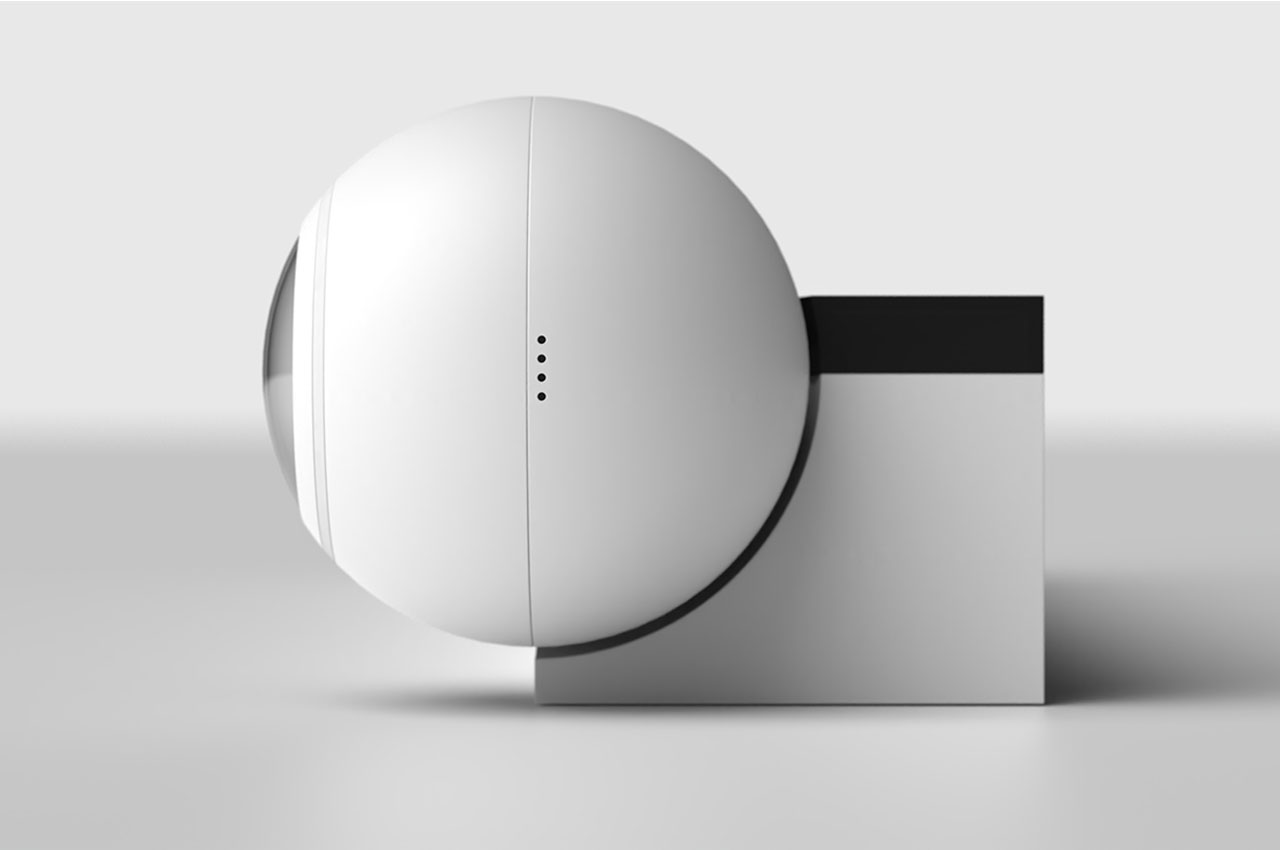
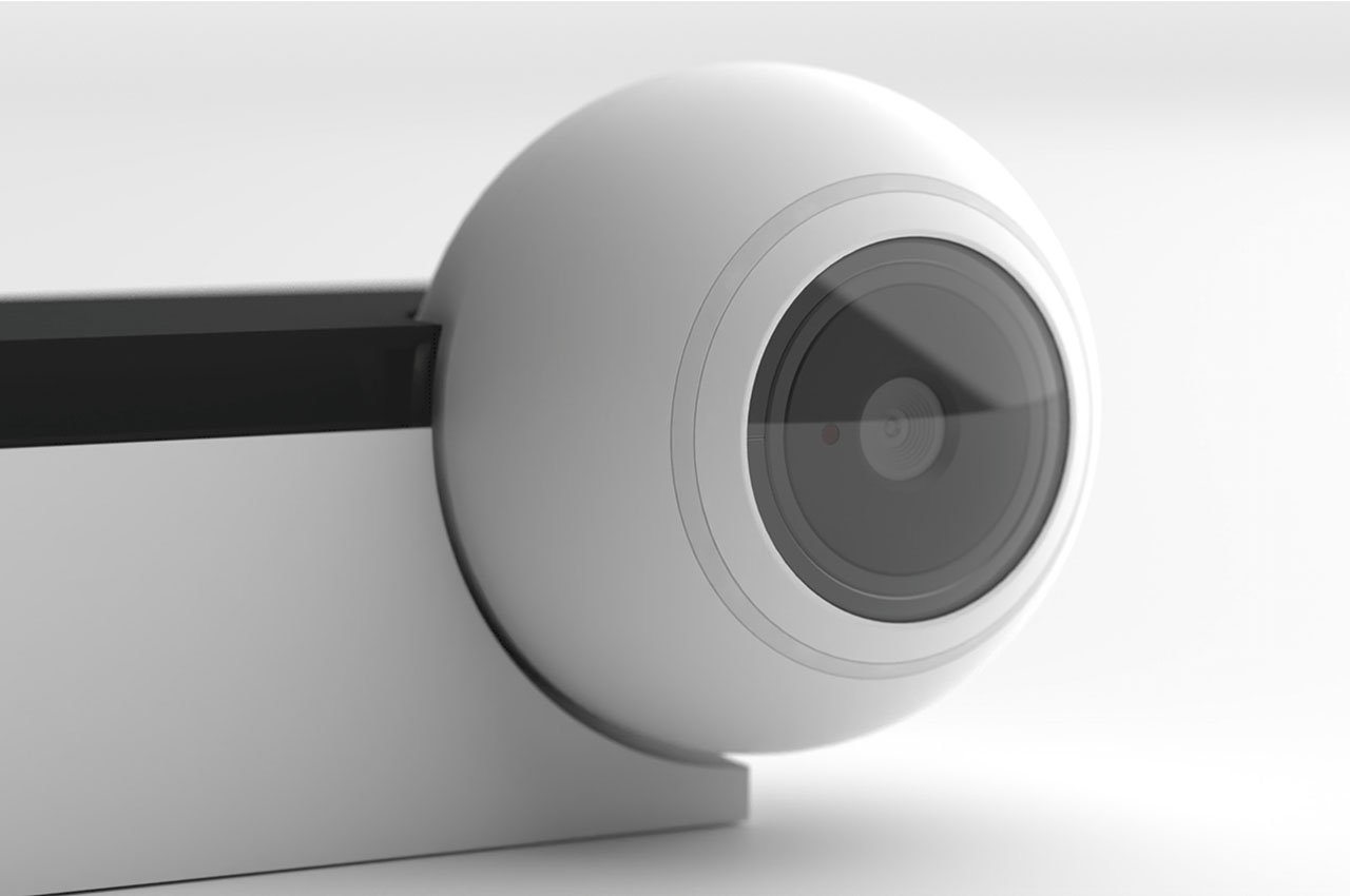
Say there’s a page in a book that’s relevant to a work project that you’d like to show your team – instead of scanning and printing out tens of copies of the same page, the Visual Presenter would allow users to project that page on a Zoom call for the rest of the team to follow along, just like old history lessons in grade school. The camera itself boasts a simple form, coming together only as a small rotating ball positioned at the end of its foldable metal rod. The Visual Presenter’s camera can capture documents and images laid out on your desk or even behind your desk using its folding mechanism. It’s like a webcam, only much better and with a lot of control from our end.

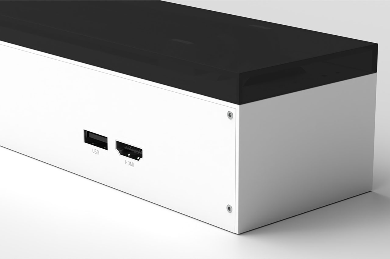
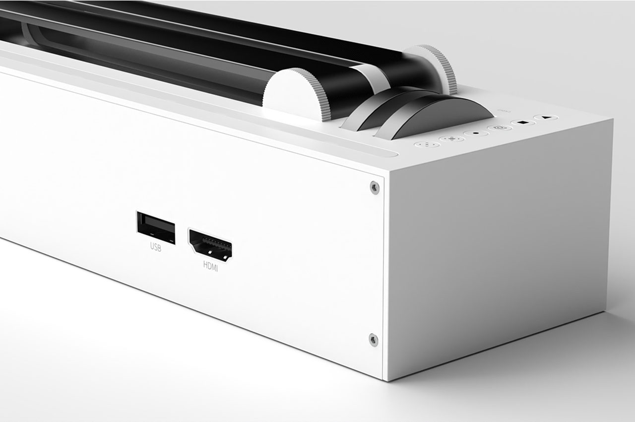
When not in use, the Visual Presenter folds down into a slim, discreet desk accessory that can rest just behind your keyboard. Then, when needed, the Visual Presenter can be unfolded to reveal its cross-axis extension that can be adjusted to capture images from anywhere in the room. Additionally, a small control panel located on the side of the Visual Presenter’s base allows users to fine-tune the focus and adjust the brightness of any given projection.

Designer: Dongeon Kim with Designer Dot

1

2

With bright colors and blockish designs, this furniture collection makes the office playful!

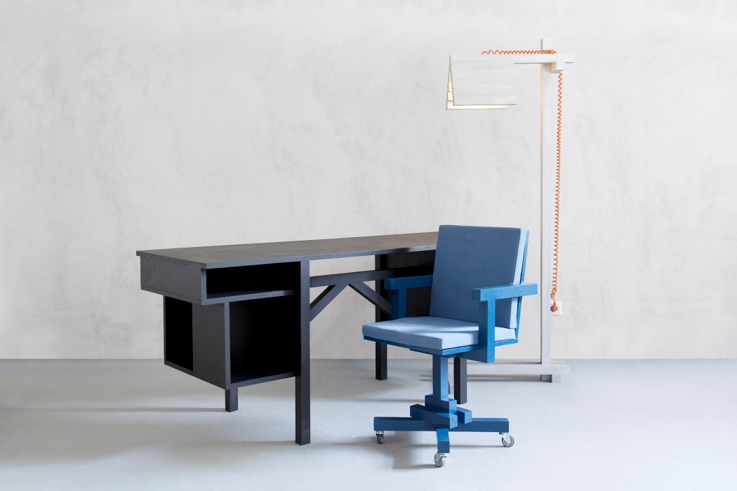
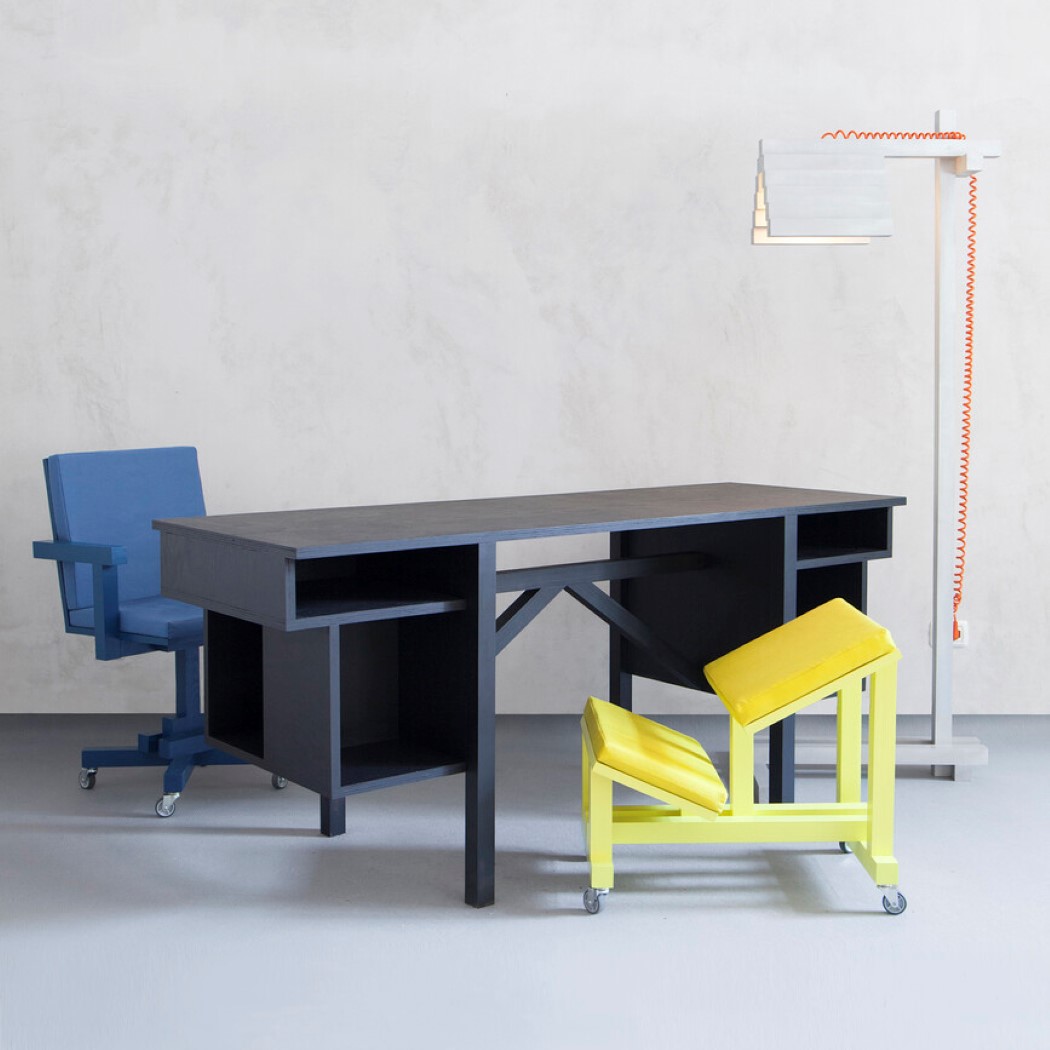
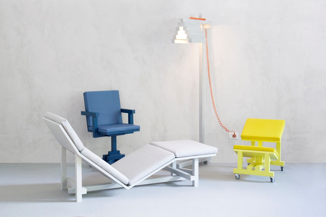
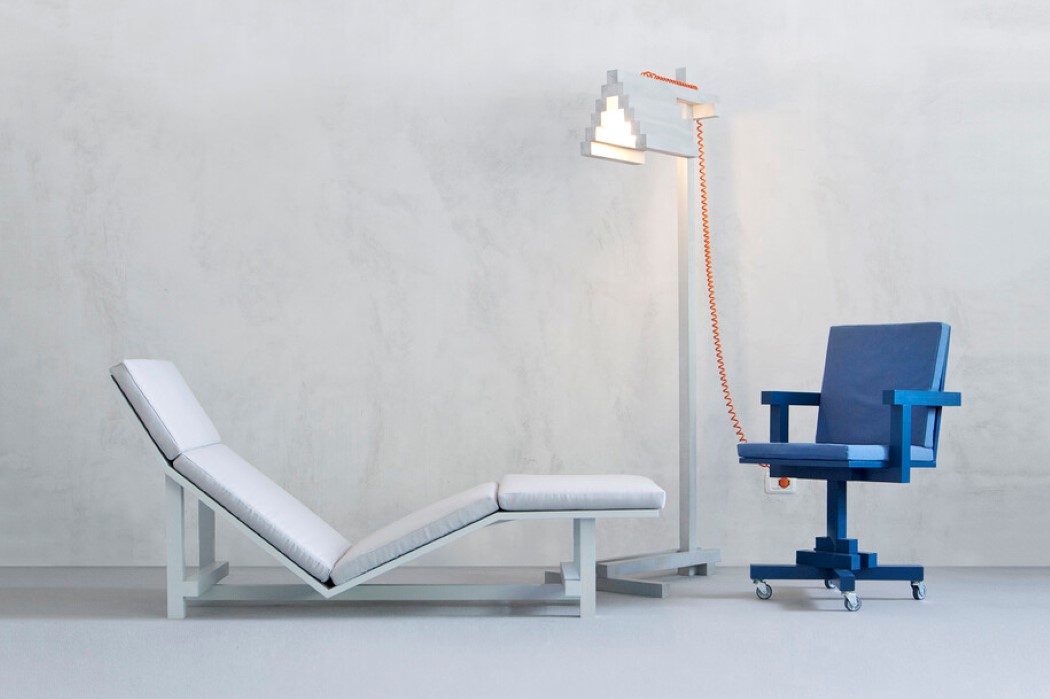
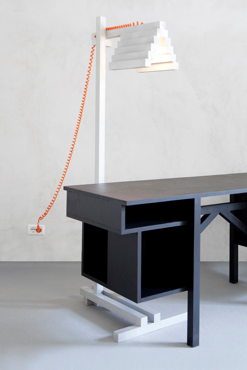
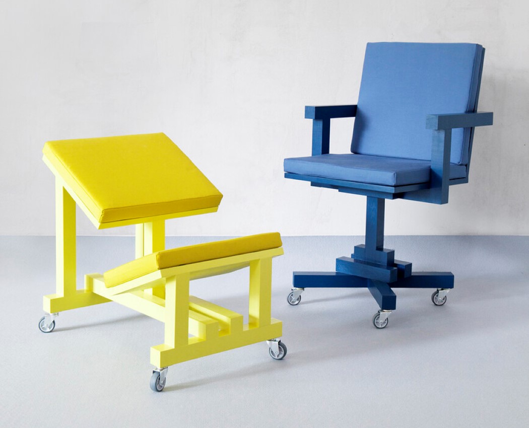
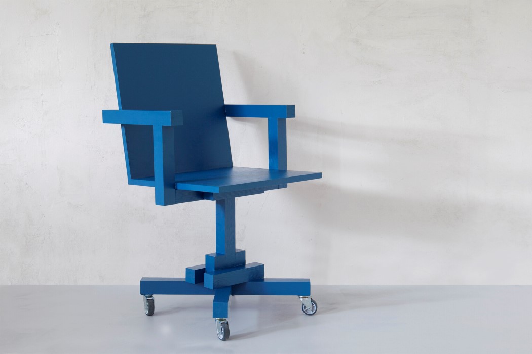
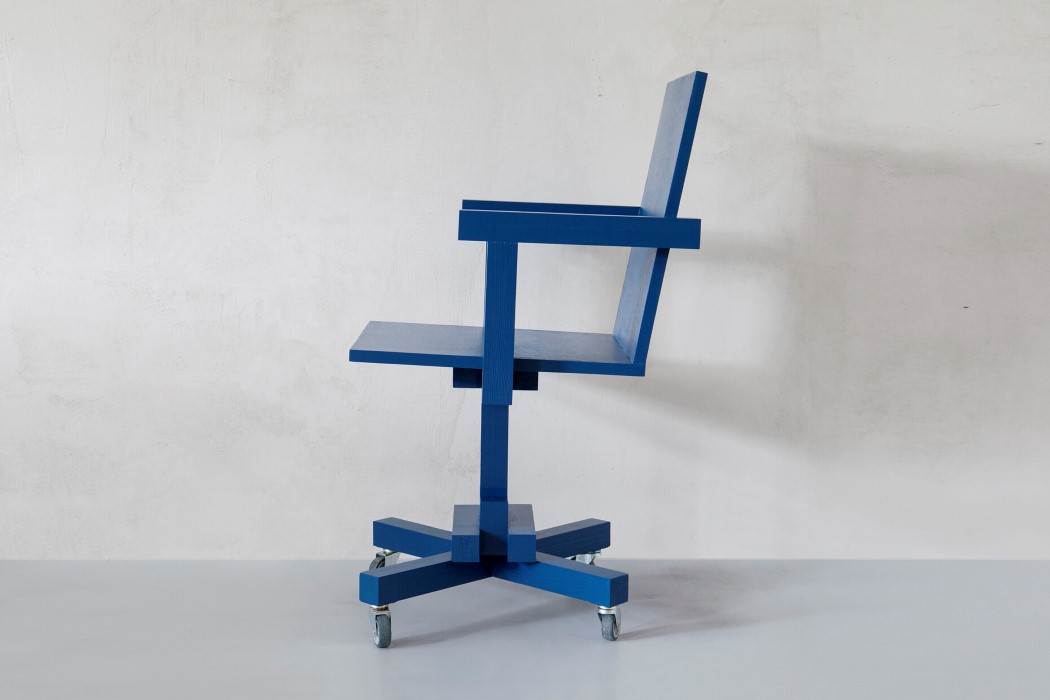
If the OFIS Collection by chmara.rosinke vaguely reminds you of LEGO bricks, Minecraft, or Jenga, let it be known that it’s completely intentional! There’s a common consensus that making objects curved allows them to look less threatening and more playful, but the OFIS shows that if done right, the opposite is just as true!

Constructed from timber, and colored with strictly monochrome hues, the OFIS Collection’s furniture promotes a sense of fun and relaxation. The collection, which includes a swivel chair, a kneeling stool, desk, chaise-longue, and standing luminaire, follows a somewhat Constructivist-meets-Memphis 2.0 design approach, and questions everything we know about form and its relationship with comfort as well as spaces. Even the name OFIS flouts the traditional spelling, showing how the collection looks at reinterpreting our “professional” and “serious” relationship with our office and its artifacts. The collection debuted after the COVID-19 pandemic rocked the world, as a way of making the office appear more benign. As these professional workspaces began infiltrating our homes and sacred spaces, designers Ania Rosinke and Maciej Chmara felt the term ‘office furniture’ needed an absolute makeover. With the OFIS series of furniture, chmara.rosinke hope to ‘soften the edges’ of the ‘hard’-working attitude we’re supposed to embody at work… even though the furniture pieces themselves showcase hard, blocky, geometric forms!

Designers: Ania Rosinke and Maciej Chmara of Studio chmara.rosinke

Google union files first complaint over alleged labor abuses

The newly formed Alphabet Workers Union isn’t wasting time challenging the tech giant on alleged labor abuses. Bloomberg reports the union has filed a National Labor Relations Board complaint accusing Google partner Adecco of illegally silencing cont...

Microsoft’s new tools help you adapt to the realities of remote work

There’s a real chance you’ll be working from home long after it’s safe to return to the office, and Microsoft thinks it can make that remote work easier to handle. It just introduced Viva, an “employee experience platform” that helps you connect with...