To be very honest with you, when I was invited by the Red Dot Awards to be a part of the Xiamen International Design Business Week, I was not very sure about what I was going for. I mean, this is not an awarding ceremony or some exhibition per se, its something very different. Forums, Red Dot Academy …. Design + China …. Really? Here is a recap on what I experienced, the people I met and why you should be seen in Xiamen next year.

What I like about Peter Zec and his team is that they are always looking at pushing the envelope for their design winners, and this tie-up with the Fujian Government is a very clever strategy. What we have here is an event that has many layers to it. It is an exhibition that allows you to showcase your work; it is a platform that attracts Business; it is a gateway to introducing design to China; it is a learning academy where a panel of experts comes in to educate designers, students and companies on the selected theme of the event.

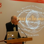
This year the theme for the Red Dot Academy was Branding – its value, it’s meaning and how to use this important tool to give and extra edge to your business. Four classes held by Gordon Bruce, Prof. Michel De Boer, Jean Jaques Schaffner and Iosa Ghini Studio, were the corner stones of the learning academy.

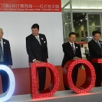
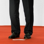
The opening day was a grand event and quite remarkable, the Chinese counterparts with a very somberly dressed Peter Zec (he is known for his flashy red shoes, and opted for formal blacks), Ken Koo and a host of dignitaries graced the stage. In true Chinese display of showmanship, the event was marked open with a very flashy Red Dot signage that illuminated as soon as the team hit the button.

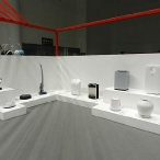
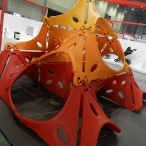
The exhibition had some interesting booths; in its third year the outreach has certainly notched up from a humble 5000 visitors to over 25,000 visitors this year. I spoke with several people during the course of the 5-day event, to get their perspective and the kind of value this event offers. Folks from the Hangzhou Teak Culture, Raft Wong from Rcube Design, Sandeep Sangaru from Sangaru Design Objects, Luis Angarita from CD&I, Dirk Schumann from Schumanndesign, Nicola Zanetti from Segnoinverso and of course the very witty Michel De Boer; some of them like Nicola have been a part of this China exhibition since its inception.

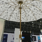
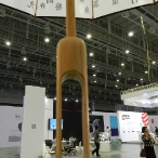
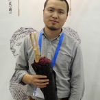
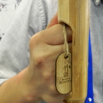
The Words of Bamboo umbrella is traditional Chinese Umbrella that won a Red Dot Award for Product Design. The designer wanted to redesign the traditional Chinese bamboo umbrella and make it modern. He wants to get new styling and design to the young generation of Chinese. Using design strategy, Hangzhou Teak Culture also wants to introduce Chinese Culture to the world. Currently the umbrella is being retailed only in China, but with this exhibition an international exposure is guaranteed. The USP is the handle, which accommodates the strong grip of a man’s hand as well as the delicate hands of a woman or children. Crafted from a single piece of bamboo and magnets, the design and craftsmanship is truly unique.

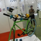
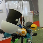
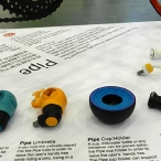
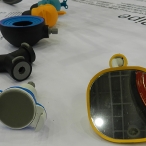
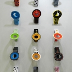
Raft Wong from Rcube Design is a young man and his startup is a year old. Asian communities are more inclined use cycles in their daily life, so his award winning Pipe multifunctional holder, which fits onto cycle bars to hold accessories, is ideal for this Xiamen Showcase. Coming to this exhibition was good for him as he got some valuable feedback from potential end-users as well as tapped into some big buyers. What I loved about his product range was the marriage of simplicity in design and functionality – a winning combination!

Sandeep Sangaru from Sangaru Design Objects is a design-entrepreneur who was always on the fence about opening his own workshop and studio. Winning his first Red Dot Award: Product Design in 2009, gave him the push that he was looking for. Soon he had people calling him up and asking him to collaborate with them. The floodgates opened and people became aware of his work. His mission is basically to marry industrial design with arts and craft. His goal is to work with the artisan community, empower them with good design that is functional and that can be commercially sold. Essentially, taking them to the next level. There was a rocking horse – a rodeo bull, as he corrected me later – that was a super hit with the children that visited his booth. So much so that a lot of inquires have come in, urging him to make an adult version of the same. Yes Sandeep, my order is in that list too … would love to ride this one! Interestingly, Sandeep works predominantly with bamboo, and when you contrast his creations with the bamboo used in the umbrella that I was talking about before, you realize how a single material can be used in radically different products, with breathtaking results.
I asked Sandeep if we could liken his efforts of promoting Indian Arts and Crafts through modern design as the same as the Japanese style of design – which is very rooted with artisan works and yet modern.
“Japanese style is very minimalist and stay evergreen and modern even years after it has been designed. It remains contemporary throughout its lifetime. Indian arts have a limited timespan or life, simply because of its colorful character and the sensibilities behind designing them is the need for them to be decorative. Here lies the difference between the two styles.” – Sandeep.
The biggest takeaway from my conversation with him is that although bamboo is a material widely used in China, products that are handcrafted in the country are much more expensive. Hence, to manufacture handcrafted goods in volume is very costly and getting competitive rates is difficult, thus designers from India and other countries where pricing can be matched, should give it a try here in China.

Luis Angarita from CD&I is a funny man! He had us in splits when he gave his presentation on the Day 1 of the exhibition, and his famous dialogue – “Not all Colombians are drug dealers, a few of them are industrial designers like me” – lightened the mood. As witty as he is, the Monsters Catmasutra – salt and peppershakers – is a clever tribute to the famous Indian book ‘Kamasutra’. Focusing on the various positions of making love, the two shakers can be ‘positioned’ in many creative ways. Born almost twenty years ago, the CD&I have grown from a student project to a company that has offices across the globe. Sharing his experiences from over the years, Luis hopes to extend out a message of spreading innovation through fun. His team won a Red Dot for their concept ‘Sense’, almost three years ago and this platform in Xiamen has helped him to connect with suppliers, get known and acquire new business clients and partnerships. Perfecto!
Lookout for them, they will be launching their own products soon.
One of the most common feedbacks that I have got from the participants is that winning the Red Dot Awards has not only helped them get recognition, it has also opened up new doors for partnerships. Moreover, it has come as a validation that they are doing something right; something innovative that is worth their salt. So all they need to do now is to keep up their caliber and maintain their inventiveness.

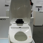
Dirk Schumann from Schumanndesign is a designer from Germany and designs mostly for the medical industry, technology and sanitary wares. This is the second time he is here for the Xiamen International Design Business Week with a booth of his own. Incidentally Dirk is also a Red Dot Awards: Product Design jury. I picked his brains to get some inside info on how a designer can ensure he wins an award; any tips and pointers? “Sometimes with a single glance we can make out if the product is worthy of a Red Dot and other times we have to really go in-depth and get into the design. It’s always easier if your product can speak for itself and is intuitive enough for the consumers to use. Attention to small details in design and functionality are of utmost importance. The standards set and the benchmarks to be achieved are very high, so to maintain quality is imperative on part of the manufacturer. Judges are also looking into the ecological impact of the product and its consumption.”
He cited a good example of this company that submitted a product that looked very good but was not worthy of a Red Dot because it lacked finesse and handling it was not a good experience. The company re-submitted the product the following year, after making refinements, and it went on to win the Red Dot and become a best seller. In short, the judge’s perspective and feedback goes on to help improve the product design and make healthy changes or refinements. The validation is an excellent marketing tool for both the design studio and the company making the product.
Many eastern designers feel that industrial design can have an artistic edge, however Dirk warns that ID is a strategic part of the product; we do not make the product for ourselves but for the market, hence we have to see it from the consumer’s perspective and not ours.

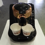
Nicola Zanetti from Segnoinverso is a designer who mainly focuses on products that are appliances. I tasted the coffee from one of his well-designed espresso machines, the coffee was excellent and the appliance was even better! Working with an international team of designers, his main clients and market is China. Using traditional methods of designing by starting with concept sketches, to brainstorming and then engineering, they keep themselves open to make changes based on engineering requirements, material costs etc. In short they are flexible enough to go back to the drawing board, should the client require it. This is a rare quality seen these days, where young studios do not wish to compromise on price, style and engineering aspects. Nicola’s philosophy is that when you design for people, it also means good design for business, because people will buy what they will like … and if they like your product, and then for sure its good for the business as the client will come back to you with more work.
My takeaway from Nicola was his experience; this was his second time at the Xiamen exhibition and he developed good contacts that led to substantial work coming his way. He’s opened an office in Xiamen and is working with the Xiamen Government to get some help to setup shop. His lecture on the opening day attracted a lot of potential clients because they believed in the value that he had to offer. He would definitely like to see a lot more workshops and lectures being held for the young students so that design can be engrained in the culture from the very beginning. Designers in China are more driven to work on shapes, Nicola hopes that this will change to working with matter that changes into shape, as this will enhance their design capabilities.
Made in China, Created in China to Designed in China.

Professor Michel De Boer is a traveling nomad who recently gave up his shares in his design studio. He gave up ‘sitting on a bus with uninspiring designers’ to travel independently in a ‘taxi’ that can take him anywhere that he wants to go. He typically now fills up his taxi with the requisite designers when a project surfaces and is enjoying the process. I asked him about his perception of design in China and its evolution over the years … and this is what he said … “There is so much of energy over here now, however you are talking about a society that has not been trained from a teacher’s point of view. In our current situation, I have noticed that the students are far ahead of their teachers in terms of imagination. However the hierarchy system is too strong here and for a student to fight it becomes very difficult. This is ironic because, if there is any place that you can stand your ground in front of a teachers, is the design faculty. On the flipside, I also see progress being made, however it is slow, it could have been faster. Communication Design is where a lot can be done, although it’s not high in demand. Branding is growing here, because competitors are arriving from other countries and the need to differentiate is great. Now that China is in the process of manufacturing its own cars, so the need to differentiate through communication and brand is being felt and this will soon apply to many other products and faculties. I foresee great opportunity for Branding Designers who wish to work here. As a part of the Red Dot Academy, I hope to unlock their minds and make them explore their creative potential. I want to make them understand that design is beyond looking pretty and that it is about functionality and solving problems.”
Very correct Michel, which is why I went to the other end of the spectrum and discovered that students like Matthew Nelson from Australia, who is currently studying in UK (Central Saint Martins), flew in just for the event. He is currently studying disruptive innovation – innovations that are game changers, like the Tablet – and thought that lectures presented in the forum regarding branding were valuable. His biggest takeaway from the Academy was meeting up with such imminent professors and getting their feedback on his works on disruptive innovation.

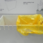
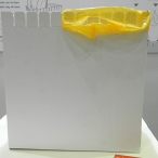
To wrap it up, it was a moment of glory when I came across the Eco Trashcan being presented by the Xiamen Technology University in their booth. I loved the design right from day one; seeing it and interacting with its designer Zhang Baoyi, who is also a professor with the university, was a treat. The Eco Trashcan will soon be on a crowdfunding platform, and its all thanks to the exposure it got after winning the Red Dot Awards: Design Concept. Sweet!
-
Yanko Design
Timeless Designs - Explore wonderful concepts from around the world!
Shop CKIE - We are more than just concepts. See what's hot at the CKIE store by Yanko Design!
(Design, Branding, Business and more with the Red Dot Awards was originally posted on Yanko Design)
Related posts:
- iF Concept Design Awards Awards 2013
- Red Dot Awards: Design Concept and Yanko Design Party Hard – Part 1
- Red Dot Awards: Design Concept and Yanko Design Party Hard – Part 2
