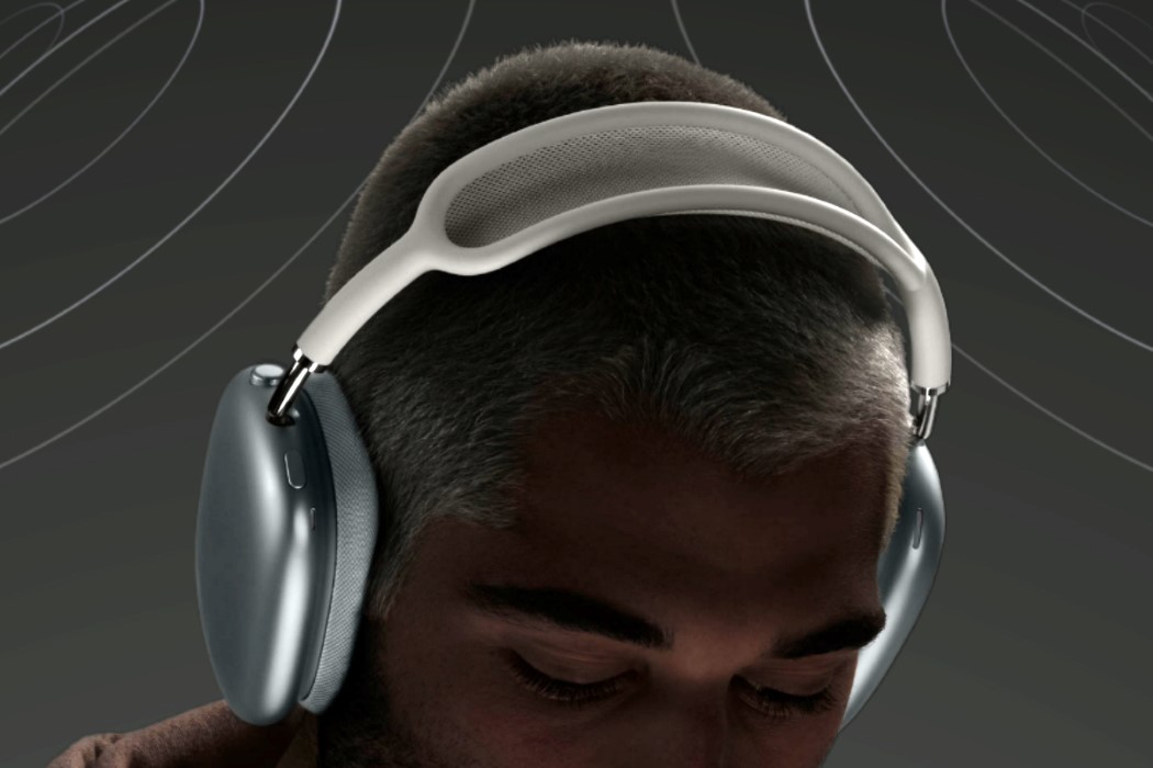
Experimental Industrial Designer Michael Young describes his diverse work as “Industrial Art”

It’s really difficult to pinpoint Michael Young’s style. A lot of designers develop a very recognizable quality that allows you to box their work into a certain category, but that’s far from true in the case of Hong Kong-based Industrial Designer Michael Young. Young’s work is best described as experimental, as he dips into a world of creativity shaped by his life in Britain, Iceland, Taiwan, Brussels, and finally Hong Kong. Young’s studio specializes in creating modern design through exploring the endless possibilities Asia’s technological ingenuity provides, while constantly pushing to experiment with new materials and see how they inform the design of different products within different categories.

Yanko Design had a chance to reach out to Michael and take a closer look at some of his work from the years gone by. Michael graduated from Kingston University in 1992 and set up his design studio the following year. With nearly 3 decades in the industry, he’s made a name for himself as one of the leading international figures in his field, and the Michael Young Studio aims at providing exclusive, quality design services across an eclectic range of markets – from interiors to technology. His minimalist, elegant, and sophisticated style is a trademark in his body of work, which has always attracted the attention of the industry and has been acquired by public institutions such as the Pompidou Center and the Louvre Museum. “It is Design as Industrial Art that interests me, not just as a limited edition, but on a scale of mass production”, Michael says about his approach to creativity and design.

Click Here to visit Michael Young’s website and view his work


Michael Young x Coalesse – LessThanFive Carbon Fiber Chair
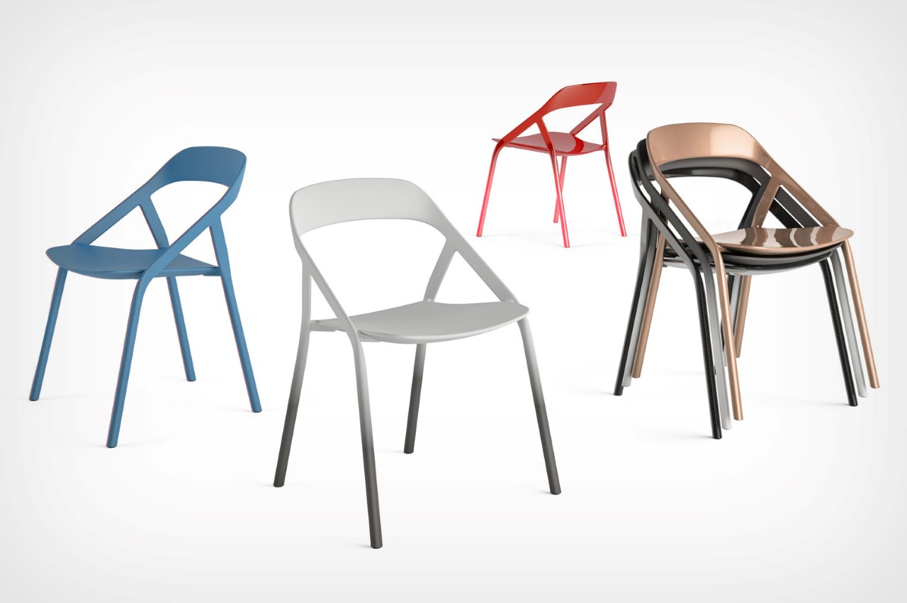
A winner of the iF Gold Award, the LessThanFive chair gets its name from the fact that it weighs less than 5 pounds. Made entirely from carbon-fiber, the chair was a collaborative project between Michael Young and Coalesse, a Steelcase brand. The chair explores carbon fiber as a material for furniture by pushing the boundaries of what the material can do. The chair’s form is so elegantly slim that it can only be made out of carbon fiber (any other material would cause it to buckle), and even though it weighs less than 5 lbs, it can hold a stunning 300lbs of weight!

Michael Young x O.D.M. – Hacker Watch
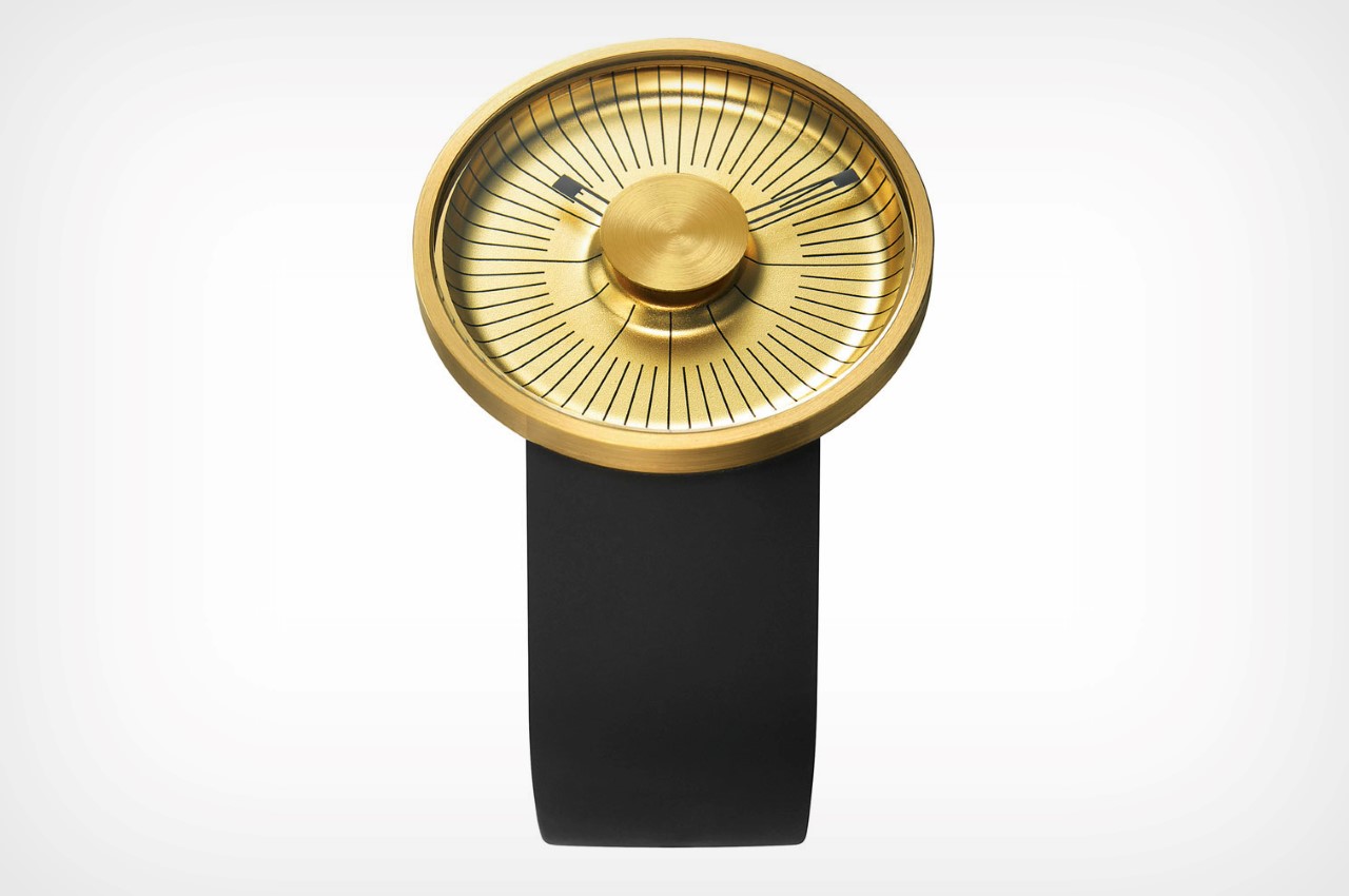
The Hacker Watch encapsulates Young’s east-meets-west approach rather perfectly. “ODM was a local brand and at the time had not worked with an international designer at this level. Paul So, the CEO, is a great thinker and had predicted world timepiece recession, due to smartphones, long before they became household items”, says Young. The watch was designed as a result of this approach, and combined an iconic design along with an affordable price, making the watch instantly desirable, even in an age where people just read the time on their smartphone. The watch was designed and manufactured in 2011, when the smartphone movement had just picked up pace.

Michael Young – MY Collection
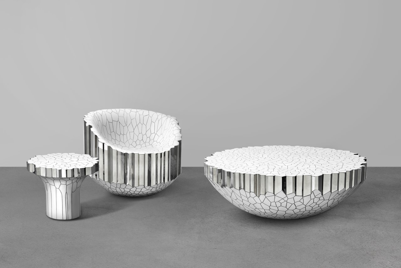
The MY Collection first premiered at Gallery ALL in LA and Beijing, and comprised a chair, a side table, a writing desk, a round coffee table, a console, and a lounge chair. The unusually designed pieces featured polished stainless steel honeycomb frames, inlaid with white enamel surfaces. Each piece consisted of a cluster of hollow metal extrusions capped at each end and covered with enamel, making the furniture look less like conventional home decor and more like eye-catching jewelry. “A while back, I had worked with cloisonné in Northern China and began to look at how patterns and colors came together and how metal could be shaped to create divisions of form”, Michael mentions. “Some of my earlier attempts were inspired by oil on water and the natural patterns generated by this when taken in a snapshot. For Gallery ALL, we looked at these in a new way by self-generating forms created by the computer, and then we extracted the patterns in two-dimensional slices.”

Michael Young x Moke International – Moke Car

Initially produced to share some of the Mini’s mechanical parts, but with a more rugged body shell to give it a life intended for the beach, the Moke holds its own as a historic and cult car with a rich 50-year history that was sadly put out of production in 1993. However, when Young got an email asking if he would work on redesigning a Moke reissue, he called it a “call of duty as a Moke Enthusiast”. It was essential to strike an equal balance for the old enthusiast and the new generation of Moke drivers, like himself. After redesigning and reengineering more than 160 new parts the MOKE was brought back, better than ever. “It has the same spirit, the same style and is just as suave as the original Moke”, says Young.

Michael Young x CIGA Design – Templates Watch
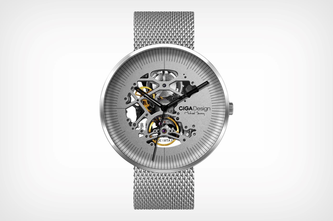
The Template watch hopes to merge the movement and face into one singular piece. It isn’t as much a skeletal watch as it is a work of art that also displays the watch’s fine engineering. Yet another winner of the iF Gold Award, the Template Watch flips the tradition of having a plain watch-face and integrating a transparent exhibition back to showcase the watch’s movement. Instead, the ornately designed watch-face itself lets you peer through and see certain aspects of the watch’s movement. It balances its ‘industrial aesthetic’ with curved edges on the watch-face, that give it a softness to the appearance.

Michael Young – Oxygen Chair

Perhaps one of the most unusual projects in Michael’s body of work, the Oxygen Chair has a strangely relic-esque quality to it… along with an incredibly interesting manufacturing method. The chairs are molded out of aluminum that’s injected into steel casts along with high-temperature gas at immensely high pressures (hence the name Oxygen Chair). The process is somewhat similar to how rocks are formed, and the resulting chair looks less like metal and more like an excavated block of stone with imperfect, porous surfaces that are almost in line with igneous rocks. Finally, to give the furniture its color, it’s coated in a way similar to ceramic glazing, but with absolutely rustic and unusual results. The final chair challenges the archetypes of furniture and craftsmanship, offering a radically experimental manufacturing method that results in chairs fit to be in a museum!

Michael Young x Lasvit – Homune Table
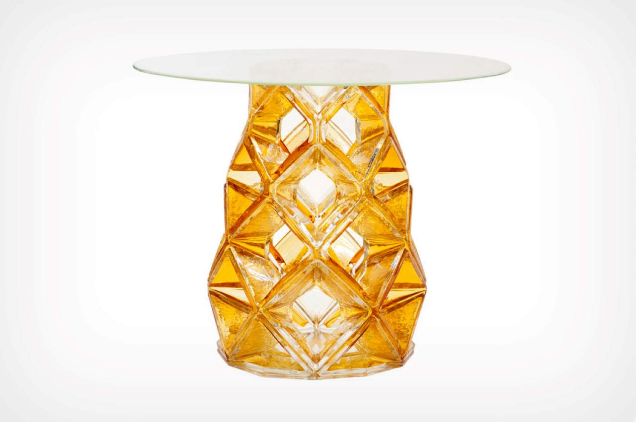
Once again challenging the archetypes of furniture, the Homune Table combines jewelry and furniture design into one absolutely eye-catching final product. The Homune Table’s base comes hand-blown from amber-glass, giving it an almost gem-like appeal that’s accentuated by the geometric design of the base. The honeycomb structure isn’t just an aesthetic detail, but rather gives the table strength too, while the complete glass design really sets it apart as bordering on glass solitaire.

Michael Young x Christopher Farr – Voronic & Tessellation Rugs
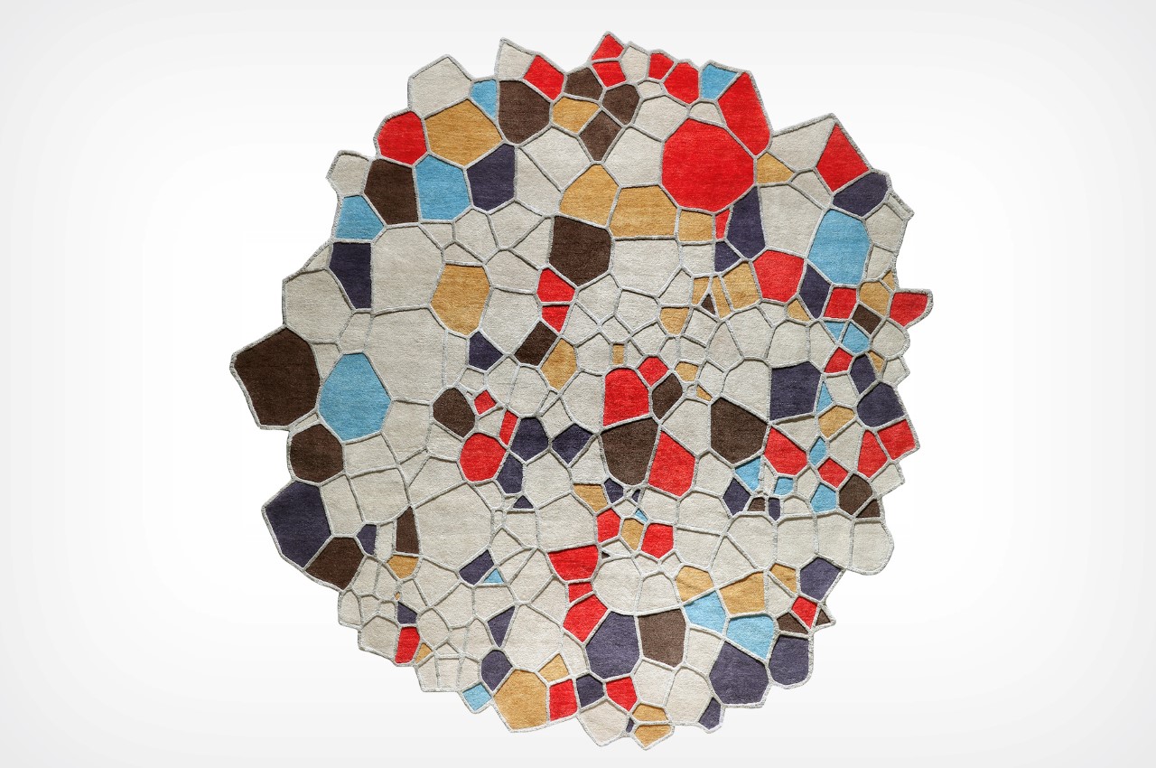
Designed to look less like a fabric rug and more like stained-glass art, the Voronic & Tesselation Rugs is a result of a long-time partnership between Young and rug-company Christopher Farr. The use of voronoi patterns gives the rug an aesthetic that’s a massive deviation from the oriental and occidental rug styles, or even contemporary rugs, that are either rectangular or circular in shape. ‘Voronic’, a hand-knotted rug, and ‘Tessellation’, a hand-tufted version are both designs configured through Young experimenting with a voronoi pattern. This motif is found in nature – where it is perhaps most instantly recognizable as the pattern of a giraffe’s skin, or even in the cellular patterns found on leaves. With various points of shape and color, this rug is infinitely customizable, allowing it to expand as a series, or even be tailor-made to certain spaces/rooms/interior styles.


Young’s work spans nearly three decades, multiple continents, and features clients/brands like Steelcase, Titan, Lacoste, Coca Cola, Absolut, Hair, CIGA Design, Native Union, and many more. He’s been a recipient of multiple awards, including the iF Design Award, Red Dot Design Award, Tokyo Good Design Award, German Design Award, and the Eurobike Awards, among others. Young’s work has even found itself a home in institutions like the Louvre, San Francisco Museum of Modern Art, and The Design Museum. Click here to visit Michael Young’s website and see his other works.


Tesla hasn’t produced any new cars in over 2 years… but it can’t stop announcing them.

[This is an Editorial. The views, opinions, and positions expressed in this article are my own.]

Tesla’s most popular car to date, the Model 3, was announced in 2016. Its most recent production unit, the Model Y, was announced in March of 2019, more than 2 years ago. Ever since that moment up until now, Tesla’s debuted the Roadster 2nd Gen, the Tesla Semi, the Cybertruck, the Cyberquad, and finally today, an updated Roadster 2nd Gen (SpaceX Package). It hasn’t committed to a delivery date for any of them.

Imagine you ordered the iPhone 12 in 2020, and Apple said it would deliver the smartphone to you in 2021. You wait for a year and instead of receiving an iPhone 12, you receive news that Apple, instead of working on producing and delivering the iPhone 12, spent all that time designing an iPhone 12S. Apple now has two conceptual products in its catalog, and you, the consumer, have nothing in your hand. That’s the short story of the Tesla Roadster. If you’re one of the thousands of people who have been waiting for the 2nd Gen Roadster since 2019, you probably feel pretty annoyed that Tesla already announced a better version without even delivering on its previous version. You can’t even buy the Roadster 1st Gen since the company promptly discontinued it. In short, the Roadster is basically a myth at this point… quite like the Cybertruck.

Along with its Roadster 2nd Gen update, Tesla also sent a shoutout mail to the millions of people who ordered a Cybertruck saying… well, saying that the company hadn’t even begun producing it yet. The pickup truck, which was scheduled for delivery in 2021 will start production at the end of 2021. In short, that $100 pre-order you gave to the car company was just one massive paid newsletter program. You’re not going to receive cars by a long stretch in time… you’re just going to receive updates.

All this sort of proves one point that many people have been making for a while now. Let’s first start by acknowledging that producing cars is HARD. It’s an absolute herculean task taking a sketch or a concept render all the way to production – it requires a tonne of money, man-power, infrastructure, a robust supply chain, international cooperation, extensive testing, and a marketing team on steroids. That being said, it’s safe to opine that Tesla isn’t selling cars anymore – it’s selling hype, and more than an entrepreneur, Elon is a hypeman. There’s no doubt that Tesla is at the very forefront of innovation, but it’s difficult to digest that the company’s worth shot up from $75 billion in 2019, to $559 billion today when it hasn’t produced a single new car in the interim.

Full disclosure, I own Tesla stock. I saw its meteoric rise last year and fall this year. I’d love to drag Elon through the mud for being the market manipulator dudebro he is. Ever since his $420 tweet up until now, where he somehow has the power to make cryptocurrency values rise or fall just by tweeting about them, Musk is nothing but a self-proclaimed hustler but this isn’t about him, it’s about the effect he has on Tesla’s ability to hold its ground as a car manufacturer instead of becoming a hype manufacturer.

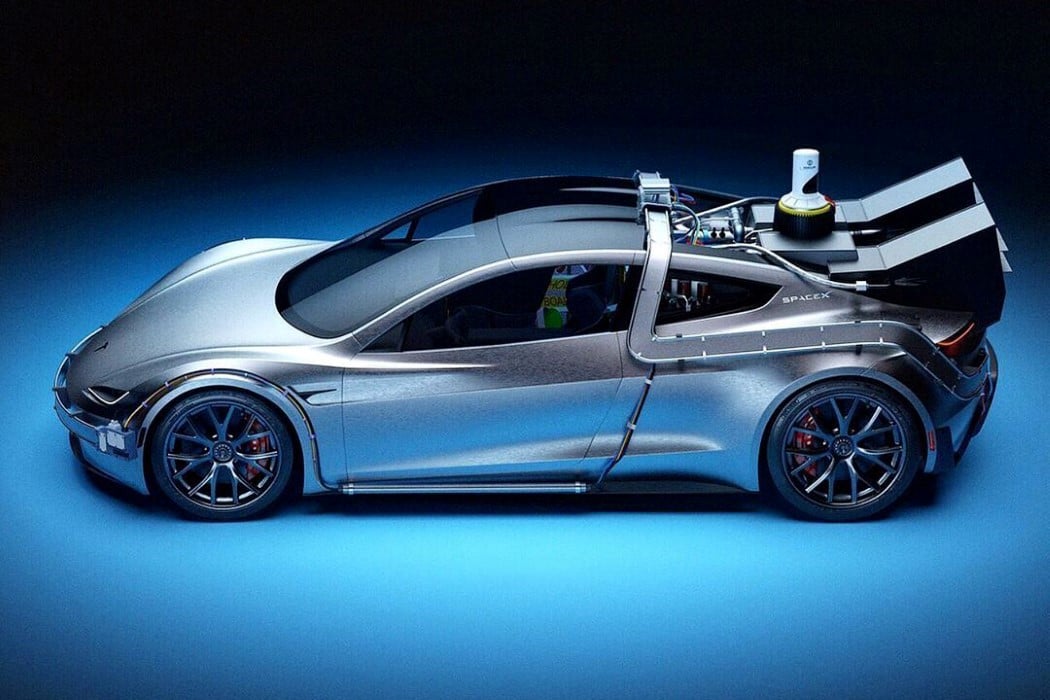
For the sake of context, let’s just look at what Tesla announced this weekend. The company’s NY account announced that the Roadster prototype was being showcased at the Petersen Automotive Museum, to which Elon promptly announced that the production model would look even better than the prototype, and a special SpaceX package (courtesy a collaboration between two of Elon’s companies) would see the Roadster getting a major acceleration upgrade of 0-60 in 1.1 seconds, thanks to the presence of cold air rocket thrusters built right into the automobile. Sounds fancy, right? Well, it also sounds imaginary because the Roadster IS imaginary. Those specs mean nothing if the product doesn’t exist. It’s a lot like Musk’s fancy underground tunnel network, which was supposed to help cars avoid traffic by blitzing through sub-surface tunnels at nearly the speed of sound. A demo video released by The Boring Company showed pretty much that, except the cars were moving at a paltry 40mph. Musk also was responsible for major fanfare around Neuralink, his revolutionary brain-augmenting hardware company. Their first major demo had nothing except for a few pigs demonstrating how the Neuralink chip could read brainwaves. Impressive, sure. Is it what Elon promised? Not by a far shot.

The irony of me being the editor of a design website that primarily covers conceptual content isn’t lost on me. However, those concepts don’t trade on the stock market. After a certain point, what’s the difference between Tesla and some designer with a Behance profile – they both announce concepts, except one of them’s a $559 billion-dollar company. What’s the point of innovation if it won’t exist for another half-decade (a conservative guess, no less)… we’re also assuming that Tesla will actually deliver on these promises – so if it doesn’t, how is Tesla any different than Theranos or Magic Leap??

You see, the reason I used Apple as an example earlier on is that barring the AirPower, Apple’s always been absolutely 100% certain of its capabilities. It announces products it intends on delivering in the near future. Apple is great at innovating WHILE managing its expectations… and if Tesla wants to be treated as a disruptor and a company modeled on the fast-paced Silicon Valley modus operandi, it better deliver too. Not on ideas, not on random flip-flops between fiat currencies and cryptocurrencies, but on expectations. Sure, I understand that car-companies often announce models that take a year or two to produce. However, Tesla isn’t most car companies, and the Roadster still doesn’t have a definite set-in-stone delivery date even 2 years post its announcement. Heck, the Cybertruck was announced 20 months ago and it still won’t begin production for another 6 months at the least. There’s no doubt in my mind that electric cars are the future… but let’s face it, every tweet Elon sends needs to end with “Terms and Conditions Apply”.


Designer Charlie Nghiem imagines what the Tesla Roadster SpaceX Package could look like

Ten Podcasts you should listen to if you’re a Creative or a Designer in 2021

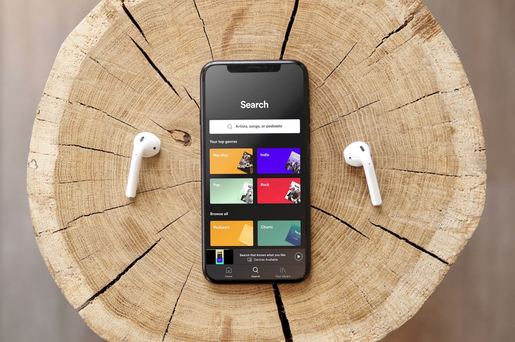
Working from home comes with its perks, but also with its fair share of loneliness. I like being the king of my castle and working in my pajamas, but for most of the time I spend working, I stay alone. I’ve been listening to YouTube videos in the background for a while now, but I only installed my first podcast app in 2018. Over the last two years (primarily 2019), podcasts have been my way of surrounding myself with informative (and sometimes comedic) chitchat. Podcasts are a great way to pass time while you’re sketching, or searching Pinterest for mood-board images, or selecting multiple edges and faces of a solid to apply a complex variable fillet on. I personally love listening to them as I eat, travel, edit images I need to add to my articles, or while tinkering around with design software. These podcasts are a lovely way to fill the silent gaps in your average WFH day, and offer a great alternative to the discourse you’d have at your workplace, be it about design, tech, creativity, self-help, or occasionally, even politics. Here are my 2021 picks for podcasts to listen to if you’re a creative.

1. TheFutur Podcast


Led by TheFutur team and Chris Do (who recently launched a book too), TheFutur Podcast is literally like going to design university for free, which is why we put it on the top of our list this year. Chris Do is one of the most prolific design gurus of our time and offers excellent advice on common design problems, whether it’s what to charge as a designer, to whether you should follow your passion or paycheck. TheFutur Podcast oscillates between insightful debates to meaningful interviews with designers in the industry who share their own tips and tricks to ‘making it’ in the diz-biz (that’s what I’m calling it from now on). They have some great videos on YouTube too.
WebsiteApple PodcastsSpotify

2. Solvable


Solvable showcases the world’s most innovative thinkers and their proposed solutions to the world’s most daunting problems. Conducted by Malcolm Gladwell (Revisionist History) and Jacob Weisberg, these interviews explore and acknowledge the complexity of the issues while inspiring hope that the problems are, as the name of the title suggests, solvable. The show tackles broader systemic problems like global hunger, vaccine distribution, destructive agriculture, the tech gender gap, and so on.
WebsiteApple PodcastsSpotify

3. Food by Design: an IDEO Podcast


Perhaps one of the biggest systems challenges to ever present itself to us – the way we grow, produce, distribute, and consume our food. From the fine chaps at IDEO, this podcast tackles the various aspects of our complex food chain… from how we grow our plants to how much we tip our waiters. Listen in just to get a sense of how one of the world’s largest creative consultancies thinks and works.
WebsiteApple PodcastsSpotify

4. Designed This Way


Designed This Way is the east’s answer to Design Matters with Debbie Millman. Hosted by Kawal Oberoi, a graphic designer and brand consultant from India, Designed This Way lets you be a fly on the wall as Kawal has candid conversations with leading designers from India and even outside the subcontinent. The podcast helps uncover “not just the stories of courage, hard work, and success but also the stories of mistakes, rejections, and doubts.” A great podcast to listen to if you want to know more about a country that is only just discovering the power of design, and more about the people leading the way.
WebsiteApple PodcastsSpotify

5. The Honest Designers Show


The Honest Designers Show is one of my most frequently recommended podcasts for designers. Rather than dealing with in-depth interviews, it feels like sitting in the break room with fellow designers and literally talking about design. Hosted by Tom Ross, Ian Barnard, Dustin Lee, and Lisa Glanz (all accomplished designers in their own right), the podcast never fails to tackle relevant topics and deliver some key insights to designers about various things, from working with creative blocks, to using social media to your to propel your portfolio, determining your value as a freelancer, and even working effectively with your clients.
WebsiteApple PodcastsSpotify

6. Should This Exist?


A question every designer must ask before creating a product or a solution, ‘Should This Exist?’ tackles the toughest part of being a creative. It questions whether products are solving problems or exacerbating them, and presents you with a perspective that makes you wonder whether the act of creation requires more scrutiny. Give this podcast a listen, it’ll recalibrate your empathy and world-view. The podcast hasn’t released any episodes this year, but every one of its episodes from the past is a gold-mine. Personal favorite episodes – “When your invention becomes a weapon”, and “Tell your troubles to the chatbot”.
WebsiteApple PodcastsSpotify

7. This Week In Tech


The last word in tech is the first news of the week. This Week In Tech is hosted every Sunday night, so you begin your week with the freshest news and perspectives on the world of tech. Hosted by Leo Laporte, this one’s special to me because it’s the first podcast I ever listened to. In fact, it’s been running for so long, it used to be called a netcast before the word podcast was in the mainstream. Leo brings his wisdom and humor together along with a panel of the who’s who in tech journalism. Add this to your list if you like a slice of technology news along with your design breakfast every week. The show is available in a video format too, you can use the YouTube button below to view their episodes.
WebsiteApple PodcastsSpotifyYouTube

8. Creative Confidence Podcast


The podcast follows in the footsteps of the book Creative Confidence by IDEO founders David and Tom Kelly. Think of it as a TED Talk just for creatives – The IDEO U Creative Confidence Podcast hosts candid conversations with some of today’s most inspiring change makers, design thinkers, and creative minds. What’s even more refreshing is that the show meticulously sources and invites guests from incredibly gender and race-diverse backgrounds.
WebsiteApple PodcastsSpotify

9. Working


The greatness of design is that its goal lies in helping uplift other industries and fields. Being a designer often means working with (and often looking at the world through the eyes of) people from a wide variety of professions, whether they’re businessmen, scientists, doctors, engineers, celebrities, etc. Working is a podcast that dives into how different professions work and how professionals in these fields go about their day. With over 200 episodes and counting, Working interviews a complete gamut of people, from curators at MoMA, to husbands of influencers, coders at NASA, firefighters, and even a few designers too. A great way to understand how professions work, how systems function, and even to help spot areas of intervention in these systems for creative problem-solving.
WebsiteApple PodcastsSpotify

10. Product Hunt Radio


Coming from the popular product discovery site, Product Hunt, this weekly podcast show has Ryan Hoover and Abadesi Osunsade interview founders, investors, journalists, and makers to discuss today’s products and tomorrow’s topics. Whether it’s in the field of design, funding, marketing, or even of podcasts, the show finds out how people found success in their industries, and what lies in the future for them and the world.
WebsiteApple PodcastsSpotify

A designer and consumer’s critique of the new Apple Airpods Max headphones

It’s been roughly 13 months since the last time I felt the need to express a sense of disdain at a product launched by a large company – and in a lot of ways, it’s a good thing that I haven’t found myself tapping into this side of me in over a year. It’s a testament to the fact that we’ve got enough good design to talk about. The Swiss-Cheese Mac Pro and the Toblerone-on-wheels Tesla Cybertruck drew my ire last year, and while most of my time in 2020 has been focused on making banana bread and dalgona coffee while we figure out the vaccine situation, I now find myself disapprovingly tut-tuting at Apple… and it isn’t because the company has literally had 4 separate keynotes in a single year.

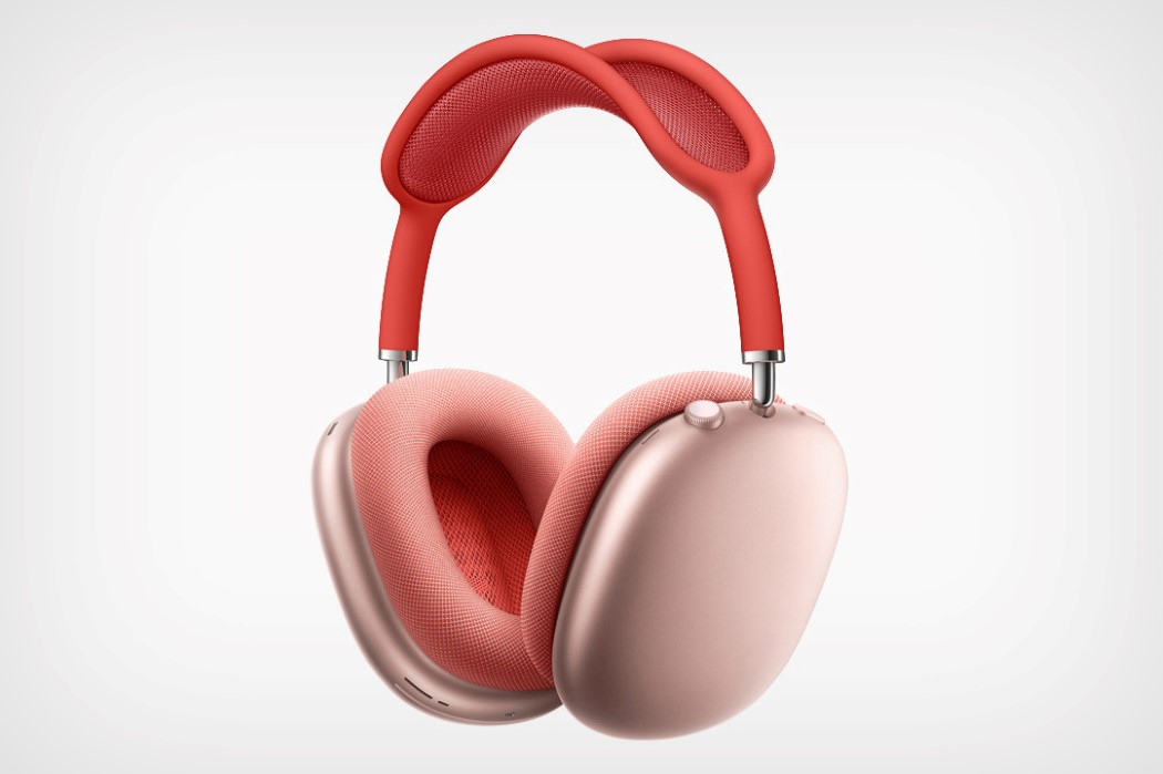
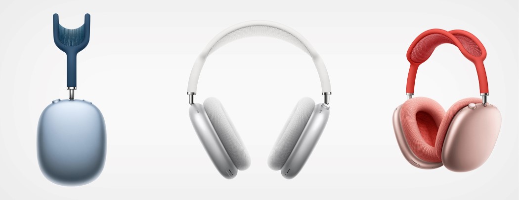
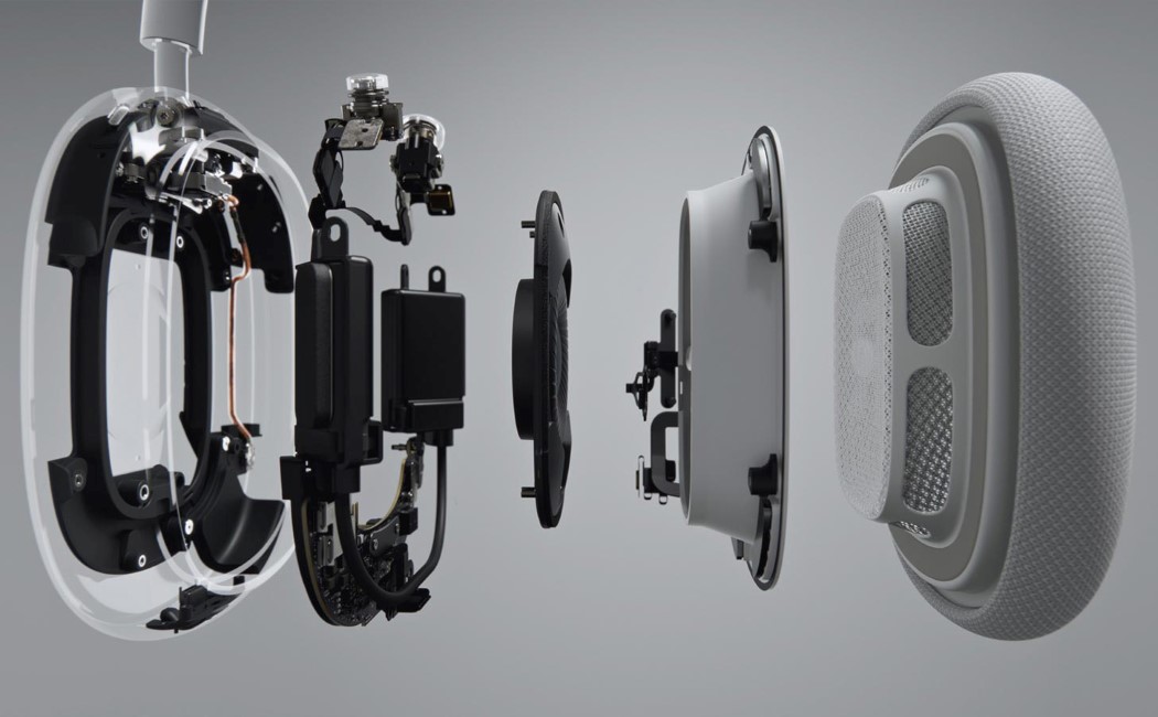
Let’s talk about Apple’s “One more thing” moment this year with the AirPods Max. Steve Jobs would be rolling in his grave at that word-salad of a product name for something as simple as “headphones”. The name, however, is just one of many issues I have with the product, which I’m sure is “the best pair of headphones” Tim Cook’s ever experienced. So, why don’t we break down the AirPods Max and analyze why Apple’s probably dropped the ball on this one.

Hey Apple, it’s a name, not a family tree…

I can only imagine how disappointed children will be on Christmas when they ask for the AirPods Max and their parents come back with a pair of 2nd Gen Airpods saying “Isn’t this what you asked for?”. Names are supposed to give you clarity, not confuse you. The strategy has been working phenomenally well for Apple’s MacOS version nomenclature (which used to be named after animals, but are now named after locations in California). It’s sweet, memorable, and you rarely confuse version Catalina with version Big Sur because they sound so different. The AirPods Max, however, is confusing because each word is a separate product, and I venture it won’t be long before they release a pro-line of headphones that they’ll call the AirPods Max Pro.

Wait, where’s the Apple Logo??

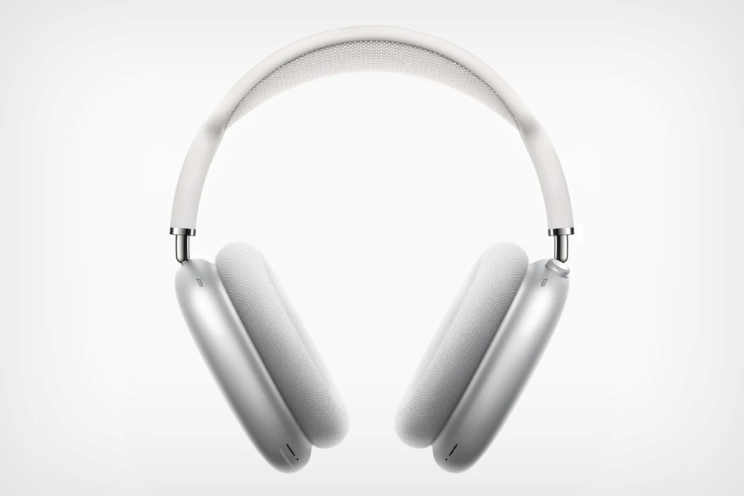
Aluminum used to be a design statement a decade ago. Now it’s just the ‘boring option’. The AirPods Max’s biggest tragedy is that it never built on the legacy left by Beats by Dre. Instead, you’ve got a product that looks like something available at a Shenzen streetside vendor with no branding or recognizable design language. That’s right, not even an Apple logo. Now the AirPods (the small ones) had a valid reason for not including the Apple branding on them. They were small… and they looked exactly like the wireless versions of the EarPods that came with each iPhone (which also didn’t have the branding on the earpieces). The AirPods Max, on the other hand, are large enough to accommodate the logo, but more importantly, they’re a new product and category… two pretty strong reasons to need to brand your product (especially as some sort of protection against counterfeiters). I mean, even the Beats headphones had massive branding on them.

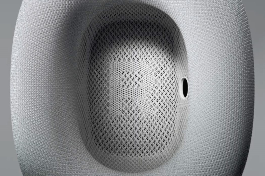
The lack of branding is just further reinforced by the lack of identity. The AirPods Max would look practically unrecognizable in a sea of headphones (even though the AirPods are a design icon themselves), and if that wasn’t embarrassing enough, take a look at this concept from a couple of years back that arguably does a MUCH better job of looking like a great Apple audio device. It has synergy, by using the same weave pattern on the HomePod and even the same holographic abstract color-blob associated with Siri. The AirPods Max, however, looks like something you’d find in the ‘Free Models’ section at CGTrader. However, I’d be remiss if I didn’t show appreciation for the Apple Watch-inspired rotating crown on the top of the right-earcup, and the way Apple weaved L and R into their loose-woven earcups.

Too Little, Too Late, Too Expensive

I honestly can’t think of a good enough excuse for why Apple waited this long to release their wireless smart headphones. They launched the AirPods in 2016, waited a whole 3 years before launching the AirPods Pro, and then decided now was a good time to drop the headphones, when a majority of Apple users already own the wireless AirPods. Those 4 years were enough to see a wide variety of companies like Sony, Bose, and Microsoft launch their OWN smart headphones… a blunder that Apple made with the HomePod too, releasing the device years after the Amazon Echo and Google Home. That would’ve been tragic enough if Apple hadn’t also made the massive error of pricing these at a whopping $549… that’s double the price of the Microsoft Surface Headphones (2nd Gen) and it’s as much as the price of the iPhone 11 today. It seems like Apple is doomed to repeat the same mistakes it made with the HomePod, even though I’m sure the AirPods Max are a pretty impressive pair of headphones when push comes to shove (I’ll wait for the reviews to come in). Now let’s hope Apple doesn’t surprise us with any more launches this year.

Designer: Apple

Lessons design school didn’t teach me – Entrepreneurship and how to protect your creative work

As designers, we often care most about creating the best possible product and can be guilty of tunnel vision during the design process. However, I learned the hard way that it is critical for designers to have a basic understanding of the mechanisms that surround and support product design to ensure our creative efforts and the businesses built around them are protected. It isn’t just about designing something, it’s about safeguarding what you design too.

Protect yourself and your work! (Intellectual property)

Intellectual property was something I didn’t understand or have time for until it was too late. A modular lighting unit I designed during my graduation thesis soon went on to become a successful commercial product (I eventually developed my own company around it too), but it wasn’t long before the internet was just flooded with cheap copycats. They were essentially the same design with cheaper components, less reliable assembly, and a heavily undercut price tag. Not only did it hurt the business, but it ended up hurting the brand I built too. Without IP protection, designers lose leverage with the business or person we are partnering with. Having the right protection in place is extremely helpful when negotiating a deal and having a certain amount of control over what happens to our work.

More importantly, IP protection prevents other companies from copying and selling our work. It has been tough to see how ruthless some of the overseas markets can be when it comes to plagiarism. Unfortunately, the more successful my designs were, the more appealing a target my work became. I’ve seen third parties literally just copy and paste entire websites – the images, the copy, the product, company mission, etc.

At times it often felt like everybody was profiting from my hard work, except me. And once it starts, it’s extremely difficult to stop since most of these companies are based overseas and do not have any contact information available. Usually, the best course of action to combat this is to contact the actual platform they are using, Shopify, Amazon, Instagram, etc. The best way to slow their growth is to target where they’re growing.

Like myself, I‘m sure many young designers are financially limited when starting out, so the process of getting a patent can be quite daunting. Everyone’s situation can be unique so please seek professional advice but I would suggest at minimum to file a ‘provisional patent’. You may be able to do this without a lawyer depending on the complexity of your design and it is the cheapest and easiest way to get you off to the races. A provisional patent will essentially put your design protection in a queue and give you priority. And you don’t need to be completely specific when filing at this point. It will take around a year to clear, after which you can decide if you want to spend a little more money on writing it properly and filing it officially. While it’s processing you can use the term ‘patent-pending’ as a form of protection. Here are a few ways of protecting your work.

• Utility patent – Used to protect new technologies and concepts.

• Design patent – Used to protect the aesthetic of your product.

• Copyright – Used to protect original works of authorship like images, music, copy etc. (This is automatic)

Read the fine print! (Contract and business law)

Every designer should have an understanding of what a fair deal is! It sounds basic but it’s not something most designers are familiar with. Just ‘getting exposure’ for creating the majority of a company’s assets is not good enough. It is hard to understand how certain contract structures will play out until you have lived through them. However, I would advise designers to take a crash course on standard deals between designers/inventors and businesses.

One of my first mistakes out of school was signing a deal for a share of ‘net profits’. It sounded fair to me until I learned that ‘net profits’ isn’t a clear-cut figure, and can quite easily be manipulated. If you do sign a deal for a share of profits/revenue, then at least know that you have the right to have visibility and transparency from the company on their numbers (Quarterly profit/loss statements).

I would suggest that before getting into negotiations you make sure you have a clear idea of what you want the outcome to be. Would you like a one-time payment for your concept and head off into the sunset or do you want to be a part of the journey and help build the business? There’s no written formula for which route to take, but it’s a gut decision ability that you’ll develop with time and experience.

Plan for all contingencies (Good as well as Bad)

This is probably a lesson that is very familiar in the startup world but you need to make sure you have the tough conversations right at the outset instead of operating on dreams and lofty assumptions. Although it may be an uncomfortable process, but if you’re looking to be an entrepreneur and starting a business venture with a new partner you need to make sure you are very clear upfront regarding responsibilities and compensation. Ask yourself “What happens if this business/product makes $1,000,000?” “What is our company mission?” “What happens if we accumulate a large amount of debt?” “Do we have a process in place if we disagree?” “What happens if someone is not fulfilling their duties?” etc.

When starting out, everyone is probably very conscious of maintaining a positive mentality. But don’t be afraid to talk through all of the different potential road bumps or outcomes with your partner. Focusing on building a successful business first and then worrying about it later is a mistake and a difficult (and very expensive) lesson I learned the hard way. You do not want to invest your time and money until you have made the terms extremely clear upfront and have these agreements dated and signed!

You can do it too! (Having confidence in your abilities)

Even after receiving significant recognition and multiple awards coming out of university, I still didn’t really have full confidence in myself and my abilities. I would love for someone reading this who is thinking about starting their own business or design studio to have the confidence to go for it! I may be a little biased but I believe the design and creative-ability of a business is really the secret sauce. I think the importance of good design and good branding is becoming more and more significant as time goes on and markets saturate.

There is no better feeling than seeing something that was previously just a thought in your mind materialize into the real world and then see customers interact with it in a positive way. The journey is long, and you will need some perseverance, optimism, and a clever strategy along the way, because there will always be pitfalls and competitors jealous of your success. Have patience and realize success doesn’t happen overnight – being successful is, in fact, a journey, not a goal… and it’s all in constantly looking at the road ahead, and how you deal with the challenges that come your way!


ABOUT THE AUTHOR

James Vanderpant is an award winning industrial designer and inventor of the world’s first modular, touch sensitive lighting system. He graduated from Brighton University, England in 2016 where he founded Brighton’s biggest product design exhibition. He is now running Polygon, a designed focused company in NYC (polygonlight.com) and is also working on the next bathroom revolution. Besides this he also runs a YouTube channel – making creative and design centered videos.

Timeless or Trendy: How to choose the right design direction for your consumers

Hi, I am Kelly from Knack, where we help mobility brands make their products irresistible.
I recently wrote an article about how to design timeless products. The comments and discussion that followed highlighted the fact that trendy and timeless products serve different purposes. One isn’t necessarily better than the other. However, one IS more irresistible, depending on who your customer is.

So, in this article, we’re going to dive into what makes a product either trendy or timeless and determine which type is right for your product.

IRRESISTIBILITY

To be irresistible, a product must possess an enticing aesthetic, solve a meaningful problem, deliver a delightful user experience, and have a no-brainer price tag. An irresistible product must check all of these boxes, but can also be either trendy or timeless to boot.

It is important that you understand what makes a product trendy or timeless so that your product’s fate is not accidental, but instead part of your design strategy.

Let’s take a close look at each:

TRENDY

The Cambridge Dictionary defines trendy as, “modern and influenced by the most recent fashions or ideas.” Trendy products flaunt hot, popular attributes.

To design a trendy product, focus your product development efforts on exploiting the in-thing your customer is most obsessed with. Trendy products require an understanding or prediction of the current fads and quick action to deliver a relevant product before the trend fades.

With a design that’s trendy, you’ll be able to ride the wave of buyer interest created by the current craze. Heavily influenced by emotion, your consumers will buy more impulsively to fill an immediate need or desire.

TIMELESS

Unlike trendy designs that are focused on being relevant in the present day, timeless design is focused on staying relevant and looking appropriate for many years to come.

When setting out to design timeless products, avoid clues of the current time. Instead, strive for a proper proportion, functional form, and classic colors that were cool way back when, now, and for many years to come. Designing timeless products requires an extra level of thoughtful refinement, void of frivolous aesthetics, often yielding an understated product.

Achieving timelessness in your design gives your product staying power, sparing you a great deal of future new product development costs while allowing your product’s fan base to compound over time.

WHICH ONE?

Again, whether your product should be trendy or timeless depends on your consumer. While many designers would argue that a product should always be timeless, timelessness requires an extra level of aesthetic refinement and subtly that a here-today-gone-tomorrow product can’t always afford.

If your consumer values keeping up with the times, looking cool and flashy in the moment above all else, your product needs to be trendy. A consumer who is obsessed with the latest and greatest will inevitably be onto the next big thing soon. In this case, there’s no reason to over-invest in a timeless aesthetic.

If your consumer values products that endure the test of time and don’t look dated in just a few years, or you just simply want to invest in a product that doesn’t need to be revamped every 3 years, you should pursue a timeless design.

Note: With strategic industrial design execution, it is possible for a product to be both trendy and timeless.

Do you know what your consumer desires? As soon as you do, you’ll be one step closer to achieving irresistibility.


ABOUT THE AUTHOR

Kelly Custer is the Founder + Design Director of Knack

Pairing her transportation design education from the College for Creative Studies in Detroit, Michigan with over 8 years of design consulting experience in consumer products, Kelly has built a strong passion for mobility. She founded Knack in 2014 and leads the studio to deliver irresistible simple mobility products.

When she’s not in the studio, she can be found on a mountain bike trail, trying to keep up with her husband on her dirt bike, or exploring the Tennessee river on their vintage stand-up jet skis.

Follow Knack on Instagram

What should smartphones look like after COVID-19? An open letter to Apple, Google, and Samsung

Hint: It definitely doesn’t involve expensive folding smartphones.

In a span of one month, I’ve seen leaks and official releases from OnePlus that indicate that they’re launching 3 phones (the 8, 8 Pro, and the Nord) in just the first half of 2020. That figure pales in comparison to Samsung, which has ALREADY launched 6 flagship phones just between January and March of this year (with more in the pipeline). Apple’s launched one low-end iPhone and is working on two more flagship iPhones to launch in September, Google’s allegedly working on the standalone Pixel 4A and the Pixel 5 series. Do we really need so many phones? Wait, let me rephrase that. Do we really need each tech company to launch a minimum of three smartphone models each year? I’m not even including Samsung’s A and M series, which would bring its grand total of 2020 launches to 16 separate smartphone models. Now, I’m no supply chain expert or marketing whiz, but I’ll just say this from a place of common sense. The human race DOES NOT NEED 16 new Samsung smartphones each year. It’s ridiculous that I even have to articulate such a thought. That doesn’t mean that launching 3 smartphones each year, like Apple, is a better business model either, ethically speaking. Consumer demand for smartphones may be high, but the demand for alcohol is high too. Does it make it ethical to ‘cater to consumer demand’ and pump out more alcohol each year? I honestly don’t think so.

(If you’re wondering why I’m equating smartphones with alcohol, it’s pretty simple. They’re both addictive, have a negative impact on behavior and mental health, and just to drive the point home, you’re legally forbidden from driving a car while under the influence of alcohol or while you’re on your phone… makes sense now, right?)

The world can’t pay $1.5K for ‘an innovative slab of glass’ anymore

The pandemic has done a good number on the economy, and consumer technology will surely feel the burn. The last thing phone manufacturers need to do right now is focus on quantity. Here’s my advice to Apple, Google, Samsung, and other smartphone manufacturers. Spare yourselves the trouble, maybe reconsider your marketing team and its budget, and cut down the number of phones you release each year to a more sensible number like TWO phones per year. One flagship, and one mid-range. Nobody has money to throw at folding display phones, so here’s an open request to Samsung to ditch the upcoming Galaxy Fold 2. Focus more energy on building phones that cost less, last longer, and can be repaired. You could consider charging a premium for repairing phones and earning your money through fixing and prolonging the lifespan of existing devices, not through selling new ones.

Don’t try to be ‘disruptive’. This year has disrupted enough.

Sparring isn’t always about throwing punches, it’s about dodging them too. When you anticipate a knockout blow approaching your face, it’s only common sense to take a step back instead of trying to land a punch of your own. That metaphor holds true when it comes to business, technology, and innovation too. When the situation is conducive to moving forward, facial recognition, faster processors, flexible displays, and pop-up cameras make absolute sense. When the world as we know it is in tailspin, relying on more robust features like better battery life, fingerprint reading, durable construction, and a radio chip for emergencies makes more sense, even if it feels like a step backward. After all, that’s how you avoid being knocked out, right?

Now would be a good time to focus on redefining ‘safety and protection’

As we enter these unprecedented times, the approach to safety needs to be manifold, involving both physical as well as digital protection. It’s pretty common knowledge (and I’ve shared this a bunch of times) that the average smartphone is as dirty as, if not dirtier than, your regular toilet seat. It collects bacteria on an hourly basis, constantly touches our hands, our face, and rarely (if ever) gets sanitized. Now I’m thinking out loud here, but wouldn’t it be a good time to make a smartphone that, by design, repels germs? We’ve covered, in-depth, hook-shaped EDC designs machined from copper or brass that help you maneuver through life, opening doors, pressing buttons, or carrying bags without having to use your hands. The copper/brass construction helps actively kill/repel viruses and bacteria, so how about if the backplate of your phone, instead of glass or aluminum, was made of an anti-microbial material like brass or copper which would help reduce germ collection? What if the phone’s OLED display had a built-in low-intensity UV-C light that could neutralize germs on the glass screen while the phone was idle? It’s time to start thinking of the phone as an extension of the body, and just how masks and PPE are necessary to protect YOU from viruses, your phone should be built to resist germs too… it isn’t too much to ask, especially for a device that we throw thousands of dollars on, and use for an average of 6-8 hours every single day.

Speaking of viruses and its obvious dual-meaning both in real life as well as in tech, digital safety is arguably just as important as physical safety. As companies like Apple and Google roll out their contact-tracing APIs that help track users and who they’re interacting with, the obvious risk to personal privacy is more than apparent. We’re always quick to surrender our privacy for safety immediately after a disaster, but it’s been nearly 20 years since 9/11, and Edward Snowden says the FBI still taps into our devices, has records of our lives, and reaches out to big companies for information on you. Google’s even being slapped with a whopping $5 billion lawsuit for tracking user data even within their browser’s incognito mode, and it’s happening as we speak. Privacy is a basic human right, and a disaster shouldn’t really change that fundamental fact. It’s an opportune time for phone companies to appeal to us by being more trustworthy. I, for starters, wouldn’t mind a smartphone with a physical disengage switch that turns off the cameras, microphones, and disconnects the SIM card. Like an Airplane Mode that goes ahead and physically severs your phone’s connection to the SIM card, WiFi module, GPS module, camera, and microphone… or better yet, a smartphone that isn’t that smart to begin with – Nokia, Blackberry, it’s your time to shine!

Final Thoughts

To conclude this monologue (which I hoped would be a little more optimistic than it’s turned out to be), it’s time big OEMs revise their playbook, not just for the sake of their customers but for their own longterm health. It’s obviously time to say goodbye to massive keynotes with large swathes of journalists and fans, and to hardware releases that show up every year like clockwork… and to usher in an age where smartphones are designed to actually last, and to be repaired when for some reason they don’t. A long-term relationship with your phone isn’t going to be complete without trust either, which, to be honest, there is an absolute deficit of… especially after how many times companies like Google, Facebook, and the like have betrayed our trust, prioritized profits over basic human decency, or have been so incredibly tight-lipped about what they’re doing with our data. How else do you explain major companies boycotting Facebook Ads to the tune of $7 billion, or the fact that people are legitimately tipping over 5G towers as a form of protest??

The virus, as negative and devastating as its impact has been on the global scale, has also given us a unique opportunity to wipe the slate clean and begin afresh. I honestly hope that companies like Apple, Samsung, Google, and their contemporaries actually seize this moment to reflect on their values, to do better, and to be better.

Why Do So Many Self-Driving Vehicles Look ‘Cute’?

Hi, I am Kelly from Knack, where we help mobility brands make their products irresistible.

Self-driving vehicles: We’re seeing them pop up all around us and maybe you’ve even been lucky enough to have a first-hand encounter with one.

Sure, these vehicles look new and different, that makes sense. But why exactly do a majority of them look so… well, cute? You know, they look like little friends that are just begging for a smile and a wave.

The answer lies within a great example of functional aesthetics. By intentionally designing self-driving vehicles to look cute, manufacturers are able to accomplish a few pretty big feats:

Encourage Adoption

Getting people to try and then ultimately adopt self-driving vehicles requires that they are approachable. Unfortunately, the technology behind self-driving vehicles is complex and unfamiliar to the general public. Consequently, the helpful intent of these vehicles is overshadowed by intimidation.

By wrapping the self-driving tech in a “cute” shell, the manufacturers of these vehicles are able to visually simplify the complex and make what could be scary appear friendly. In other words, making self-driving vehicles look cute gives them a fighting chance at being accepted.

In regards to Amazon’s Scout, Sean Scott shared, “One of our favorite parts of this journey so far has been witnessing how excited customers are when they see the delivery device for the first time and how they’ve welcomed Scout into their neighborhood. We have a lot of pride packed inside these cooler-sized devices and love to see such a positive reaction from the community.”

Increase Ridership

Once people are willing to accept these vehicles into their communities, there is yet another feat in getting people to use the product for themselves. “Cute” styling also helps with this.

In order for someone to want to use one of these vehicles, they have to trust it. Because of this, the manufacturers of these vehicles have put an incredible emphasis on safety and respect. The product’s “cute” aesthetic broadcasts this message.

Michael Mauer, Head of Design at the Volkswagen Group, explains, “Powerful bodywork pillars, distinctive wheelhouses, and short overhangs give SEDRIC an impressively robust appearance as the epitome of safety and trustworthiness.”

If you need further convincing… Which one of the examples below would you be comfortable walking up to?

Companies like Postmates pride themselves in delivering a vehicle that is a respectful member of the community. Postmates describes Serve as a “cheerful, trusty sidewalk delivery robot that delivers right to your place.”

With a humble stance, rounded forms, and calming colors, “cute” vehicles seem less foreign and more familiar. A cute aesthetic transforms the vehicle from a machine into a character- something us humans can better emotionally connect with. Similarly, the vehicles seem harmless and respectful instead of brash and unpredictable.

Build Loyalty

While introducing a new vehicle to our streets, self-driving vehicle design teams are taking the opportunity to inject some light-hearted positivity into our communities. To combat the suspicion that naturally arises around an unfamiliar new neighbor, vehicles are being equipped with friendly faces and positive personalities to drive cheer instead of fear.

On Local Motors’ Olli 2.0, “the screen in the front can be shown as eyes, making Olli 2.0 more approachable and anthropomorphic.”

Over time, the vehicle’s cheerful and respectful demeanor pays off as its neighbors accept, grow to love, and eventually defend it- earning product and brand loyalty.


ABOUT THE AUTHOR

Kelly Custer is the Founder + Design Director of Knack

Pairing her transportation design education from the College for Creative Studies in Detroit, Michigan with over 8 years of design consulting experience in consumer products, Kelly has built a strong passion for mobility. She founded Knack in 2014 and leads the studio to deliver irresistible simple mobility products.

When she’s not in the studio, she can be found on a mountain bike trail, trying to keep up with her husband on her dirt bike, or exploring the Tennessee river on their vintage stand-up jet skis.

Follow Knack on Instagram

8 don’ts for your industrial design portfolio!

For an Industrial Designer, there are few things more significant than your portfolio. It’s the number one reason you still haven’t landed your first design job. Alternatively, it’s the main reason you got the job you are in. We all understand its importance, so here are a few pointers you should AVOID in your design portfolio.

Shiny Renderings, Shitty Ideas

Don’t get us wrong – high quality sketches and renderings are a plus in every portfolio. But an experienced recruiter will also judge your ideas, design decisions and know-how.

Products Without Process

Your portfolio is not a product catalog. It’s about you and how you work – so make sure to highlight your process.

User is Missing

Good research is more than a google search for competitor products. Go deeper and show that you know how a user-centered design approach looks like.

No Story

Don’t be boring – the product development process can be exciting! Use (visual) storytelling to build a portfolio that sticks.

Quantity Over Quality

Don’t start to fill your portfolio with low quality projects, only to reach a certain number of pages. A portfolio should contain your BEST work.

Decorative Graphic Design

Like Dieter Rams said: “Less but better”. You don’t have to highlight your awesome graphic design skills, keep it simple and let your designs shine.

Too Many Details

Yes, show the process (research, sketches, prototypes ect.) but don’t show EVERYTHING. Do a selection and show the relevant stuff only.

Lack of Structure

Where does one project end and the next start? Why don’t you use a proper layout grid? Provide a solid structure, it will definitely help you.

This guest post is by Boostfolio.


How Designers Can Thrive (Not Just Survive) in Uncertain Times

How are you feeling? Let me guess… uncertain, a bit scared… even cheated maybe? The unique thing about this problem is that it’s affecting everyone globally… and while everyone’s facing the impact of this pandemic, the way we react to it is what sets us apart. What if I told you that your outlook towards this problem could help you thrive as a designer?

If the core of what we do as designers is to solve problems, there’s no better time than uncertain times to do what we do best. If you ditch your fearful mindset, be perceptive towards opportunity, and put in the work to adapt, you could not only survive, but thrive in these uncertain times.

Let’s dive into exactly what you’ll need to do to pull this off:

Reframe Your Aim

When times are good, companies focus on making money. When things take a turn for the worse, companies shift their focus towards not running out of money. To stay valuable, you too need to shift in order to help them do just that. It’s important that you reapply your skills in a way that aligns with your client’s current goals.

How can you reshape your once revenue-focused expertise to now support your client or company with their cost-saving efforts? Now more than ever, your contributions need to be directly tied to business results that create an immediate return on investment.

Pivot To A Pressing Problem

Does your design role now seem irrelevant? That is because your job solves a problem that is no longer a priority. During uncertain times, external forces come along that drastically change the landscape we had gotten used to. With the new reality, comes new problems. These problems probably look drastically different than they did before the change.

To thrive in a downturn (or really any market), you need to solve a relevant and important problem. This is what makes your role valuable. If the problem you solve is no longer relevant, then you’re no longer valuable.

Let go of what has now become irrelevant, keep your finger on the pulse of what your clients or company is struggling with and then figure out how you can use your expertise to help them in the best way that you can.

Within uncertain times lies great opportunity. Those who are the quickest to adapt will thrive.

Create Certainty Through Strategy

Just as you’ll need to pivot, your client/company may have to do the same. If they find that their product has now become irrelevant due to the new landscape, they’ll need to adapt their product to solve a new problem.

As designers, our superpower is to see the future. Not by guessing, but by empathizing with users, understanding the big picture, utilizing our creative thinking to connect the dots, and visualizing solutions before they ever exist. This ability of ours, offers foresight and confidence to place the right bets- just what your client needs in order to act in the face of uncertainty.

To help your client navigate these uncertain times, offer your strategic expertise. Help them to understand their current predicament, their customer’s needs, the new landscape, and how they could pivot to solve a more valuable problem for their customers. Designers thrive when their clients thrive.

Support Not Sell

These unforeseen events have created uncertainty, for both you and your client. Your client feels the pressure to keep their people and business in good health. You feel the pressure to land a project or two before your savings dry up. Rather than desperately pitching your service to an unwilling client, now is the time to stop selling and start supporting.

Instead of trying to convince your already nervous prospects, to hire you, let them come to you when they are ready. (p.s. if your service doesn’t address a problem that is important to them, they’ll never be ready.) Tap into your runway of savings while you thoughtfully pivot your offer and find ways to help both your current and future clients.

Do not go silent, but instead keep showing up. Take advantage of extra free time to invest sweat equity into building and strengthening your relationships. Focus on being genuinely helpful and supportive. Share informative content through blogging and social media. Find ways to relieve the new found pains that your connections are experiencing.

What this does is builds trust and loyalty as clients see that you are there for them- providing value in both good times and bad. Play the long game and you’ll build a long-lasting business.

Serve A New Space

While there are a lot of people and businesses hurting right now, there are quite a few that are busier than ever. Take some time to do your research on which industries are booming because of this new landscape. Businesses in these industries (such as healthcare, sanitization, and virtual tools) may need design and your expertise now more than ever.

You don’t have to stick with what you’ve always done and who you’ve always done it for. Pay attention to where the demand is and then redirect your efforts to serve in that space. Be flexible. Get creative. Remember, those who are the quickest to adapt will thrive.


ABOUT THE AUTHOR

Kelly Custer is the Founder + Design Director of Knack

Pairing her transportation design education from the College for Creative Studies in Detroit, Michigan with over 8 years of design consulting experience in consumer products, Kelly has built a strong passion for mobility. She founded Knack in 2014 and leads the studio to deliver irresistible simple mobility products.

When she’s not in the studio, she can be found on a mountain bike trail, trying to keep up with her husband on her dirt bike, or exploring the Tennessee river on their vintage stand-up jet skis.

Follow Knack on Instagram