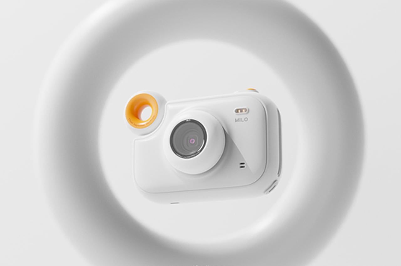
Milo x LEICA children’s camera introduces kids to photography in a fun, intuitive way!

Children are curious. I genuinely believe kids learn more from copying everything we do rather than what we say. And they want to copy us by using the same gadgets we do. For example, my husband picked up his passion for photography from his dad. His dad’s love of tinkering with cameras and picture taking converted this into a lifelong of passion for his son. Understanding this inherent need to pass on our love to our children in a constructive way, Milo x LEICA is a camera that encourages fun, intuitive exploration in children of all ages.

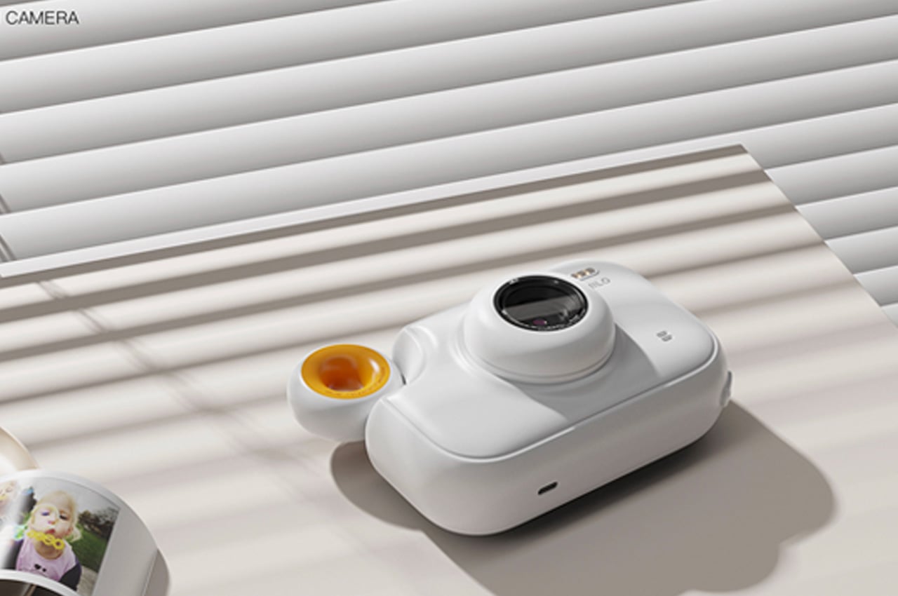
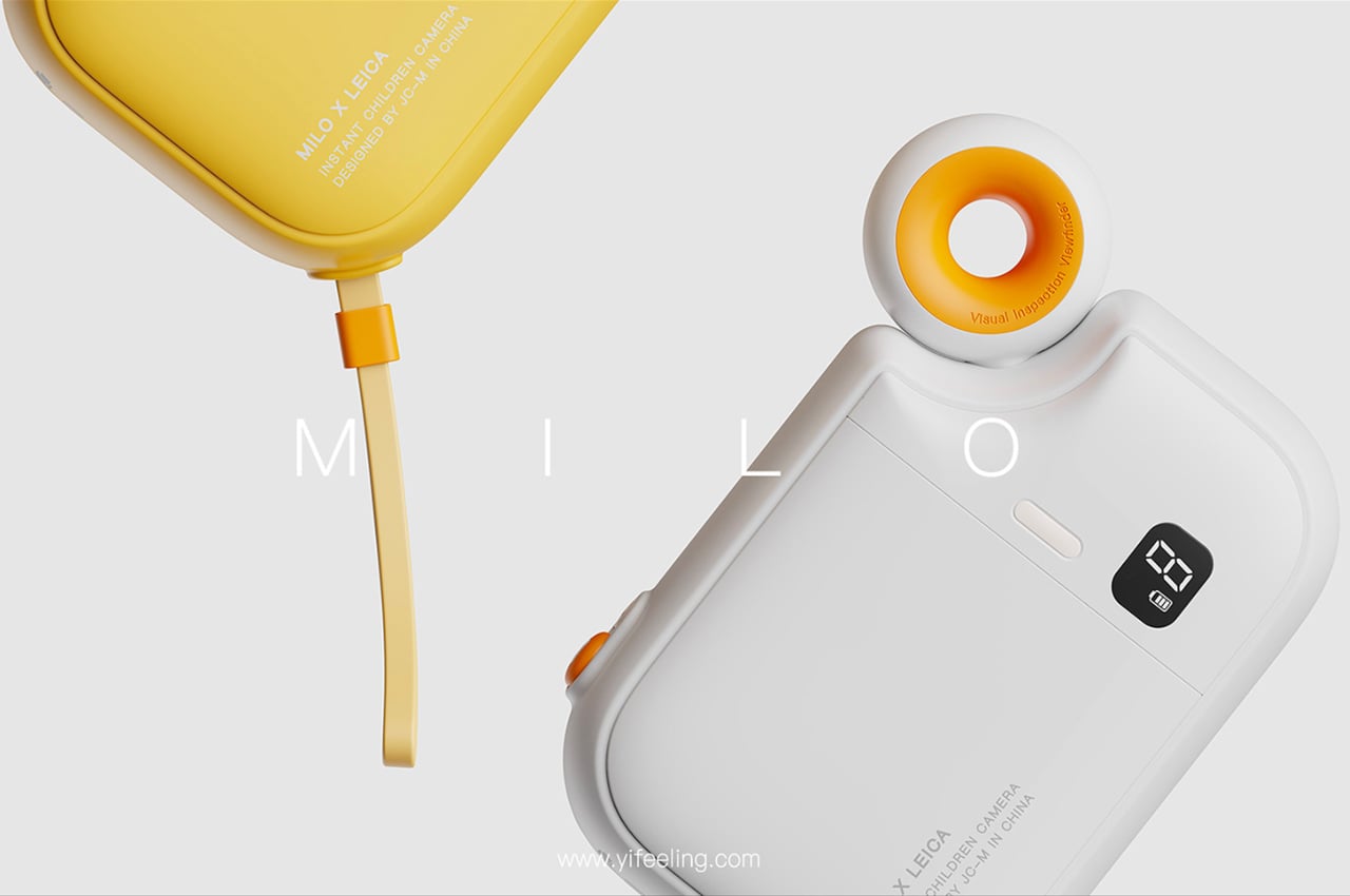
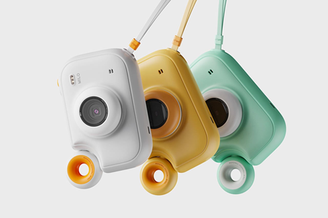
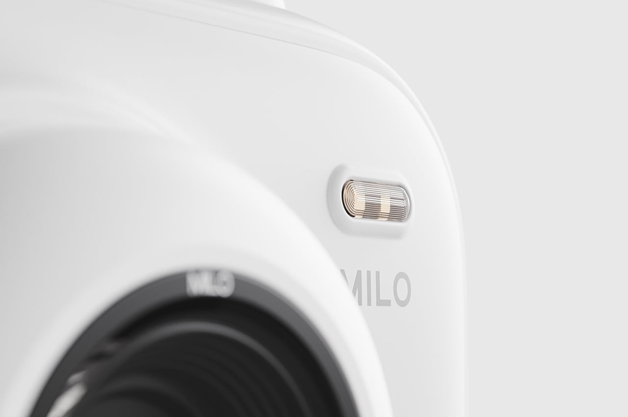
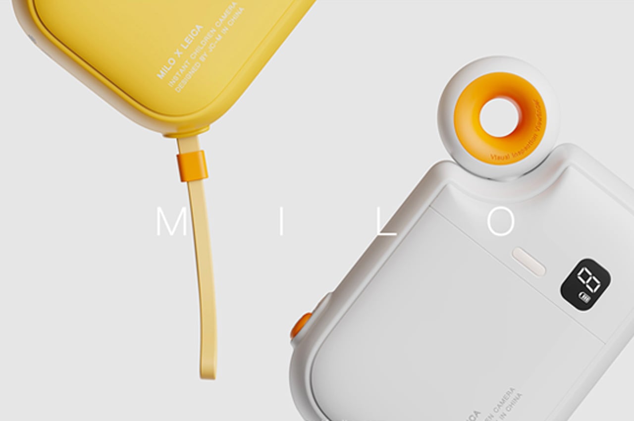
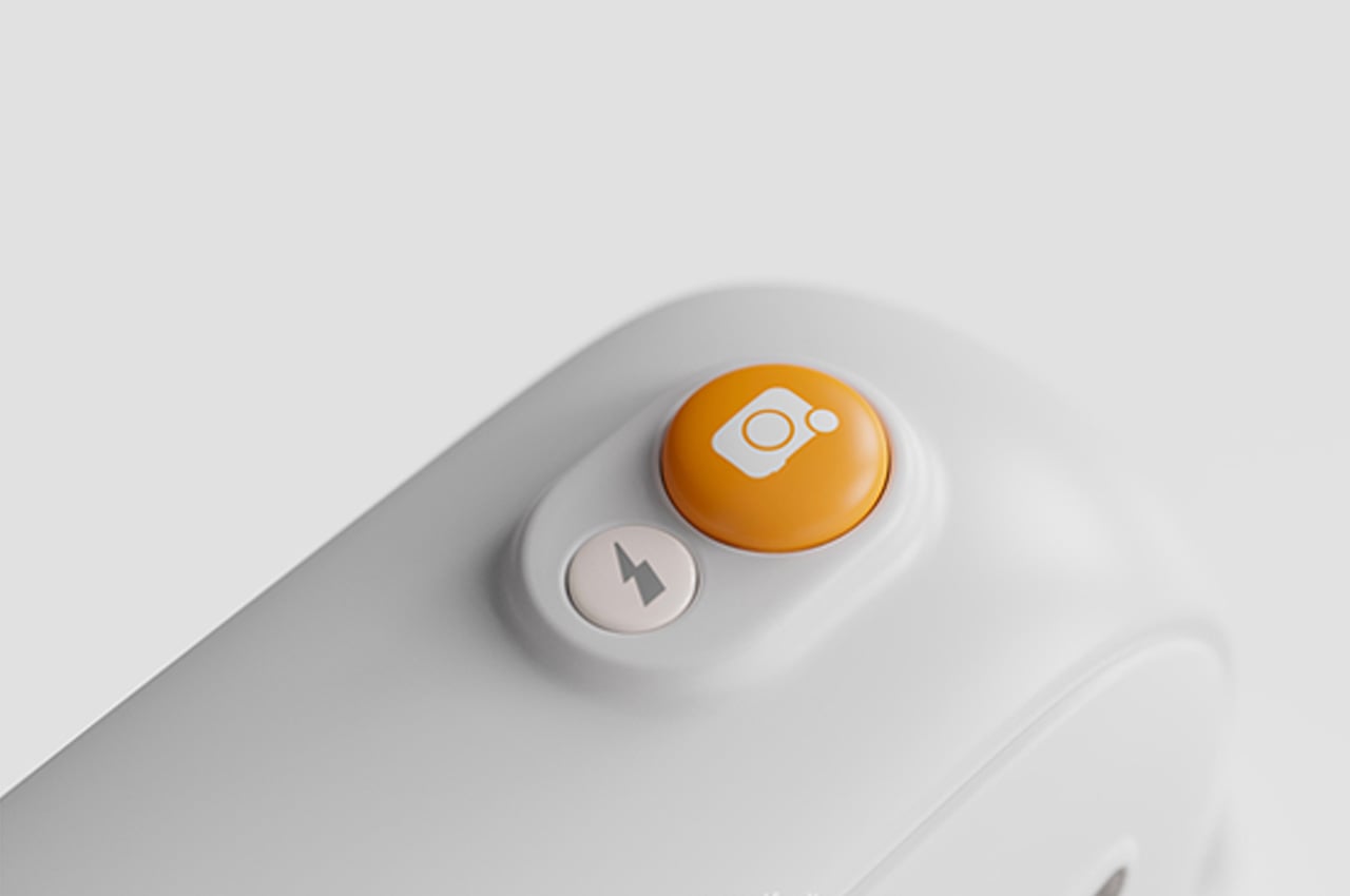
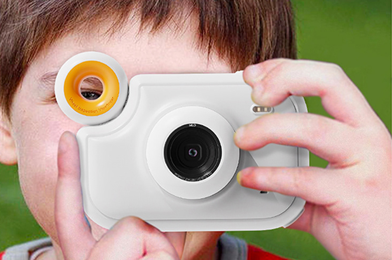
LEICA is known for creating bespoke cameras that are almost collectible. While this clashes with the idea of handing them over to a kid, the quality of the output they deliver are sure to encourage the kids into taking up this hobby with increased frequency. The form of the camera is designed to encourage exploration – with soft rounded edges and a viewfinder that resembles a donut. The design names the viewfinder the visual inspection tool – letting the kid peek through it to discover the world they want to click a picture of. The aesthetics use a soothing yet vibrant white-yellow combination, sparking joy in all they do. Functionality-wise, the camera has a viewfinder, a button to click, a battery level indicator, and a lot that shoots the printed paper out once we click the photo.

Instant cameras are the gatekeepers of our memories. In a world going quickly digital, each printed picture is a gateway into a memory that we can cherish more often. The Milo x LEICA lets us do just that, making photography a fun activity and allowing your child to click pictures that go on and decorate your fridge every day!

Designer: Yang Lei with Yifeeling Design
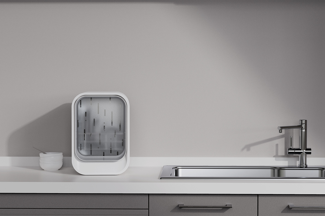
This desktop dishwasher inspired by rain is the space-saving solution modern homes need

I usually do my dishes just before bed so all I have to worry about in the morning is making my coffee. On some evenings, however, I just feel too tired before bed – doing the dishes feels more like running a marathon. I live in a studio apartment, so I know the importance of keeping a tidy space, but I don’t have room for automatic machines like dishwashers or steamers. To come up with a solution for small spaces in need of an automatic dishwasher, a team of creatives from Yifeeling Design felt inspired by the cleansing and quiet nature of gentle rain to design a micro dishwasher called Rain that’s functional for small spaces and also quiet, so it can run through the night.
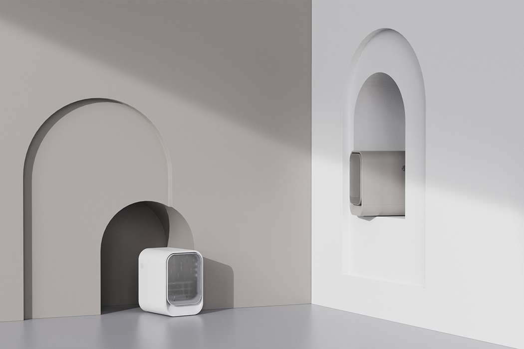
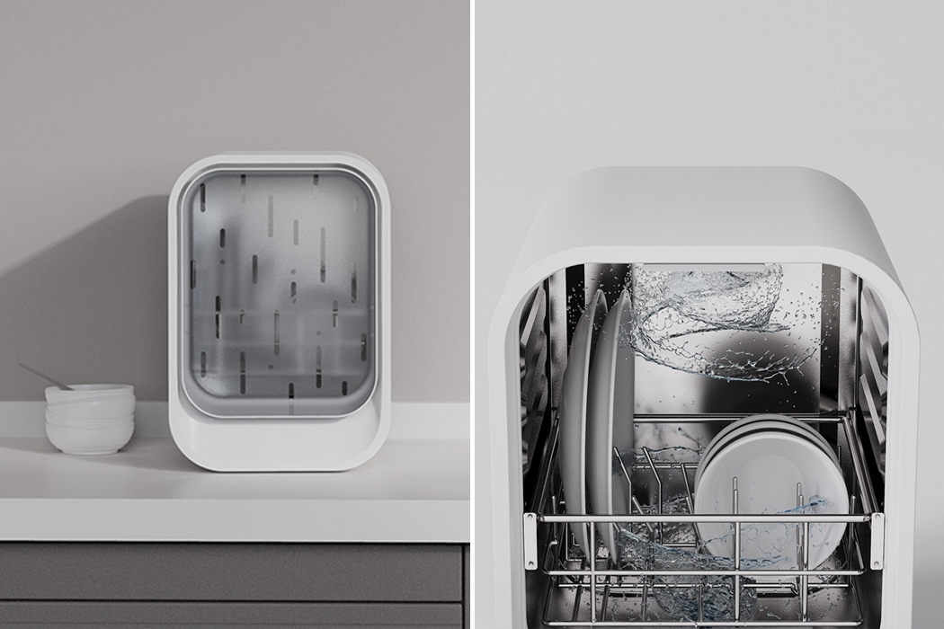
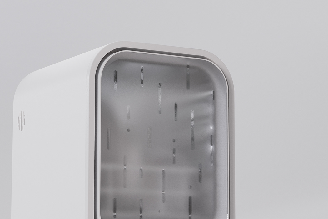
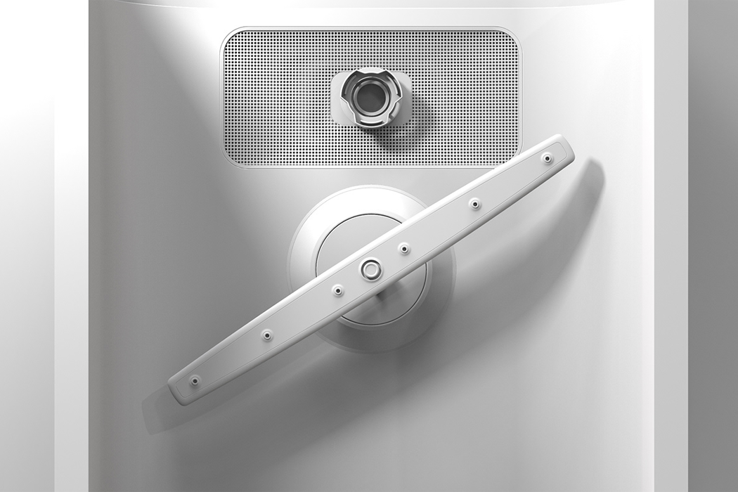
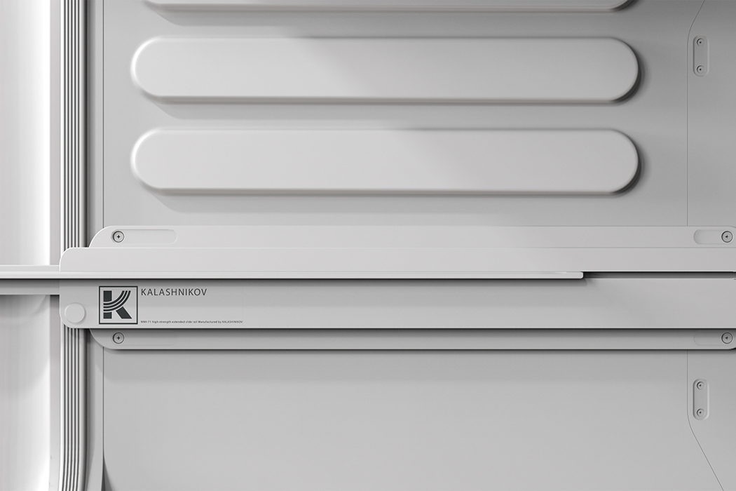
Rain’s structure is inviting and bright, like a gentle sunshower, with rounded edges and smoothed-down sides for a reflective finish and refined shine. Then, Rain’s translucent front facade hides the dishes in plain sight with raindrops etched onto the dishwasher’s glass-pane door. The stainless steel interior of Rain reveals a compartment large enough to hold your bigger plates and a few smaller bowls, making it the ideal personal-sized dishwasher. Sockets for water tubing are attached to Rain’s rear and provide clean water for washing and an exit tube for dirty water. Finally, Rain’s control panel is located on the front-facing, digital interface where you can find a timer option, the power, start, and stop buttons, as well as a mode selector.

Yifeeling noticed a few problems in our existing catalog of dishwashing options. Mostly, dishwashers are too bulky and require too much space, they’re expensive and just don’t fit into smaller kitchens. In order to reduce the volume and space that dishwashers regularly occupy, Yifeeling aimed to design a desktop dishwasher that doesn’t rely on noisy mechanics to get the job of cleaning dishes done. Instead, Rain utilizes the gentle cleanse that follows a day of rain. The days after those summer rainstorms always bring with them cleaner air quality and naturally fresh aromas – those days just feel cleaner. While rain can sometimes be destructive and bring on floods or thunderstorms, it is also a natural element of our ecosystem and it always brings life to dry climates or lush forests, despite the floods and lightning. The creatives at Yifeeling Design utilized this latter aspect of rain to bring their own desktop dishwasher to life.
Designer: Yifeeling Design
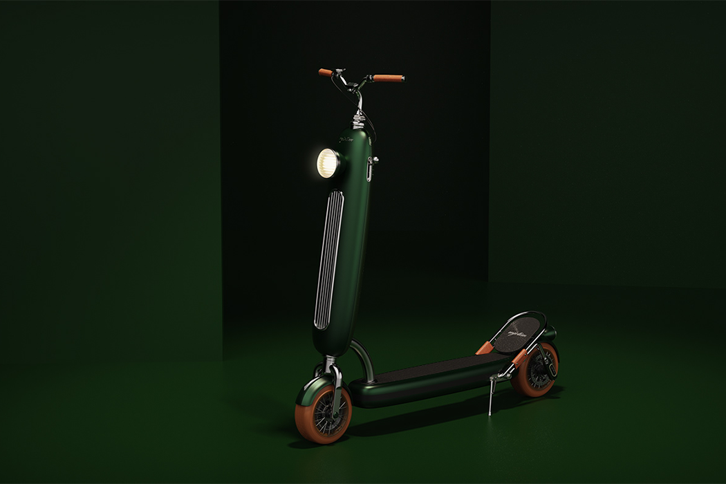
This Porsche clover green e-scooter is the retro style statement you need to end 2020 with a bang!

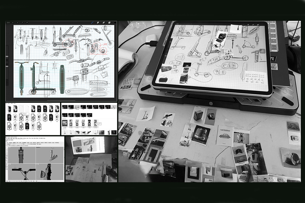
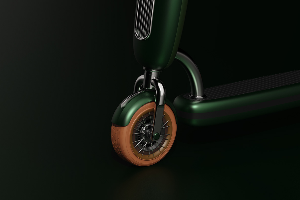
One of the earliest motor scooters was designed in 1915. The finished scooter was mounted on top of two ten-inch tires and operated from the handlebars, offering speeds up to 20 mph with 125 miles to a full tank. Back then, the design was ahead of its time, but it wasn’t too popular amongst consumers. The only people interested in motor scooters seemed to have been city dwellers. With city living being the preference for most young people today, it’s no wonder motorized scooters are increasing in popularity. Mjotim, from Yifeeling Design Lab, was produced in order to meet today’s technological standards while paying tribute to the earliest forms of motorized scooters.
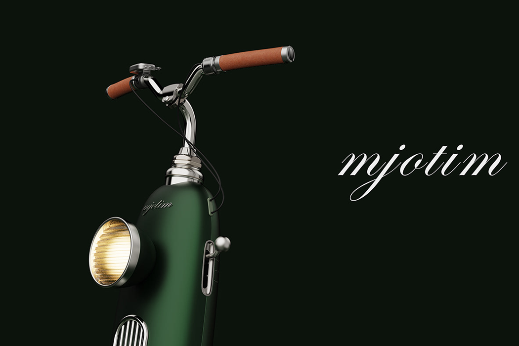
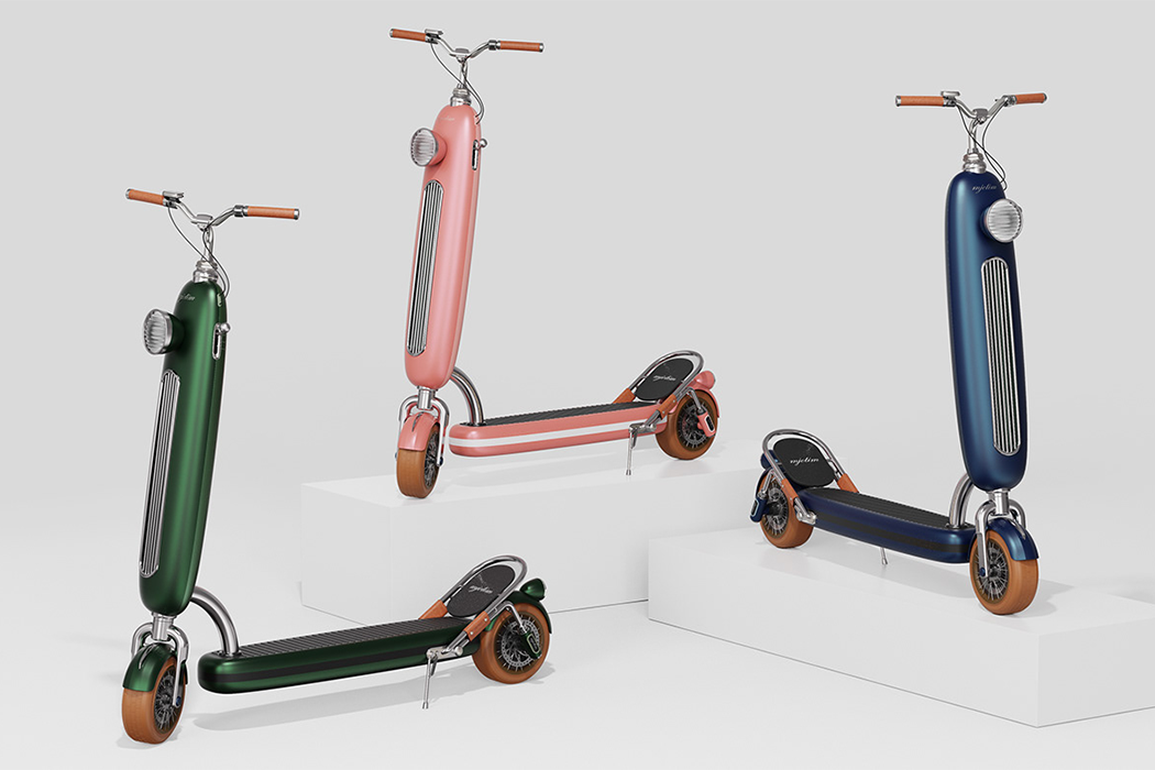
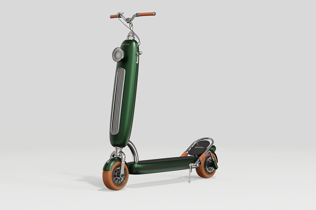
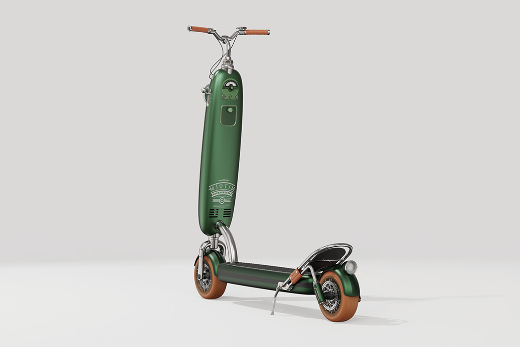
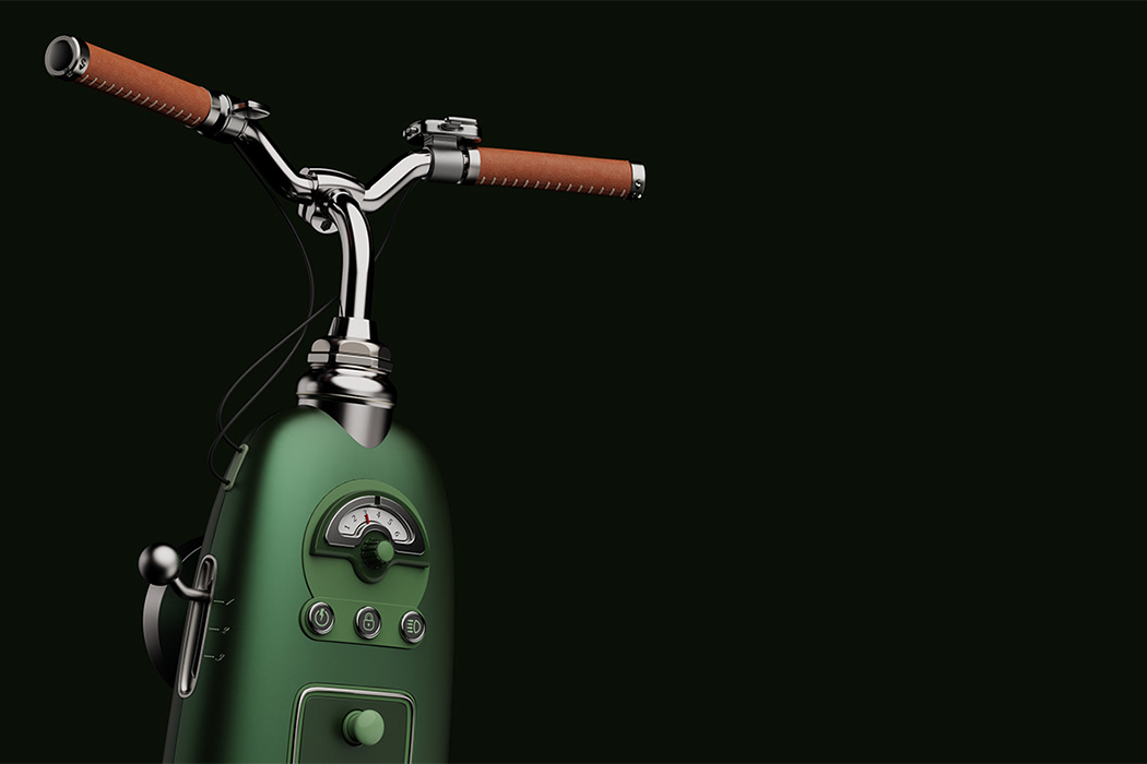
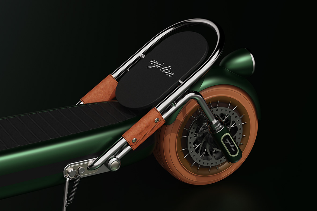
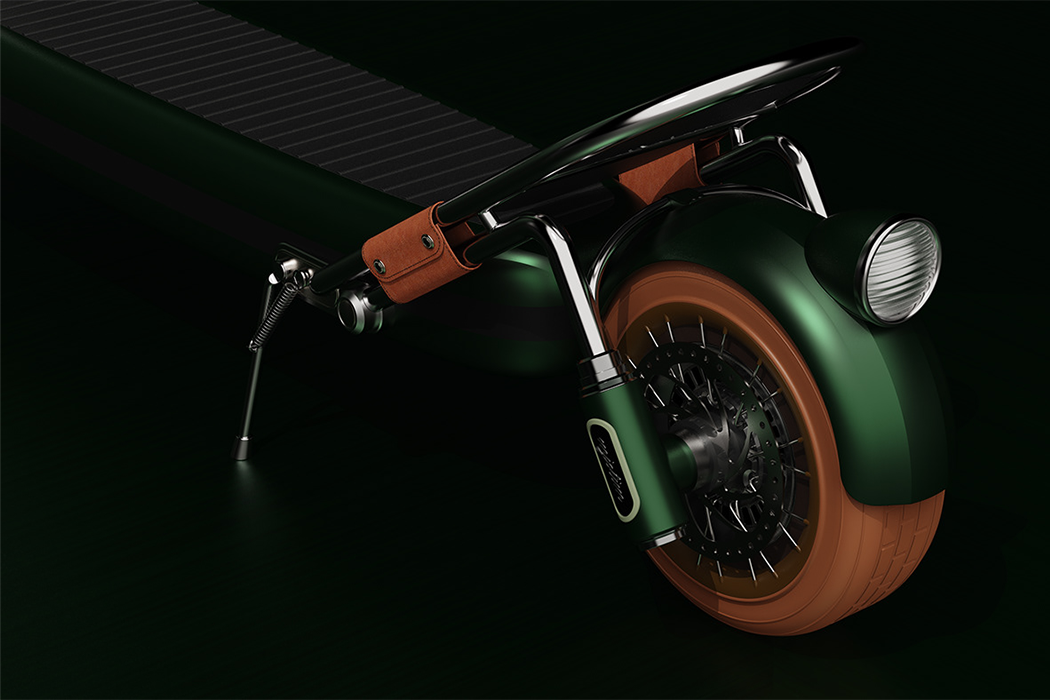
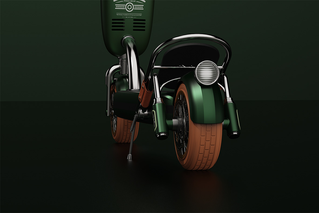
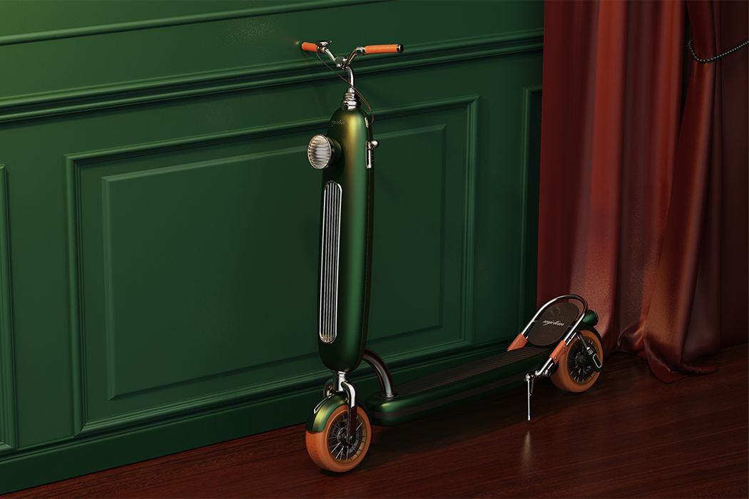
Adhering to the typical structure of the scooter, Mjotim was designed to be ridden standing up, with the vehicle’s motor encased inside and gear information outside of the steering column, along with two handlebars, which are primarily used for steering. A screen on top of the right handlebar informs the rider of their speed on a gauge and a brake lever adjusts the rider’s speed on the left handlebar. In the center of the steering column, a tachometer indicates to users the wheel’s rotation speed, along with different knobs that comprise the scooter’s power control interface: a power pushbutton, a lock button, and an accelerator. Below the tachometer and power control knobs, a small compartment fans out if the rider is ever in need of storage space. Mjotim has one headlight that outwardly faces oncoming traffic for late-night rides to the grocery store or commutes back home after the workday. Atop the scooter’s rear wheel, a backlight shines from behind so that cars and pedestrians see you no matter how late the ride.

Mjotim does its expected job of getting riders from Point A to Point B and it looks good while doing it. With burnt natural leather accenting emblematic retro color schemes. Mjotim is practically a rendered time traveler from 1967, and maybe that’s what we need – a dose of everything old and good in our life to wrap up 2020 feeling good about the oncoming year. Taking inspiration from the Royal typewriter, a clover green Porsche and gleaming Schwinn bicycles, the designers behind Mjotim aimed to provide young professionals and city dwellers with a mode of transportation that not only safely carries riders to their destination but brings them there in vintage style.

Designers: Tim Danilaer Fasikola, Yang Lei x Yifeeling Design